This Place was a visualisation of 2011 Census data for England and Wales, for your local area. [It is now offline.]
I’ve been meaning to adapt Michal Miguski‘s This Tract for the 2011 UK Census, ever since I saw it a couple of years ago showing the 2000 US Census. The clear, clean styling – simple a map of the local area, and a nice table of pie charts – was a world away from the choropleth maps I’ve produced previously. The most striking feature is what’s not there – when you are looking at a particular area, the surrounding areas are blanked out – they don’t distract.
Following the release of fine-grained 2011 Census data at the end of last month, at least for England and Wales, I’ve spent some time getting the data into the equivalent format and also customising the website with UK-specific metrics. The end result is not architectured in quite such an elegant way as Michal’s – his version uses geographical information direct from the “official” Census site, courtesy of their web services, and predefined static datafiles, whereas mine makes numerous queries to a local database – so his would scale better, although mine is backed by a decent academic server.

I’ve used different colour ramps for each of the metrics – for ethnicity I used a rainbow-based colour ramp. The attempt is that the “colourfulness” of the wheel shows the ethnic diversity of an area. A fully diverse area will have significant proportions of every colour, creating a “wheel” of colour.
Lots of interesting results – for example, parts of London are very diverse while there’s plenty of places which are extremely homogenous – but not always with White British. Sometimes there’s a two-way split. As you might expect, parts of university towns have a young and highly educated population. The centres of major cities have many more men than women living there, and seaside results have an old population. Deep in the rural countryside, primary industries such as farming are popular. Liverpool’s large public sector workforce is clear.
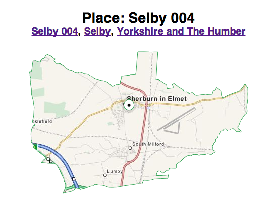
One undocumented feature – you can input the MSOA code (found at the bottom of the page) into the search box, or the URL, to create a weblink specifically for that area. At the moment, my smallest unit geography is MSOA – the size is about right, but the boundaries of MSOA can be very arbitrary. If the data is released at ward level I may well switch to that.
The mapping for This Place comes from MapQuest Open, which is MapQuest-style map based on OpenStreetMap data. ThisPlace is now offline.