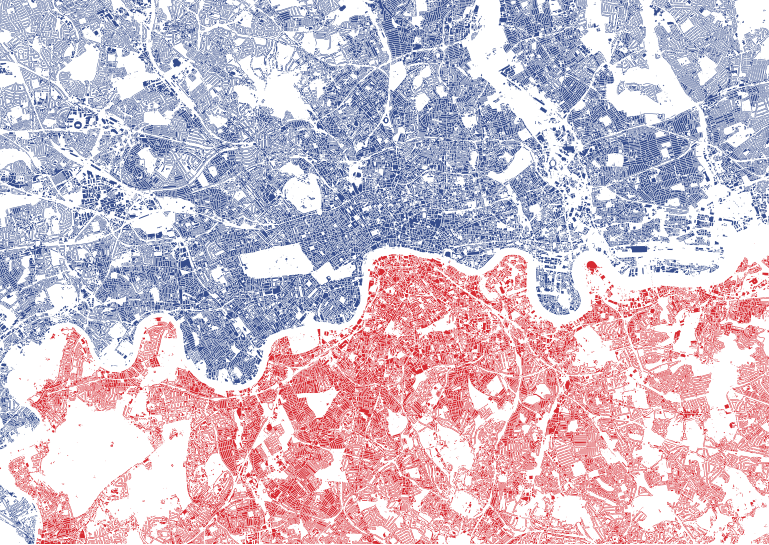
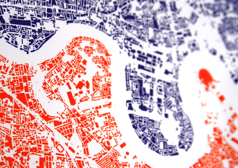
London North/South shows every building block in central and inner city London, coloured blue if it’s north of the River Thames and red if it’s south. And that’s all. No other features are shown, and yet, from this simple premise, a map of the city appears. Almost every street is visible, as a linear white line. Longer lines, with gentler curves, particularly in south London, are often the railways. Stadia are noticeable for generally having a football-field-sized hole surrounded by an often oval block of colour. St Paul’s Cathedral is surprisingly small, but obvious if you know where to look. Big holes in the map are London’s grand parks – Hyde Park and Kensington Gardens being perhaps the most distinctive, as they are surrounded on all sides by densely packed building blocks. A flash of blue appears in the bottom left corner of the map – a mistake? No, the Thames wiggles so much in west London, that this area (Hampton Wick), on the far south of the map, is in fact on the river’s north bank.
The map has 48912 shapes on it – 28200 in blue and 20712 in red. It covers, I think, more than half of London’s eight million plus population, suggesting an average of around 100 people live in each housing block. It does include industrial and commercial buildings, but it’s a fair assumption I think to say that the great majority of buildings in London are residential ones.
The map is centred on a spot just south of Waterloo Railway Station, which is the geographical centroid of Greater London – despite this being south of the river, while the major institutions of the capital – and most of Zone 1 of the tube network – are on the north.
One feature which is on almost all London maps is the River Thames. Famously, when it was removed from the official tube map a few years ago, there was a big outcry and it was hastily restored. This map doesn’t have the Thames on it – but the space through where it runs is obvious. Think of it as being there after all – but coloured white.
I’ve had the graphic professionally litho-printed and it is currently available as a limited edition A2 edge-to-edge print which you can buy from my new online shop, as one of two designs available at the shop’s launch. So far, it’s comfortably outselling the other print which is an update of my Electric Tube design. I think a lot of people like the idea of owning something which has their house on it!
The data comes is Ordnance Survey’s Vector Map District, released under the Open Government Licence. The data is therefore Crown copyright and database right Ordnance Survey 2014. It was prepared in QGIS 2.0, with finishing touches and colouring carried out in Illustrator.
2 replies on “London North/South”
Are you interested in selling the vector graphic for a piece of commercial work?
Thank you
Hi N – potentially – please contact me at o.obrien (at) ucl.ac.uk.