Categories
CDRC Conferences

Mapping Data: Beyond the Choropleth

I recently gave a presentation as part of an NCRM Administrative Data Research Centre England course: Introduction to Data Visualisation. The presentation focused on adapting choropleths to create better “real life” maps of socioeconomic data, showing the examples of CDRC Maps and named. I also presented some work from Neal Hudson, Duncan Smith and Ben Hennig.

Contents:

  • Technology Summary for Web Mapping
  • Choropleth Maps: The Good and the Bad
  • Moving Beyond the Choropleth
  • Example: CDRC Maps
  • Example: named – KDE “heatmap”
  • Case example: Country of Birth Map – concerns of the data scientist & digital cartographer

Here’s my slidedeck:

(or you can view it directly on Slidedeck).

Categories
Conferences

ICA/Esri Cartographic Summit

cartosummit_james
I attended the Cartographic Summit “The Future of Mapping” (#cartosummit) which took place at the Esri campus in Redlands, California, earlier this month. Some notes from the week, which was co-organised by Esri and the ICA (International Cartographic Association). Here are some notes about the event, which I’ll continue to add to/tweak over the next few days.

  • The attendee list included some key names in modern cartography, including Cynthia Brewer, creator of the “ColorBrewer” set of colour ramps which I use widely in almost all my output mapping, such as in DataShine and many of the datasets on CDRC Maps
  • It was a good natured event. The only map that came in for (justified) criticism from a presenter was – unfortunately – one of my own! Former TIME graphics director Nigel Holmes (below, showing an old US election map) was perturbed to find that my Dwelling ages map seemed to be suggesting that his old house was 50 years younger than he knew it to be. The problem was compounded by some notes he referred to in this blog, which indicated a low proportion of the dwellings on the area concerned were being mapped. It is fair criticism – the detail on my map implies a level of precision that is simply not true – my counter argument being that people like to see maps of recognisable features rather than generalised blobs representing villages and towns. I think what I need to do is revisit the mapping and indicate such low proportion areas using an “uncertainty” indication such as fading out the colour…
  • James Cheshire of UCL (photo above) presented early on the conference and got straight to the point – that good maps are hard to do and, when they are done right, it’s hard to spot the effort and skill that goes into them. The proliferation of bad maps throughout the web is testament to this. He used the production process he developed for his recent book on mapping London datasets, to drive home the additional steps (shown in bold above) needed to turn a good map a great map, and reinforced the need for time – there are plenty of tools out there that allow good maps to be produced, but great maps still need care and attention.
  • Alan McConchie of Stamen talked all too briefly about the wonderful basemaps produced at the studios, including the famous “Watercolour” digital map.
  • Gary Gale of W3W looked ahead and reinforced the point that far from being an old-style industry, cartography has never been more current or key.
  • Ken Fields of Esri gave us a dizzying tour of new cartography that he has been experimenting with over the last couple of years. He also gave a sneak peek of a very interesting looking book that he is currently working on…
  • There was good academic representation in the audience, however there were some notable gaps. Commercial considerations are understandable but it was a pity there were no representation from Google, HERE, CartoDB or – especially – MapBox. The digital cartography groups within these organisations are producing great things. MapBox, in particular with its huge number of GitHub open source projects such as CartoCSS. MapBox did get a mention in one of the later talks, relating to Esri’s ongoing work to implement the MapBox Vector Tiles (MVT) format. The absence is perhaps reflective of Esri being the co-sponsor and host, who may therefore be reluctant to provide the other organisations with a high-profile platform but it still remains the fact that no discussion of modern digital cartography can be complete and representative without including the excellent work by these groups. Having said that, the small guestlist and excellent facilities provided for breakouts and discussion, allowed for good networking opportunities and gave everyone time to discuss cartographical insights with key professionals, an opportunity likely not afforded at a larger, less focused event.

cartosummit_nigel

My key take-away from the event is that digital cartography is now more important than ever. The plethora of tools available in the “market” now for creating maps has never been larger, but the need to create maps, which present the data fairly and impartially while engaging the viewer and encouraging them to explore, is just as critical as it has ever been. Anyone can make a map now, but creating a great map is very much a skill.

A very timely, useful conference and very much shows the need for a dedicated cartography track at the major industry and academic conferences in the GIS/geovis/datavis fields.

cartosummit_attendees

Categories
BODMAS Conferences

In/Visibility and Difference – Visual Methods Workshop in Berlin

vmw1

I presented a talk on geodemographic mapping, at a visual methods workshop “In/Visibility and Difference” which took place in Berlin at Bard College (formerly the European College of Liberal Arts). The workshop was organised by the TransformIG project at Humboldt University in Berlin, which was also the venue for the keynote part of the meeting. Thank you to the organisers for organising an interesting and intensive workshop which presented a wide variety of visual and geographical techniques which are becoming key ways to structure and analyse sociological studies.

I structured my talk into four sections:

  1. An primer on improving choropleth mapping of socioeconomic data, moving beyond the basic “heat map” by adding regular geographical feaures (see photo below), labels and clipping coverage to populated areas, to explain the demographic patterns and highlight external influences. This is the technique used by DataShine to display Census 2011 aggregate statistics, and CDRC Maps to show geodemographics. I also outlined alternative approaches used by other research groups, such as cartograms and dot density maps.
  2. A tour of the geodemographic maps in CDRC Maps, including the Output Area Classification and a map of the latest Index of Multiple Deprivation. I also touched briefly on the problems of geodemodemographic classifications, where good/poor fits to the classification are typically mapped identically, and the “second choice” classification doesn’t get shown, showing some techniques to try and map these subtleties.
  3. An introduction to more novel methods of mapping demographic data, such as Lives on the Line and Tube Tongues, but highlighting the shortcomings of such maps too.
  4. Finally, a brief mention of mapping more novel datasets, showcasing the Twitter language maps for London and New York – again discussing the flaws as well as strengths of such maps.

vmw_me

I found many of the other talks very interesting – particularly the work by plan b – two performance artists who have essentially tracked their entire outdoor life over the last 8+ years, both creating GPS traces which they have turned into artworks at various scales and on mediums (including a 3D mould), but also temporal activity indicators which they have grouped together into small multiples. They term these the “birch trees” due to their characteristic stripy white/black columns (see top photo). I also liked the striking pictograms created by Migrantas who have created simple and powerful graphics, from stories from the migrant community in Berlin and elsewhere. Their work can be seen on billboards and walls in various places across the city. There was a good talk by Stefan Lindemann on “SuperLUX”, focusing on linear development along commuter lines to Luxembourg City and corresponding population changes – essentially an international take (due to the country’s size) of the more recent “Northern Powerhouse” project to connect the cities of the north of England.

There was one more map “treat” for me at the workshop – the closing keynote given by Caroline Knowles included her investigative journalistic project where she tracked the complete journey of a pair of flip flops – from oil in Kuwait, to factories in South Korea, then to and through the markets in east Africa, to the consumer, and then finally to the rubbish dumps of the region. A map illustrating the life cycle of the flip flops is below.

Thanks to Agata Lisiak and the TransformIG team for inviting me to speak at the workshop and the opportunity to learn as well as disseminate. (Photo credit for the top photo: Agata).

vmw2

Categories
Conferences

ECTQG 2015

ectqg_2015_alistair

Just a quick report on the 19th European Colloquium on Theoretical and Quantitative Geography, which took place near Bari in Puglia, South-east Italy, earlier this month, and which a significant amount of the quantitative geography group here at UCL attended, including myself. The meeting was held at an agricultural college in a university town a few miles from Bari itself, and was held Friday-Monday, which emphasised the residential nature of the meeting.

A couple of frustrating aspects, which persisted throughout the weekend, were some relatively uneven grouping together of talks on unrelated topics into a single session, and also a relatively large number of talks were included on the programme despite being from presenters who had submitted abstracts but weren’t present at the actual meeting, resulting in quite a few gaps or sessions. In one case, the first of three OpenStreetMap sessions was cancelled after most presenters were absent, but the three sessions were later being regrouped (unannounced, so I missed it) into a single session with seven presenters squeezed into the time for five. In another case, one person had been allocated to chair one session while giving a presentation simultaneously in another stream!

Positives from the conference though were the excellent food provided, the weather meaning that several of the meals could be taken outdoors – as well as at the grand gala dinner in a hotel in central Bari. The local feral kittens also provided entertainment, particularly for us Brits who are suckers for such things! We also managed some time off to visit Monopoli, a lovely little town about 30 minutes from Bari, with a pleasant old town and central square, a small (sadly, too small) bikeshare system, and apparently almost completely off the tourist radar.

Next ECTQG is much closer to home – the Leeds part of the CDRC research group that I am affiliated with are organising it somewhere in Yorkshire in 2017.

Above: Alistair Leak discusses Ward’s hierarchical clustering for surnames, as part of his presentation at the colloquium. Below: An evening meal outside.

ectqg_2015_dinner

Categories
BODMAS Conferences

UKDS Census Applications Conference

census1

I was in Manchester a couple of weeks ago for a UKDS conference on applications of the Census 2011 datasets that have been made available, through the ONS, NOMIS, UKDS and other organisations/projects. The conference was to celebrate the outputs and projects that have happened thus far, now that the Census itself is four years old and most of the main data releases have been made.

It was a good opportunity to present a talk on DataShine, which I made a little more technical than previously, focusing on the cartographical and technological decisions behind the design of the suite of websites.

I enjoyed an interesting talk by Dr Chris Gale, outlining graphically the processes behind creating the 2011 OAC geodemographic classification. Chris’s code, which was open sourced, was recently used by the ONS to create a local-authority level classification. There was also some discussion towards the end of the two-day meeting on the 2021 Census, in particular whether it will happen (it almost certainly well) and what it will be like (similar to 2011 but focused on online responses to cut costs).

All-focus

After the conference close I had time to look around MOSI (the Museum of Science and Industry) which is mainly incorporated around an old railyard, terminus of the world’s oldest passenger railway and containing the world’s oldest station (opened in 1830, closed to passengers in 1844). But I was most impressed by the collection of airplanes in the adjoining hangar (once a lovely old market building), which included a Kamakaze. I also had a quick look around the Whitworth Gallery extension which has been nominated for this year’s Stirling Prize.

census3

Categories
Conferences

China: Fuzhou

fuzhou7

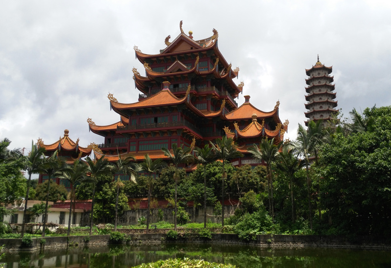
I spent a week in Fuzhou earlier in July, in China’s Fujian provice, presenting and attending a summer school and conference, respectively, at Fuzhou University. I’ve already blogged the conference itself (read it here) but during the week I got plenty of time, outside of the conference to get a feel for Fuzhou and this small part of China. Here are some notes:

fuzhou5

Bikesharing
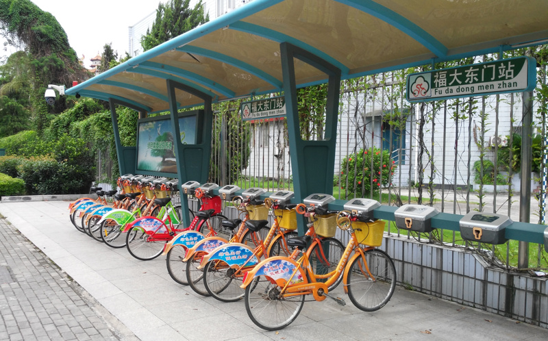
There is a bikeshare system in Fuzhou, but it is small (by Chinese standards). I saw a few bikeshare docking stations during my trip, in particular one outside the university, which was complete with a (closed) booth for an attendant (I think this is where you get a smartcard to operate it). Each station has 10-20 docks, generally nearly full of the bright orange and green bikes, docked under a bus-stop-style shelter that also contains an alarm light, CCTV and loudspeaker, and red scrolling LED information screen. Adjacent there were typically 10-20 further bikes chained together, presumably for manual restocking by the attendant when they are there. The one thing I did not see, at any point during the trip, was anyone actually using the bikeshare bikes. The modal share of cycling is low anyway in Fuzhou (the roads are intimidating, but this doesn’t stop the swarms of electric bike users) but I wasn’t expecting to see a completely unused bikeshare system in a country so famous for the transport mode.

fuzhou4

Transport in General
Fuzhou is a city of nearly five million people – half the size of London. And yet it has no metro, tram or commuter rail (apart from a couple of stations right on the outskirts). So everyone travels by car, taxi (very cheap – £1 for most journeys), bus (10p per journey, air-conditioned and frequent), or electric bike. Probably 50% car, 15% bus, 30% electric bike, 5% taxi. Walking is not so popular as the roads are generally very wide and difficult to cross (you don’t generally get much space given to you at zebra crossing!) and likely because of the hot climate at this time of the year. The one mode that I saw extremely little of, is pedal cycling. I had heard that cycling has quickly become an “uncool” thing to do in China, it is interesting to contrast with the rapidly rising cycling use in London – albeit from a low base. London’s cycling mode share was also once much higher and also had a sharp fall – maybe London is just ahead of hte curve.

fuzhou3

Climate and Pollution
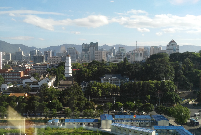
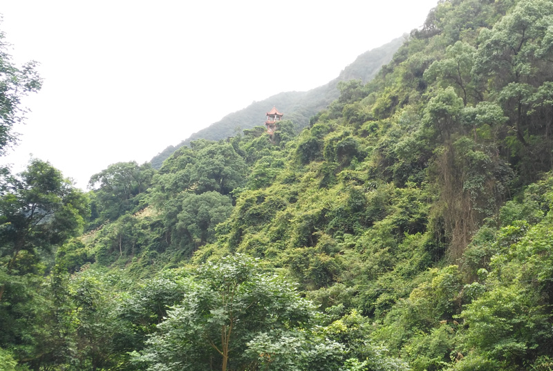
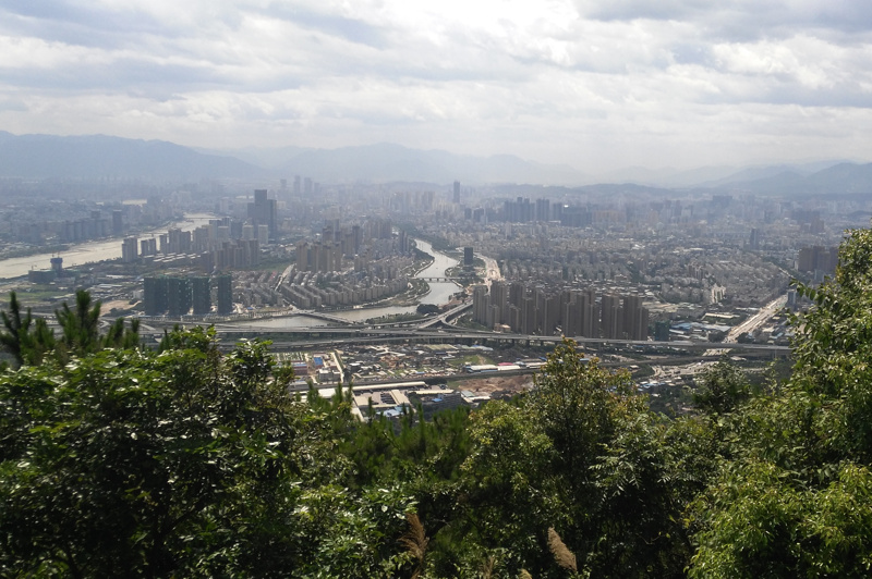
Fuzhou is a southern Chinese city. It’s around an hour’s drive in from the coast, where its airport is. It’s north of the many cities near Hong Kong – about 90 minutes on a plan from the latter – but south of Shanghai, and a long way south from Beijing. The climate is therefore quite hot and muggy at this time of year. As you might expect from a city of five million people where most people drive, a haze of pollution was often visible where I was there. However, the haze is not too bad. Fuzhou is helped in this by being surrounded on most sides by thickly forested mountains, which often rise up steeply, immediately beyond the city limits. One of these ranges indeed forms the Fuzhou National Forest Park which contains a wide variety of trees, including a 1000-year old tree with its elderly branches supported by concrete pillars! The masses of trees on all sides no doubt help with some soaking up of pollutants. Many of the large roads have lines of thickly foliaged trees running along them, and the bridges for pedestrian crossings, and highway flyovers, also have lines of shrubs and bushes all the way along them, which doubtless also help absorb pollutants and keep the haze under control. The street foliage also has the side effect of making many views of the city look quite pretty, with lines of green and purple plants softening the concrete structures and making the city seem to blend into the landscape.
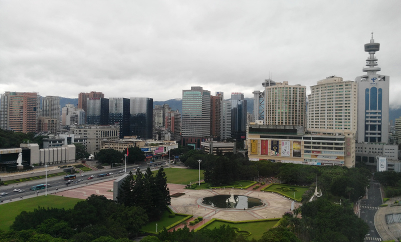
fuzhou1

Urban Structure
Fuzhou is a city largely of apartment blocks. Strikingly, the centre of the city has virtually no construction going on – it is as dense it as needs to be, Fuzhou’s population does not need to increase, and the congestion need not get any worse. A few from the central hotel reveals almost no cranes, anywhere on the horizon, apart from some small ones for the aforementioned metro construction project. This is starkly different to the edges of the city, at the few gaps between the mountains, particularly along the road leading to the airport and the coast. There is a brand-new high-speed railway station at this edge of the city, and it also is the direction towards the shipbuilding and electronics industry factories that are a few miles distant. The area around the station is relatively free of apartment buildings, but huge numbers are currently being built, many 30-40 stories high and often built very close to each other, in clusters with distinct designs. The new station and the good road leading outwards it presumably the spur. This is infrastructure building, and developers responding to this, on a grand scale.

fuzhou6

Consumer Culture
One thing I noticed was that most of the Chinese attendees of the conference I was at had iPhone 6 phones. I’m not sure if this is representative of the Fuzhou population at large, but I was surprised to see no Huawei or Xiomai phones (both Chinese brands, i.e. home-grown). I have a Huawei myself – it is excellently built and I am very happy with it. Apple has done hugely well out of convincing people to pay thousands of extra yuan for the a phone with the Apple branding. Talking about luxury brands in general, Fuzhou has a cluster of these (Christian Dior etc) in a small mall in the centre, and also I spotted a Starbucks and McDonalds lurking nearby. But, Apple aside, in general western brands have little impact. And as for the popularity of the iPhone, the (official) Apple Stores have not made it to Fuzhou yet.

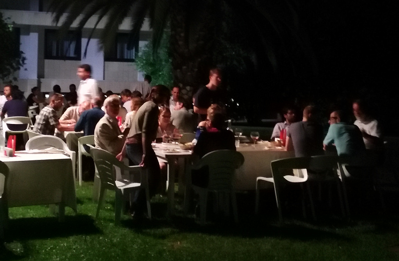
More generally, the food in China takes some getting used to, both the variety of produce and also the local varients. Lychee trees are everywhere (the region is where they were originally from) and there were plenty of other unusual fruits. The look of lychees takes some getting used to, but the taste is very pleasant. Fish features in a lot of dishes, as do various meats – the buffet and “lazy Susan” format though thankfully means the more mysterious items can be ignored! Our host also took us to an upscale restaurant where we had a lot of very spicy food (rare for the region) and also some weak but pleasant Chinese beers.

fuzhou2

Categories
Conferences

China: ICSDM Conference

IMG_20150706_163812ec

Last week I was in China for the 2nd IEEE International Conference on Spatial Data Mining (ICSDM), travelling with my lab’s director who was keynoting and giving a day’s teaching at the conference’s accompanying summer school. The conference was based in Fuzhou University, on the western edge of Fuzhou in Fujian Province, a city of five million people about 90 minutes north east of Hong Kong by plane, and an hour’s drive inland from the ocean. The city’s setting is rather dramatic – it is surrounded by forested mountains, and the greenery extends into the city too, where it helps absorb pollution.

IMG_20150709_165709ec
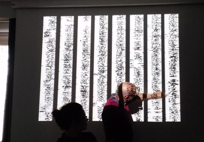
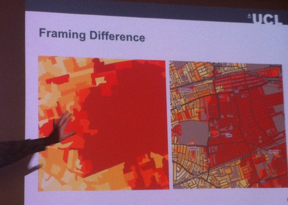
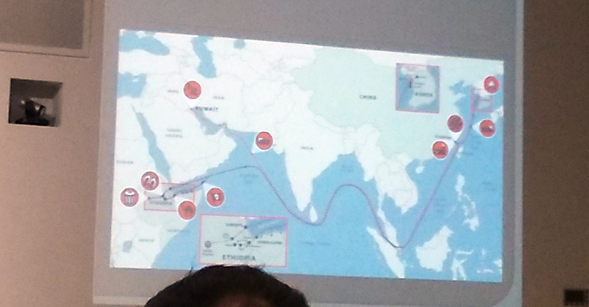
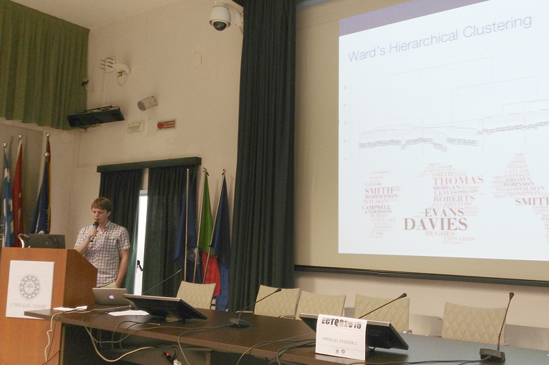
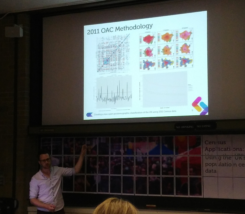
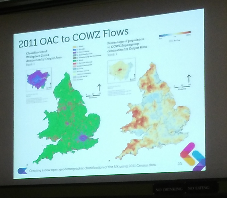
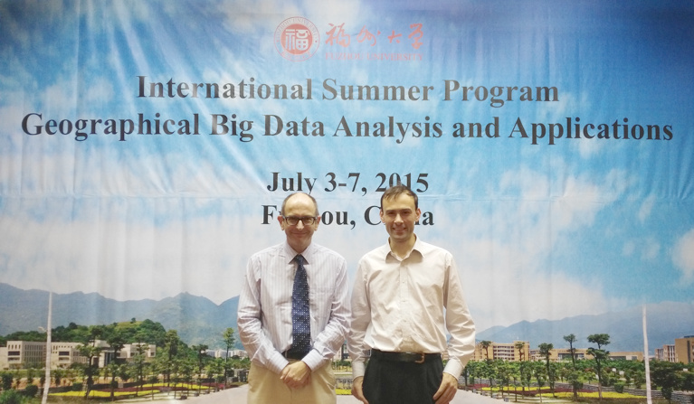
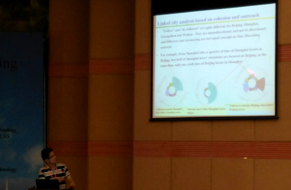
The conference consisted of a number of keynote presentations given by domain experts on topics such as Big Models for Big Data, to Social Media geographic data mining and classification, to multi-source pollution monitoring and modelling. Interspersed with the keynotes were parallel tracks of project presentations, many (but not all) of which were given by Ph.D. candidates and other students at various universities elsewhere in China, as well as at Fuzhou itself. Remote sensing was a major theme of the conference, but other topics included modelling house prices based on demographic information and looking at movements of people using the Chinese equivalents of Facebook and Twitter.

As well as the conference itself there was time for a number of walks in the local forest parks and up some mountains – tough in the heat and humidity of southern China in the summer, but well worth it for the views. We also visited a number of temple buildings and other areas popular with tourists.

It was a well organised conference and was interesting to attend – not least to see that the sorts of research topics that we are familiar with here in quantitative geography at UCL, are carried out in China too – but with a local perspective, based on the different datasets available and cultural habits. The keynote talks also added a good, rounded perspective on the spatial data mining field as it currently stands. All in all, an eye-opening week.

All-focus

Categories
Conferences

GISRUK 2015

The week before last I was at GISRUK, the long-running annual academic conference for early (and not-so-early) career researchers in GI Science in the UK, Ireland and further afield. This year’s conference was in Leeds and attracted a record number of 250+ participants. I presented a poster at a meeting the day before the main conference, but otherwise had no talk to give at Leeds, which means I was able to relax and focus on seeing the most interesting sessions. This year we had some great keynotes, including two visually impressive talks from Google’s Ed Parsons and MIT’s Sarah Williams, opening and closing the conference respectively. Outside of the keynotes, there were three main streams running simultaneously, but with the theme regularly changing after each group of talks, which meant for plenty of room swapping.

Some of my favourite talks:

  • With a large UCL attendance, there were plenty of talks on geodemographics and socioeconomic mapping. One of my favourites was from Monsuru Adepeju of the UCL Crime, Policing and Citizenship project, the talk looked at a new way of detecting crime hotspots. The presentation included the below map showing a crime-weighted geodemographic map of London.gisruk1
  • Staying with UCL and geodemographics, but going from crime to food, this classification, developed alongside a major food retailer in the UK, was presented by UCL’s Guy Lansley of the Consumer Data Research Centre, the work linked ethnic-weighted classifications with the popularity of certain food types, to simplify the task of providing particular food-types popular with one or more major ethnic groups in the UK, as the country’s population demographic continues to change and move.gisruk2
  • Staying with the geodemographic theme, Mark Birkin of Leeds gave an overview of geodemographics research in the era of big data, where ever increasing amounts of data allow ever more sophisticated analysis to be performed. The below image shows a slide from a presentation presenting a very detailed geodemographic map – right down to postcode (typically 50 homes) level.gisruk3
  • Away from geodemographics and to cartography: Jonny Huck of Lancaster presented the results of a study into creating a number of map types that encouraged good interaction with the map itself – the aim making maps for mobile devices that were engaging and encouraged people to look at the screen frequently when navigating – but not being so difficult to interpret that they were frustrating. Four styles of map, of the Lancaster University campus, were created from a Google Maps base, and participants were asked to navigate around the campus. The style that proved to be most effective in terms of engagement, while being fun to use, was the “PacMap”, a screenshot of which is shown below. Ironically Google released an unrelated PacMap for the whole world, as part of this year’s “April Fool” Google Maps hack.gisruk4
  • Ed Manley of UCL showed some results of using mobile phone data to derive patterns of mobility through certain parts of an urban area, showing that different communities experience their cities in different ways and to different extents.gisruk5
  • I didn’t see the presentation by Robin Lovelace (Leeds) on his work-in-progress on creating an R/Shiny-based tool for visualising current inter-neighbourhood cycling flows, and predicting future flows based on several scenarios, but I did get a demo of the tool, which is looking impressive, and will be a powerful way to communicate and interrogate a complex dataset.
  • Some other highlights included TransportOAC (Nick Bearman, Liverpool) which is a geodemographic map focused on who people move around the UK. The classification is relatively “noisy” spatially, and London’s unique transport system (compared with the rest of the UK) means it gets a number of classification groups to itself. I also enjoyed Nilufer Aslam’s talk about linking metro smartcard data (from TfL’s Oyster Card) with journey and usage information of bikeshare systems, to see whether they indeed formed a “last mile” option for commuters, and how availability patterns affected this.
  • I presented a poster, below, on DataShine, at the poster session for a meeting immediately prior to GISRUK. The poster summarises the three websites that are my principal output thus far, from the BODMAS project.gisruk6

So, an excellent conference, full of interesting talks on geodemographics and various other GIS-related research. Thanks to the organisers for their hard work in staging a smoothly-run and successful three days.

Categories
Conferences

Conference Review: GIScience 2014

IMG_0953c

I was in Vienna for most of last week, presenting at a satellite workshop of the GIScience conference, before joining the main event for the latter part of the week.

GIScience is a biennial international academic conference, alternating between America and Europe. At the intersection between geography, GIS and information visualisation. It is very much academically focused, which contrasts strongly with FOSS4G (GIS technology), WhereCamp (GIS community) and the AGI (GIS business).

My highlights for this year’s conference:

  • Jason Dykes (City) gave a keynote on balancing geovisualisation and information visualisation. As ever with presentations from City’s GICentre unit, the graphics were presented by way of various live demos and compellingly explained.
  • UCL Geography/CEGE had a strong presence of the conference and various of my colleagues gave presentations, a number focusing on using geolocated social media, both as a tool for research (e.g. population synthesis) and for research itself. There was also an unveiling of LOAC (UCL/Liverpool), a classification specially built for London, further details on this to follow soon as LOAC is signed off and rolled out.
  • Another UCL Geography presentation on comparing surname clustering and genotype clustering in the UK
  • A interesting presentation from TU Eindhoven on automatically creating and simplifying network diagrams using circular arcs.
  • Automatic Itinerary Reconstruction from Texts (LIUPPA/Pau) – showed how a fairly accurate map can be made simply by scanning prose, and otherwise unknown locations of places can be roughly determined by their textual relations to other, known places.

Many of the talks appear in an LNCS proceedings book.

Outside of the conference, much Wiener Schnitzel and Gelato was consumed, and historic old Vienna was explored. A highlight was conference drinks in the huge barrelled halls underneath the very grand city hall.

IMG_0963ec

Categories
Conferences Geodemographics

Mapping Geodemographic Classification Uncertainty

oxford_sed

I’m presenting a short paper today at the Uncertainty Workshop at GIScience 2014 in Vienna, looking at cartographic methods of showing uncertainty in the new OAC 2011 geodemographic maps of the UK using textures and hatching to the quality of fit of areas to their defined “supergroup” geodemographic cluster.

Mapnik was used – its compositing operations allow the easy combination of textures and hues from the demographic data and uncertainty measure onto the same tile, suitable for displaying on a standard online map.

These are my presentation slides (if you get a bandwidth message, try refreshing this webpage, or download here):

You can download a PDF of the short paper from here.

A special version of the OAC map, which includes the special uncertainty layers that you can see in the paper/presentation, can temporarily be found here. Use the extra row of buttons at the top to toggle on/off uncertainty effects, and see the SED scores at the bottom left, as you mouse over areas. Note that this URL is a development one and so likely to change/break at some point soon.

Background mapping is Crown Copyright and Database Right Ordnance Survey 2014, and the OAC data is derived from census data that is Crown Copyright the Office of National Statistics. Both are used under the terms of the Open Government Licence.