I think this sort of thing is amazing:

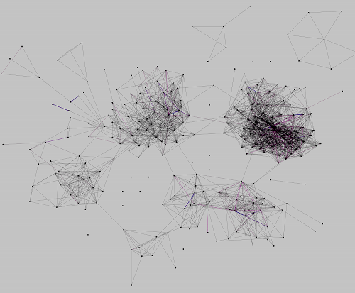
It’s a visualisation of my contacts on the Facebook social networking website, generated by the Nexus Friend Grapher. The black dots are people I know, and the lines connect mutual friends together. Using a Hooke’s Law type of mechanics, where the black dots are masses and the lines are springs, produces this sort of graph, where clumps form.
I think this sort of “personal social footprint” is as powerful a way to show your identity and uniqueness as conventional demographics. Every person’s graph will have a unique shape and pattern.
It’s also an interesting conceptual idea to find the “shortest line” from one side of the graph to the other. This in effect discovers the “best way” that two completely unrelated friends could get to know each other, just by meeting other friends of mine along the way, without me needing to be around to do the introductions.
By the way, forming the biggest clump, on the right, are the orienteers. The top part roughly corresponds to SLOW – not as tightly connected as it’s not a student club. The middle part is JOK and the bottom-right OUOC.
One reply on “Social Network Visualisation”
[…] popular here in the CASA lab. I produced a similar kind of map a good 15 months ago of my Facebook connections – this latter map has a richer set of connections but people are connected by the simple […]