Categories
CDRC Geodemographics

Introducing Mapmaker

I’ve been based at the ESRC Consumer Data Research Centre, a multi-university (UCL/Liverpool/Leeds/Oxford) lab focused on research and provision of specialist UK consumer datasets, since 2015. One of my first outputs was to adapt DataShine, which I’d created in 2013 as part of a previous UCL project, to produce CDRC Maps – to map some of the open datasets we held, and aggregates of some of the more interesting socioeconomic datasets that we produced from the controlled collections.

CDRC Maps is an OpenLayers-based “slippy” (pan/zoomable) map website consisting of pre-rendered raster tiles of choropleth maps of consumer metrics, layered under another raster “context” layer containing roads and labels, and a mask which results in only building blocks being coloured by the underlying choropleth. It served its purpose of showing impactful, pretty and effective maps of our UK socioeconomic datasets, but being a raster based map, with billions of tiles sitting on one of our old servers, it has been showing its age for a while.

The modern web mapping toolstack has moved on, with the rise of powerful web browsers with fast vector rendering, responsive design for smartphones and tablets, and comprehensive GUI frameworks that elevate regular Javascript. CDRC’s requirements have evolved too, with a desire for map visualisation that includes downloadable snapshots, basic analytical functions and filters, rather than the simple view-only concept of CDRC Maps, and a need to embed the map in stories and dataset records, rather than only sitting standalone.

CDRC Maps has also long been hosted directly at UCL, on a local development server. CDRC is a data research centre not a technology centre and there is a desire for use to our server infrastructure for data primarily. The website has long been the most popular public website for CDRC and also is prone to usage spikes due to mass media often finding that maps are a quick way to illustrate a story – or be the story – compared with raw datasets that are less immediately accessible with media deadlines. It was clear that an external host for the sites itself, and ideally the data that powers the site, would be preferable.

To address this and bring CDRC Maps up to date with the new data platform, the centre commissioned Carto and Geolytix to produce CDRC Mapmaker during late 2020. The developers created a Node.js based website that uses the Vue templating framework. Mapbox GL JS 1 is used for the map controls/canvas and the vector tile rendering. The map framework has recently become non-open but there is an open fork, MapLibre, which we will take a look at in due course. The development toolchain has also been brought up to date with industry practice, with proper source code management, continuous integration, rapid development/testing on localhost, and deployment through GitHub.

Map config is in Javascript but this component is separated from the templating Vue/Javascript allowing configuration and setup of new maps to be discrete from the main code itself.

Data is completely separated from the code and there is no server-side processing element for the code. (We do also use an external service, Google Analytics, for our stats). The data is hosted on Carto’s data platform, where a number of datasets are loaded, and also a postcode lookup table. Carto is in fact built on PostgreSQL/PostGIS and provides a management GUI to allow these to be managed independently of the map code.

While the complete (albiet minified) code, config, fonts, images and stylesheets are less than 4MB, the datasets themselves use approximately 7GB of space on the Carto servers. Each geography used (MSOA, LSOA, OA, local authority) has four spatial data files, representing the unmasked choropleth along with three levels of clipping – urban extent (towns/cities), detailed urban (village level) and individual building blocks.

The application is structured around presenting two types of maps – metric maps (which show a various continuous variables associated with a particular dataset, sliced into groups) and classification maps which categorise areas into a single value (sometimes with a hierarchy of levels) and generally include a pen portrait description of the category.

We were delivered six functioning maps and I have gradually worked on extending the codebase and GUI functionality to encompass the wider variety of maps that were on CDRC Maps and that are listed in CDRC Data. Quirks of each additional map have actually meant minor changes to the code in each case to accommodate them, but I am hopeful now that the codebase is broad enough to allow for additional maps to be added in the future with minimal effort.

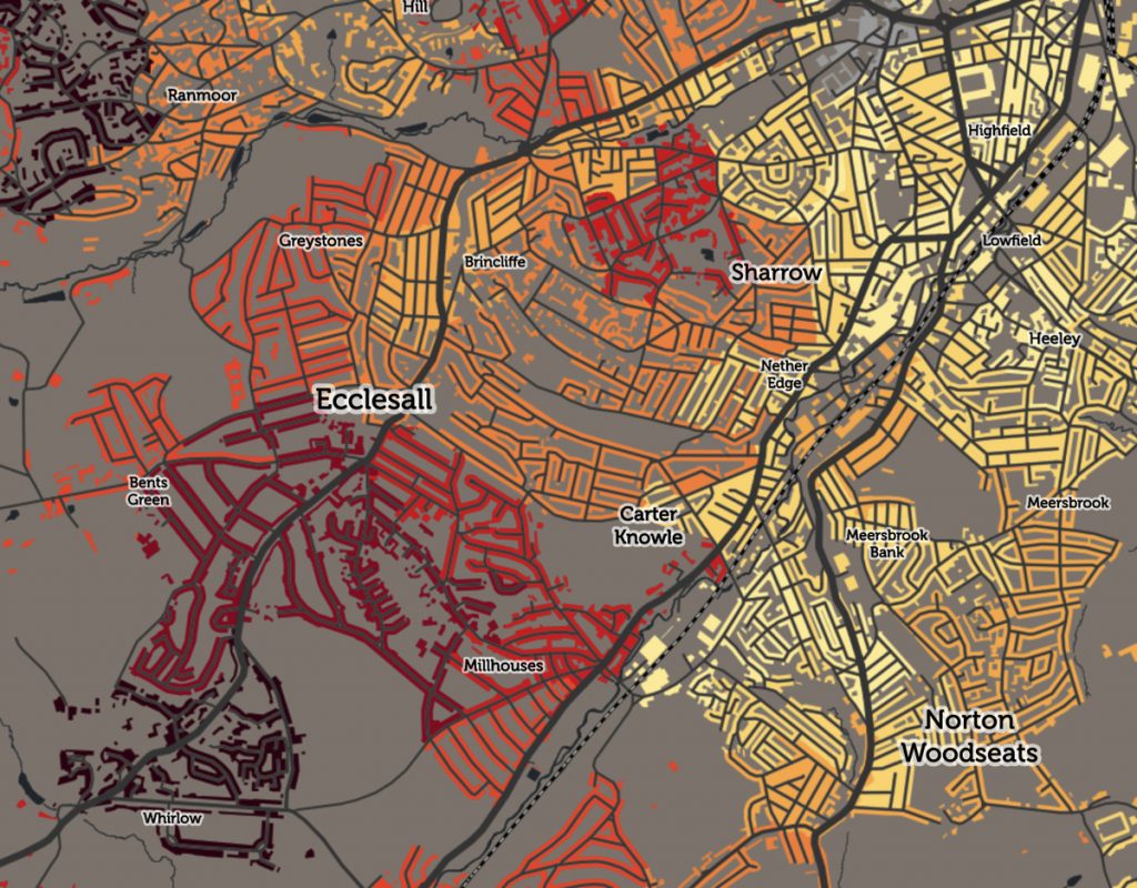
For this first release of Mapmaker, there are around 30 maps, covering CDRC classifications such as Consumer Vulnerability and the Internet User Classification (IUC), CDRC metric products such as Access to Healthy Assets and Hazards (AHAH) and Residential Mobility (Churn) and some popular government datasets like the Index of Multiple Deprivation (IMD), VOA building ages and Ofcom broadband speeds/availability.

Users can filter maps based on one or more classification categories or on multiple metric value ranges, and a PDF report can be easily produced with a view of the current map, a key and accompanying text and direct link. Clicking many of the maps will not only present the metrics or portrait, but include statistics on proportions in the current administrative area or a custom drawn region. The user interface is deliberately simple with standard pan/zoom controls, map selector, postcode search and layer toggles – that’s it. Planned development in the short term will include an even simpler UI to allow for easily embedding the map in CDRC Data and other CDRC data-led outputs.

CDRC Maps is currently still available for the limited number of maps that show datasets not included on CDRC Data, and it does have the advantage of a pure raster display meaning that some of our controlled datasets which require limited dissemination can be included in this way – on CDRC Mapmaker we would be delivering the dataset to the user’s browser, which is not ideal. Our plan is to de-brand CDRC Maps to provide a home, outside of the core CDRC output, for these legacy maps, in the same way that we have a GitHub repository storing some of our older datasets no longer on our main sites. CDRC is now nearly 8 years old and as the centre’s focus has been refined, not all our older assets have remained central to its mission, but for research reproducibility and historic linking purposes, it is important to preserve these.

We hope CDRC Mapmaker forms a useful visualisation tool for some of CDRC’s many data assets, and its filtering and reporting functionality allow CDRC’s data to be viewed and used in new ways.
Categories
CDRC

Mapping House Prices Across Small Areas

I wrote about a new dataset from the ONS, HPSSA (House Prices for Small Statistical Areas), a few years ago. The dataset has continued to be updated quarterly, and more recently, ONS started publishing the data at a more fine-grained spatial resolution, namely LSOAs (Lower Super Output Areas).

LSOAs typically each contain a population of 1000 people, or 400 houses, so, particularly in cities, mapping house price variation by LSOA, provides a good balance of spatial detail and ease of use. You can of course get individual house prices by looking at the Land Registry Price Paid Data, but the ONS HPSSA is a useful shortcut, particularly as it provides a rolling yearly average, so smoothing out variations caused by low transaction volumes in a small area. The ONS HPSSA data covers all of England and Wales.

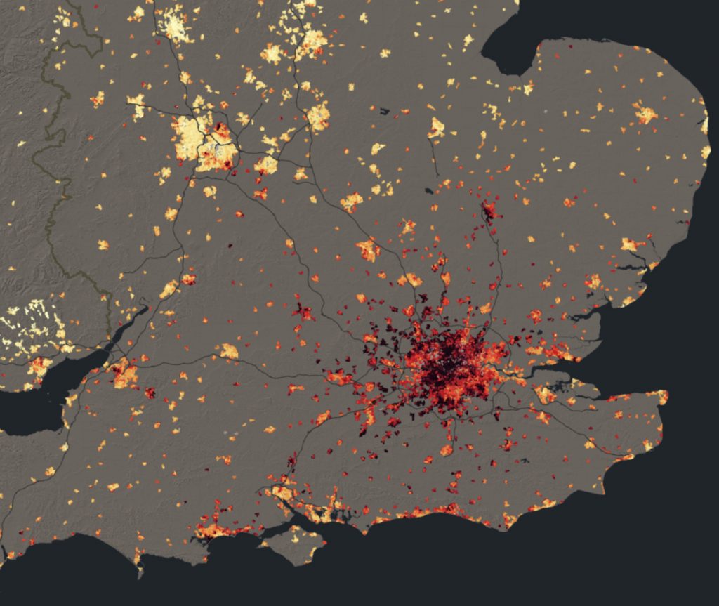
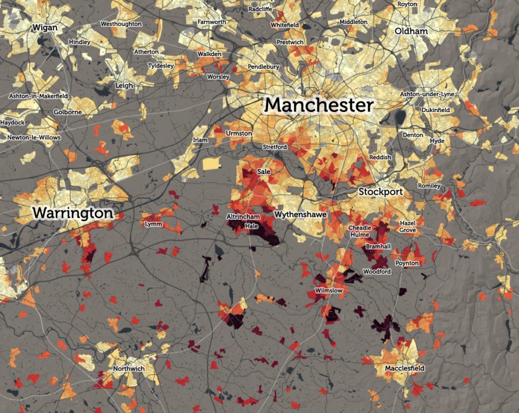
I’ve therefore published an updated map of median house prices on CDRC Data, to use the latest release of data, which is Q3 2018. I’ve also extended the key, to reflect that, since 2015, more of London is now firmly above the £500k level which was the previous highest band theshold on the map. The resulting map shows a “dark red cloud” of high-priced areas across much of London, Oxford and Cambridge, with only small areas of cheaper properties standing out in bright yellows – Dagenham, Edmonton and Hayes in London, and Orchard Park in Cambridge. Strikingly, many other cities and large towns also show a small red/maroon area, typically an enclave of expensive houses in an otherwise cheaper urban area (shown with yellows and oranges) – e.g. Solihull in Greater Birmingham, Clifton in Bristol, Hale in Greater Manchester and Gosforth in Newcastle.

Remember that these are median values – so 50% of the houses in each small area, that sold between Q3 2017 and Q2018, sold for more than the value shown, and 50% sold for less. Grey areas are where there were not enough house sales in the year, for a median value to be reported. These tend to be in older inner city areas where little public property transactions take place. Examples in London include Stamford Hill, the area around the just-opened Tottenham Hotspur stadium, and the area behind Euston station in central London, which is being extensively redeveloped. Large areas of social housing, where there simply aren’t properties available on the housing market, also often show up as grey, such as the Aylesbury and former Heygate Estates in Southwark.

The colour ramp is the inverse of that used by Dr Cheshire in his book London: The Information Capital, which depicted house prices in the city using a “fire” colour ramp, with cooler reds with more expensive areas burning bright with yellows/whites, while the highest price, “unaffordable” areas were shown as being completely burnt away from the map. By inverting the ramp, my map shows light, welcoming colours for more reasonably priced areas while inflated values are darkened out.

Categories
CDRC

Changing Broadband Speeds in the UK

The Broadband Speed map has been one of the most popular maps that the Consumer Data Research Centre has ever published on our CDRC Maps platform. The map is based on data from Ofcom, the UK’s digital connectivity and broadcast media regulator, and I was invited to talk at their Innovation Workshop event, hosted by ODI Leeds, earlier this month. My brief was to demonstrate the Broadband map but also critique Ofcom’s open data offering (which provided the data for the map). The talk slides can be found below:

As part of the preparation for the event, I produced a new version of the the Broadband map, showing 2017 data from the Connected Nation report (the original was based on the 2016 data). This gave the opportunity to therefore prepare a third map, showing the change between 2016 and 2017. Note that this is showing the change in the average broadband download speed experienced across both business and residential premises conneections, averaged by postcode with each postcode averaged then averaged again across the local output area (which typically contains five postcodes for residential areas, but many more than this for business areas.) The metric population numbers displayed when you mouse across each area, therefore, is the number of business and residential connections – typically 50-150 for the latter.

The map shows a general light green gradient across the country, showing broadband connection speeds are gradually increasing, as more and more fibre to the cabinet (FTTC) is installed and people change organically contracts to providers with better service. The places where other colours appear are the interesting results. Large increases are seen in rural Lancashire, near Kendal in the Lake District, as a community-driven ultra-high-speed rural service there continues to roll out. More dramatic improvements are seen just to the east of Cheltenham, again a rural area with specialist high technology and defensive industries.

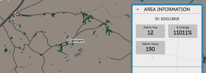
Cranham, for example, has seen a 11000% improvement, from 1.7mbit/s to 190mbit/s, as new business connections have come online:

Appleton, on the other hand, has seen a 99% decrease, from 540mbit/s to 2.3mbit/s:

In London, the drop around King’s Cross, the previous year’s fastest postcode, is almost certainly not due to a general decrease in available speed, but actually because residential connections have come online, and demonstrates the problem with aggregating by the residentially defined “Output Area” geography. The previous, ultrafast result was likely due to dedicated ultra-highspeed links into Google’s new UK office, and other high-technology businesses opening there. Since then, the residential blocks nearby have opened. These still have pretty nice connections, but not the business-level infrastructure needed. So, it shows as an average fall in London.

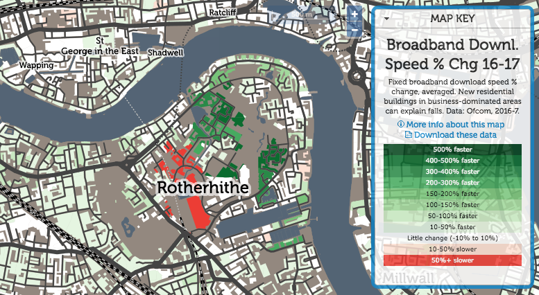
Rotherhithe is always an interesting area:

A traditionally very poorly connected area, both in transport but also digital connectivity, it has seen dramatic improvements in many areas. but also big falls in the newest area – again possibly due to an increased residential component in the mix.

Explore the broadband difference interactive map.

Categories
CDRC Conferences Data Graphics London OpenLayers

FOSS4G UK 2018 Meeting and OpenLayers 4

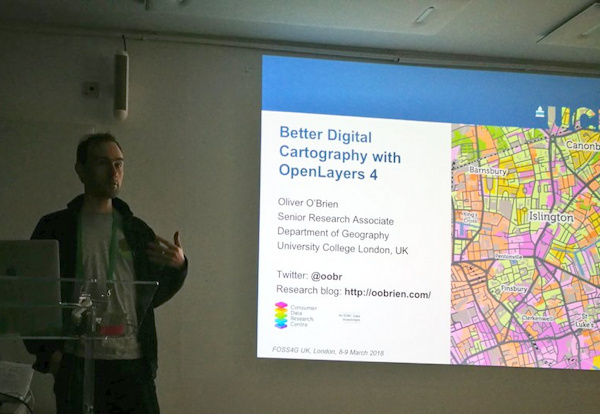
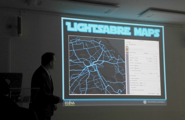
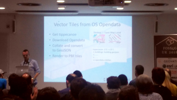
I attended and presented at the FOSS4G UK conference in central London, in early March. I was scheduled to present in the cartography track, near the end of the conference, and it ended up being an excellent session, the other speakers being Charley Glynn, digital cartographer extraordinaire from the Ordnance Survey, who talked on “The Importance of Design in Geo” and outlined the release of the GeoDataViz Toolkit, Tom Armitage on “Lightsaber Maps” who demonstrated lots of colour compositing variants and techniques (and who also took the photo at the top which I’ve stolen for this post):

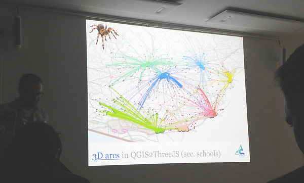
…and finally Ross McDonald took visualising school catchment areas and flows to an impressive extreme, ending with Blender-rendered spider maps:

My talk was originally going to be titled “Advanced Digital Cartography with OpenLayers 4” but in the end I realised that my talk, while presenting what would be “advanced” techniques to most audiences, would be at a relatively simple level for the attendees at FOSS4G UK, after all it is a technology conference. So, I tweaked the tittle to “Better…”. The main focus was on a list of techniques that I had used with (mainly) OpenLayers 4, while building CDRC Maps, Bike Share Map, TubeCreature and other map-based websites. I’m not a code contributor to the OpenLayers project, but I have been consistently impressed recently with the level of development going on in the project, and the rate at which new features are being added, and was keen to highlight and demonstrate some of these to the audience. I also squeezed on a bonus section at the end about improving bike share operating area maps in London. Niche, yes, but I think the audience appreciated it.

My slides (converted to Google Slides):

Some notes:

  • My OpenLayers 2/Leaflet/OpenLayers 3+4 graphic near the beginning was to illustrate the direction of development – OpenLayers 2 being full-featured but hard to work with, Leaflet coming in as a more modern and clean replacement, and then OpenLayers 3 (and 4 – just a minor difference between the two) again being an almost complete rewrite of OpenLayers 2. Right now, there’s a huge amount of OpenLayers 4 development, it has momentum behind it, perhaps even exceeding that of Leaflet now.
  • Examples 1, 3, 4 and 5 are from CDRC Maps.
  • Example 2 is from SIMD – and there are other ways to achieve this in OpenLayers 4.
  • Examples 5, 6 and 9 are from TubeCreature, my web map mashup of various London tube (and GB rail) open datasets.
  • Regarding exmaple 6, someone commented shortly after my presentation that there is a better, more efficient way to apply OpenLayers styles to multiple elements, negating my technique of creating dedicated mini-maps to act as key elements.
  • Example 7 is from Bike Share Map, it’s a bit of a cheat as the clever bit is in JSTS (a JS port of the Java Topology Suite) which handily comes with an OpenLayers parser/formatter.
  • Example 8, which is my London’s New Political Colour, a map of the London local elections, is definitely a cheat as the code is not using the OpenLayers API, and in any case the map concerned is still on OpenLayers 2. However it would work fine on OpenLayers 4 too, particularly as colour values can be specified in OpenLayers as simply as rgba(0, 128, 255, 0.5).
  • Finally, I mention cleaning the “geofences” of the various London bikeshare operators. I chose Urbo, who run dockless bikeshare in North-East London, and demonstrated using Shapely (in Python) to tidy the geofence polygons, before showing the result on the (OpenLayers-powered) Bike Share Map. The all-system London map is also available.

FOSS4G UK was a good meeting of the “geostack” community in London and the UK/Europe, it had a nice balance of career technologists, geospatial professionals, a few academics, geo startups and people who just like hacking with spatial data, and it was a shame that it was over so quickly. Thanks to the organising team for putting together a great two days.

Categories
CDRC

Broadband Speed in the UK

Recently published on CDRC Maps is a new a map of Broadband Speed in the UK. This is the average download speed for premises, right across the UK. It’s based on data annually released by the national regulator, OFCOM (I’m using the most recent dataset, from 2016). I’m using a Purple-White-Green colour ramp, where purples indicate areas with very slow speeds, white tends towards the national median and dark greens show areas of very fast connection – potentially homes using the new “ultrafast” connections available in some areas.

It should be noted that this is based on the actual average download speed based on the deal people have signed up for, not the maximum attainable download speed (either theoretical or actual) in an area. I hypothesise below that, in cities, this may be due to consumer inertia as much as infrastructure gaps – while in rural areas it is more likely the latter. I’m not mapping broadband through high-speed mobile networks, only “fixed line”.

Urban/rural divide

As would be expected with infrastructure costs, the economics of putting in fibre connections, and increased distances to the nearest telephone exchanges, broadband speeds still suffer in the countryside, with the Llandrindod Wells (LD) postal area in rural central Wales, having the slowest average broadband connection of 14.9Mbit/s. Looking at specific postal outcodes, PA70, on the also extremely rural island of Mull in western Scotland, has an average speed of just 1.1Mbit/s.

Why do city centres show up as slow?

Of note, as well as this urban/rural divide, the very centre of cities often show slower speeds than the suburbs. This is possibly because of the difficulty of installing the needed infrastructure under narrow, busy streets and through old, often historic buildings. By contrast, newer housing developments, normally on the edge of cities may come with broadband infra designed in to the plans. The fastest postal region is OX, the Oxford postal area, perhaps reflecting the large technologically literate population (thanks to the universities and various science parks in the area). The fastest postal outcode in the country, however, is N1C, the new area behind King’s Cross. This is a central city area, but one which has essentially been built from scratch in the last few years, rather than needing broadband retrofitted into it. Another new area however, E20 (the Olympic Park) appears in the London bottom 10.

An alternative argument is that it may be that city centres got the “first wave” of broadband capabilities, many years ago, and people switched then – and consumer inertia means that they are less likely to switch to faster broadband offerings that are now available to them. In central London, the Rotherhithe area shows up as having particularly slow broadband speeds being used. This area is quite distinct to just about every other central London area, having become a residential area in the 1980s and 1990s. It is also rather isolated geographically. However, the lowest speeds of all in London are found, rather surprisingly, in and around the City of London. For example, the Barbican Estate has few keen users of ultra-fast broadband. It may be available to them, but the elderly population here may just not want it.

A short note on methodology: This is an area average (by output area – 150 properties) of postcode averages of individual connections. I’ve excluded postcodes with no broadband connections, as these are still recorded in the source data but with a speed of 0. By using OAs rather than individual postcodes, the data is slightly smoothed, i.e. less noisy, so trends can be seen easily across areas, even though individual properties (or indeed whole postcodes) may be connecting at a faster speed than what appears in the map in that place. In short – the map is of the overall picture, not individual addresses.

You can download the data, and see the Top/bottom 10 postal area stats, on the CDRC Data page for the dataset, or explore the data on the interactive map.

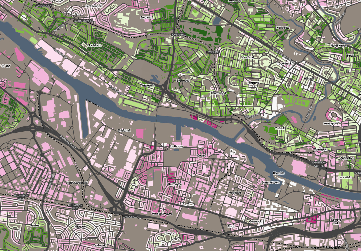
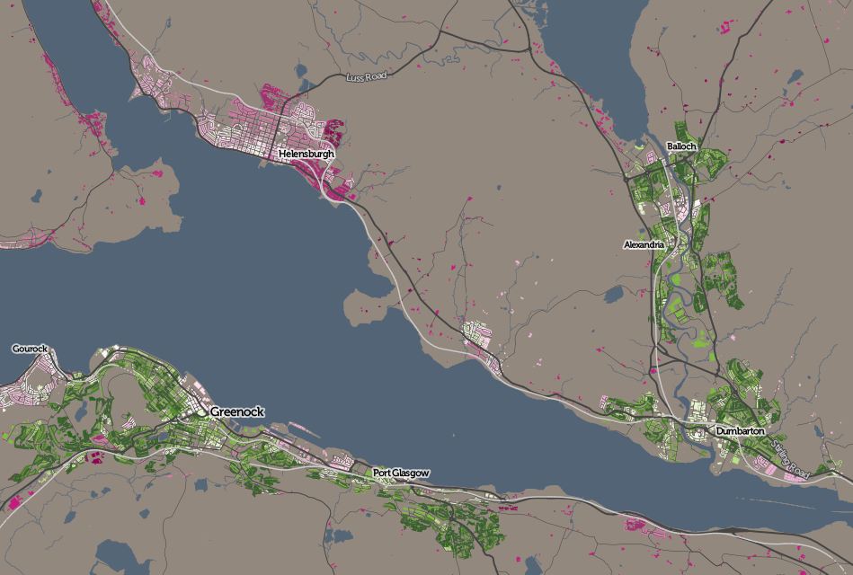
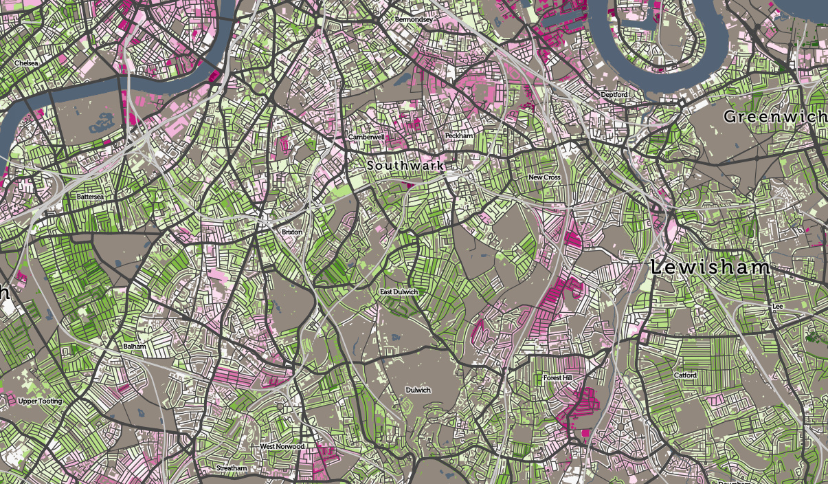
Top: A river divides them – broadband average download speed in west Glasgow. Above: Towns north and south of the Firth of Clyde. Below: Variations in south London. All maps based on data which is Crown Copyright OS and OFCOM.

Categories
CDRC London Technical

Big Data Here: The Code

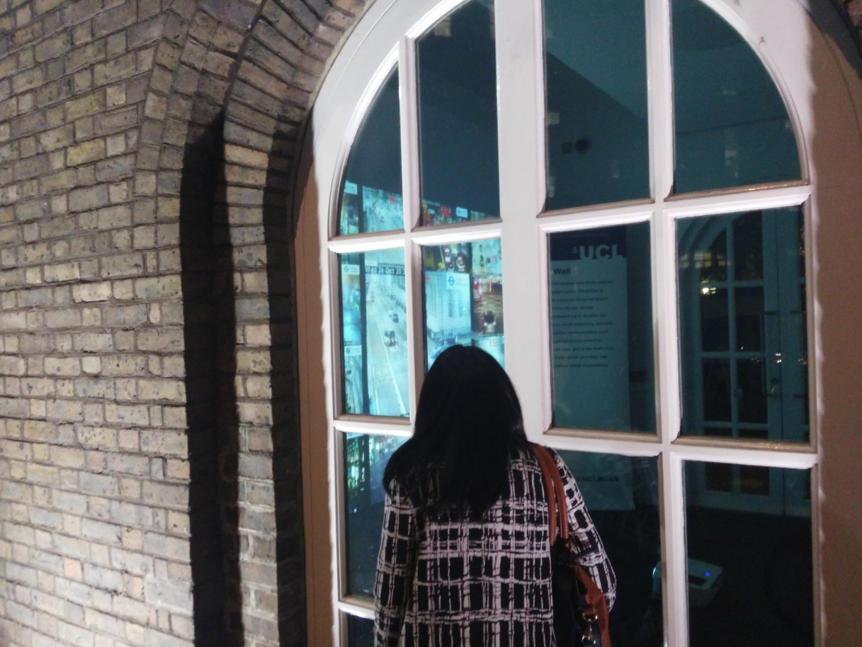
So Big Data Here, a little pop-up exhibition of hyperlocal data, has just closed, having run continuously from Tuesday evening to this morning, as part of Big Data Week. We had many people peering through the windows of the characterful North Lodge building beside UCL’s main entrance on Gower Street, particularly during the evening rush hour, when the main projection was obvious through the windows in the dark, and some interested visitors were also able to come inside the room itself and take a closer look during our open sessions on Wednesday, Thursday and Friday afternoons.

Thanks to the Centre for Advanced Spatial Analysis (CASA) for loaning the special floor-mounted projector and the iPad Wall, the Consumer Data Research Centre (CDRC) for arranging for the exhibition with UCL Events, Steven Gray for helping with the configuration and setup of the iPad Wall, Bala Soundararaj for creating visuals of footfall data for 4 of the 12 iPad Wall panels, Jeff for logistics help, Navta for publicity and Wen, Tian, Roberto, Bala and Sarah for helping with the open sessions and logistics.

The exhibition website is here.

I created three custom local data visualisations for the big screen that was the main exhibit in the pop-up. Each of these was shown for around 24 hours, but you can relive the experience on the comfort of your own computer:

bdh_buses

1. Arrival Board

View / Code

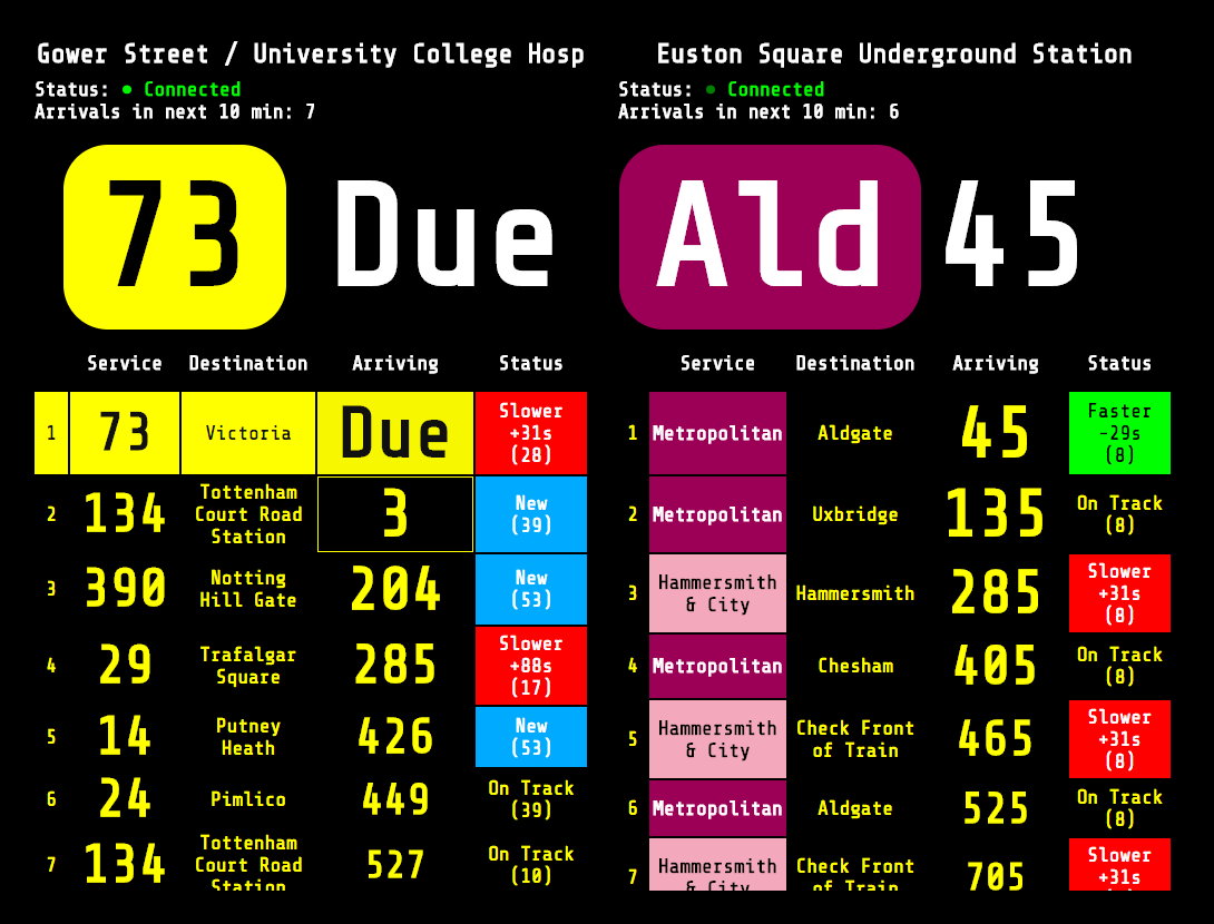
This was shown from Tuesday until Wednesday evening, and consisted of a live souped-up “countdown” board for the bus stop outside, alongside one for Euston Square tube station just up the road. Both bus stops and tube stations in London have predicted arrival information supplied by TfL through a “push” API. My code was based on a nice bit of sample code from GitHub, created by one of TfL’s developers. You can see the Arrival Board here or Download the code on Github. This is a slightly enhanced version that includes additional information (e.g. bus registration numbers) that I had to hide due to space constraints, during the exhibition.

Customisation: Note that you need to specify a Naptan ID on the URL to show your bus stop or tube station of choice. To find it out, go here, click “Buses” or “Tube…”, then select your route/line, then the stop/station. Once you are viewing the individual stop page, note the Naptan ID forms part of the URL – copy it and paste it into the Arrival Board URL. For example, the Naptan ID for this page is 940GZZLUBSC, so your Arrival Baord URL needs to be this.

bdh_traffic2

2. Traffic Cameras

View / Code

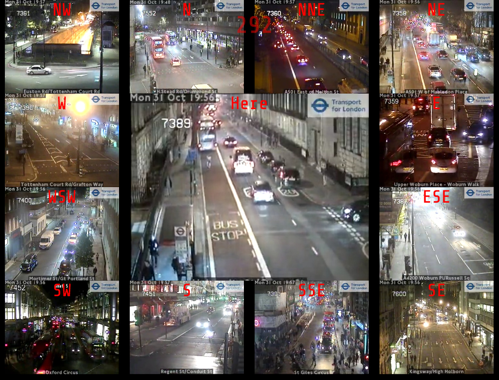
This was shown from Wednesday evening until Friday morning, and consisted of a looping video feed from the TfL traffic camera positioned right outside the North Lodge. The feed is a 10 second loop and is updated every five minutes. The exhibition version then had 12 other feeds, surrounding the main one and representing the nearest camera in each direction. The code is a slightly modified version of the London Panopticon which you can also get the code for on Github.

Customisation: You can specify a custom location by adding ?lat=X&lon=Y to the URL, using decimal coordinates – find these out from OpenStreetMap. (N.B. TfL has recently changed the way it makes available the list of traffic cameras, so the list used by London Panopticon may not be completely up-to-date.)

bdh_census

3. Census Numbers

View / Code

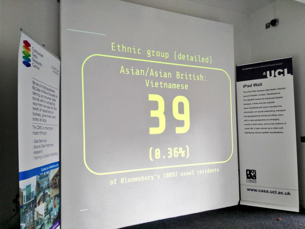
Finally, the screen showed randomly chosen statistical numbers, for the local Bloomsbury ward that UCL is in, from the 2011 Census. Again, you can see it in action here (wait 10 seconds for each change, or refresh), and download the code from GitHub.

Customisation: This one needs a file for each area it is used in and unfortunately I have, for now, only produced one for Bloomsbury. The data originally came, via the NOMIS download service, from the Office for National Statistics and is Crown Copyright.

bdh_traffic3

Categories
CDRC

Population Density and Urban/Rural Split of the UK

popdens1

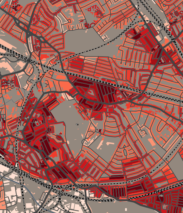
A new map on CDRC Maps showing perhaps one of the simplest demographic metrics – residential population density – how many people live in each hectare across the UK. The data is available at the smallest statistical area available (output areas in GB and small areas in NI) and I have combined this with the various urban/rural classifications used by the three national statistical agencies across the UK, to produce a single map. Colour is the urban/rural classification, and lightness/darkness shows how densely populated each area is. Because urban areas are so much more densely populated than rural ones are, I’ve used a series of scales to gradate the representation of density on the map – the scale used depends on the classification. This is the best way to allow both high and low density populated areas to be able to show local variations.

A few observations:

  • many linear blocks along roads in east London have a noteably high density compared to the rest of suburbia – there are not tower blocks here, just terraces, so maybe this is a sign of overcrowding?
  • The centre of Birmingham is extremely low density – very few residential blocks here.
  • There is a significant contrast between high-density Portsmouth, hemmed in on three sides by water, and the much lower density Southampton, not far away, which is not so constrained by the sea.
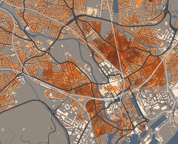
  • Many cities, such as Cardiff (above) show a distinct pattern where the inner city has two parallel zones of high-density population, either side of a relatively sparse CBD core. Other cities where this is seen include Plymouth, Glasgow and Leicester.

popdens2a

There are flaws in this method of combining datasets across national boundaries. The different agencies calculate in different ways. Notably, in Scotland, the small areas are themselves smaller in population and are designed to better encapsulate the urban part only of settlements, with different small areas for the rural parts. As such, Scottish villages tend to show up as higher density than their English counterparts, which by necessity often need to include a substantial rural element in order to hit their population threshold. This is a statistical quirk.

The other significant difference is that English/Wales define “sparseness”, while Scotland and Northern Ireland use “remoteness” and measure this quantitatively in terms of driving time to the nearest settlement of over 10000 people. The definition of sparseness does not relate to distance from such settlements and therefore there are some “urban” areas with population of over 10000 but in a sparse setting. For consistency, I consider these alongside remote settlements in the other nations, which are considered rural. The raw data download, on CDRC Data, includes a simple urban/rural flag if you prefer to use the strict urban/rural definitions.

See the map here.

popdens3

As ever, please note that maps on CDRC Maps show all buildings but the data is generally for residential buildings only. The data is a single value across the whole small area, not a measurement of population in individual buildings.

Categories
CDRC

Population Change in Great Britain 2011-14

popchange_doncaster

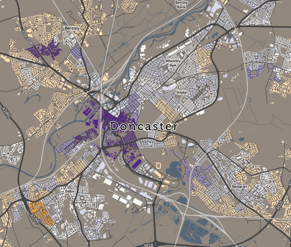
The ONS publish small-area population estimates annually, for England and Wales, and the NRS similarly do for Scotland. By taking two of these datasets, we can see how the population of Great Britain is changing – births, deaths, internal and international migration and military deployments/homecomings all act to fluctuate the population.

I’ve taken the 2011 and 2014 “mid-year” population estimates for LSOA and DZs – statistical areas with a typical population of 1000-1500 people – and compared them, to derive small-area population changes. You can see the resulting map here.

In London, a couple of striking patterns appear. Inner West London – Kensington & Chelsea, Fulham, Wandwsorth – is seeing a striking depopulation (orange on the map). This may be due to the tendency of landlords in these wealthy areas to convert old housing stock, that was split into multiple flats, back into houses for the (very) rich. In a few exceptional cases, houses themselves are being knocked together. The unaffordability of the area and its old-age population may also have something to do with it. Further east in Tower Hamlets, increased immigration and a high to-immigrant birth rate may be contribution to the rapid rise in the population here (10%+ in many area – dark purple on the map) in just 3 years. The increase across GB in total, from 2011-14, is 2.1%. Some of the large increases can be due to new university campus accommodation opening up, while large falls are often an indication of housing estates being demolished and redeveloped.

Many cities across Great Britain show a characteristic of newly-desirable city centres increasing in population, as denser housing developments pack people in, while the suburbs decrease in population. The Liverpool/Wirral conurbation is a fine example of this. An exception is Milton Keynes, where no Green Belt constraints its expansions, and new housing estates keep being built in the outer “blocks” of this grid city. Some smaller places with special employment constraints on them seem to be almost universally decreasing, such as Barrow in Furness, as well as Thurso and Greenock, both in Scotland.

Explore the map on CDRC Maps, and Download the data on CDRC Data.

Categories
CDRC Conferences

Mapping Data: Beyond the Choropleth

I recently gave a presentation as part of an NCRM Administrative Data Research Centre England course: Introduction to Data Visualisation. The presentation focused on adapting choropleths to create better “real life” maps of socioeconomic data, showing the examples of CDRC Maps and named. I also presented some work from Neal Hudson, Duncan Smith and Ben Hennig.

Contents:

  • Technology Summary for Web Mapping
  • Choropleth Maps: The Good and the Bad
  • Moving Beyond the Choropleth
  • Example: CDRC Maps
  • Example: named – KDE “heatmap”
  • Case example: Country of Birth Map – concerns of the data scientist & digital cartographer

Here’s my slidedeck:

(or you can view it directly on Slidedeck).

Categories
CDRC Geodemographics

A Map of Country of Birth Across the UK

eastse_countryofbirth

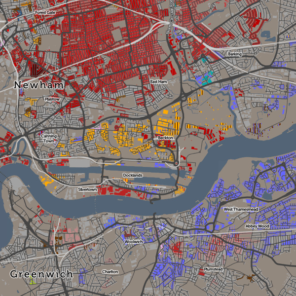
Above: Areas of east and south-east London with more than 8% of inhabitants being originally from (from top to bottom) India (in East Ham), Lithuania (in Beckton) and Nigeria & Nepal (in Abbey Wood).

[Updated] Ever wondered why some branches of Tesco, the ubiquitous supermarket, have an American food section, while others have a Polish food chiller? Alternatively, it might have a catch-all “World Food” aisle, or it might not. The supermarket is, of course, catering to the local community. Immigrants to the UK do not uniformly spread out across the country, but tend to cluster in particular localities.

The latest map that I’ve published on CDRC Maps is a Country of Birth map, which attempts to summarise such communities in one view. It uses the same technique as Top Industry, it maps the most common country of birth (excluding the home nation) of residents in each small area, as of the 2011 Census. The purpose of the map is to identify and map the approximate extent of single-country communities within the UK. For example, to see how big London’s Chinatown is, or whether a Little Italy in the capital still exists.

This map reveals such communities although there is an important caveat when looking at it. I have set out below the rules I applied when constructing it, the most important of which is that only 8% of inhabitants need to share a single country of birth, for it to appear on the map. Bear in mind that, across the UK, 87% of people were born here. These people do not appear on the map, unless they are outside their home nation (and not at all if they are English).

countryofbirth_keyThere are a number of rules I have needed to apply to make this a map that tells an interesting story in a measured and fair way:
  • I don’t map native births – the English-born people in England, Welsh-born in Wales, Northern-Irish born in Northern Ireland or Scottish-born in Scotland. There are almost no areas anywhere in the UK where people born in a single foreign-born country outnumber the native-born. If I did map such native births, then the map would be almost completely dominated by them, and would not tell much of a story.
  • I also don’t map the English-born within the other home-nations, because the population of England is so much larger than in Scotland, Wales etc such that even the small percentage of them moving into the other home nations would dominate the map of Scotland/Wales/NI, if included.
  • I only map a single-country foreign born area if at least 8% of local residents are from that country. This sounds like a low threshold and it is – if an area is coloured a particular colour, it might still have up to 92% of the local residents actually being native-born.
  • The above rule means that some very multi-cultural areas don’t get mapped, because they have a large number of non-native residents, but these are split amongst various countries such that none reaches the 8% threshold.
  • Necessarily, in the source data, some countries are combined together into regions, either for a whole region (e.g. Central America) or for other countries in a region (e.g. Other East Asia, not including China/Japan etc). This is how the underlying Census statistics are represented. This can have the effect of making a result (for a region) appear when it wouldn’t otherwise appear (for any country in the region). However the number of places where this happens is small so it does not overly bias the map.
  • A slight quirk of the census results is that the Scotland and Northern Ireland chose to, based on their own sum populations, aggregate some of the smaller-UK-population countries in a different way. For example, Northern Ireland doesn’t break out “Other Old EU” (e.g. Belgium) and “Other New EU” (e.g. Bulgaria) into separate categories. The Somalian population in Scotland is not presented as a distinct statistic, but it is in NI (and England/Wales). Again, this only affects countries/regions with smaller UK populations so doesn’t overly distort the map.
  • I don’t colour the map where it would be showing data for less than 10 people. This causes a most noticeable rationalisation of the map in Scotland, because the small areas here have a lower population (typically 125 instead of 250 people). This means Scotland’s country-of-birth diversity is a little underrepresented when compared with the other regions of the map.
  • I’ve used colour hues and brightnesses in an ordered way, to group together continents and regions. Greens = UK nations, Olives = Old EU, Browns = New EU, Yellows = North America, Pinks = Central America, Blues = Africa, Purples = Oceania, Reds = Asia. There is no particular meaning to the colours picked beyond this, but be aware that the eye is naturally drawn to some colour hues more than others.
  • If a second country of birth also scores over 8%, but with a smaller local population than the first, then this is shown in striped lines over the first, and labelled as such in the interactive key.

Have a look at the map, and mouse around to find the meaning for the current colour, or see the scrollable key on the right.

Why 8%? I found that dropping this threshold (I tried initially at 5%) results in a lot of “noise” on the map, where only two large families need to move to an area, for it to acquire their birth-country colour. Increasing this threshold (e.g. to 10%, which I tried) results in many of the interesting patterns disappearing.

Interesting, some famous “immigrant” areas of London virtually disappear on this map. Brixton and Hackney are still associated with the Jamaican communities moving there in the 1940s/50s, but, at 8% threshold they virtually disappear. Only at 5% is there a significant community pattern appear. Similarly, Wandsworth and Shepherds Bush are known for their Australian communities but these also almost vanish when moving from 5% to 8%. At a 5% threshold, Hackney and Islington show a “patchwork” effect of integrated multicultural communities of Irish, Turkish, Nigerian and Jamaican-born immigrants. These also disappear largely from the map at 8% threshold. Remnants of the Irish migration to Kentish Town are more obvious.

London remains a fascinating mix where people from many different countries have set up their home in neighbourhoods with established communities and retail that cater for them. While the UK’s other cities have “international” quarters too, none shows the diverse nature of these communities. Virtually every country in the key has a London neighbourhood. (N.B. Places where there are pockets of many nations in a small area in London, and elsewhere, often indicate a student population at a globally well-known university).

Away from London, the Scottish-origin communities in Corby and Blackpool stand out, while the Americans on military bases in East Anglia also dominate the map there. Luton has a Polish, Pakistani and Irish disapora.

As ever, I am mapping small-area statistics, not those for individual houses (I don’t have that information!) and the representation of a particular house on the map is indicative of the local area rather than each house itself. The addition of houses on CDRC Maps maps is intended to make the map more relatable to the population structure of towns and cities, but it can make the data more detailed than it actually is. The map also includes non-residential buildings – there’s no easy way to filter these with the open dataset used, and the great majority of buildings in the UK are residential.

[Update – See this excellent article written by CityLab on this map, which explains some of the above nuances in a better way than I attempted to.]

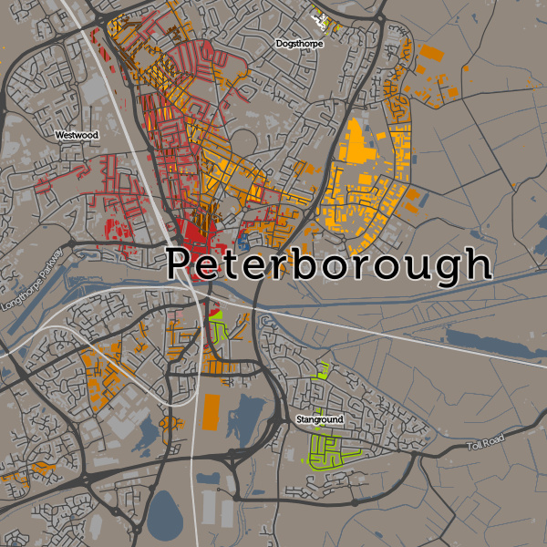
Below: There is a Little Italy, but it’s in Peterborough now.

peterborough_countryofbirth