Categories
Data Graphics London Mashups OpenLayers OpenStreetMap

Tube Line Closure Map

anim

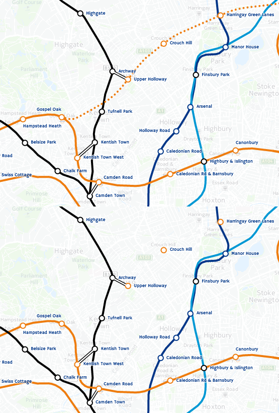
[Updated] The Tube Line Closure Map accesses Transport for London’s REST API for line disruption information (both live and planned) and uses the information there to animate a geographical vector map of the network, showing closed sections as lines flashing dots, with solid lines for unaffected parts. The idea is similar to TfL’s official disruption map, however the official one just colours in the disrupted links while greying out the working lines (or vice versa) which I think is less intuitive. My solution preserves the familiar line colours for both working and closed sections.

My inspiration was the New York City MTA’s Weekender disruptions map, because this also blinks things to alert the viewer to problems – in this case it blinks stations which are specially closed. Conversely the MTA’s Weekender maps is actually a Beck-style (or actually Vignelli) schematic whereas the regular MTA map is pseudo-geographical. I’ve gone the other way, my idea being that using a geographical map rather than an abstract schematic allows people to see walking routes and other alternatives, if their regular line is closed.

Technical details: I extended my OpenStreetMap-based network map, breaking it up so that every link between stations is treated separately, this allows the links to be referenced using the official station codes. Sequences of codes are supplied by the TfL API to indicate closed sections, and by comparing these sequences with the link codes, I can create a map that dynamically changes its look with the supplied data. The distruption data is pulled in via JQuery AJAX, and OpenLayers 3 is used to restyle the lines appropriately.

Unfortunately TfL’s feed doesn’t include station closure information – or rather, it does, but is not granular enough (i.e. it’s not on a line-by-line basis) or incorrect (Tufnell Park is shown only as “Part Closed” in the API, whereas it is properly closed for the next few months) – so I’m only showing line closures, not station closures. (I am now showing these, by doing free-text search in the description field for “is closed” and “be closed”.) One other interesting benefit of the map is it allows me to see that there are quite a lot of mistakes in TfL’s own feed – generally the map shows sections open that they are reporting as closed. There’s also a few quirks, e.g. the Waterloo & City Line is always shown as disrupted on Sundays (it has no Sunday service anyway) whereas the “Rominster” Line in the far eastern part of the network, which also has no Sunday service, is always shown as available. [Update – another quirk is the Goblin Line closure is not included, so I’ve had to add that in manually.]

Try it out

Categories
Conferences London Mashups

On City Dashboards and Data Stores

Earlier this month, I gave a short presentation at the Big Data and Urban Informatics Workshop, which took place at UIC (University of Illinois in Chicago). My presentation was an abridged version of a paper that I prepared for the workshop. In due course, I plan to publish the full paper, possibly as a CASA working paper or in another open form. The full paper had a number of authors, including Prof Batty and Steven Gray.

Below are the slides that formed the basis of my presentation. I left out contextual information and links in the slidedeck itself, so I’ve added these in after the embedded section:

Notes

Slide 3: MapQuest map showing CASA centrally located in London.
Slides 4-5: More information.
Slide 6: More information about my Bike Share Map, live version.
Slide 7: More information.
Slide 8: More information about CityDashboard, live version.
Slide 10: Live version of CityDashboard’s map view.
Slide 11: More information about the London Periodic Table, live version.
Slide 14: More information about Prism.
Slide 15: London and Paris datastores.
Slide 16: Chicago, Washington DC, Boston data portals.
Slide 17: The London Dashboard created by the Greater London Authority. Many of its panels update very infrequently.
Slide 18: Washington DC’s Open Government Dashboard and Green Dashboard, these are rather basic dashboards, the first being simply a graph and the second having just three categories.
Slide 19: The Amsterdam Dashboard created by WAAG, a non-profit computer society based in the heart of the city.
Slide 20: The Open Data City Census (US version/UK version) created by OKFN – a great idea to measure and compare cities by the breadth and quality of their open data offerings.
Slide 21: More information.
Slide 22: More information.
Slide 23: Pigeon Sim.
Slide 24: Link to iCity, More information on DataShine, live version.
Slide 25: More information on DataShine Travel to Work Flows, live version.

Some slides contain maps, which are generally based on OpenStreetMap (OSM) or Ordnance Survey Open Data datasets.

Categories
Data Graphics London Mashups

Talking Rabbits and Glowing Lamps – The Internet of London Things

At CASA we’ve always been keen on marrying the online with the tangible – such as the London Data Table (a real table, cut in the shape of London, showing live London data), PigeonSim (fly around a Google Earth view augmented with real-time information) and a couple of 3D printers, one of which was used to print the results of an online mapping field project in Lima, Peru, a couple of weeks ago. One of CASA’s core research projects, Tales of Things, is all about this space.

rabbitOver the last couple of days, Steve, boss Andy and I have been working further on linking online and offline London, by making use of Boris, one of the two Karotz Rabbits that have been knocking around the lab for a while (the other one is of course called Ken), plus a couple of wifi-controllable multi-colour Hue lightbulbs that we acquired more recently.

Steve has set up a couple of servers that receive instructions as simple URL requests, format them and pass them to the external company servers that are an inevitable part of most sensor products these days. (In the case of the Karotz server, this usefully turns text into audio files.) The servers then send instructions back into our network and on to the objects themselves.

A few Python scripts later, and we have the following:

  • Boris announces changes to the statuses of the various London Underground lines, when they occur. He also flashes the colour of the affected line as he speaks the message. Between announcements, Boris will pulsate the colour of lines which are not in “Good Service”. His ears also twitch appropriately – appearing fully alert when there are major problems on the network, and a more lackadaisical look when everything’s OK.
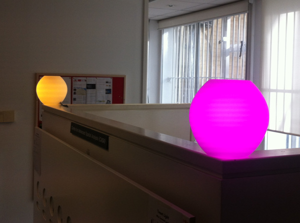
  • The first hue lamp, which sits in a spherical orb, shows the weather forecast, as calculated by CASA’s own weather station that sits on the roof of the building opposite. Steve has configured it to show a yellow glow for sunny and dry weather to follow, while a moody blue indicates rain. Disruptive weather, such as likely snowfalls or strong winds, are shown in red, while rain ceasing is green.
  • The second lamp, also in a spherical orb, polls a special Twitter list of active CASA researchers. Every time one tweets, the lamp which change to a particular colour linked to them. For instance, when I tweet about this blogpost, the lamp will turn a distinctive shade of green.

Data Sources

The rabbit, which is in the video above, sits in front of a TV showing CityDashboard, and speaks its wisdom to the office in general from time to time. The video shows him announcing that problems earlier on the Central and District lines are resolved. After the announcement, he goes back to pulsating green to indicate an ongoing District Line issue. The data comes from the tube line status panel on CityDashboard which is itself using the near-live feed from Transport for London’s Developer Area.

The lamps are in the corridor connecting CASA to the rest of the building. As such, it’s often quite a dark place, but now is bathed in an everchanging glow of light based on both sensor data (weather) and social media output (tweets) from our digital city. The Twitter data for the second lamp comes from the London Periodic Table, which accesses the data from Twitter via a proxy server that Steve built. Once a change is detected, another of Steve’s servers is used to send the message to the Hue servers, which then send it back through a special link, to the lamp. Convoluted, but, with a 10-20 second delay, it does work!

Steve has written up a blog post with more details behind the servers that make the system work.

Panos Mavros, a Ph.D student here at CASA, is also using the Hue lamps, in his research into “digital empathy”. He is bringing a whole new meaning to the phrase “mood lighting” – he only has to think and the colours change!

IMG_5532

Categories
London Mashups OpenStreetMap

Ironways of London

london_ironways

It’s always irked me slightly that many online maps of London show the various tube services as straight lines between stations, or as idealised Bezier curves. Perhaps the regimented lines and angles of the official “Beck-style” tube diagram has meant that, when translating into a “real life” geographical map, people have tended to keep the simplifications. After all, if you are travelling around London on the tube or railways, only the location of the stations are important – not how you travel between them.

Focusing on the section of the DLR just south of Canary Wharf:

Google Public Transit view, using Bezier curves between stations:
iw_google

A typical “straight lines between stations” map – from CASA’s own MapTube:
iw_maptube

One of DLR’s own official diagrammatic maps:
iw_official

Where the line actually goes:
iw_actual

OpenStreetMap contributors have faithfully mapped most of London’s railways, including best-guess alignments for tube tunnels, using ventilation shafts on the service and “feeling” corners and curves that tube trains take – bearing in mind that GPS does generally not work underground. There are a couple of minor mistakes, such as orientations of the Northern Line curves near Mornington Crescent, and a part of the Piccadilly Line in north London.

I’ve taken this now excellent dataset, and as part of work to produce a comprehensive vector file of Transport for London (TfL) service routes, I’ve produced this interim map – the Ironways of London. TfL’s public service routes are highlighted in green. Lines in red are other train operator routes, sidings and depots, freight rail routes, disused lines, unusual chords and the odd ornamental railway. Many of these are obscured by the green lines of TfL routes, where the two coincide. There are a few missing sections, e.g. a couple of tunnels to the south of London are not shown.

The map here uses Google aerial imagery as a background, Ordnance Survey Open Data to show the boundary of Greater London, and OpenStreetMap to show the rail routes themselves. As such, it’s a nice mashup of the three major sources of free-at-point-of-use spatial datasets for London.

Here is the full size version.

There are a few other examples around on the net of the same thing – here’s an ESRI one. The Carto Metro one is excellent and is a level of detail beyond what I am aiming for.

In the new year I hope to complete and release the tidied vector data. [Update: Data released, more info.]

Categories
Bike Share Data Graphics Mashups

Analysing “CitiBike” in New York City

The above interactive map compares the popularity of different CitiBike docking stations in New York City, based on the number of journeys that start/end at each dock. The top 100 busiest ones are shown in red, with the top 20 emphasised with pins. Similarly, the 100/20 least popular ones are shown in blue*.

CitiBike is a major bikesharing system that launched in New York City earlier in the summer and has been pulling in an impressive number of rides in its first few weeks – it regularly beats London’s equivalent, whose technology it shares, in terms of daily trip counts, even though London’s system is almost twice as big (compare NYC).

Different areas have different peak times

Here are three maps showing the differences in the popularity of each docking station at different times of the day: left covers the “rush hour” periods (7-10am and 4-7pm), the middle is interpeak (10am-4pm), the domain of tourists, and on the right is evening/night (7pm-7am) – bar-goers going home? The sequence of maps show how the activity of each docking station varies throughout the day, not how popular each docking station is in comparison to the others.

nyc_rushhour_small

Red pins = very popular, red = significantly more popular than average, green = significantly less popular than average. Binning values are different for each map. Google Maps is being used here. See the larger version.

Some clear patterns above – with the east Brooklyn docks being mainly used in the evenings and overnight, the rush hours highlighting major working areas of Manhattan – Wall Street and Midtown, and interpeak showing a popular “core” running down the middle of Manhattan.

The maps are an output from the stats created by a couple of requests for CitiBike data came through recently – from the New York Times and Business Insider – so it was a good opportunity to get around to something I had been meaning to do for a while – see if I can iterate through the docking station bike count data, spot fluctuations, and infer the number of journeys starting and ending at each docking station.

I was able to relatively quickly put together the Python script to do this fluctuation analysis and so present the results here. I can potentially repeat this analysis for any of the 100+ cities I’m currently visualising collecting data for. Some of these cities (not New York yet) provide journey-level data in batches, which is more accurate as it’s not subject to the issues above, but tends to only appear a few months later, and only around five cities have released such data so far.

Places with persistently empty or full docks differ

Here are two maps highlighting docks that are persistently empty (left) or full (right).

nyc_emptyfulldocks

Left map: green = empty <10% of the time, yellow = 10-15%, red = 15-20%, red pins = empty 20%+ of the time. Right map: green = full <2% of the time, yellow = 2-3%, red = 3-4%, red pins = empty 4%+ of the time. Google Maps is being used here. Live version of full map, live version of empty map.

The area near Central Park seems to often end up with empty docking stations, caused perhaps by tourists starting their journeys here, going around Central Park and then downtown. Conversely, Alphabet City, a residential (and not at all touristy) area fairly often has full docking stations – plenty of the bikes for the residents to use to get to work, although not ideal if you are the last one home on a bike.

How the stats were assembled and mapped

As mentioned above, I assembled the stats by looking at the data collected every two minutes, iterating it, and counting changes detected as docking or undocking “events”, while also counting the number of spaces or bikes remaining for the second set of maps.

There are a couple of big flaws to this technique – firstly, if a bike is returned and hired within a single two minute interval (i.e. between measurements) then neither event will be detected, as the total number of bikes in that docking station will have remained constant. This problem mainly affects the busiest docks, and those that see the most variation in incoming/outgoing flows, i.e. near parks and other popular tourist sites. The other issue is that redistribution activities (typically trucks taking bikes from A to B, ideal from full docks to empty docks) are not distinguishable. In large systems, like New York’s, this activity is however a very small proportion of the total activity – maybe less than 5%, and so generally discountable in a rough analysis like this. I detected 1.6 million “events” which equates to 0.8 million journeys which each have a start and end event. The official website is reporting 1.1 million journeys during the same period, suggesting that this technique is able to detect around 64% of journeys.

I’ve used Google Fusion Tables to show the results. Although its “Map” function is somewhat limited, it is dead easy to use – just upload a CSV of results, select the lat/lon columns, create a map, and then set the field to display and which value bins correspond to which pin types. Just a couple of minutes from CSV to interactive map. There are a few other similar efforts out there – which aim to take point-based data and stick it quickly on a map, but Google’s Fusion Tables does the job and is easy to remember.

The data is one month’s worth of journeys – 17 July to 16 August. One note about the popularity map – the data. I am really just scratching at the surface with what can be done with the data. One obvious next step is to break out weekend and weekday activity. There are a few other analysis projects around – this website is analysing the data as it comes in, to an impressive level of detail.

* Any docks added in the last month will probably show as being unpopular at the moment, as it’s an absolute count over the last month, regardless of whether the dock was there or not.
Categories
Data Graphics London Mashups

CityDashboard makes it to the Mayor of London’s Office and the BBC!

bbcipad1

bbcpiad2

CASA colleague Steven James Gray used the API from CityDashboard, which I created early last year by aggregating various free London-centric data feeds into a single webpage, to power the data for a 4×3 array of iPads, mounted in a wooden panel, itself iPad-esque in shape. The “iPad wall” was mounted in the Mayor of London’s private office high up in City Hall, so that the mayor, Boris Johnson, can look over the capital digitally as well as physically. The idea of having the digital view directly adjacent to the physical view was also captured in the fleeting but beautiful Prism exhibition by Keiichi Matsuda at the V&A, another use of the CityDashboard API.

Today the BBC has picked up on the iPad wall and featured it as London’s example of emerging smart city technology. Scrolling down the article reveals it in all its glory. It’s somewhat flattering for the iPad wall and CityDashboard to be included this way, seeing as it’s just a number of HTML scrapes regularly running from various webpages, bundled together with pretty colours. The concept only works because of the many London-centric organisations that make their data available for reuse like this, not least Transport for London. It’s not going to change the way London operates like grander Smart City ideas might, but crucially it’s already out there. The BBC emphasises that it’s cheaper than Rio’s (well, yes, because the physical bit was built in CASA on a cost-of-materials basis, as part of a UCL Enterprise grant) and that it’s available to all, not just the Mayor. Almost true – CityDashboard doesn’t quite look like the physical iPad wall, but I’m minded to tweak the design and produce a version that does.

Anyway nice to know, via the BBC, that the wall is running and the data is ticking. The Mayor of London’s team can change the content on a number of the panels to show their own custom statistics. I was pleased to see, looking carefully at the photo in the article, that my Bike Sharing Map also makes an appearance.

Categories
Mashups OpenLayers

Rise of the Colourful Circles – Election 2010 Visualisation

election

I’ve fixed and tidied up a visualisation I created back in 2010, which showed the results of that year’s General Election in the UK. Newer versions of OpenLayers had broken it (specifically the use of addUniqueValueRule with a custom context resulted in no circles appearing) and also the UI looked rather rudimentary. Now it has rounded corners, transparency, more spacing and a prettier font!

Although it was my first “coloured circles” visualisation (the Bike Share Map followed on from it a few months later when London’s system launched) it was my most sophisticated, with the circles having different coloured areas and borders, and changing in size – plus a view where the colour itself is calculated from the numeric values – select the “Constituency Colour” from the first pop-down.

The key benefit of the circles other the traditional “colour in the constituency” election map is that sparsely populated rural areas did not dominate the map. It also means that, when viewing the results from individual parties, that each pixel of each colour represents exactly the same number of votes – whether in central London or the Highlands of Scotland.

The background map is not great at all – a mess of greys and names. At the time, I was strictly keeping colour out of it, so that the only colour was the data being visualised. The early Bike Share Map also had the uninspiring background, with a dark grey river flowing past lighter grey lands. These days I’ve relented – a small amount of colour is OK, as long as the shades are pastel and appropriate, and the key data’s colours are vibrant.

You can see the map here.

Categories
Data Graphics London Mashups

Update to CityDashboard CSV API & iPad Wall!

I’ve made some minor alterations to the CSV API for CityDashboard. The main changes are in the metadata rows (the top two) rather than the subsequent rows. Specifically, the top metadata row has now split out the description, source and source URL – which were previously rather messily combined into a bit of HTML – into three text fields; and the second metadata row now uses properly formatted names for value titles, i.e. including spaces, and units, for example “broken_pc” now becomes “% docks/bikes broken”.

The reason for these changes is to accommodate a new and exciting use of the API here at CASA – our lab hardware specialist has recently been hard at work building an “iPad wall” and one of the visualisations in it is of CityDashboard data. Here’s what the uncompleted – but operational – iPad wall looks like (source):

It’s a physical CityDashboard!

I also took the opportunity to fix a few bugs and typos – mainly just cosmetic, but including a pretty silly one for the Mappiness-sourced data that was over-reporting the true value by a large and variable amount. Entirely my fault. That will serve me right for doing a coding change during a colleague’s Ph.D viva drinks reception! I also handle temporarily unavailable source feeds a little better – they’ll now appear unavailable for one complete update cycle but it means the source server doesn’t get repeatedly hammered until it comes back up again.

Categories
Mashups

Boundary Change Map

I pulled together an interactive map of “Proposed Constituency Boundary Changes” in England, after the information was released by the Boundary Commission for England last week. My colleague James Cheshire highlighted that this kind of map could be illuminating, particularly as the official maps are simple greyscale PDFs of each new constituency boundary, without the old boundaries or adjoining constituencies for context, and with one document per constituency!

Click the image above to go to the interactive map, then use the slider to fade between the current and proposed boundaries. [The map is no longer online, as the boundary change didn’t go ahead.] The new boundaries have been put together to have roughly the same populations in each one (72000-80000 people), and also the total number of constituencies has been dropped by around 5-10%. They are just proposed ones, and are themselves revised from an earlier version.

There are some interesting patterns – many urban areas, such as London, have undergone very significant redrawings, while many rural areas – historically with higher constituency populations – remain untouched. For example, Tottenham loses its identity as a single constituency, the southern half being assimulated into Stamford Hill and the northern half into Edmonton. Slough has a big bite taken out of its SW corner, the people here potentially being represented by a Windsor MP in the future. Much of north Yorkshire is unchanged however.

We didn’t use vector-based boundaries here, even though this would have made it more interactive, because of the size of the boundary files – simplifying them to reduce the size would have been tricky (as it would have made unmoved boundaries move slightly) and the necessary simplification might have distorted the boundaries too much.

As with all my more recent web visualisations, social media (Twitter and Facebook) buttons are included, and geolocation is used to default the view to the user’s location, if they are in England.

On a technical note, this is my first pure HTML5 map. It also takes advantage of simpler ways of setting up maps in the latest release of OpenLayers, 2.12. It means it is out-of-the-box compatible with mobile browsers, and the HTML, JavaScript (including a JQueryUI slider) and CSS adds up to less than 200 lines of code – the only other code used being a couple of Mapnik XML stylesheets for rendering the two maps themselves.

Thanks to James Cheshire for the idea and getting hold of the data.

Categories
Mashups OpenStreetMap

Run Every Street in Edinburgh – in Strict Alphabetical Order

…it sounds like one heck of a lot of running. But Murray Strain, one of Scotland’s top terrain runners, is counting on it for his basic training. He’s logging the whole venture, which is based on his trusty Edinburgh A-Z. If two adjacent streets with very similar names are nonetheless separated in the A-Z index by one on the far side of the city, it means a couple of legs right across the city.

Since he started the exercise last year Murray’s got through all the As, and is currently midway through the Bs. I’ve produce a couple of GEMMA maps, one showing the A-Bs (above, As are red and Bs are orange) and one showing the A-Gs (below, in rainbow order). That’s a lot of streets. N.B. The maps in fact show all linear features in the area in OpenStreetMap, so the odd named cycleway and waterway has crept in there too. But the ~95% of the coloured lines will be the streets that Murray will be run.

In order to produce the map, I’ve added a new feature to GEMMA – it now allows you specify only one desired geometry type, i.e. points, lines OR polygons, when adding an OpenStreetMap layer to your map. Previously, you got all three types, although you could reduce each to a dot if desired. This example also highlights the need for legends on the PDF maps that GEMMA produces – a larger coding change, so one that would make it into a future version 2 of GEMMA.