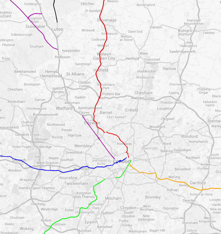
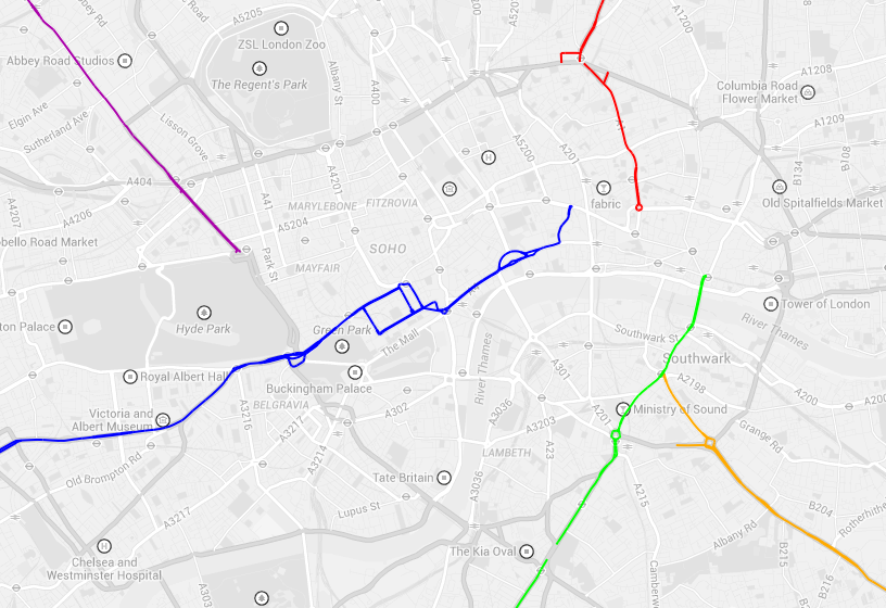
Categories
Bike Share London OpenLayers OpenStreetMap Technical

All the Docks: Technical Notes on the Routes and Map

Routes

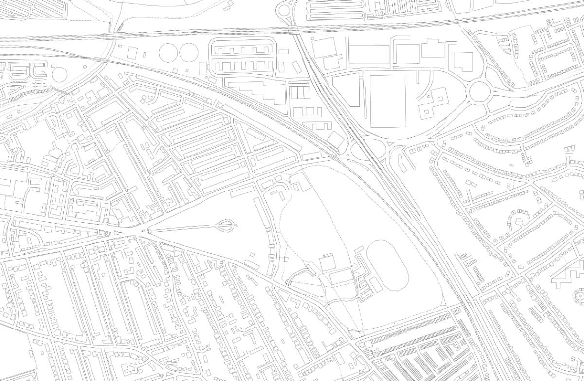
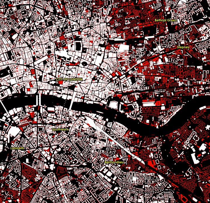
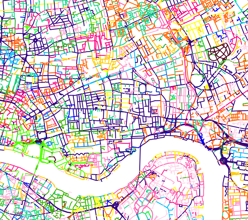
I created GPX route files for the challenge. These were created manually in QGIS, using the OpenStreetMap standard “Mapnik” render as a background, by drawing lines, with Google Street View imagery used to check restrictions.

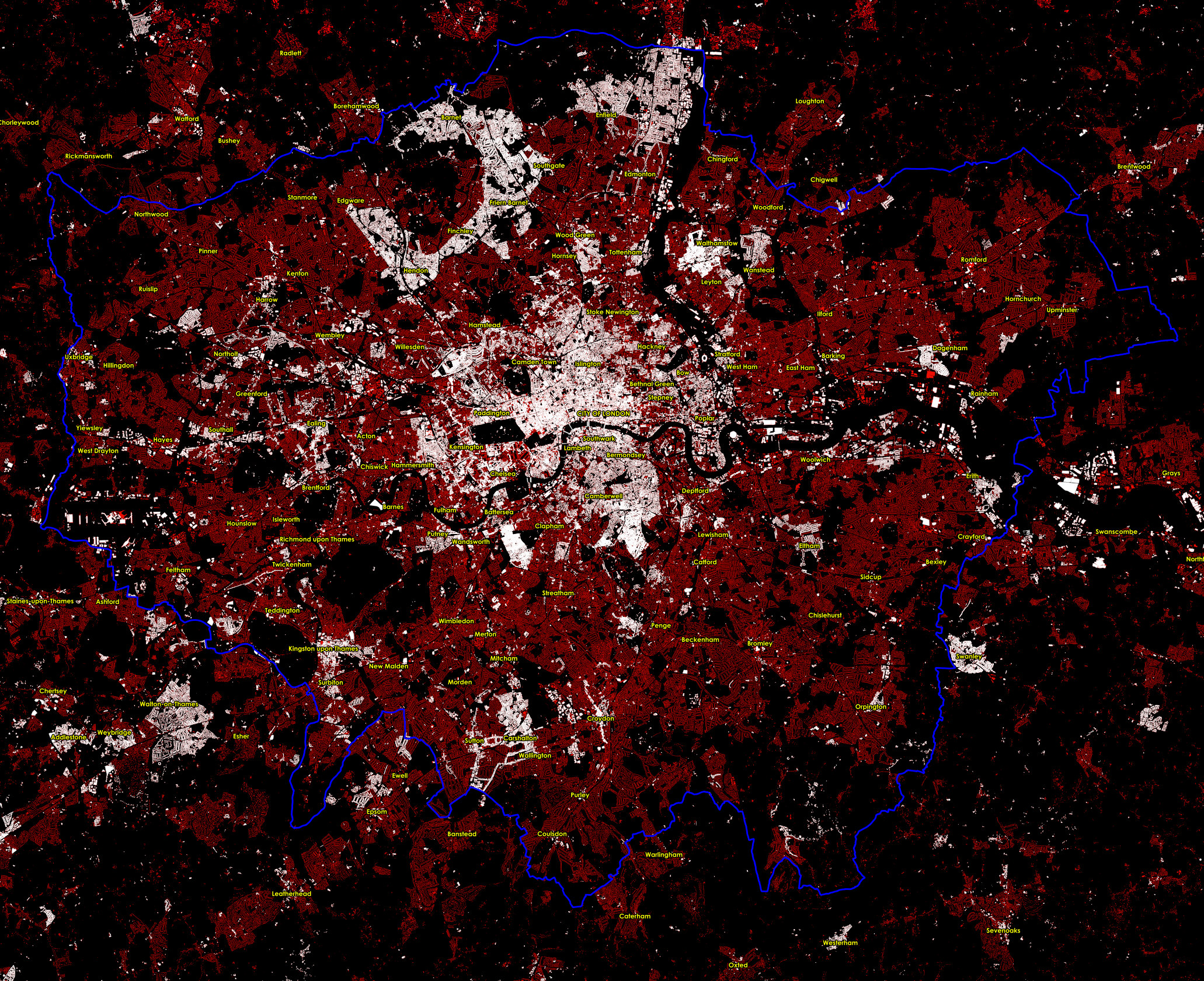
I split each team’s route into 12 stages (so 36 altogether), which were initially each just over 10km and ended at a docking station. Each stage contained between 10 and 40 sequential legs to docking stations. I’m not sure I would trust proper routing engines (based on Google Maps or OpenStreetMap, normally) to have found better routes on each leg between each docking station, than me and Google Street View, largely because many London boroughs have been experimenting a lot recently with Low Traffic Neighbourhoods (LTNs) and modal filters (e.g. two way for bikes/one way for cars). But I did run a TSP solver (RouteXL) on 3 of the stages and in 2 cases it did find a slightly shorter ordering of the legs, within the stage. So I would probably use a TSP solver more for a future iteration of the challenge.

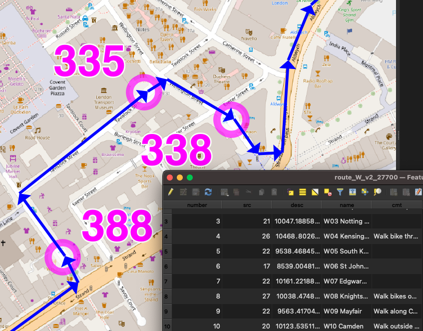
The three route/team files were saved in British National Grid (EPSG27700) GeoJSONs (technically not allowed by the spec) so I could get proper metre distances ($length) auto-updated into a column, for each stage, during planning. The stages had a number column, and were numbered sequentially. Having a number column results in LineStrings in the GeoJSONs and GPX routes/routepoints rather than single MultiLineStrings and GPX tracks/trackpoints. They were then saved as WGS84 GPX files. I (mis-)used a very limited set of column names (name, number, src, desc, cmt), due to the restrictions with the GPX specification – I didn’t want to use GPX extensions.

It was important to have three separate GPX files so that each team would need to load in just a single file to their navigation device and not see docking stations/routes from other teams). But it did make preparations a bit harder for the online map.

The docking stations were imported in via a TSV file, then saved as GPX waypoints (column names again restricted to src, desc, name, and cmt), and the relevant ones were manually appended to the GPX team files. The GeoJSONs were retained as my master editing files, as QGIS cannot easily edit GPX files due to them containing multiple geometry types.

I would certainly like to try a more automated approach to the routing. It did take a substantial amount of time – probably two evenings for each of the three routes, and a further evening for each route to enumerate the docking stations, fine-tune the routes and reorder any sliced up GeoJSON LineString segments (part-stages) back into the correct sequence. The reordering was needed as QGIS would incorrectly reorder parts of the route that crossed over itself, when it was sliced up.

But an automated approach would require a method that deals with docking stations that are just 10m down a no-entry street (so you’d just walk it), which is hard. Currently they are represented as a point defined by TfL through their API (and separately in OpenStreetMap) which may be the location of the “totem pole” kiosk but not the docking points themselves. In routing or GIS systems, the docking station needs to be represented as an area (within which you would walk the bikes) plus a (multi-)line (representing the line of dock points – some of these are quite long – some have significant gaps, and sometimes they are split on either side of a road). Potentially, the point representing a docking station really needs to be an area, and that area can extend up to the nearby road junction to deal with the one-way issue.

Future Improvements

In terms of the general design, a few things could be changed for a future challenge (some of these I mentioned in my previous blog post):

  • Ensuring that participants are well away from the finish at around the 60-80% stage, so that they are less likely to bail at that difficult time of the day, because the remainder of the challenge is then a kind of “run in” to the finish, rather than routing them away at a late stage.
  • When participants pass by another docking station twice, they should visit it on the first occasion, not the second time. (An exception is when it is on the wrong side of a dual carriageway, particularly one with a median barrier). Otherwise there is a danger of it being missed on the return.
  • Build specific meal stops in.
  • Maximum of 200 docking stations/10 hours per team.
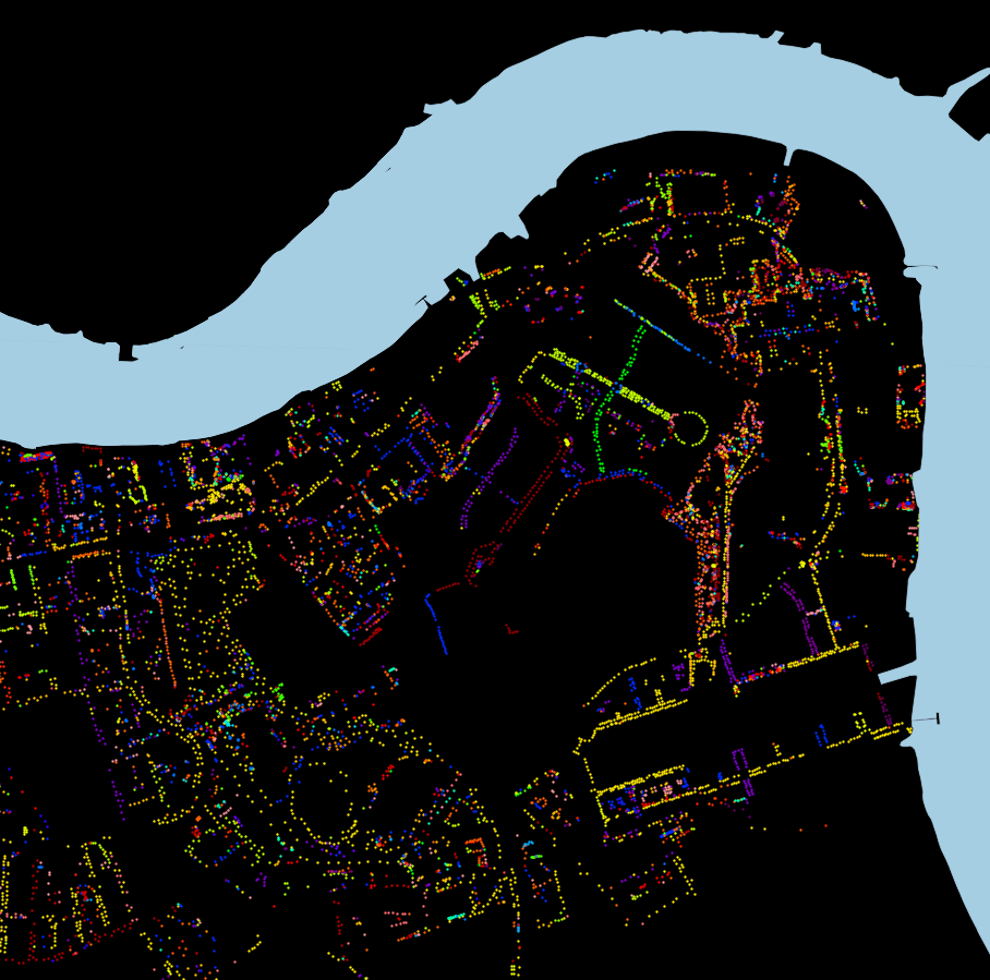
The Web Map

By comparison, building the web map was straightforward, probably just one evening’s work to build the map page itself as a basic OpenLayers map reading in GPX files and with simple browser-based geolocation, and one further evening to build a “team” version of the map that allowed ticking off the stations, the action being stored in a database, and a time string echoed back to the web map (and other viewers, on a Javascript timer) as confirmation. The database had two tables, a summary table with a row per docking station, and an action log which recorded the dock’s TfL ID, timestamp, event type and the submitter’s browser user agent string ($_SERVER[‘HTTP_USER_AGENT’]) in lieu of logins/IDs. It was fairly easy to assign a manually assign each user agent to team, post-event.

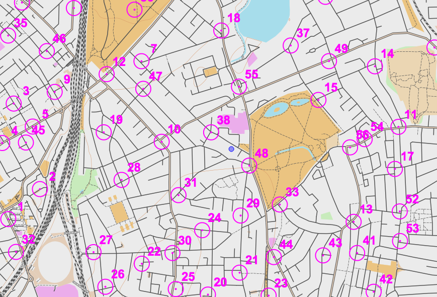
Each docking station ended up with 4 identifiers which feels a bit too many, but it kind of made sense:

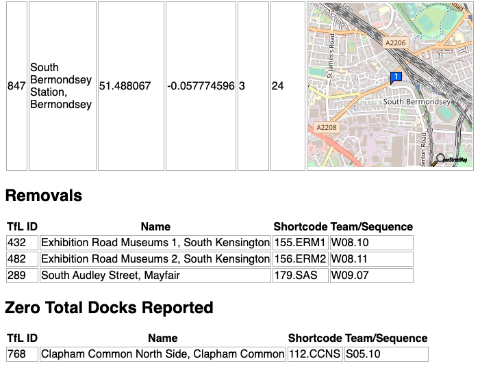
  • an integer TfL ID (e.g. 761)
  • the TfL Name that appears on the totem pole (e.g. Gower Place, Bloomsbury)
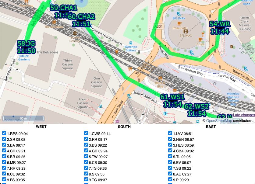
  • a shortcode which was the sequence number and the initials of the first part of the TfL Name (e.g. 37.GP). There were some duplicates across the team. FIN.HS was a special shortcode for the finish for the two teams that didn’t have that as a docking station in their “zone”. One newly added docking station had “A” appended to the sequence number of the previous, rather than having to renumber everything.
  • a unique sequence code which was the team, stage and docking station order within that stage, (e.g. W02.15). This was used as a logical ordering of the file and to help with assigning each docking station to its stage on the online map.

I also listed an “actual sequence” post-event ordering, e.g. W038, in the final results file.

I could have used the sequence code on the map but felt the shortcode was the most useful concise way of identifying each station to the team as they approached it, and hopefully the simple number would result in any missing out being spotted quickly.

I built a special “diff” webpage that compares our docks file with the live data (via BikeShareMap) every 2 minutes and this alerted us of any new, closed or zero-capacity docking stations, plus a list of full ones. There was one that opened a few days before, but none on the day, thankfully!

Future Improvements

I do think that using fewer intermediate routing points on each leg would be better and would allow for turn-by-turn satnav directions. Having said that, having street names called out is of limited use as they are often hard to spot on the ground, so the breadcrumb trail approach we used worked well.

We had paper maps (just screenshots of the website) as a backup. I never used them, and I think Team South used the website. Team West used them exclusively, with a separate person using the website to tick off.

I would have liked to have had a single source of docking station locations. In the end, they were:

  1. on TfL’s API, which is fed through to a CSV on BikeShareMap every two minutes,
  2. on a CSV file on Github,
  3. as GPX waypoints appended to each team’s GPX routes file, and
  4. in my database for recording times on the ATDMap website.

1 and 2 were automatically compared (see above), 2 could be added to QGIS to compare and generate GPX for 3, and also imported into the database table (4) but this would all be manual steps.

Links

Website map with the timings: https://misc.oomap.co.uk/atdmap/

Route GPX files and timings CSV: https://github.com/oobrien/allthedocks

Strava link (Team East): https://www.strava.com/activities/7908548122

Categories
OpenStreetMap Orienteering

OpenOrienteeringMap Version 3

OpenOrienteeringMap, the easy online tool for creating street orienteering maps from OpenStreetMap data, has been updated to version 3. Development for this version was kindly funded with a grant from the Orienteering Foundation.

New features for version 3 include:

  • Better trees! We now use SVG graphics for lone trees (and monuments). This means they are scaled correctly when appearing on the map, both on the screen and on the high quality ready-to-print PDFs. The use of SVGs and better scaling means that the trees now don’t dominate the map at smaller scales. In addition, trees are drawn underneath line features, so that they don’t obscure, for example, path detail. The same treatment is applied to monuments, too. This fixes one of the most requested bugs on the OpenOrienteeringMap Github. See above for the difference – note the better scaling, lack of pixalation, and less obscured paths, on the right!
  • Similiar vectorisation improvements have taken place for fences, walls, power lines, cliffs and embankments. These linear features have regularly spaced markings to indicate their type. Previously, these markings used PNG images, which did not work well for the high quality vector PDFs. These have been replaced with SVGs, which scale correctly and print at high quality, through the use of a different kind of Mapnik symbolizer – a MarkerSymbolizer rather than a LinePatternSymbolizer. The only remaining raster graphics that appear on an OpenOrienteeringMap are the fill textures for polygon areas, such as vegetation undergrowth. These use PolygonPatternSymbolizer, which does not support SVGs and has no equivalent symbolizer which does.
  • We now include benches, picnic tables and litterbins on the maps. These are shown as small black crosses.
  • JPEGs can now be produced for OpenOrienteeringMap. This is very useful for adding OpenOrienteeringMap maps to platforms like Routegadget or OCAD (as background map) where JPEGs are required. PDFs should still be continued to use for printing, as they will result in a much higher quality map, but you no longer need to manually convert to JPEG using an image editor or other additional software.
  • In conjunction with the above, geolocation “Worldfiles” can now be produced for OpenOrienteeringMap. These are small config files that allow a JPEG (or PDF) OOM map to appear in the correct place on a location-aware service, such as Google Earth, Mapper from the OpenOrienteering project (not tested) or similar.
  • Some of the details from the “Pseud-O” map style on OOM have been ported across to the standard “Street-O” maps. This includes trees, monuments, powerlines, sports pitches and hedges.
  • Some layer reordering – contour lines now go across roads and above buildings. The shape of the land is important, and so this change makes it easier to see hills and slopes.
  • Buildings on the Pseud-O map style are now shown as grey with black borders, rather than all black as before, this stops them from overwhelming the Pseud-O map in city centres.
  • A new style, Blueprint, has been officially launched. This style (see example at top) which was in beta for a while, is different to orienteering maps, as it is designed for people who want to create a map of their local area to colour in! A simple set of very think black lines, with lots of white spaces, is produced, allowing a simple high-quality map of local areas to be produced, ideal for colouring in! Blueprint doesn’t include contour lines and doesn’t allow controls to be added. You can try it out here.
  • The global map database has received a bulk update, so now covers changes/additions made to OpenStreetMap up to around early August 2017. The UK database continues to enjoy daily updates (changes appear approximately 48 hours after the corresponding edits in OpenStreetMap).
  • Branding of the website and the PDF maps has been updated to recognise the support received from the Orienteering Foundation.
  • The grant also partially supports the hosting/bandwidth costs associated with OpenOrienteeringMap for the next twelve months.
Categories
OpenStreetMap Orienteering

MapOnShirt

COyiL04UAAQkgk3

Here’s a great idea well executed – MapOnShirt uses OpenStreetMap data and some nice custom styling – and an easy-to-use website, to allow you to design your own T-shirt of anywhere in the world. It works best in large built-up places, particularly across new-world cities with their grid structures and other large-scale planned road topologies, but familiar shapes in older cities work too – such as the River Thames.

MapOnShirt was kind enough to create a mock-up of a shirt for the recent Street-O race in London that I organised. I reckon these kinds of shirts would make for great prizes for such events.

Categories
London OpenStreetMap

OpenStreetMap: London Building Coverage

osm_londondetail

OpenStreetMap is still surprisingly incomplete when it comes to showing buildings for the London area, this is a real contrast to other places (e.g. Birmingham, New York City, Paris) when it comes to completeness of buildings, this is despite some good datasets (e.g Ordnance Survey OpenMap Local) including building outlines. It’s one reason why I used Ordnance Survey data (the Vector Map District product) rather than OpenStreetMap data for my North/South print.

The map below (click to view a larger version with readable labels and crisper detail, you may need to click it twice if your browser resizes it), and the extract above, show OpenStreetMap buildings in white, overlaid on OS OpenMap Local buildings, from the recent (March 2015) release, in red. The Greater London boundary is in blue. I’ve included the Multipolygon buildings (stored as relations in the OSM database), extracting them direct from OpenStreetMap using Overpass Turbo. The rest of the OSM buildings come via the QGIS OpenStreetMap plugin. The labels also come from OS OpenMap Local, which slightly concerningly for our National Mapping Agency, misspells Hampstead.

The spotty nature of the OSM coverage reveals individual contributions. For example, Swanley in the far south east of the map is comprehensively mapped, thanks presumably due to an enthusiastic local. West Clapham is also well mapped (it looks like a small-area bulk import here from OpenMap) but east Clapham is looking sparse. Sometimes, OpenStreetMap is better – often, the detail of the buildings that are mapped exceeds OpenMap’s. There are also a few cases where OSM correctly doesn’t map buildings which have been recently knocked down but the destruction hasn’t made it through to OpenMap yet, which typically can have a lag of a year. For example, the Heygate Estate in Elephant & Castle is now gone.

The relative lack of completeness of building data in OpenStreetMap, for London, where the project began in 2004, is – in fact – likely due to it being where the project began. London has always an active community, and it drew many of the capital’s roads and quite a few key buildings, long before most other cities were nearly as complete. As a result, when the Bing aerial imagery and official open datasets of building outlines became more recently available, mainly around 2010, there was a reluctance to use these newer tools to go over areas that had already been mapped. Bulk importing such data is a no-no if it means disturbing someone’s prior manual work, and updating and correcting an already mapped area (where the roads, at least, are drawn) is a lot less glamorous than adding in features to a blank canvas. As a result, London is only slowly gaining its buildings on OSM while other cities jumped ahead. Its size doesn’t help either – the city is a low density city and it has huge expanses of low, not particularly glamorous buildings.

An couple of OpenStreetMap indoor tracing parties might be all that’s needed to fix this and get London into shape. Then the OpenStreetMap jigsaw will look even more awesome.

osm_london_2mb

Click for a larger version. Data Copyright OpenStreetMap contributors (ODbL) and Crown Copyright and Database Right Ordnance Survey (OGL).

Categories
Data Graphics London Mashups OpenLayers OpenStreetMap

Tube Line Closure Map

anim

[Updated] The Tube Line Closure Map accesses Transport for London’s REST API for line disruption information (both live and planned) and uses the information there to animate a geographical vector map of the network, showing closed sections as lines flashing dots, with solid lines for unaffected parts. The idea is similar to TfL’s official disruption map, however the official one just colours in the disrupted links while greying out the working lines (or vice versa) which I think is less intuitive. My solution preserves the familiar line colours for both working and closed sections.

My inspiration was the New York City MTA’s Weekender disruptions map, because this also blinks things to alert the viewer to problems – in this case it blinks stations which are specially closed. Conversely the MTA’s Weekender maps is actually a Beck-style (or actually Vignelli) schematic whereas the regular MTA map is pseudo-geographical. I’ve gone the other way, my idea being that using a geographical map rather than an abstract schematic allows people to see walking routes and other alternatives, if their regular line is closed.

Technical details: I extended my OpenStreetMap-based network map, breaking it up so that every link between stations is treated separately, this allows the links to be referenced using the official station codes. Sequences of codes are supplied by the TfL API to indicate closed sections, and by comparing these sequences with the link codes, I can create a map that dynamically changes its look with the supplied data. The distruption data is pulled in via JQuery AJAX, and OpenLayers 3 is used to restyle the lines appropriately.

Unfortunately TfL’s feed doesn’t include station closure information – or rather, it does, but is not granular enough (i.e. it’s not on a line-by-line basis) or incorrect (Tufnell Park is shown only as “Part Closed” in the API, whereas it is properly closed for the next few months) – so I’m only showing line closures, not station closures. (I am now showing these, by doing free-text search in the description field for “is closed” and “be closed”.) One other interesting benefit of the map is it allows me to see that there are quite a lot of mistakes in TfL’s own feed – generally the map shows sections open that they are reporting as closed. There’s also a few quirks, e.g. the Waterloo & City Line is always shown as disrupted on Sundays (it has no Sunday service anyway) whereas the “Rominster” Line in the far eastern part of the network, which also has no Sunday service, is always shown as available. [Update – another quirk is the Goblin Line closure is not included, so I’ve had to add that in manually.]

Try it out

Categories
Data Graphics London OpenStreetMap

Street Trees of Southwark

southwarktrees_rotherhithe


Above is an excerpt of a large, coloured-dot based graphic showing the locations of street trees in Rotherhithe, part of the London Borough of Southwark in London, as released by them to the OpenStreetMap database back in 2010. You can download the full version (12MB PDF). Street trees are trees on public land managed by LB Southwark, and generally include lines of trees on the pavements of residential streets, as well as in council housing estates and public parks. By mapping just the trees, the street network and park locations are revealed, due to their linear pattern or clumping of many types of trees in a small area, respectively. Trees of the same genus have the same colour, on this graphic.

southwarktrees_thin

Why did I choose Southwark for this graphic? Well, it was at the time (and still is) the only London borough that had donated its street tree data in this way. It is also quite a green borough, with a high density of street trees, second only to Islington (which ironically has the smallest proportion of green space of any London borough). There are street tree databases for all the boroughs, but the data generally has some commercial value, and can also be quite sensitive (tree location data can useful for building planning and design, and the exact locations of trees can also be important for neighbourly disputes and other damage claims. It would of course be lovely to have a map of the whole of London – one exists, although it is not freely available. There are street tree maps of other cities, including this very pretty one of New York City by Jill Hubley. There’s also a not-so-nice but still worthy one for Washington DC.

Also well as a PDF version, you can download a zip-file containing a three files: a GeoJSON-format file of the 56000-odd street trees with their species and some other metadata, a QGIS style file for linking the species to the colours, and a QGIS project file if you just want to load it up straight away. You may alternatively prefer to get the data directly from OpenStreetMap itself, using a mechanism like Overpass Turbo.

A version of this map appears in London: The Information Capital, by James Cheshire and Oliver Urberti (who added an attractive colour key using the leaf shapes of each tree genus). You can see most of it below. I previously talked about another contribution I made to the same book, OpenStreetMappers of London, where I also detailed the process and released the data, so think of this post as a continuation of a very small series where I make available the data from my contributions to the book.

The data is Copyright OpenStreetMap contributors, 2015, under the Open Database Licence, and the origin of most of the data is a bulk-import supplied by Southwark Council. This data is dated from 2010. There are also some trees that were added manually before, and have been added manually since, by other OpenStreetMap contributors. These likely include some private trees (i.e. ones which are not “street” trees or otherwise appear on private land.) Many of these, and some of the council-data trees, don’t have information their genus/species, so appear as “Other” on the map – orange in the above extract.

southwarktrees_book
Categories
OpenStreetMap Orienteering

OOM 2.3 – Automatic Postbox Additions

postboxes

As a fun project for OpenOrienteeringMap (OOM) during the Christmas pause, I incorporated a feature requested on the forums of NopeSport that I had actually also been thinking about myself – the automated addition of controls. I’m using Nearest Postbox which is a tool written by the polycoder Matthew Somerville to show postboxes in OpenStreetMap augment with reference numbers and other data. If you zoom into an area on the UK edition of OOM and click to add a map “sheet”, you can then click on the “Add Postboxes” button. OOM will make use of Matthew’s API to his site, to pull in known postbox locations and create controls from them. You’ll only be able to do this if there are not any controls already added. You can then edit/delete the controls (e.g. change the score) in the normal way.

postboxes_button

Some Street-O events by SLOW and other clubs already use postboxes as useful controls. This will hopefully make it more easy for the planner, although they’ll still need to visit the postboxes concerned to verify the ref and make sure the postbox is still there…

The feature is experimental, so if you run into any bugs please tell me.

Categories
OpenStreetMap

Primary Roads

a1a6_london

Britain’s “top” primary roads – the A1, A2, A3… to A9 – are arranged in a particular pattern, with the A1-A6 radiating out clockwise from London and the A7 to A9 similarly radiating around Edinburgh.

I used Gemma, an old UCL CASA project that Steve and I worked on back in 2011, to draw, from OpenStreetMap, the routes of the A1-A6 as they leave London. The A5 has a gap between Edgware and Harpenden, and the A6 only starts at Luton – both of these changes likely due to the building of the M1 motorway which effectively replaced those sections. Co-numbered roads are not included in the map due to a conflict with the way OpenStreetMap and Gemma separate information. Key for the maps: Red = A1, Orange = A2, Green = A3, Blue = A4, Purple = A5, Black = A6.

Also of interest is that the only two roads that “touch” in London are the A2 and A3, at Borough. The other roads may at one time have converged at junctions, but their starts have been shortened slightly over the years. The big junction at Bank certainly looks like a place where the A1, A3 and A4 could have started from. (Outside of London, the A7 touches the A1 at its northern end and the A6 at its southern end.) Diamond Geezer walked the first mile of the A1-A5 a few years ago.

Gemma still partially works, despite not having seen much love for the last few years and having never made it out of beta (it was a short project). It is recommended you use the OpenStreetMap (or Marker) layers only, to avoid bugs, and watch out if removing layers. You can see the live A1-A6 map here or have a go at building your own.

a1a6_detail

Key for the maps: Red = A1, Orange = A2, Green = A3, Blue = A4, Purple = A5, Black = A6.

I’ve blogged about Gemma before (more).

The coloured road lines are Copyright OpenStreetMap contributors and the greyscale background map is Copyright Google.

Categories
OpenStreetMap Orienteering

OOM on OpenCageData

I was interviewed by OpenCageData recently, the article appears on their blog and I have reproduced it here:

Continuing in our series of interviews with folks doing interesting things in the open geo world, today we enter the realm of domain specific OpenStreetMap variants by talking with Oliver O’Brien, maker of Open Orienteering Map.

1. Who are you and what do you do? What got you into OpenStreetMap?

I’m Oliver O’Brien (“Ollie” on OpenStreetMap). I’m a researcher and software developer at the Department of Geography at UCL in London, specialising in geovisualisation and demographic mapping.

I’ve been a contributor to the OpenStreetMap project since 2007. I first learnt about it when a friend was keen to try out lots of different routes around Edinburgh during the Hogmanay festival, recording them with a GPS receiver. He explained he was uploading them to a project – OpenStreetMap – a map that anyone can edit. At the time it was nearly blank in the Edinburgh area. When I got back to London I discovered that many of the roads in my local area were missing too, so got down to filling them in. At the time, the project did not have access to high-resolution aerial imagery, so GPS traces were very useful – as were annotating note by hand on various scraps of paper! I then discovered the thriving London OpenStreetMap community – we organise mapping parties, though now, as London is largely “done”, it’s generally pub meets. I’m lucky enough to regularly use OpenStreetMap data for my day job at UCL, sometimes including my own contributions.

2. What is Open Orienteering Map? What is the goal of the project?

My orienteering club (South London Orienteers, aka SLOW) has been running informal “Street-O” evening training events in various parts of London, for many years. The idea is that you have to visit as many points, marked on a printed map that you run with, as possible within one hour, and get back to the start. The route you take is up to you, so it’s vital that the map you use doesn’t get you lost. Many of the maps being used at the time I first joined the club were created in fiddly (and expensive) bespoke software used for professional maps, typically by hand, tracing in A-Z or Ordnance Survey paper maps. The process was prone to error and very slow.

Having seen OpenStreetMap data being used in various other projects, such as Andy Allan’s OpenCycleMap, I realised there was potential for it to be used for orienteering mapping too. While regular orienteering maps contain a lot of specialist features not on OpenStreetMap (such as forest thickness and crag detail), basic Street-O maps are simpler, and for many areas, OpenStreetMap likely has sufficient level of detail. Initially I set up a system which required GIS software to use, with appropriate orienteering styles and filters, but that was still hard to use for people outside the GIS world, so I then realised I could go one step further and build a website – http://oomap.co.uk– that performed the same function. So OpenOrienteeringMap was born.

The goal of the project is to make it as easy as possible for the volunteer Street-O organisers to create maps for their events. This has two main benefits – firstly, with less spent time on drawing the map, and no cartography skills needed – the website generates a PDF map to print, at the click of a button – more new people can get involved and organise their own event, taking time to plan great courses rather than draw a map. Additionally, it encourages new people into the OpenStreetMap community. By making the only easy way for organisers to update the roads, paths and other features on the Street-O map being via OpenStreetMap – with a regular refresh of the database back to OpenOrienteeringMap – the website has got a few people hooked on being “regular” OpenStreetMap editors, as well as orienteers. (N.B. if I rebuilt the service now from scratch I would probably use something the Overpass API and vector tiles directly in the browser, rather than have my own copy of the database and an image tiler and PDF generator.)

There are three versions of the website: British (with OS Open Data contours), Irish and worldwide, and two main mapping styles, “StreetO”, used for Street-O races, and “PseudO”, which is an attempt to create a “regular” orienteering map style in OpenOrienteeringMap, following the colour and symbol standards defined by the sport. It has a distinctive look but is of less use for orienteering events except in a few very well-mapped places. The styles are on GitHub.

rihcmondstreeto

Above is the map that is being used for the next South London Orienteers’ Street-O event, in December 2014, with around 100 people taking part. Further details of the events can be found at http://slow.org.uk/about/streeto/. Map data Copyright OpenStreetMap contributors.

3. What are the unique needs of a map designed for orienteering? How has using OSM to meet those needs worked out?

Orienteering maps need to be highly detailed, clear and accurate, as competitors run through unfamiliar terrain at speed and the accuracy of navigation is as important as speed, when it comes to getting a good result. This general principle applies to Street-O events, where it is important that all navigable roads, tracks and paths are included and that the map is as uncluttered as possible. Other datasets can often neglect tracks and paths in particular, but OpenStreetMap has historically had a good record in this regard, being a grassroots community comprised of many enthusiastic walkers and cyclists, amongst others. The data isn’t perfect, but for areas in London that my local club users, it’s worked out pretty well. Sometimes missing detail is spotted by the organiser and they edit OpenStreetMap to fix it. Occasionally it isn’t spotted and competitors report back missing paths at the race finish – edits can then be made which will benefit future races there. Both these processes improve OpenStreetMap itself (for everyone) while also improving OpenOrienteeringMap (for racers), so everyone benefits.

6160108706_c4363f55bf_z
Competitor in a London park. Although he is using a custom drawn map for this particular race, the level of detail in some London parks on OpenStreetMap means that OpenOrienteeringMap is a possibility for more informal events here. Copyright Oliver O’Brien.

4. What steps could the global OpenStreetMap community take to help support the use of OSM in unique communities like this?

One feature which would be of great use, would be the ability to “sign off” certain areas has achieving a particular level of completeness, e.g. a local contributor confirming that, to their knowledge, an area in a particular bounding box has all the roads and paths on it. Such a mechanism was created by ITOWorld with their OSM Quality tool, for Great Britain, using complementary data from the national mapping agency, however a global version, using experienced OpenStreetMap editors as the authority, would very useful in encouraging Street-O event organisers to use OpenOrienteeringMap or other tools for using the data in orienteering events.

5. OSM recently celebrated its 10th birthday, where do you think the project will be in 10 years time?

It will be a map with virtually every building and road in the world on it. Improving and more accessible satellite and imagery will greatly help with this process. Detail will increase too, but I don’t think it will end up mapping every tree or lamppost – there will be spinoff projects which will cover things like that. The project’s licence does ensure that the data will always be as good as it is currently and so can only get better still. I think also, the project emphasis will shift away from the standard “openstreetmap.org” front page map and become more known as the definitive map data store for the world, with other websites becoming the primary way the data is viewed. The project is sometimes described as the “Wikipedia of mapping” and I think it will encounter the same problems, and come up with the same solutions, that Wikipedia did – such as dealing with vandalism of the dataset by having different levels of editors, area guardians and protected places. More generally, I see many more projects like OpenOrienteeringMap filling particular niches and the parent database continues to expand. Perhaps the database will form the start of a global postcode system?

Many thanks Ollie! A great example of a practical application of open geo data. Anyone who is interested in the project can learn more here. OpenOrienteeringMap is just one of many geo related projects Ollie is involve in, I highly recommend everyone follow him on twitter and read his blog.

Categories
London OpenStreetMap

OpenStreetMappers of London

IMG_1370

I contributed a number of graphics to LONDON: The Information Capital, a book co-written by Dr James Cheshire, also of UCL Geography. Two of my graphics that made it into the book were based on data from OpenStreetMap, a huge dataset of spatial data throughout the world. One of the graphics, featured in this post, forms one of the chapter intro pages, and colours all the roads, streets and paths in the Greater London Authority area (around 160,000 “ways” which are discrete sections of road/path) according to the person who most recently updated them. Over 1500 indivdual users helped create and refine the map, and all are featured here. I was pleased to discover I was the 21st most prolific, with 1695 ways most recently modified by myself at the time that the graphic was produced.

The more active users will typically have areas around home and work which they intensively map, plus other, smaller areas such as contributions made during a mapping party or other social event organised by/for the London OSM community. Here’s an example filtering for just one user:

osm_dan

Putting the users together reveals a patchwork of key authors and more minor contributors, together forming a comprehensive map of the city. Detail levels vary, partly as the fabric of the city varies from area to area, but also as some contributors will be careful to map every path and alleyway, while others will concentrate on the driveable road network.

osm_detail

The data was obtained from a local copy of the OpenStreetMap database, for Great Britain, that I maintain for various pieces of work including OpenOrienteeringMap. You can obtain the data files from GeoFabrik (this link is to their new London-only version). The data was captured in early February 2014. Newham borough in east London (light blue) shows up particularly prominently because it looks like it had had a bulk update of all roads there by a single user, just before the capture, to indicate which were lit by streetlights (lit=yes).

I used QGIS to assemble the data and applied the temp-c colour ramp, classifying across all the contributors – I then changed the ones which were assigned a white colour, to green. The colours used in the book are slightly different as some additional editing took place after I handed the graphic over. The colour ramp is relatively coarse, so multiple users will have the same colour assigned to them. The very long tail of OSM contributions (where only a small number of people make the great majority of edits) mean that this still means that most major contributors have a unique colour assigned to them.

osm_book


View larger version.

Download:

Note that these files actually are for an area that is slightly larger than the Greater London Authority extent – a buffer from Ordnance Survey Open Data Boundary-Line is used to mask out the non-GLA areas.

If you like this thing, it’s worth noting that Eric Fischer independently produced a similar graphic last year, for the whole world. (Interactive version).