Categories
CDRC Geodemographics

Introducing Mapmaker

I’ve been based at the ESRC Consumer Data Research Centre, a multi-university (UCL/Liverpool/Leeds/Oxford) lab focused on research and provision of specialist UK consumer datasets, since 2015. One of my first outputs was to adapt DataShine, which I’d created in 2013 as part of a previous UCL project, to produce CDRC Maps – to map some of the open datasets we held, and aggregates of some of the more interesting socioeconomic datasets that we produced from the controlled collections.

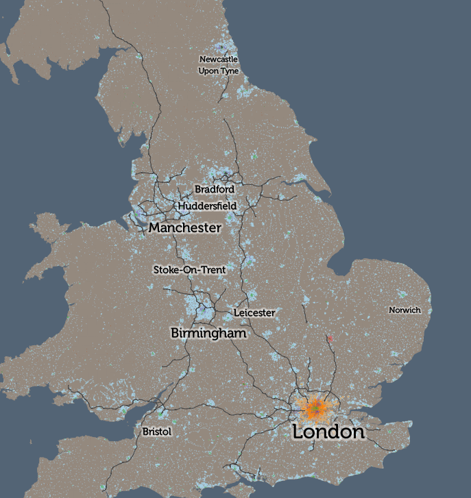
CDRC Maps is an OpenLayers-based “slippy” (pan/zoomable) map website consisting of pre-rendered raster tiles of choropleth maps of consumer metrics, layered under another raster “context” layer containing roads and labels, and a mask which results in only building blocks being coloured by the underlying choropleth. It served its purpose of showing impactful, pretty and effective maps of our UK socioeconomic datasets, but being a raster based map, with billions of tiles sitting on one of our old servers, it has been showing its age for a while.

The modern web mapping toolstack has moved on, with the rise of powerful web browsers with fast vector rendering, responsive design for smartphones and tablets, and comprehensive GUI frameworks that elevate regular Javascript. CDRC’s requirements have evolved too, with a desire for map visualisation that includes downloadable snapshots, basic analytical functions and filters, rather than the simple view-only concept of CDRC Maps, and a need to embed the map in stories and dataset records, rather than only sitting standalone.

CDRC Maps has also long been hosted directly at UCL, on a local development server. CDRC is a data research centre not a technology centre and there is a desire for use to our server infrastructure for data primarily. The website has long been the most popular public website for CDRC and also is prone to usage spikes due to mass media often finding that maps are a quick way to illustrate a story – or be the story – compared with raw datasets that are less immediately accessible with media deadlines. It was clear that an external host for the sites itself, and ideally the data that powers the site, would be preferable.

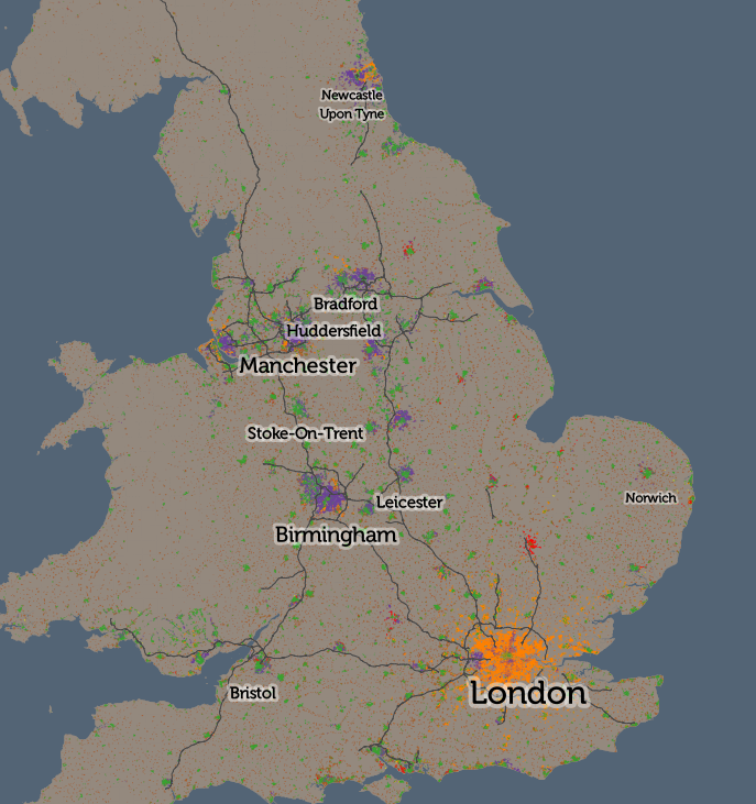
To address this and bring CDRC Maps up to date with the new data platform, the centre commissioned Carto and Geolytix to produce CDRC Mapmaker during late 2020. The developers created a Node.js based website that uses the Vue templating framework. Mapbox GL JS 1 is used for the map controls/canvas and the vector tile rendering. The map framework has recently become non-open but there is an open fork, MapLibre, which we will take a look at in due course. The development toolchain has also been brought up to date with industry practice, with proper source code management, continuous integration, rapid development/testing on localhost, and deployment through GitHub.

Map config is in Javascript but this component is separated from the templating Vue/Javascript allowing configuration and setup of new maps to be discrete from the main code itself.

Data is completely separated from the code and there is no server-side processing element for the code. (We do also use an external service, Google Analytics, for our stats). The data is hosted on Carto’s data platform, where a number of datasets are loaded, and also a postcode lookup table. Carto is in fact built on PostgreSQL/PostGIS and provides a management GUI to allow these to be managed independently of the map code.

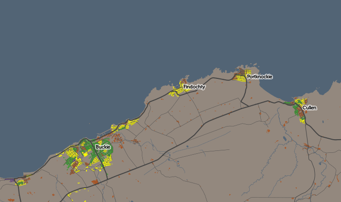
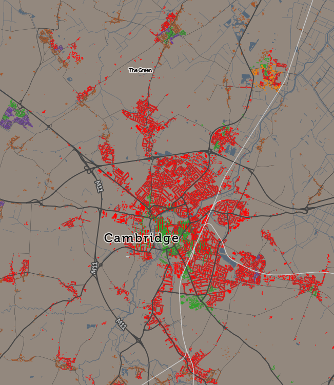
While the complete (albiet minified) code, config, fonts, images and stylesheets are less than 4MB, the datasets themselves use approximately 7GB of space on the Carto servers. Each geography used (MSOA, LSOA, OA, local authority) has four spatial data files, representing the unmasked choropleth along with three levels of clipping – urban extent (towns/cities), detailed urban (village level) and individual building blocks.

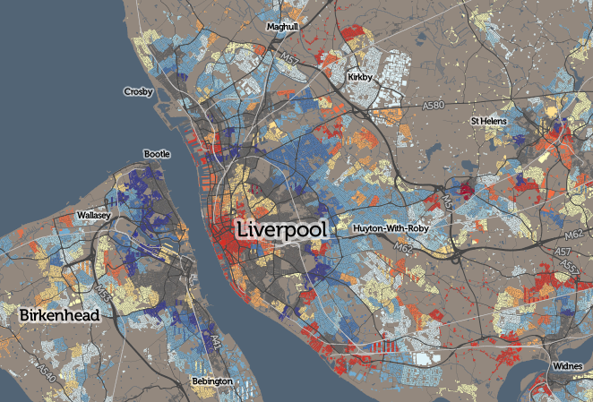
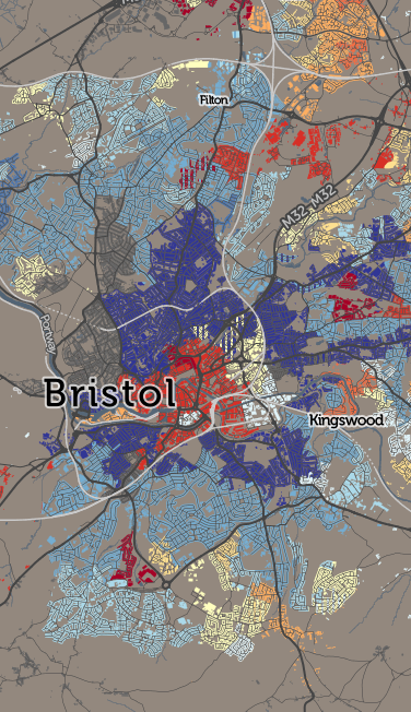
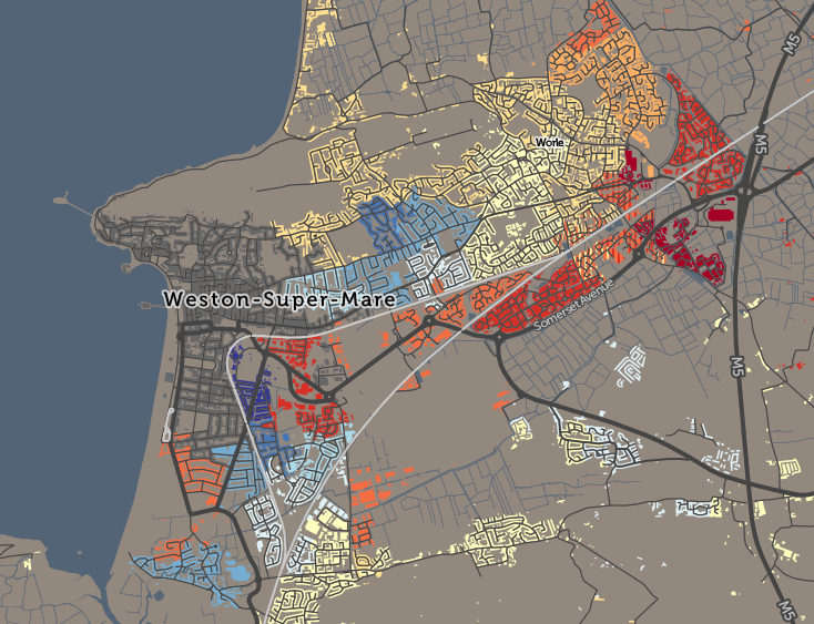
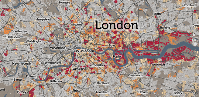
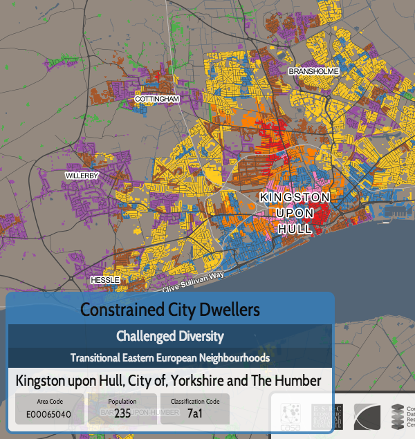
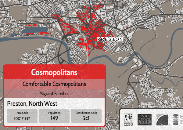
The application is structured around presenting two types of maps – metric maps (which show a various continuous variables associated with a particular dataset, sliced into groups) and classification maps which categorise areas into a single value (sometimes with a hierarchy of levels) and generally include a pen portrait description of the category.

We were delivered six functioning maps and I have gradually worked on extending the codebase and GUI functionality to encompass the wider variety of maps that were on CDRC Maps and that are listed in CDRC Data. Quirks of each additional map have actually meant minor changes to the code in each case to accommodate them, but I am hopeful now that the codebase is broad enough to allow for additional maps to be added in the future with minimal effort.

For this first release of Mapmaker, there are around 30 maps, covering CDRC classifications such as Consumer Vulnerability and the Internet User Classification (IUC), CDRC metric products such as Access to Healthy Assets and Hazards (AHAH) and Residential Mobility (Churn) and some popular government datasets like the Index of Multiple Deprivation (IMD), VOA building ages and Ofcom broadband speeds/availability.

Users can filter maps based on one or more classification categories or on multiple metric value ranges, and a PDF report can be easily produced with a view of the current map, a key and accompanying text and direct link. Clicking many of the maps will not only present the metrics or portrait, but include statistics on proportions in the current administrative area or a custom drawn region. The user interface is deliberately simple with standard pan/zoom controls, map selector, postcode search and layer toggles – that’s it. Planned development in the short term will include an even simpler UI to allow for easily embedding the map in CDRC Data and other CDRC data-led outputs.

CDRC Maps is currently still available for the limited number of maps that show datasets not included on CDRC Data, and it does have the advantage of a pure raster display meaning that some of our controlled datasets which require limited dissemination can be included in this way – on CDRC Mapmaker we would be delivering the dataset to the user’s browser, which is not ideal. Our plan is to de-brand CDRC Maps to provide a home, outside of the core CDRC output, for these legacy maps, in the same way that we have a GitHub repository storing some of our older datasets no longer on our main sites. CDRC is now nearly 8 years old and as the centre’s focus has been refined, not all our older assets have remained central to its mission, but for research reproducibility and historic linking purposes, it is important to preserve these.

We hope CDRC Mapmaker forms a useful visualisation tool for some of CDRC’s many data assets, and its filtering and reporting functionality allow CDRC’s data to be viewed and used in new ways.

Categories
CDRC Geodemographics

A Map of Country of Birth Across the UK

eastse_countryofbirth

Above: Areas of east and south-east London with more than 8% of inhabitants being originally from (from top to bottom) India (in East Ham), Lithuania (in Beckton) and Nigeria & Nepal (in Abbey Wood).

[Updated] Ever wondered why some branches of Tesco, the ubiquitous supermarket, have an American food section, while others have a Polish food chiller? Alternatively, it might have a catch-all “World Food” aisle, or it might not. The supermarket is, of course, catering to the local community. Immigrants to the UK do not uniformly spread out across the country, but tend to cluster in particular localities.

The latest map that I’ve published on CDRC Maps is a Country of Birth map, which attempts to summarise such communities in one view. It uses the same technique as Top Industry, it maps the most common country of birth (excluding the home nation) of residents in each small area, as of the 2011 Census. The purpose of the map is to identify and map the approximate extent of single-country communities within the UK. For example, to see how big London’s Chinatown is, or whether a Little Italy in the capital still exists.

This map reveals such communities although there is an important caveat when looking at it. I have set out below the rules I applied when constructing it, the most important of which is that only 8% of inhabitants need to share a single country of birth, for it to appear on the map. Bear in mind that, across the UK, 87% of people were born here. These people do not appear on the map, unless they are outside their home nation (and not at all if they are English).

countryofbirth_key
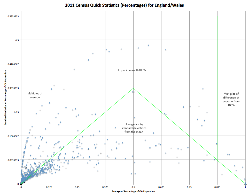
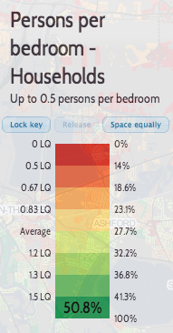
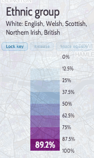
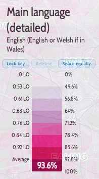
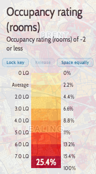
There are a number of rules I have needed to apply to make this a map that tells an interesting story in a measured and fair way:

  • I don’t map native births – the English-born people in England, Welsh-born in Wales, Northern-Irish born in Northern Ireland or Scottish-born in Scotland. There are almost no areas anywhere in the UK where people born in a single foreign-born country outnumber the native-born. If I did map such native births, then the map would be almost completely dominated by them, and would not tell much of a story.
  • I also don’t map the English-born within the other home-nations, because the population of England is so much larger than in Scotland, Wales etc such that even the small percentage of them moving into the other home nations would dominate the map of Scotland/Wales/NI, if included.
  • I only map a single-country foreign born area if at least 8% of local residents are from that country. This sounds like a low threshold and it is – if an area is coloured a particular colour, it might still have up to 92% of the local residents actually being native-born.
  • The above rule means that some very multi-cultural areas don’t get mapped, because they have a large number of non-native residents, but these are split amongst various countries such that none reaches the 8% threshold.
  • Necessarily, in the source data, some countries are combined together into regions, either for a whole region (e.g. Central America) or for other countries in a region (e.g. Other East Asia, not including China/Japan etc). This is how the underlying Census statistics are represented. This can have the effect of making a result (for a region) appear when it wouldn’t otherwise appear (for any country in the region). However the number of places where this happens is small so it does not overly bias the map.
  • A slight quirk of the census results is that the Scotland and Northern Ireland chose to, based on their own sum populations, aggregate some of the smaller-UK-population countries in a different way. For example, Northern Ireland doesn’t break out “Other Old EU” (e.g. Belgium) and “Other New EU” (e.g. Bulgaria) into separate categories. The Somalian population in Scotland is not presented as a distinct statistic, but it is in NI (and England/Wales). Again, this only affects countries/regions with smaller UK populations so doesn’t overly distort the map.
  • I don’t colour the map where it would be showing data for less than 10 people. This causes a most noticeable rationalisation of the map in Scotland, because the small areas here have a lower population (typically 125 instead of 250 people). This means Scotland’s country-of-birth diversity is a little underrepresented when compared with the other regions of the map.
  • I’ve used colour hues and brightnesses in an ordered way, to group together continents and regions. Greens = UK nations, Olives = Old EU, Browns = New EU, Yellows = North America, Pinks = Central America, Blues = Africa, Purples = Oceania, Reds = Asia. There is no particular meaning to the colours picked beyond this, but be aware that the eye is naturally drawn to some colour hues more than others.
  • If a second country of birth also scores over 8%, but with a smaller local population than the first, then this is shown in striped lines over the first, and labelled as such in the interactive key.

Have a look at the map, and mouse around to find the meaning for the current colour, or see the scrollable key on the right.

Why 8%? I found that dropping this threshold (I tried initially at 5%) results in a lot of “noise” on the map, where only two large families need to move to an area, for it to acquire their birth-country colour. Increasing this threshold (e.g. to 10%, which I tried) results in many of the interesting patterns disappearing.

Interesting, some famous “immigrant” areas of London virtually disappear on this map. Brixton and Hackney are still associated with the Jamaican communities moving there in the 1940s/50s, but, at 8% threshold they virtually disappear. Only at 5% is there a significant community pattern appear. Similarly, Wandsworth and Shepherds Bush are known for their Australian communities but these also almost vanish when moving from 5% to 8%. At a 5% threshold, Hackney and Islington show a “patchwork” effect of integrated multicultural communities of Irish, Turkish, Nigerian and Jamaican-born immigrants. These also disappear largely from the map at 8% threshold. Remnants of the Irish migration to Kentish Town are more obvious.

London remains a fascinating mix where people from many different countries have set up their home in neighbourhoods with established communities and retail that cater for them. While the UK’s other cities have “international” quarters too, none shows the diverse nature of these communities. Virtually every country in the key has a London neighbourhood. (N.B. Places where there are pockets of many nations in a small area in London, and elsewhere, often indicate a student population at a globally well-known university).

Away from London, the Scottish-origin communities in Corby and Blackpool stand out, while the Americans on military bases in East Anglia also dominate the map there. Luton has a Polish, Pakistani and Irish disapora.

As ever, I am mapping small-area statistics, not those for individual houses (I don’t have that information!) and the representation of a particular house on the map is indicative of the local area rather than each house itself. The addition of houses on CDRC Maps maps is intended to make the map more relatable to the population structure of towns and cities, but it can make the data more detailed than it actually is. The map also includes non-residential buildings – there’s no easy way to filter these with the open dataset used, and the great majority of buildings in the UK are residential.

[Update – See this excellent article written by CityLab on this map, which explains some of the above nuances in a better way than I attempted to.]

Below: There is a Little Italy, but it’s in Peterborough now.

peterborough_countryofbirth

Categories
BODMAS Geodemographics

The Battle of the Roads

ttwm_miltonkeynes

Following on from my two maps of the small-area modal method of travel to work – one map includes cars and so is most interesting for London, and one map excludes cars and so is most interesting for the rest of the country, where cars otherwise dominate – I’ve refined the car-excluding map and introduced a third one.

The Refinement: Map Meaningful Results Only (>10%)

I was mapping the second most popular method of travel to work, after cars. But for many areas, there is no sensible second method. Therefore, I was often mapping results for extremely small numbers of people. One person cycling to work while the other 199 drive, in a small area, does not tell us much. The more interesting result is the lack of a strong non-car travel mode. So, I’ve refined the map to remove the colour where it is representing less than 10% of workers. For areas with good public transport options, or a strong tradition of working from home or walking to work, the map is largely unchanged, but for other areas which are sadly dominated by the motor car, the map now shows large areas of grey.

Four notable areas of greyness are Milton Keynes, the Welsh Valleys, Telford and Middlesbrough. In large conurbations, distinct areas appear, such as Walderslade near Chatham, the outer parts of Swansea or the eastern half of Cannock. London changes little, the nearest car-only area being Sunbury on Thames, which is technically just outside London but within its sphere of influence, if not its public transport options.

Additionally, I previously was also showing a “runner up” non-car mode of travel, where this fell only slightly behind the main mapped mode. This additional mode was shown using vertical stripes. However, I’ve tweaked this so that it is instead always included if, like the primary non-car mode, it also represents at least 10% of workers there. This has most effect in London, where buses are in fact widely used right across London, even if the tube/train mode is also heavily used. So London now is mainly composed purple stripes (bus) on top of orange (tube/train). This change also brings out the cycling mode in a number of other cities, notably Hull and Bristol, cities where public transport is well used – and so was masking the still-popular cycling mode.

The New Map: Road Users Only

I’ve introduced a third map, focusing on road travel only – so I’ve eliminated tube/metro use, as well as working from home.

Do the buses beat the cars (remember though, there are more people on a typical bus than in cars), or do the cyclists beat both? Well – mainly it’s the cars, with most cities and other urban areas showing a walking core, surrounded by cars. Inner city areas often have bus use appearing, typically as a second-place usage (I only show here, unlike above, it where it nearly is as widely used as the main mode) in some sectors, but not others. Leeds and Bradford both show this pattern:

ttwn_leedsbradford

London is the stand-out exception with heavy bus and bike usage, across wide areas well away from the centre. Taxis are also popular with the rich of Kensington.

But in some towns and cities, even the central walkers lose out. Telford is one place with no walking core. Wellingborough/Rushden is another, and Boston. Margate/Ramsgate’s is unusually small. In these places, at least, the car is king of the roads, throughout the urban realm.

Note: Like all the travel to work maps, I’m mapping small-area statistics for the residential location (i.e. home) of people that are of working age. Each small area has a typical working population of around 200 and typically represents two or three average-length residential streets. The maps include non-residential buildings by necessity, as I do not have data to eliminate these, but the colours/stats only represent the nearby residential population, not people who work in these buildings.

ttwm_stamfordhill

Categories
BODMAS Geodemographics

What if There Were No Cars?

Here’s a map of the top method of travel to work, for each “small area” (~250 people) in the UK, for people aged 16-74 and in employment, at the time of the 2011 Census (or try the interactive, zoomable version):

traveltowork_car

The pattern is, fairly evenly, that car use (light blue) dominates except for people living in the very centre of cities, where walking to work (green) is the most popular method. The two big exceptions are London, where rail/metro travel (orange) dominates for the inner city zone, separating the walking core and car-driving outer London ring; and Cambridge, where the cyclists (red) really are king. There are some other interesting results in small areas (e.g. walking is popular in central Leicester but not in the centre of Peterborough), but overall, the map doesn’t tell you much more.

So, I’ve considered what the map would look like if we removed cars from the calculations – what form of transport is used by the people that need to work but don’t own or otherwise have access to cars, either as a driver or passenger? How does the UK commute, without cars, right now – and what might a UK landscape look like without the great rush-hour traffic jam, if the alternatives, pro-rata, were adopted? A whimsical hypothesis – cars are always going to be essential for certain kinds of commutes in certain parts of the UK – but let’s see what happens anyway, as it will still tell us something about public transport provision, city walkability and maybe attitudes to working life in general.

Here is a map of the top carless commute method for small areas, right across Britain:

traveltowork_nocar

(Here is the interactive, zoomable version).

Suddenly, all sorts of interesting trends emerge. In rural areas, working from home dominates – with no public transport, and motorbikes being an uncommon form of transport in the UK, this is the only option. In towns and villages, and in city centres, walking to work dominations. Both are obvious – the interesting results appear if you zoom in:

  • In London, the central walking-to-work area (green) coincides almost perfectly with the congestion charge zone. Other walking areas include the large outer London town centres of Hillingdon, Croydon and Kingston that have been absorbed into the metropolis, and the traditional community of Stamford Hill.
  • Rail/metro (orange) dominates throughout Zones 2-6 London and beyond.
  • London has four major areas of bus dominance (purple) – Burgess Park in the south, Hackney in the north-east, the western Lea Valley in the north and a huge zone surrounding Heathrow Airport in the west. Three of these not surprisingly coincide with areas of poor rail/metro provision, but the western Lea Valley result is interesting – there are two rail lines down through this area with stopping services. However, notably, this area’s most popular employment type is cleaning – cleaners typically have to work nights, where the bus is the only public transport option.
  • York versus Leeds – both have a similarly sized walking core, but then the rest of Leeds has bus users, while York’s outskirts are dominated by cyclists (red). The flatter nature of York is likely the major reason.
  • Buses are pretty crucial in the Birmingham conurbation.
  • Cycling dominates in almost every part of Cambridge but less so in the other famous cycling city, Oxford. In London, Hackney’s famed cycle community actually has roughly equal prominence with both bus and train/metro use.
  • Stoke-on-Trent has a very large walking core, larger than for the larger cities, covering the whole area almost, rather than being surrounded by bus/cycling/train commuters as normally happens. Stoke-on-Trent is actually a conurbation of six towns, with employment scattered throughout rather than concentrated in the normal core. Alternatively this could be due to poor bus provision or a dominance of driving.
  • Ilkley and Bingley like their trains – nearby Keighley and Skipton, nearby and on the same network, don’t. The former two towns perhaps act more as commuter towns for Leeds while the latter two have a tradition of more local employment.
  • The very richest areas have a high proportion of people working at home (brown) – live in help, aka domestic servants? See Knightsbridge and Hampstead Garden Suburb in London, or Sutton Park near Birmingham, are two examples.
  • The new towns in central Scotland seems to have a greater proportion of working-at-home than equivalent new-town areas in England.
  • Fishing communities (yellow – other) are obvious in north-east Scotland:

traveltowork_nocar_fish

These are just a few of the spatial patterns I’ve spotted – there are I’m sure many more interesting ones. Sometimes, removing the dominant factor reveals the interesting map.

The technique of mapping only the most dominant mode of transport has a serious flaw, in that, depending on how you merge or split other transport modes, you can significantly influence which appears “top”. I have merged some modes together (driver+car passenger, train+metro+tram, and taxi+motorbike+other, e.g. boat), hopefully in a meaningful way that shows interesting results without hiding the bigger picture. Another mitigating factor is that, where a second mode of transport has nearly as much use as the first, I include its colour too, in narrow vertical banding, and highlight this in the interactive “area information” panel.

All the maps in this article use the CDRC Maps platform, created by the Consumer Data Research Centre, to map small-area consumer and other demographic data for the UK. Because I am using Census data, I am able to map for the whole of the UK (including Scotland and Northern Ireland), as, for the Census at least, the activity is coordinated across the nations, and while the outputs are arranged differently, they are sufficiently similar to combine and use together with care. The data comes from the National Statistics agencies – the ONS, NRS and NISRA, and is Crown Copyright, licensed under the Open Government Licence.

Have a look at some other CDRC datasets mapped, download the data yourself or find out more about the CDRC.

traveltowork_nocar_cambridge

Categories
CDRC Geodemographics

The Age of Buildings

liverpool_houseages

We don’t have individual building age open data in the UK, unlike in some other countries (the data has been used to great effect in New York City and Amsterdam) but the Valuation Office Agency, which amongst other things decides council tax bandings for residential properties, has published some interesting data on how old houses are in England and Wales – it’s their “dwelling ages” dataset. A separate governmental organisation, the ONS, publishes house prices summaries, at a relatively small-area* scale, on a quarterly basis for the previous year. I have combined both these datasets into a record on CDRC Data. and have mapped them both on CDRC Maps.

bristol_houseages

The dwelling age data is supplied grouped in approximately ten-year age bands (+ a Pre-1900 catch-all) with a count of the number of houses in each band, for each small area (LSOA) in England/Wales. I’ve mapped just the modal band, that is, the band with the most number of houses in it**. In some cases, houses were steadily built in an area throughout the 20th century, so that the band assigned to that area is not actually very representative of the houses there – this can be spotted by looking at the “Classif. %” number which appears on the right.

Many UK cities show a pattern of Pre-1900 inner-city (dark grey on the map), with early 20th century houses out towards the edge (lightening blues). The “Green Belts” of the 1940s stopped this radial outward development, so, some old housing was instead overhauled to build 1960s-70s housing estates (shown in yellow) and more recently, the urban core has seen much of the recent housebuilding activity. This shows up on the map as an area of red in the centre of many cities. There are some exceptions – Milton Keynes is a large, and new, town, its map showing mainly yellows and reds.

Not all areas are constrained by Green Belts but some have other, physical constraints, such as the sea. Weston-super-Mare, for example, has steadily expanded westwards over the last 150 years:

westonsupermare_ages

A second map concentrates just on post-WW2 (1945+) building, showing the proportion of such houses in each area. Hello, riverside east London:

london_riverside

The house price pattern in England/Wales is quite familiar to many people – basically London is eye-wateringly expensive, particularly in the central and west, along with some satellite towns and cities (e.g. Oxford and Cambridge) but not others (e.g. Luton and Harlow). I’ve mapped the median house prices for each small-area as I think this better provides an indicator of a typical price paid. 50% of properties sold in the previous 12 months, in each area, sold for less than this amount, and 50% for more. As only a few houses in an area typically get sold in a year (I have included this number in the metric data) it is worth noting that the values can jump around a lot.

Explore the interactive maps:

houseprices

* There is separately individual house transactions (with prices) released regularly by a third organisation, the Land Registry, however I have not mapped this at this time.

** Where an area is fairly equally split between two bands, I’ve included the “runner up” band as well, shown thinner vertical stripes. This only appears where the runner up housing count is 90% of the modal band, and the two bands account for more than half of the total housing. I’m using Mapnik compositing operations to get the vertical stripes, rather than a very long and repetitive stylesheet. I calculated the modal band in Excel from the original VOA dataset by using MAX (to find the value) and nested IFs (to display the category). Calculating runner up (i.e. second from mode) was a little more tricky, but I was able to do this but using COUNTIF and LARGE (to find the value – which could the same as the mode, ie. multimodal) and then nested IFs/ANDs to display the category.

Categories
Conferences Geodemographics

Mapping Geodemographic Classification Uncertainty

oxford_sed

I’m presenting a short paper today at the Uncertainty Workshop at GIScience 2014 in Vienna, looking at cartographic methods of showing uncertainty in the new OAC 2011 geodemographic maps of the UK using textures and hatching to the quality of fit of areas to their defined “supergroup” geodemographic cluster.

Mapnik was used – its compositing operations allow the easy combination of textures and hues from the demographic data and uncertainty measure onto the same tile, suitable for displaying on a standard online map.

These are my presentation slides (if you get a bandwidth message, try refreshing this webpage, or download here):

You can download a PDF of the short paper from here.

A special version of the OAC map, which includes the special uncertainty layers that you can see in the paper/presentation, can temporarily be found here. Use the extra row of buttons at the top to toggle on/off uncertainty effects, and see the SED scores at the bottom left, as you mouse over areas. Note that this URL is a development one and so likely to change/break at some point soon.

Background mapping is Crown Copyright and Database Right Ordnance Survey 2014, and the OAC data is derived from census data that is Crown Copyright the Office of National Statistics. Both are used under the terms of the Open Government Licence.

Categories
Data Graphics Geodemographics

A Result/Turnout Correlation for the Scottish Independence Referendum?

graph_corr2

A final update to my Scottish Independence Referendum Data Map – the circle borders now show the turnout percentage, with the highest (>90%) as a solid green, the lowest showing as red.

There is a weak (R^2 = 0.177) negative correlation between the Yes vote %, and the Turnout %, suggesting that the Yes campaign had more difficulty in getting its supporters to vote on the day. This may be due to the traditional tendency for older voters to turn out more than younger ones, and the polls suggesting that younger people were more likely to vote Yes. (The BBC has more on the demographics of the Scottish voters.)

You can see this weak correlation on the map, with green-borders (high turnout %) on red circles (low Yes %), and some of the bluer areas (high Yes %) having red borders (low turnout %), although East Dumbartonshire is a noticeable exception.

map_corr

Categories
BODMAS Geodemographics

DataShine: 2011 OAC

oac2

The 2011 Area Classification for Output Areas, or 2011 OAC, is a geodemographic classification that was developed by Dr Chris Gale during his Ph.D at UCL Geography over the last few years, in close conjunction with the Office for National Statistics, who have endorsed it and adopted it as their official classification and who collected and provided the data behind the classification – namely the 2011 Census.

A geodemographic classification such as this takes the datasets and looks for clusters, where particular places have similar characteristics across many of the variables. It does this on a non-geographic basis, but spatial autocorrelation means that geographic groupings do typically appear – e.g. a particular part of an inner city will typically have more in common with another part of the inner city, than of the suburbs. However, these areas will often also share much in common with other “inner city” parts of cities elsewhere. Names are then assigned, to attempt to succinctly describe the clusters.

As part of the DataShine project, we have taken the classifications, and mapped them, using the DataShine style of restricting the classification colouring to built up areas and (when zoomed in) individual rows of houses. The map is the third DataShine output, following maps of individual census tables and also the new Travel to Work Flows table.

We’re just mapping the eight “Supergroups”, the top-level clusters. A pop-up shows the more detailed groups and subgroups, and you can find pen-portraits for all these classifications on the ONS website.

Click on the box for an individual supergroup, in the key at the top, to see a map showing just that supergroup on its own. For example, here are the “Cosmopolitan” dwellers of London:

oac3

Like 2011 OAC itself, the map covers all of the UK, including Scotland and Northern Ireland. For the latter, there is no Ordnance Survey Open Data which is how we created the building/urban outlines, so we have improvised with data from OpenStreetMap and NISRA (Northern Ireland Statistics).

The map is part of DataShine, an output of the BODMAS project, but also is in conjunction with the the new Consumer Research Data Centre, an ESRC Data Investment which is being set up here at UCL and other institutions. As such, there is a CDRC version of the map.

As part of the BODMAS project we have also been studying the quality of fit of 2011 OAC for different parts of the UK, and techniques to visualise the uncertainty and quality of the classifications. We will be presenting these findings at the Uncertainty workshop at the GIScience conference in Vienna, later this month.

Direct link to the map.
See also the DataShine blog.

Categories
BODMAS Geodemographics

Introducing DataShine

kingston_5beds

This week, James and I launch DataShine: Census. This is part of the ESRC BODMAS project, here at UCL’s Centre for Advanced Spatial Analysis, that is led by James, and which started at the beginning of this year.

DataShine: Census shows web maps of the Quick Statistics aggregate tables of Census data for England/Wales for 2011, that were published last year by the Office of National Statistics.

DataShine: Census is the successor to CensusProfiler which I put together when I was at UCL’s Department of Geography in 2009. The main difference, apart from being a more modern website with updating URLs, geolocation etc, is that the data maps presented are “shone” through buildings, rather than covering all the land area. This has two advantages, and two disadvantages. The two advantages are that it means the countryside doesn’t dominate, and that the urban form (building blocks, parks, road structures) is more recognisable – so it looks more like a map of real places rather than a complicated patchwork of bright colours with abstract boundaries. The two disadvantages are that buildings can be individually represented, implying a greater level of spatial precision than is the case.

For the Census data, I wanted to come up with a good way of showing an interesting map, for all ~900 census aggregate variables, without having to make 900 decisions manually. To do this, I calculated the average percentage population, based on the populations across the output areas (~150 houses each), and the standard deviation of the percentage population. When you do this, and then plot the two statistics for each variable against each other, you get a graph like this:

census_qsgraph

Most variables have very small averages and so cluster at the bottom left hand side. The distinctive line of variables with small averages and high standard deviations are where the overall population is care homes and other institutions, rather than people or standard households.

I have split the variables into four sections, each of which is grouped differently for the key. The ones under the main triangle are mapped using a divergent colour scheme (red/green by default) from the average, which always appears in the middle of the key:

divergencemean

The ones above it (high standard deviations) are mapped as simple equal intervals of eighths, between 0 and 100%:

equalintervals

Finally, variables with very small/large averages, and large standard deviations, are mapped as multiples of the average (or 1-average) – here the average will always appear one from the beginning or the end of the key:

highav_highsd lowav_highsd

(The other three are using sequential colour ramps.)

DataShine is a platform for creating these kinds of web maps. As well as the initial census example, we are hoping to use it create other sorts of web maps, I hope to release and blog about those soon! I am also running a dedicated DataShine blog, which currently features some examples of particularly interesting maps coming from DataShine: Census, as well as some technical detail of the “geostack” behind the platform.

James has also written about the project.

Categories
Conferences Geodemographics

GISRUK 2014 (Part 3)

A final post where I highlight more of the best papers at GISRUK 2014 in Glasgow – see Part 1 and Part 2.

Geodemographic classification for Ireland

It was an early start on a Bank Holiday Good Friday, particularly as I was commuting from Edinburgh, but I made it in for the second half of Chris Brunsdon (NUI Maynooth)’s talk on creating a geodemographic classification for Ireland. Applying many of the same techniques used to produce the 2001 (and indeed the forthcoming 2011) OAC for the UK, but applying an Irish emphasis – where availability of septic tanks is an important census variable – using using PAM rather than K-means clustering, and ensuring a fully reproducable approach. Six “broad clusters” were identified, as shown on the colourful dendrogram here. Chris also showed maps of the classification, both for Ireland in general and Dublin in particular.

IMG_5783

Mapping neighbourhoods from internet-derived data

Defining London’s “real” neighbourhoods is something of a preoccupation for me at the moment, with a number of related maps on the Mapping London blog, so this was a talk of great interest to me. Paul Brindley (Nottingham). There are a wide variety of potential sources of data to define neighborhoods – social media, Flickr photograph tags, OpenStreetMap etc. Paul concentrated on postal addresses – specifically the “unnecessary” bit between the street and city, which people habitually still include. By mapping these extra pieces of information to postcodes, and also looking at their population and where their footprints overlapped, an informal geography of neighbourhoods, defined by people themselves, is revealed. The pre-press version of the paper is online.

IMG_5789

Whitebox Geospatial Analysis Toolkit

Finally, a bit of a surprise, and a talk that would have fitted in well at FOSS4G in Nottingham last year, Whitebox GAT is a GIS package focused on complex raster (e.g. LIDAR) manipulation and analysis. The open-source project looks powerful and impressive, but has a low profile, particularly as it’s not part of OSGeo, so the lead author was at the conference, and gave this talk, as part of an effort to increase its profile.

After the conference concluded, I took the opportunity of the unusual weather for Glasgow (i.e. sunny, warm) for a wander around the city, going via the University campus, the new Riverside Museum (and tall ship), the “Squinty Bridge” and Glasgow Green.

IMG_5799

IMG_5794

Above: View of the Glasgow University campus from Dumbarton Bridge, and the Riverside Museum building.

GISRUK 2015 will be at Leeds University.