Categories
Conferences Geodemographics

GISRUK 2014 (Part 2)

Following on from part one of my conference review, here are my favourite talks from the middle part of the conference.

Social media and spatial modelling – Tweets and museums

Robin Lovelace (Newcastle) won best paper at the end of the conference, for this talk on examining tweets “geofenced” around many local museums, to see from where these people travelled and what they had to say about the museum.

Agent Based Models and GIS for disaster zones

Sarah Wise (George Mason University & UCL) presented a chapter from her Ph.D on the use of GIS in immediate post-disaster zones, focusing on the Haiti earthquake. OpenStreetMappers quickly mapped Port-au-Prince and other badly damaged areas, using satellite and aerial imagery made available, and Sarah studied the resulting crowdsourced GI information. An agent-based model was then used, with the fractured road network, to model how survivors would move to locations where food and other aid was made available, the visualisation of the model output showing how well different areas, some with considerable damage to the road network, were served in the days after the disaster. Sarah won Best Paper on Spatial Analysis which is awarded by CASA based on submitted abstracts for the conference.

OVsLGyDB

Visualising activity spaces of urban utility cyclists

This talk by Seraphim Alvanides (Northumbria) showed that utility cyclists – those aiming to get from A to B as efficiently as possible – are often poorly served by dedicated cycling infrastructure. Where a road route is shorter than a cycleway, more people than you might expect will take the former, and the talk showed some graphics of flows along roads and paths to demonstrate this.

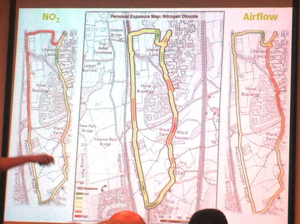
Exposure to air pollution: the quantified self

Jonny Huck (Lancaster) gave one of my favourite presentations of the conference, and certainly one of the most visually impressive. It first explored personal sensors (for heart rate, breathing etc) and the internet of things (with small internet-connected devices), then combining the two to detail a device, based on Arduino, e-Health, Waspmote and Android, for monitoring exposure to pollution – combining breathing rate and air pollution levels – for a walk around the campus at Lancaster University, where climbing up steep hills in the campus had as much impact as walking alongside major roads. It’s early stage research and I’m not sure the very intrusive breathing monitor is going to catch on, but certainly points to a quantified future. At CASA, we have started to acquire and evaluate personal and environmental sensors, with FitBits and pollution sensors in the office, so a CASA-centric approach to this kind of research might not be too far off.

IMG_5776

The final session of the day took the form of a series of plenaries about interdisciplinary research. While some of these were interesting in their own right (particularly, an unexpected one on cellular biology!) I didn’t get as much out of them as I did from the paper sessions.

At the end of the second day of the conference most people went to the dinner – I didn’t have a ticket for this though, so headed back to central Glasgow with Addy, who’s written up his thoughts on the conference here on the EDINA Go-Geo blog. My comments on the final day will appear in the final part, tomorrow.

Categories
Conferences Geodemographics

GISRUK 2014 (Part 1)

I was at the Geographic Information Systems Research United Kingdom (GISRUK) 2014 conference last week. GISRUK is the key GIS conference for early-career academic researchers in the UK and Ireland, and is hosted by a different university in the British Isles each year. The audience are mainly UK academics, with young researchers and professors in roughly equal attendance, along with some academics from abroad, including Malaysia, Nigeria and Canada. They are definitely more geo and less tech, the conference being relatively quiet on Twitter, especially compared to conferences such as State of the Map or Wherecamp EU.

This year the conference was hosted up at Glasgow University. Being tucked into the Easter break might have meant a reduced attendance on previous years. However, there were many good talks in the two parallel streams that ran through the three days of the conference – some 50 talks altogether, plus plenaries – and some talks were very popular, with attendees just about squeezing in to the venue.

In this post (and in the second and third parts, to follow) I’ve highlighted the talks that I found the most interesting. Of course, with two streams, there were inevitably interesting sessions which overlapped, and so I may have missed some of the best of all – in a couple of cases I ended up changing room half-way though a session. I’ve paraphrased the talk titles here.

Streets vs landmarks for text-based directions for pedestrians

This talk, given by William Mackaness from Edinburgh, was on an interesting study monitoring how people get from A to B, given one of two kinds of text directions – landmark based “turn left at the Bank of Scotland branch coming up on the left” or street based “continue on George Street, turn left onto Frederick Street in 500m” and monitored, with GPS and movement sensors, how well they moved through the urban realm, with landmark based directions proving better. Of course, these are harder for automated systems as street names a more uniform and consistent storage type than landmarks.

Clustering landmark tags in urban images

This was probably my favourite talk of the whole conference. By the same team as the above, it was presented by Phil Bartie (St Andrews) and outlined algorithms used to detect buildings and other landmarks from photos, by looking at where people tag interesting features in set photographs, how they tag them, and then linking the tags and locations together to try and separate visually close (but distinct) features, and combine different elements of the same feature that are spatially far apart. The heatmap examples used in the talk were compelling.

IMG_5764

Using social media data to assess crime hotspots

Nick Malleson’s (Leeds) talk looked at tackling the “daytime population” problem – crime statistics tend to exaggerate city centres, as these have a large daytime population but a low residential (i.e. census/official) population, which areas are typically normalised by to produce a crime rate. By looking at georeferenced social media activity as a proxy for daytime population, the city centre hotspots disappear and move into the most deprived suburbs – although these need to be controlled also by a possible lower-than-average use of social media in such areas.

IMG_5765

Exploring links between coal-mining, deprivation and health

This known link was mapped out well by Paul Norman (Leeds), using some great maps of the relevant census data. The talk included a potted history of coal mines and their phased closures. The study was longitudinal – combining statistics over multiple censuses, with data on opening and closing of mines (mine opening dates often being hard to determine).

IMG_5771

At the end of the first day of the conference, therewas a reception at the opulent City Chambers in the centre of Glasgow, where I had the novelty of being served a glass of Irn Bru (Scotland’s other national drink, and tougher to find in London) by a waiter, in a room surrounded with marble and various paintings of former council leaders!

IMG_5769

Part two to follow tomorrow. Addy Pope at EDINA Go-Geo has also reviewed the conference.

Categories
Data Graphics Geodemographics London

Data Windows

datawindows
Our 10×10 artwork for 2013.

This is a data visualisation artwork created by Dr Cheshire (@spatialanalysis) and myself. We were invited to submit an entry to 10X10 Drawing the City London, run by the building design charity Article 25. The submissions, including various from “real” artists and architects, will then be auctioned in November to raise funds for the charity’s projects.

Our technological, cartographical and geographical skills are almost certainly better than our artistic ability, so we decided to let technology create our artwork. We took the 2011 census data for the target area (Shoreditch) and combined it with building data from Ordnance Survey Vector Map District, creating a 3×3 panel. Colorbrewer colour ramps, supplied in QGIS 2.0, were used, to colour each panel differently.

The resulting artwork is completely based on open data, licensed under the Open Government Licence.

A single physical copy was printed directly onto white canvas, using specialised equipment operated by Miles Irving at the Drawing Office in UCL Geography. He mounted it onto a wooden frame. The resulting artwork can be seen above and has now been passed to Article 25 for their exhibition and auction next month.

Update: They invited us back for 2014 and 2015, and we produced maps for these latter two editions too.

2014 was taken from an old high-resolution Ordnance Survey map, which we vectorised and stylised:

Our 10×10 artwork for 2014.

Our 2015 map was from GIS digital raster data – using a high-resolution DEM for our square, and styling it in Illustrator:

Our 10×10 artwork for 2015.
Categories
Geodemographics

This Place

thisplace1

This Place was a visualisation of 2011 Census data for England and Wales, for your local area. [It is now offline.]

I’ve been meaning to adapt Michal Miguski‘s This Tract for the 2011 UK Census, ever since I saw it a couple of years ago showing the 2000 US Census. The clear, clean styling – simple a map of the local area, and a nice table of pie charts – was a world away from the choropleth maps I’ve produced previously. The most striking feature is what’s not there – when you are looking at a particular area, the surrounding areas are blanked out – they don’t distract.

Following the release of fine-grained 2011 Census data at the end of last month, at least for England and Wales, I’ve spent some time getting the data into the equivalent format and also customising the website with UK-specific metrics. The end result is not architectured in quite such an elegant way as Michal’s – his version uses geographical information direct from the “official” Census site, courtesy of their web services, and predefined static datafiles, whereas mine makes numerous queries to a local database – so his would scale better, although mine is backed by a decent academic server.

thisplace2

I’ve used different colour ramps for each of the metrics – for ethnicity I used a rainbow-based colour ramp. The attempt is that the “colourfulness” of the wheel shows the ethnic diversity of an area. A fully diverse area will have significant proportions of every colour, creating a “wheel” of colour.

Lots of interesting results – for example, parts of London are very diverse while there’s plenty of places which are extremely homogenous – but not always with White British. Sometimes there’s a two-way split. As you might expect, parts of university towns have a young and highly educated population. The centres of major cities have many more men than women living there, and seaside results have an old population. Deep in the rural countryside, primary industries such as farming are popular. Liverpool’s large public sector workforce is clear.

One undocumented feature – you can input the MSOA code (found at the bottom of the page) into the search box, or the URL, to create a weblink specifically for that area. At the moment, my smallest unit geography is MSOA – the size is about right, but the boundaries of MSOA can be very arbitrary. If the data is released at ward level I may well switch to that.

The mapping for This Place comes from MapQuest Open, which is MapQuest-style map based on OpenStreetMap data. ThisPlace is now offline.

Categories
Geodemographics

A Map of Scotland’s Deprivation

newbooth_edinburgh

[Updated] About this time last year, I created a “Map of the Geodemographics of Great Britain” which included the Output Area classifications (OAC) for GB, based on the 2001 Census, and also included the Index of Multiple Deprivation (IMD) for England, published in 2010. At the time, there was no up-to-date equivalent to the IMD for Scotland. However the 2012 SIMD (Scottish IMD) has recently been published, and I’ve applied the resulting datasets to my map, using the same technique of filling in just the buildings, rather than all the land, in the appropriate colour (a red-yellow-green Colorbrewer ramp from most to least deprived).

The SIMD and IMD are calculated in a similar way – by looking at measurements of poverty for each area across several categories (e.g. education, crime, income) – however the details of the way the measures are taken is slightly different between the two countries. Additionally each index is based on the range of deprivation found in that country. This means that the indices should not be directly compared across the two countries, i.e. A dark green area in Scotland only has the same relative level of deprivation to similarly coloured areas in Scotland, not in England. Accordingly, the website does not show the two IMD maps at the same time – there is a toggle at the bottom to switch between the two (and to the OAC). As an example – just because Edinburgh is largely green does not mean that it has the same leve of affluence/deprivation, on absolute terms, as a similarly-coloured city in England.

Nonetheless, comparisons within Scotland are perfectly valid, and the differences between the cities are striking – most notably Edinburgh vs Glasgow. See the whole map here.

[Update – I have created a new user interface for SIMD12, you can see it at CDRC Maps]

As always with classifications, remember that they represent an average throughout the geographical area concerned – in Scotland this area is known as a Data Zone, which is similar to an English Output Area (as an aside, the SIMD is more fine-grained than the IMD – the latter uses a more aggregated measure). This means that the colour covering a house is not a measure for that house, simply that that house is within an area where the average SIMD is that value. Also, non-residential buildings get coloured, as the dataset I’m using for the building (Ordnance Survey Vector Map District, via the OS Open Data releases) does not distinguish building types. The SIMD of buildings that have no occupants is meaningless, and they are not included in the underlying calculation.

newbooth_glasgow

Categories
Geodemographics

Modal Council Tax Bands in England

Here’s a map of England, overlaid on it is a choropleth map showing the modal (i.e most common) council tax band within each Census Output Area (OA) in England, based on March 2011 data released by the Office of National Statistics and listed on data.gov.uk.

I’m using a manually created colour ramp instead of a “standard” (i.e. ColorBrewer) diverging or sequential ramp, to emphasise the outliers (the big, expensive Band H houses and the small, cheap Band A ones) and try and reduce the “patchwork quilt” effect that you get when looking at such a map (which has nearly 170000 areas.) Another way to minimise this effect would have been to use larger geographies (LSOAs and MSOAs) at the smaller scales.

The map shows a swathe of light blue Band A housing across the north of England, and in Birmingham. In London, generally this doesn’t happen, and indeed a band of very large, expensive houses, protrudes from the affluant commuter belt right into the centre of London, from the south-west and north.

The map was created using UCL CASA’s MapTube, with a CSV file, descriptor file and stylesheet being the inputs. Welsh council tax bands use a different scale so are not included here. The Scotland/N.I. data is not available through the ONS website.

A gotcha when producing this map is that the file uses the new (2011) identifiers for OAs. Thankfully I found a file that maps the old to the new ones, although it took a bit of sleuthing to find it on the ONS website.

A zoomable, explorable version of the map is available..

Categories
Geodemographics London

Reworking Booth: Geodemographics of Housing

[Update January 2013 – Scottish SIMD 2012 map added, more details.]

I’ve created a new visualisation, a dasymetric map of housing demographics which you can see here, which attempts to improve on the common thematic (a.k.a. choropleth) maps – a traditional example is shown below – where areas across the country are colour-coded according to some attribute. My visualisation clips the colour-coding to the building outlines in each area, leaving open ground, parks etc uncoloured.

The Traditional Approach

The shortcoming of choropleth maps is that each area is coloured uniformly. If the attribute being measured is a property of the houses in that area, such as much of the census data, then choropleth maps not only colour the houses in each area, but also the parks, rivers and mountains that might also be contained within the area, even though the data being displayed arguably only applies to the houses. This means that geodemographic classification results that predominate in rural areas tend to overwhelm a map at smaller scales – as can be seen in the map on the right – where the green represents a countryside geodemographic.

An alternative to choropleth maps is to use cartograms. These distort the area, elastically, to tessellating hexagonal groups or to circles (Dorling cartograms), to match typically population rather than geographic extent, so that the colours are represented more fairly, but cartograms are very difficult for most people to interpret and relate to familiar physical features. They can look very “alien”. One further alternative is dot distribution maps – these assign dots of colour, randomly within each area. This reduces the colour density correctly in sparsely populated areas, but distributes the dots evenly across empty parks and rows of houses, if both are in a single area, and imply single points of population.

Clipping the Choropleth Maps

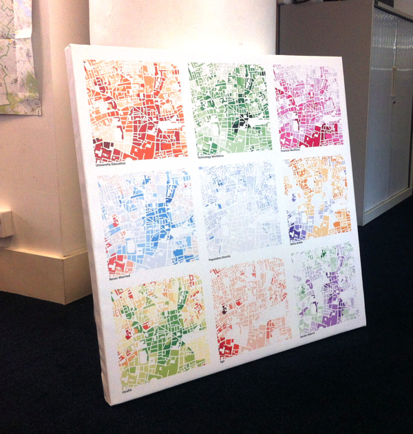
My visualisation attempts be the best of both worlds, by retaining the familiar geographic shape of the UK and its towns and cities, but not swamping the map with colours in all areas, and indeed ensuring that unpopulated areas have no colour. This is possible because Ordnance Survey Open Data includes Vector Map District. The second release of this dataset improved the quality of building outlines considerably, allowing distinct rows of buildings on streets to be seen and even individual detached houses. Unfortunately building classifications are not included, so the process necessarily colours all buildings, rather than just the residential ones that formed part of the census data. This is why, for example, the Millennium Dome in Greenwich appears, even though no one (hopefully!) lives there.

The major shortcoming of doing this is that it falsely implies a higher level of precision within each Output Area, by often showing and colouring individual buildings, whereas the colour is representative as an average of the properties in the area concerned, rather than telling you something about that particular building itself. That is, the technique is showing no new or more detailed data than can be seen in the traditional choropleth maps, but tends to mislead the viewer otherwise. This is balanced by making the map seem more realistic, by not unformly covering everything in the area with a giant blob of a single colour.

The map can be considered to be a dasymetric map, albeit one where the spatial qualifier, population density, is one of two values – high (in a building) or zero (not in a building).

Booth’s Poverty Map

An inspiration for this kind of map is the Charles Booth Poverty Map of 1898-9, although my example is considerably less sophisticated. For this map, Booth (and his assistants) visited every house, to determine the demographic of the house, and then painstakingly coloured in the houses, along the streets. His map therefore did not suffer from the falsely implied accuracy – his map really was as accurate as it looks. The Museum of London, incidentally, has a “walk in” Booth poverty map, I featured it on Mapping London blog last year.

The photo above compares Booth’s map (from a photo of the map in the Museum exhibition, including a friend’s hand) with my map, for the Hackney area in London.

OAC, IMD and London

My main geodemographic map is showing the OAC (Output Area Classification), which was created by Dan Vickers in Sheffield in 2005, and is based on data from the 2001 census. The areas used are Output Areas, there are around 210,000 of them in the UK, each one with a population of roughly 250 people in 2001.

The OAC map is not particularly illuminating for London – the capital is considerably more ethnically diverse than most other parts of the country, but because the clustering process used to create OAC is run across the whole country uniformly, only one Supergroup appears to show such ethnically diverse areas – “7” (Multicultural), rather than showing the variety within this group that extends across the capital. With this in mind I have created an alternative map, which colours the housing according to the IMD (Index of Multiple Deprivation) rankings. This covers England only, and the data is only available at larger spatial units, called LSOAs (Lower Super Output Areas) but is more up-to-date, being from 2010, and shows considerable more variety across London. Use the link at the bottom of the visualisation to switch between the two.

You can view the map here. It uses geolocation to attempt to zoom to your local area, if you allow it to – it will probably ask you to allow this when you visit the site.

Categories
Data Graphics Geodemographics OpenStreetMap

Main Street UK

GEMMA is the project I’ve been working on for the last six months, it’s one of the JISCgeo projects and it is now released – although consider it to be beta as there are lots of bugs and UI quirks that we are aware of. More about GEMMA can be found on the project’s blog.

One use of the OpenStreetMap feature highlighter in GEMMA, that was suggested by one of the participants at the JISCgeo Meeting earlier this week where we launched the web application, and augmented by a friend who was trying it out, was mapping the occurrences of the “High Street” road name – and a few regional variations, namely Main Street, Front Street, Market Street, Fore Street and The Street. Using GEMMA, and the high level of completion of OpenStreetMap in the UK and Ireland, allows us to visually show the spatial patterns of such street names.

Here’s a stitched-together screenshot of the GEMMA webpage showing the pattern throughout the UK and part of Ireland:

It turns out that Main Street is popular in the Midlands and in Scotland and Ireland, and Front Street is popular in the North-East of England (around Newcastle) while High Street is used nearly everywhere in the UK – but only sparingly in Ireland. Market Street is popular in the Manchester and Devon areas. Fore Street is popular in Cornwall and The Street very popular in Essex and Kent.

Note that many parts of Northern Ireland and the Republic of Ireland, are not yet well mapped in OpenStreetMap, so the street names will be missing in some parts here. The base-map is copyright Google and the street data is CC-By-SA OpenStreetMap.

You can see the live version of the map here.

Categories
Conferences Geodemographics

The Census for the Google Generation

I presented a talk on web visualisation of Census data at a couple of of conferences last week – a seminar at the Market Research Society (MRS) in London on Monday, and an extended version at the Census 2011 Impact and Potential conference on Friday at the University of Manchester. The talk is a look at various visualisations on the web, mainly of the 2001 UK and 2010 US census datasets. It also mentions the CensusProfiler project I worked on last year. I used several examples of work from Chris Gale at UCL Geography, who is working on potential geodemographics of the 2011 census.

I certainly hope to see some of these ideas implemented when the 2011 census aggregate data starts to be released – the “second stage” release, of univariate table at quite detailed (output area) level, is likely to be the most interesting, and is scheduled to happen in late 2012 or 2013, following the first stage release of the core metrics next summer. Having Stamen’s ThisTract webpages, and CUNY’s ethnicity change swipe maps for the UK data, for example, would be excellent.

You can download the talk in PDF form from here.

Categories
Geodemographics Mashups

OAC Groups on MapTube – A Demographic Map of the UK

The 21 Output Area Classification Groups is a updated version of one of MapTube’s most popular maps of the UK’s geodemographic. The original has had over 17,000 views and the was the first map added to the social mapping website which now has had almost 1,000 maps uploaded to it.

The Output Area Classification takes data from over 50 variables from the 2001 census, and clusters it into 7 supergroups, each subdivided into 2-4 groups to make a total of 21. Each group indicates broadly similar characteristics. Each of the 220,000 output areas in the postcode (typically representing ~300 people, or ~6 postcodes) is assigned to a group best on the “best fit” for that area’s population, bearing in mind only one group can be assigned, regardless of the diversity of the population there.

The new map is improved from the original in several ways:

  • The map is now broken up into the 21 groups, rather than the 7 top-level supergroups, revealing greater detail of the UK’s geodemographic.
  • Taking advantage of new technology built into the latest MapTube release, you can now click on any point on the map, and see the name of the supergroup, group (and subgroup) for that particular area in the resulting popup.
  • The colour scheme has been modified slightly – the groups in the “Countryside” supergroup are sublter shades of green, so the map is not visually dominated by bright green when viewed at a small scale.
  • Each supergroup has a distinct colour, as before, and their constituent groups vary by brightness – e.g. the “Prospering Suburbs” supergroup’s four groups are different shades of red.
  • Northern Ireland is now included.
  • The source data is downloadable as a CSV file – follow the “More Information” link on the key.

Here is a special link to the map, with the “Satellite Hybrid” Google Map layer selected, which provides a contextual overlay to the new OAC Groups choropleth map, and maximum opacity – I think this version is the most useful view.

The new map is also currently the Featured Map on the MapTube homepage. (Disclaimer: this is only because I have access to the Featured Map picker!)