Categories
Bike Share Reviews

The State of Mobility: MaaS Consolidation on the Horizon?

Mobility is a complex and important topic in geography, planning and technology. My research only touches on a small part of the field, namely automated micromobility services (aka micro-MaaS?) such as bikeshare and escootershare, so it’s always interesting to see a wider viewpoint.

As such, I was interested when an acquaintance at HERE Mobility, an autonomous part of HERE Technologies (a major location platform provider), mentioned a new report they’ve recently published, the State of Mobility 2019. While there’s a myriad of information sources on mobility, which has evolved rapidly the last few years, with increasing urbanisation and big technology players funding driverless car research, a single document is a helpful read to keep track of what’s going on.

I’ve used the report to frame some of my own observations of the mobility space, as it stands, rather than a simple review of the report. So, to see HERE Mobility’s own take, you’ll need to download the report (signup link above).

Mobility + Cities = MaaS, Right Now

The report is clear that Mobility as a Service (MaaS) is the current driver of mobility research. That is, shared assets are the way of the future. When living in a dense city of the future, only the lucky few will have space for a car, an electric bike (and easy access to a workshop to fix it). Moreover, even if you do, parking it at the other end of your journey will be increasingly tough.

As a personal example (not in the report), 22 Bishopsgate in London, a tower under construction in the City of London, will have a daytime population of 12000, but will have 4 disabled car parking spaces, no regular ones, and 1700 bicycle parking spaces. The other 80-90% will arrive by public transport. Great – but the trains and tubes of London don’t have much in the way of spare space for the extra people at this and other developments. So, MaaS will become increasingly important in such an environment. You need a bike or would prefer a private ride to a meeting? A fleet of cabs or electric bikes are at your service. The system is patchy now, with rival operators of both modes not particularly integrating well – but the options are there and will only become more important – and their integration is crucial for a useful system that serves all. This is an obvious point but also one that HERE Mobility’s business is staked on – as it aims to become an honest broker of MaaS services rather as a provider itself.

The report emphasises that while MaaS technology is going to have to get smarter – we are going to have to get better at utilising the newer ways of moving through the urban environment, too. The report points out too three technology components of MaaS – the backend crunching big data to create a smart fleet and smart usage of it, a mobile app so the user can get information on MaaS options and perform transactions, and the asset itself having technology, being aware of what it is, where it is, and what it is capable of doing – a so called Internet of Things (IoT) platform. For example, your electric bike (aka pedelec) needs to have a good idea of its remaining battery range and whether it is inside an allowed operating area.

Design Globally but Think Locally

Another key point as that the US is not Europe (and neither are Asia, I would add) – and so MaaS solutions in one of these regions is not necessarily going to ride in the other. Another personal example would be bikeshare.

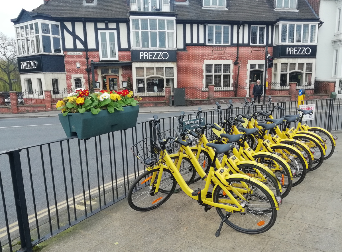
In Europe, we had Asian-origin bikeshares arriving in 2017-8 (Ofo, Mobike and oBike to name but three) but European and Asian cities and city cultures are fundamentally different. European cities tend to not have the huge pavements of Asian cities or huge roads of American and Asian cities, but we do tend to have a problem with vandalism and theft at a level that is less seen certainly in much of Asia. So, a one-size-fits-all bikeshare is not going to work here.

Similarly we are currently having a wave of US-origin bikeshares and escootershares (Bird, JUMP and Lime). Again, narrow pavements may struggle with the physical equipment, although at least technologies have improved to secure assets more effectively.

HERE Mobility’s report uses the example of the fundamental difference of European and US transport networks – with US cities typically being more car-designed, with wider, straighter roads, while European cities have often had a bigger focus on public transport, such as bus lanes or subway networks. If MaaS is going to come in and act as a complement to both types of cities, then it has to be adapted accordingly. Regulatory differences in the regions are also a factor – while the US has been keen to lead on autonomous vehicle research but introducing sections of public roads in some cities an states where such vehicles can be trialled, European cities often restrict cars of all sorts from large parts of their city centres.

The report’s most interesting section disseminates a survey of over 20000 people, around 50% in each of the US and Europe. Within Europe, they split out northern Europe (UK/Scandinavia/Netherlands) from the big continental players (France/Germany/Spain).

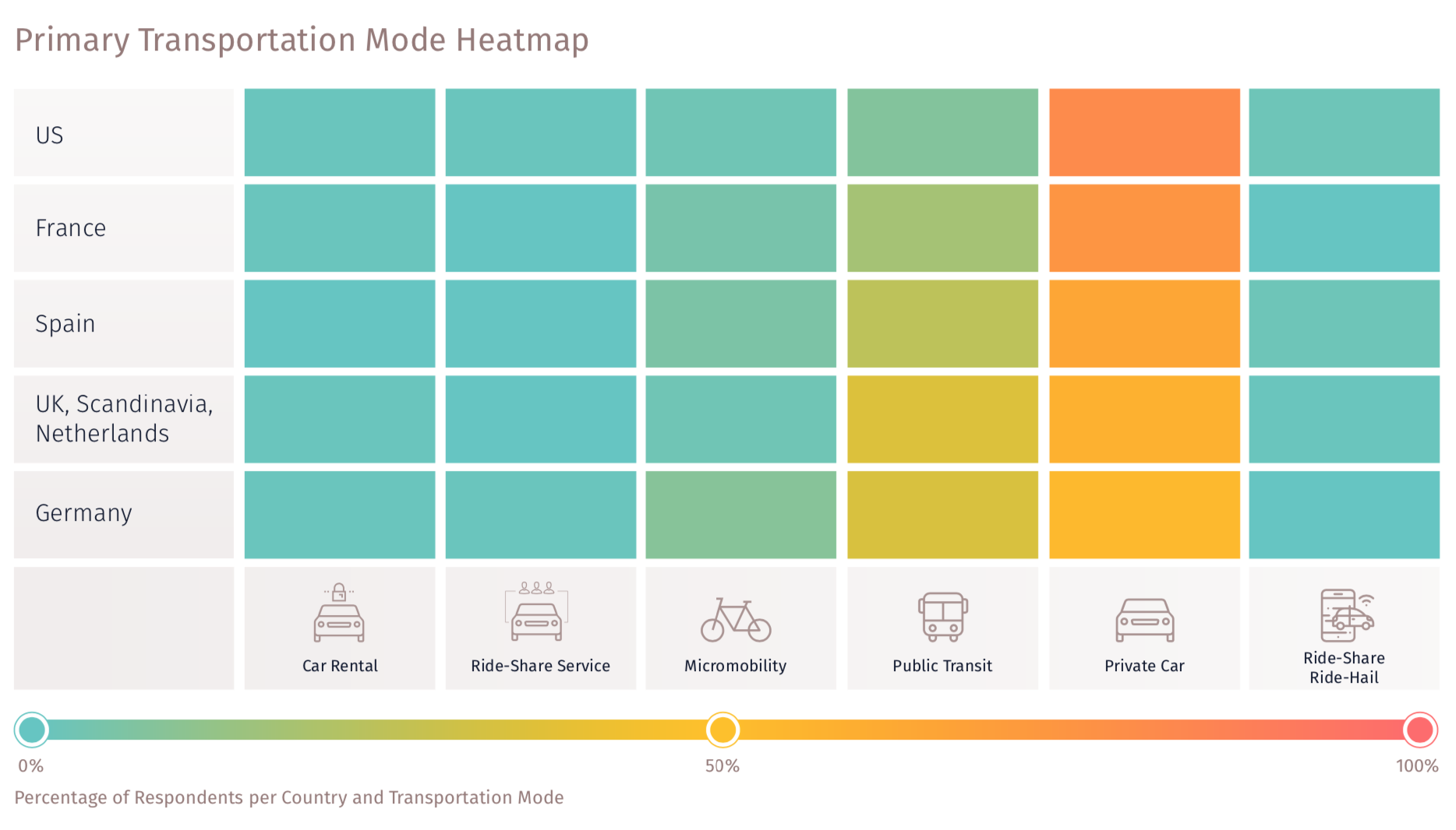
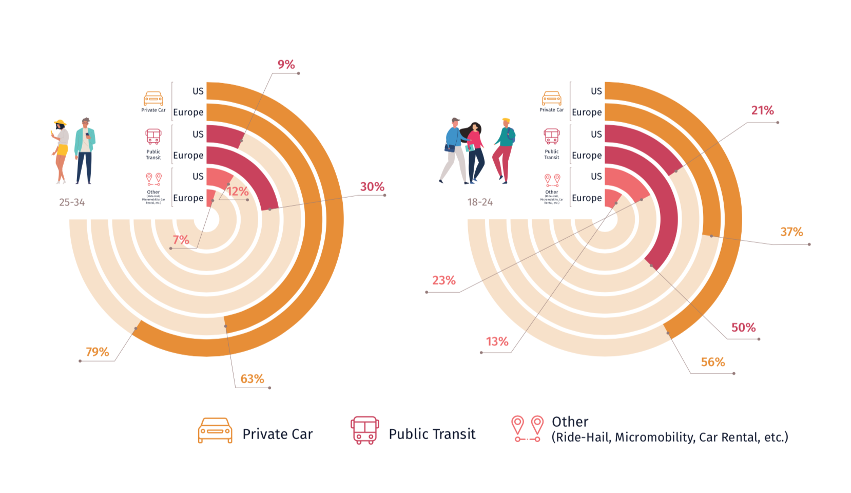
The differences between US, northern Europe and southern Europe are noticeable. Unsurprisingly the car dominates as the “primary” transportation mode in all three regions. In Europe a significant minority use public transport, and in continental Europe in particularly, micromobility also makes an appearance, indicating that Germany, France and Spain are ahead of the game not only with respect to the US but with their more northern neighbours. The other modes in the survey: car rental, ride hail and rideshare, have very low usages throughout the surveyed regions. The survey also breaks down by age group across each region and mode type, with the only significant difference being the youngest group (18-24) using public transport a lot more than the other groups – and US 18-24 year-olds using rideshare/micromobility noticeably more:

Transport App Consolidation

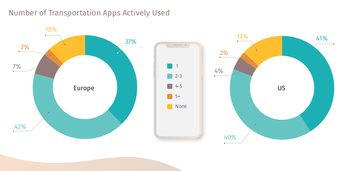
As mentioned above, HERE Mobility is aiming to be a “neutral” MaaS marketplace and so the final part of the survey focuses on the current situation on many people’s mobile phones – multiple apps needed for utilising all the transportation options in a city, along with measuring the desire for such a consolidation for service discovery and payment:

The final part of the report summarises the survey looks to the future. The authors note that it’s not all about price and that a more expensive but higher quality commute, if suggested by an app, might win out. Users generally also are not going to keep multiple transportation apps on their phones although they may try them out for a limited amount of time. And finally, private car usage is very much expected to continue to decline. The report sites Whim, a Helsinki based system that integrates all MaaS modes, from multiple providers, into a single app, is resulting in some very positive outcomes after only its first year of operation.

Here in London, and again focusing on the bikeshare services here, we are seeing some limited horiztonal and vertical consolidation, but we are a long way from rival services sharing their provision data. In terms of apps showing multiple services:

  • Uber has its JUMP bike service, and Transport for London (TfL)’s open data public transport information, integrated into its main app.
  • Google has included the TfL public transport data along with TfL’s (open data) bikeshare (through an ITO data brokerage agreement) and Lime bikeshare, and Uber and a couple of other cab and rideshare servies, into its app, although not Uber’s bikeshare. Apple Maps is similar.
  • CityMapper has Mobike, Lime and Santander Cycles bikeshares, but not Uber’s JUMP, along with TfL data but no cabs.
  • TfL’s own journey planner just includes its services.
  • A number of smaller services (e.g. London’s Beryl Bikes) have started to publish location information in open data formats but these are generally below the radar of multi-option aggregators and so have not yet been adopted.
  • Transactions (i.e. payment) involve, in almost all cases, the user getting redirected from their planning app to the providers app, with the notable exception of CityMapper and TfL services – but if you are signed up for their “CityMapper Pass”

So, a long way to go in London and – indeed – the rest of the world.

Thanks to HERE Mobility for sending me a copy of the report.

Categories
Reviews

Huawei P Smart Review

Through The Insiders I recently received a Huawei P Smart smartphone at a special rate. Here’s a review of it and some notes, a couple of weeks in:

The Huawei P Smart is a new “budget” phone launched by Huawei in the UK in early 2018, around the same time as its premium featured/priced P20 range, but an attractive price-point (£230 list price, in practice around £200) compared with £600+ for the P20 series.

The transfer process was straightforward. First I made sure my Whatsapp history was auto-backed up to Google Drive, then I simply removed my current SIM, snapped out the Nano shape and put it in the new phone, transferring my SD memory card at the same time. I then installed Phone Clone on both phones, the app creating a phone-to-phone network and then copying all applications

The Good

  • Comes in a nice compact Apple-style white box.
  • The fingerprint unlock mechanism is simple to set up and works very well.
  • The phone is a really nice physical design, with a curved edge and nice, black back with thin two metal bars to add a nice bit of styling. The logo is the bottom rather than the top, which is a bit weird but I’m getting used to it there.
  • Comes with USB Micro socket for charging, and a nice compact charger with a pop-up third pin. USB Micro cables/chargers are widely available so it’s good to have this as the charging solution rather than the still rare USB C.
  • Quite quick to charge – around 3 hours from empty to 100%.
  • Comes part charged (~60%) out of the box.
  • Comes with a decent looking pair of headphones, and a regular headphone socket.
  • Takes nano SIMs and Micro SD card on the same slideout tray
  • The screen is lovely and sharp.
  • Both front and rear cameras take excellent, sharp photos (see the examples above and below).
  • The “Bokeh” effect, while not being perfect (see grumble below) produces really nice “portrait” photos, as long as you have the distance right and good lighting conditions. A great example is a photo I took of a colleague above.
  • Comes with Android v8 which is a great UI and well designed, with an improved permissions request mechanism and more UI consistency.
  • Definitely a lot snappier than my Ascend G7 was, with the same number of apps loaded/open.
  • Not too many “junk” apps installed on it.
  • Nice auto-switch between mobile network data and Wifi data. One of my perenial annoyances was where I would auto-connect to a Wifi network and then not get data as I was not logged into it. Now, it will just switch back to the mobile data without me needing to disconnect the Wifi manually. Conversely, it will also auto-connect to new open Wifi networks it finds, seamlessly, for saving on mobile data usage limits.
  • Only a single speaker – but this a good thing, phones are juke-boxes to irritate near people with, the speaker should just be for ringing, or use the nice stereo headphones.

The Bad

  • It only lasted about 30 hours between its first charge to 100%, and being empty, with “normal use” (no videos). I was hoping it would manage to go 2 days and 1 night without a charge, at least for its first year, like the Huawei Ascend G7 it is replacing. Since then, it’s done a little better. With light use it will manage a couple of days. But if you spend a day at an event (e.g. wedding reception), taking lots of photos and maybe using the map a few times, it will be out of power before the end of the day.
  • This is the first Huawei “budget” phone to have dual back cameras for simulating low F Number effects (allowing for blurring of background detail while bringing the only subject into sharp focus). This works quite well but is not perfect – perhaps because the second camera, which is calculating the depth of field, is low-resolution (2MP). So, it doesn’t quite get the blur/not blur boundary quite right.
  • It is also not obvious how to start using this feature. Basically, it is activated by using the Portrait mode.
  • Photo processing tends to aggressively sharpen images, causing a halo effect for certain shots.
  • The system occasionally pauses/hangs for a few seconds, e.g. when reopening Google Maps, or going from standby to taking a photo with the camera. It’s something that my older phone did all the time, but I was hoping that this newer one would never suffer these pauses.
  • In the default keyboard, the space bar has been shifted slightly to the right. This means I keep hitting the new Emoji button which is in the middle-left, where the space bar used to extend to, and so keep putting in Emojis when I was just hoping to have a space…
  • Out of the box, the system uses 7GB of space, so you have 7GB less to play with, than is written on the box (so 25GB rather than 32GB in my case). Slightly confusingly, the space is called “ROM” on the box, which I always thought was Read Only Memory. These days its referring to the solid-state internal memory space for storing files/photos.

Conclusion: It’s not perfect, but for £200 SIM-free this is an excellent smartphone, well built, powerful and with some good premium features. Just be prepared to watch that battery, and be patient when waking it.

Categories
Reviews

Testing Map-Based UIs for Self-Driving Cars: HERE’s Knight Rider

I was kindly invited, earlier this week, to take part in “insideHERE” in Berlin, a small event run at the HERE HQ in Berlin. HERE, being born out of the ashes of Navteq and Nokia Maps, is now owned by a consortium of German car companies. For the special event, HERE’s developers and engineers opened up their research labs and revealed their state-of-the-art mapping and location services work. HERE Auto is making a real play to be the “Sat Nav of the future”, competing directly with Google and Apple to create, manage and augment data between your smartphone and your car. Tomorrow I’ll outline the general visualisation work I saw that demonstrates their high-precision spatial datasets, but first, today, I mention one particular research project which shows how maps will be continue to be a crucial part of driving, even when cars drive themselves.

“Knight Rider” is a test rig, built to simulate a car, where the engineers and UI/UX designers can try out different configurations and locations of controls and maps on a dashboard. They key aspect being tested is how much trust the user can place in the car, based on what they can see and information that is displayed. Testers can sit in the “car” and drive it, to experience map/control designs and, crucially, how it feels to give up the steering wheel but continue to have the confidence that the journey will proceed as planned! Large exterior screens, fans and a windshield provide some depth of realism. The intention is not to create a realistic driving simulator, completely with fully photorealistic buildings and roads, but instead to get the tester as comfortable as possible to evaluate the designs effectively, before they are put in a real test car on the road.

When we saw the rig, it was configured with maps in three places – a short but wide one that wraps across the dashboard, a circular map that sits just to the right of the dashboard, beside the steering wheel, and finally a heads-up display (HUD) that reflects in the windshield, this achieved by a carefully angled screen pointing upwards.

The dashboard map shows a single map, behind the regular digital numbers/dials you would expect on a normal dashboard. The map here switched between a general 3D overview of the journey ahead, when “cruising”, to a more detailed, but still a “helicopter” 3D view, when carrying out manoeuvres such as approaching a destination or a complex junction:

dashmap1

dashmap2

The panel alongside typically shows an overhead map, in a circle with your location on the centre, it rotates as you move:

circlemap
It is also the main drive control panel when not steering, for example if you want to tell the car to overtake a car in front, the AI having decided not to do so already – you are not steering that car here, but “influencing” the AI to indicate that you would like it to do this, if safe:

circlemap2

Finally, the HUD necessarily does not show much information at all, apart from a basic indication of nearby traffic (so that you are reassured the computer can see it!) and any indication of hazards ahead. You mainly want to be looking though the window for the traffic yourself, of course:

hud

The key interaction being tested is changing from human to computer controlled driving, and back. The first is achieved by listening for the comptuer voice prompt, then letting go of the steering wheel once asked to. If you don’t retake control of the car when you need to, for instance as you are changing onto a class of road for which autonomous driving is not available, and you have ignored the voice prompts, then then the car will park up as soon as it’s safe to do so.

It’s an impressive simulator and crucial to shaping the UI of the autonomous cars which are starting to appear on the horizon, in the distance, now.

Photos and video courtesy of HERE Maps.

Categories
Reviews

Book Review: GIS Cartography (2nd Ed)

GIS software is used by many professionals to process spatial information, but the results are often poorly presented and the resulting map can be unattractive. GIS packages, such as QGIS, are increasingly including a broad range of cartographic styling and map design options, to present synthesised spatial data attractively, but it remains all too easy to produce a map without due consideration for its presentation. The old, non-geospatial approach produces beautiful maps in regular graphic applications, e.g. Illustrator, but these lose the data linkages and spatial analysis capabilities of GIS that produce the data to be mapped in the first place. Then there’s the new “slippy map” online map websites that provide a whole new set of tools to allow anyone – be they a geospatial professional or not – to create maps. It can however be all to easy to produce maps with these tools that are unhelpful, look ugly, are difficult to interpret or worst of all are downright misleading.

GIS Cartography, by Gretchen Peterson, is a book that seeks to address these problems, seeking to guide GIS software users and web designers alike to produce maps that contain good cartographic design, harking back to when maps were produced by a dedicated “offline” cartographer. The book does this by taking a structured approach to the elements of data-driven maps, and examining and commenting on each of these in detail.

The book is largely technology-agnostic, not detailing operations for specific GIS software or online mapping APIs but instead outlining the basic concepts of good digital maps that users of such software should normally be able to implement. Peterson is not afraid to espouse her opinion – her experience in the field means that her view is a salient and sensible one. For example, the author has a distinct dislike for the use of logos on maps – arguing for them to be minimised – or ideally dropped altogether, while making the creator’s name more prominent than is often the case. I particularly liked the discussion on fonts and the display of text – perhaps not an area traditionally dwelled on by GIS-focused map makers. For example, different kinds of text halo application are demonstrated well, with a set of excellent graphics. One section of the book that I felt was overlong however was the section on the colour palettes for feature types. Gretchen is attempting to cover all common types of GIS maps (from political to soil) but the detail is overwhelming. By contrast, the section detailing colour blindness issues with maps (which I frequently get caught out with) was succinct.

Online cartography is dealt with in the last chapter “Zoom-Level Design”. This section reflects the recent rise of online mapping software (Google Maps, OpenLayers, Leaflet, etc) used by non-professionals, with the core part of the book solidly focused on the regular desktop GIS (ArcGIS, QGIS, MapInfo, etc). The section focuses on the issues of scale and generalisation for maps designed to be viewed rapidly at multiple zoom levels. Ideally the book would integrate the online and offline (or “slippy map” and “GIS window”) worlds throughout its length rather than addressing online mapping in a single chapter. Of course, many of the aspects presented in the main part of the book – particularly relating to colour and adornments – are also applicable to this kind of mapping.

One slight irony is the variable quality in the design and reproduction of the illustrations in the book itself. Many of them are rather traditional looking, and some are quite pixellated. The generic look is likely because of the desire of the author to keep the book as neutral and platform-independent as possible.

Overall this is an excellent and comprehensive guide to ensuring high quality cartographic output from GIS users and slippy map creators. If you read it from cover you’ll build up an excellent set of guidelines for maps with a rigorous high quality. Alternatively you can dip in to it from time to time when you need advice on specific aspects of your mapmaking, such as tips on how to do scale bars or inset maps well. Even if you are already experienced with mapmaking from GIS software, you’ll quite become aware of design aspects you hadn’t previously considered. If you regularly create online maps, or find yourself increasingly using a GIS to create and output maps straight for presentation, this is an essential book in your professional collection.

GIS Cartography: A Guide to Effective Map Design (Second Edition)
Author: Gretchen Peterson, Publisher: CRC Press. 299 pages. Out now.

Further information on Amazon.

Thanks to the Society of Cartographers for arranging a review copy. This review may appear in the society’s Bulletin in due course. I am happy to accept copies for review of other books in this and related fields – send to Oliver O’Brien, Dept of Geography, UCL, Gower Street, London WC1E 6BT. Review copies can be returned on request, if an SAE is included.

Categories
Reviews

Review: Map of a Nation – A Biography of the Ordnance Survey

Map of a Nation, by Rachel Hewitt, comes in a large, chunky hard-back volume with a beautiful, gold-laced front depicting one of the Ordnance Survey’s earliest First Series maps, dated 1810. The book documents, in often immense detail, the early history of the Ordnance Survey – from the activities leading up to its creation in the early 18th century, to the publication of its final First Series map in 1870.

Rather than being a general history of the OS, the book focuses on the lives of its first director generals, Mudge and Colby, and Roy, whose work led to the creation of the organisation. It details particularly the trigonometric survey, under which an accurate triangular network of known points was gradually built up, and the creation, alongside, of large and small scale maps.

The book is therefore somewhat misnamed – it’s really “Ordnance Survey: Its Birth and The Early Years”. I was disappointed that there is little discussion of the OS’s history after 1870, apart from in a brief Epilogue. The organisation’s more modern history was what indeed I had been most looking forward to. The cover notes mention a Ph.D thesis written by the same author a couple of years before the book’s publication, and I wonder if the book is largely based on the thesis. The language in some parts of the book is also quite formal, with the prose being sometimes on a level consummate with a professional thesis but a little above what would normally expected for a popular book. (A very flowery way of saying I didn’t understand every word in the book!)

The pacing of the book is generally quite good, it is on a near chronological basis, although does tend to jump back in time briefly for short sections. Perhaps too much time is spent on the pre-OS period, important though it is – the detailed biographical sections of the principal people involved, prior to the organisation’s foundation, weighed the narrative down a bit. Later on, the book’s pace picks up. The latter half of the book details the slow progress towards completion of the First Series, with various delays caused by creation of the Irish Survey and expeditions to Sinai and so on.

The book includes a short plate section with colour extracts of various paintings and maps. It is a pity though that it has no photographs of, for example, the monuments showing the endpoints of the original baseline across Hounslow Heath. (See these pictures by Diamond Geezer.)

A note for those that measure their progress through a book by the position of their bookmark – the narrative ends quite abruptly 114 pages before the end, with the rest taken up by the extremely comprehensive citation marks, citation references and index. Again, very worthy for a thesis – the content has been researched extremely thoroughly – but slightly overwhelming for a book like this.

In all, a rigid, well written and authoritative discussion of the first part of the Ordnance Survey’s history, but I was left wanting for more. This is not the OS’s complete biography!

You can see the book on Amazon. A paper-back edition is coming out in July.

Categories
Reviews

Reviews: Nike Lunarglide+ 2s

I’ve recently acquired a pair of Nike Lunarglide+ 2 running shoes, thanks to some quick decision making and a carefully timed run during the Nike Grid challenge back in November. These are the first Nike running shoes I’ve owned, and they certainly are very different – both to look at and to wear – than the standard “white/stripe padded” shoes I normally have, such as my Adidas adiStar Salvations.

The first thing that struck me – after noticing that they are luminous yellow and black – no white bits at all! – is they are very light indeed, the sides in particular are very thin, made in part seemingly from a single layer of translucent plastic, with no padding. Contrasting this, however, the heel is very firm, with a hard plastic “cup” on the outside and a bit of padding on the inside. At the top of the heel is a significant bit of padding. Having occasionally got blisters here from hard-heeled shoes, I was quite pleased to have this. The front of the shoe again is very thin, with little padding, and so looks very breathable.

I wouldn’t want to wear these shoes in an orienteering race, or even in a muddy field, as they are so light – the apparent lack of stitching means I wouldn’t want to subject them to rough terrain that would scratch the side of the shoe.

The back of the shoes have a small vertical reflective strip which is useful for being seen, particularly at night in urban areas, which just so happens to be the time of day and location that my club, SLOW, runs its regular Street-O events. There was one earlier this week, so I wore the Lunarglides to give them a road test. Other SLOW members were also sporting their Grid-won shoes, including some customised Nike+s with their initials on the back – nice! Anyway the race proved to be an ideal road-test, the terrain being purely tarmac, very hilly (Crystal Palace) and with lots of sharp corners allowing for some good grip testing.

Despite the shoes not being particularly padded, the heel is quite deep and they are extremely comfortable to wear and run in. I had no problems at all – after a few minutes of getting used to the lightness of the step. The initial part of the race was steeply downhill, on a tarmaced path which was damp from recent rain. The grip seemed to be fine on the shoes, with no slipping on the potentially treacherous slope. On the flat road they also seemed very responsive, and they coped with the twists and turns of the course – feeling fine after an hour of running.

To sum up, I think these shoes are excellent road shoes. I wouldn’t want to take them on terrain, but I have plenty of road training coming up for a marathon later this year, and will be alternating these with my Salvations as much as possible. Crucially, the light design and breathability means they should remain comfortable when running in warmer conditions this summer. Hopefully they should stay in one piece until then too.