Categories
Mashups OpenLayers

Manchester Map

This is the fifth in a series detailing the projects I have worked on at UCL in the last academic year.

manchester

This was born out of Alex acquiring a old (1094) map of Manchester showing the different housing types that existed back then. I put together some image tiles he created of the map, in OpenLayers, and combined it with some existing modern OAC demographic map tiles that I had created for a separate project, and Google mapping and aerial imagery. Vectors are not used on the map, but you can switch between, combine and reorder the raster layers, for quick visual comparison between the maps.

Alex blogs the creation process here, and you can see the map itself here.

Categories
Data Graphics Mashups OpenLayers

HE Profiler

This is the fourth in a series detailing the projects I have worked on at UCL in the last academic year.

The HE Profiler is the last of the three “core” school-profiling map mashups that I have developed over the last year – this has been developed over the last few weeks and indeed was finished only today, my final project of the year.

It is designed to be used by university widening-participation administrators, as a graphical tool to discover and evaluate the schools to target for campaigns to encourage university application. To do this, it makes use of two metrics – the OAC demographics of pupils attending each school, and the POLAR score of their postcode – in simple terms a National Statistics demographic describing the likelihood that people from this postcode go to university.

Again it is powered by OpenLayers, displaying point-based vector information on top of Google Maps image tiles, using NPE data for geocoding postcodes. The most interesting thing about this application is I’ve started to explore the very powerful rule/attribute based symbolisation for points available in OpenLayers. This sort of symbolisation will be, I expect, very useful in my next year’s project. I am very impressed with what can be done – some quite GIS-like properties present in a popular and freely available web application.

heprofiler

The graphic above shows target schools for a central-London university, based on the proportion of POLAR1/2 pupils (least likely to go to universities) compared with the rest. Schools with a majority of pupils in this category are coloured red. The area of each circle represents the number of such pupils present. The poor representation at university of the Thames Gateway region can be clearly seen. As an aside, the OAC demographic, not shown here, does not work well for London due to its size – the OAC is calibrated across the whole UK, and it is likely a more specific demographic analysis for London (e.g. LOAC) for schools there, would be more useful.

Categories
Mashups

School Catchments

This is the third in a series detailing the projects I have worked on at UCL in the last academic year.

catchments
School Catchments was developed to complement the Education Profiler. Like the Education Profiler, It is powered by OpenLayers, but uses Google Maps tiles as its background rather than custom OpenStreetMap-based ones. For each of the schools in the database, it loads in “catchment maps” for the GCSE and A-Level students. OpenLayers’ vector mapping is used to display them on the Google Map. These reveal the “real” catchment areas for a school, which may or may not correlate with the school’s official catchment area, if available (many schools choose not to publish this information.)

Most schools are roughly in the centre of their catchment area, but geographies, spatial distribution of population – and geodemographics – can all act to distort the contour’s shape. In general, the Roman Catholic and other faith schools have noticeably large catchment areas. Of the regular schools, poorly performing schools often have very small catchments. It should be noted that we only had geodemographic data for the state school sector.

The process of developing the catchment maps was interesting – the known postcodes for each pupil are geocoded and the resulting grid of locations is simplified into a single “contour”, generally surrounding at least 60% of the pupils. One requirement was that only a single contour is produced – problematic when one school serves two small and well spaced villages. The contours were created in R, a statistical programming language popular in the academic community – it’s popular in the department, but quite alien to my Java/PHP/python past. I found the learning curve rather steep and am still a “non-proficient” R coder. Most available documentation for R assumes a level of experience I do not have. Searching for R information in Google is a pain too, thanks to its name.

catchmentgen

The generation process is highlighted in the second half of this screen video that my boss produced for a presentation – in the context of the School Profiler that also included the catchments.

The website is also the first eCommerce site I’ve developed (my boss is planning on the catchment vectors being available only through a subscription.) It was interesting getting to grips with the eCommerce paradigm. After struggling for a while to try and make sense of Google Checkout (having assumed, incorrectly in this case, that Google=easy) I switched to using NoChex as the payment processor. It is impressively simple to use, if not well documented, and I got the end-to-end flow set up in only a couple of days.

The site is still in “test” mode and needs some polishing (and the underlying data updated) before a public release.

Categories
Mashups OpenLayers

The Education Atlas

This is the second in a series detailing the projects I have worked on at UCL in the last academic year.

This is a mashup, powered by OpenLayers, and using network data from OpenStreetMap (OSM) to provide a “contextual window” on top of choropleths (colour-region maps) representing various educational attributes. Both the choropleths and the OSM maps were created using Mapnik. Data from the NPEMap project is used to provide geocoding (locating from postcodes). Schools from the ShowUsABetterWay competition are available as a simple point-based vector layer.

This project has been through various iterations before ending up as a (sort-of) finished product. An earlier version was briefly demoed at the GISRUK 2009 conference in April at Durham. This was an “all-singing, all-dancing” mashup, which wowed the judges at the conference (it was entered in, and won, the Mashup Challenge competition) with its many layers and features, but was probably too complicated for the intended end use.

The functionality has been split into three different mashups – the first, the choropleths, form the Education Atlas. The school catchment contours are in a separate mashup, School Catchments, which I’ll talk about in a future post. The detailed metrics about each individual school are in a third application.

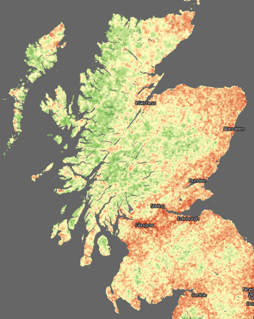
The choropleths mainly relate to academic attainment and geodemographic background (for GCSE pupils) and A-Level subject choice. Some interesting patterns emerge, for example French is particularly popular in Kent (funny that…) and Geography is more popular in the rural north of England than in the cities – as shown below. The demographic maps show a characteristic pattern of city poverty/underachievement compared with rural areas.

eduatlas

The resulting slimmed-down application is available at http://atlas.publicprofiler.org/, however it is only soft-launched, as the data is quite old, and there are some noticeable gaps in coverage, particularly in Manchester and Hampshire, where state school pupils generally don’t have any sixth-form provision in their secondary schools.

Noteable features, apart from the bespoke black-and-white “network” layer, are the keys, which change depending on the choropleth selected.

I presented some screenshots of the mashup, and talked about how it was made, at the RGS conference in Manchester, in August.

A screenshot of the mashup forms the banner of this blog.

Categories
Mashups

Modelling and Mashing

I’m coming up to the end of my current role at UCL, starting a new role (same department, same lab) on Thursday 1 October. Over the next couple of weeks, I’m going to outline the work I’ve been doing over the last year. The projects I’ll blog about are:

The core project:
1. Spatial interaction model for school to university flow

Core visualisations:
2. Education atlas
3. School catchments
4. HE profiler

Incidental visualisations:
5. Manchester map
6. HEFCE funding map

Preview of my next project:
7. Censusgiv prototype

Other work:
8. A Facebook application for names
9. The Splintdev blogs

Categories
Conferences Mashups OpenLayers OpenStreetMap

Education Profiling with an Open Source Geostack

I was in Manchester yesterday for the first day of the Royal Geographical Society annual conference. I gave a talk at the session called “New Urban Geography: Evolving Area Classification for Socio-Spatial Generalisation” which was convened by my boss Dr Alex Singleton and chaired by Prof Paul Longley, both also of the Department of Geography here at UCL.

My talk discussed a Web 2.0-style mashup of English school attainment and geodemographic data, which has been put together as an online “atlas” using OpenStreetMap data as a contextual layer, Mapnik to produce the graphics and OpenLayers to display them. The atlas is not yet complete, and the data is a little old, so it’s not being widely promoted yet, but if you are really keen on visiting it yourself you can find the URL by looking carefully in the presentation…

It is here.

[slideshare id=1914330&doc=openlayersandmapnik-090827073034-phpapp01]

Categories
Mashups OpenStreetMap

Map of UK Scenicness… and Pubs

picture-5

Here’s a little something [no longer online] I knocked up, based on the MySociety scenic score data release last week, as well as OpenStreetMap’s data for the UK – including particularly its pubs.

Basically, the vote point data was converted to a surface, using an IDW (Inverse-Distance Weighted) function. The cell size was pretty small (1km), so there isn’t much smoothing across many vote locations going on – a single vote may cause quite a steep gradient. Instead, the surface effectively extrapolates the values into all areas. Some jiggery-pokery was required to first project the votes onto the British National Grid (so that x/y distances become equivalent) and then the resulting surface was fully rasterised and reprojected to Spherical Mercator so that it could be tiled under the existing OpenStreetMap network overlay. This was surprisingly painful to do.

Note that the photographs that were voted on generally weren’t of the pubs shown on the map, so the pub might well be extremely photogenic – but in an area where the nearest Geograph photos used in the dataset for the voting were not rated highly.

It’s good to see that the Scottish Highlands come out so green (i.e. scenic.) Urban areas generally don’t do too well, although the voting was generally quite critical, so a yellowish hue is still a sign of a very scenic part of a city.

Data came from MySociety (using photographs from Geograph) and OpenStreetMap. The pub icon came from Wikimedia. The map tiles were produced using Mapnik for the OSM network overlay and MapTiler for the scenic map. The increasingly excellent OpenLayers is used to display the tiles, and a point vector layer showing the pubs.

There’s many areas with apparently no pubs at all. This is simply because the data wasn’t in OpenStreetMap when I pulled it in on Friday. However OpenStreetMap’s data is rapidly becoming more complete throughout the UK at the moment, so a future pull of the data should reveal many more pubs.

Some very remote areas don’t have any vote data either, but the production of the surface uses and extrapolates the values from nearby votes instead.

scotland
Categories
Mashups

ScenicOrNot

Those clever and inventive people at MySociety have created another slick website – now you can rate each square kilometre of the UK to help build up a map of the country’s prettiness.

See here to start voting! You’ll see a near-randomly selected photograph of a place in the UK – click 1-10 above the photo and you are on to the next one.

I hope that the Scottish Highlands come out very well – they certainly should do, many parts are very pretty when it’s not raining there…

I must declare a personal interest, as some of the photographs out there are mine. The scores for mine are pretty middle-of-the-road, as when I joined the Geograph project (which is where the photos are coming from) all the scenic areas near me had already had been well photographed.