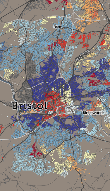
Top Industry maps the most popular employment for each of the ~220000 statistical small areas* within the UK. I’ve reused the “top result” (i.e. modal only) technique that has produced interesting maps for travel to work, to look at the Industry of Employment tables produced by the national statistics agencies, from the 2011 Census.
The tables I’ve used group each job into a Standard Industry Classification (SIC) category, I’ve then mapped which of these is the most popular. I’m mapping the home locations of workers, rather than where they work. I’m also only mapping where at least 20% of the working population falls into one of the categories. The “G: Wholesale retail trade, repair” category dominates through the UK – we are a nation of shopkeepers – so I’ve used a muted off-white colour to represent areas where this is the most popular. Other, rarer categories have more vivid colours.
 All sorts of interesing patterns appear:
- Manufacturing (mid-blue) in Derby vs education (red) and accommodation (light green) in Nottingham.
- Similarly, manufacturing in West Bromwich contrasts with a predominance of education and social work (pale orange) in nearby Birmingham.
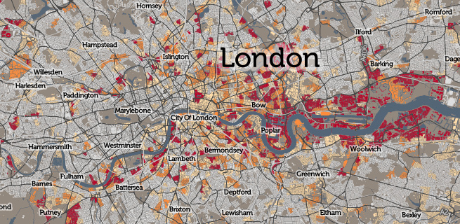
- London as ever is an interesting place, with a huge professional scientific and technical workforce (yellow) living in Islington, Wandsworth and Fulham, contrasting with the financial sector (dark orange) based in the West End, the City and Canary Wharf, near where they work. Stamford Hill’s traditional community stands out as a teaching hotspot.
- Crawley is full of transport workers (turquoise) for the nearby Gatwick Airport.
- An ICT community (purple) in Reading and neighbouring towns.
- Teaching and science in Cambridge.
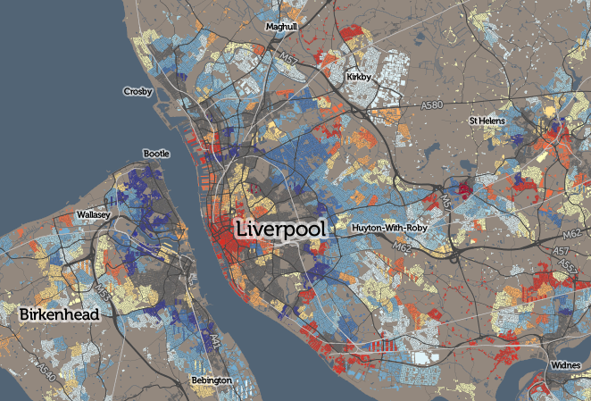
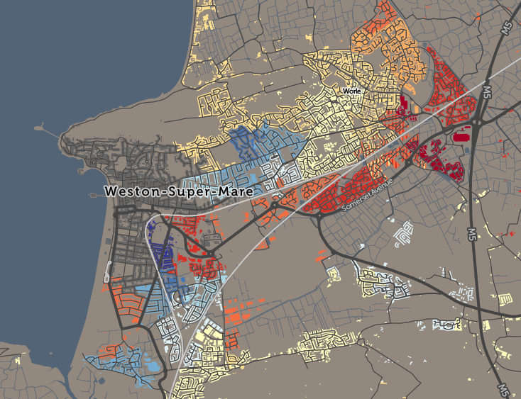
- Social work in Liverpool and Sussex seaside towns.
- American service personnel in Mildenhall (maroon), contrasting with manufacturing in nearby Thetford and arts/recreation (pink) in Newmarket, also not far away.
- Military bases (dark blue) in North Yorkshire.
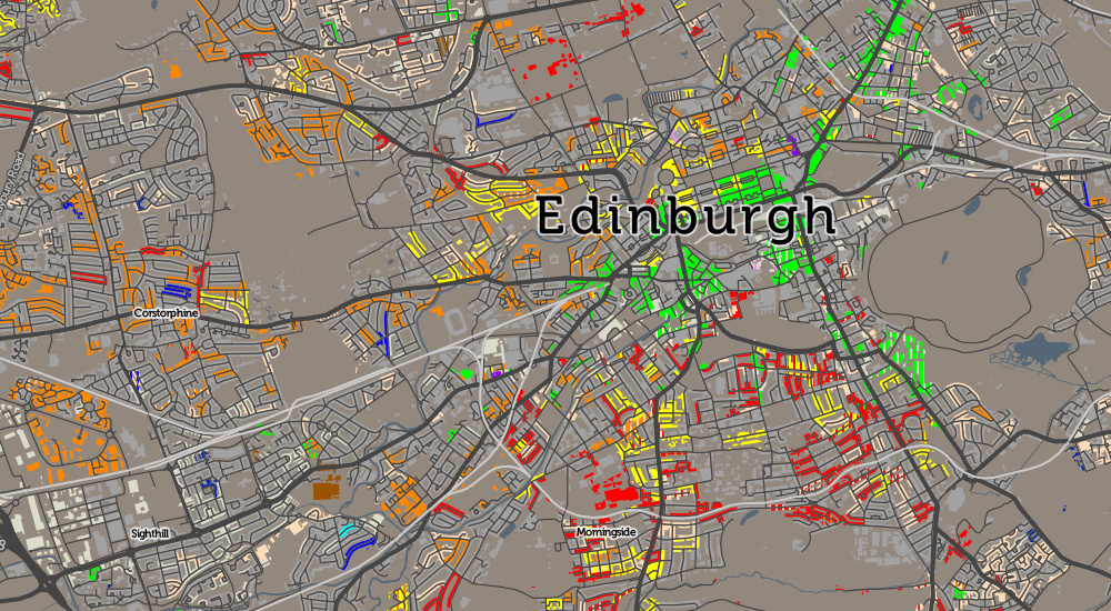
- Edinburgh shows less employment segregation, with communities of educators, science/technical professionals and financial workers spread throughout much of the city.
The map shows that the UK is far from homogenous when it comes to the industries and occupations that people work in. It reveals many areas where manufacturing remains the key employer for the local working community – typically mid-sized towns – while showing the diverse and uneven nature of the employment landscape in the larger cities. While remembering that the map is only showing the “top” (and second-top where relevant) industry category, and that other industry workers can also live in the same places, it still shows a structure and pattern consistent both with historical reasons for many of the communities’ development, but also the realities of the modern workforce, with new technology industries, and social work, becoming increasingly prevalent.
See the interactive map on CDRC Maps.
The data is available on CDRC Data.
* Known as Output Areas in Great Britain and Small Areas in Northern Ireland.