I wrote about a new dataset from the ONS, HPSSA (House Prices for Small Statistical Areas), a few years ago. The dataset has continued to be updated quarterly, and more recently, ONS started publishing the data at a more fine-grained spatial resolution, namely LSOAs (Lower Super Output Areas).
LSOAs typically each contain a population of 1000 people, or 400 houses, so, particularly in cities, mapping house price variation by LSOA, provides a good balance of spatial detail and ease of use. You can of course get individual house prices by looking at the Land Registry Price Paid Data, but the ONS HPSSA is a useful shortcut, particularly as it provides a rolling yearly average, so smoothing out variations caused by low transaction volumes in a small area. The ONS HPSSA data covers all of England and Wales.
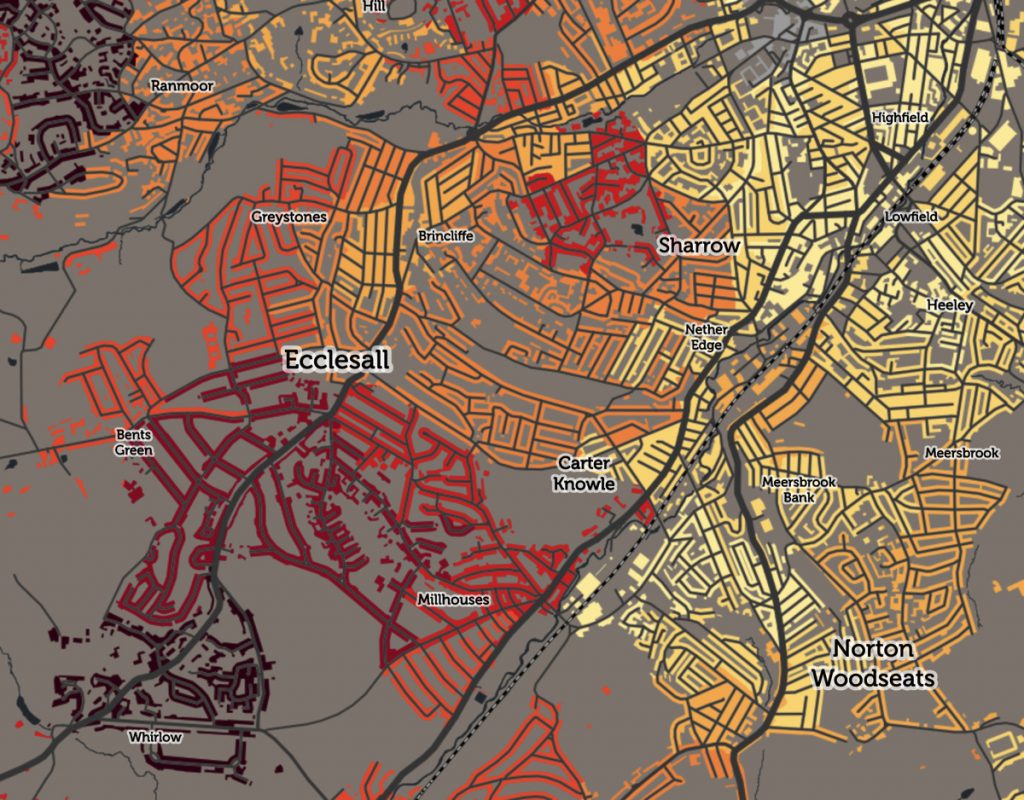
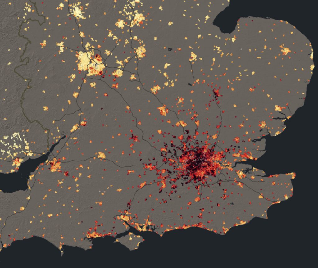
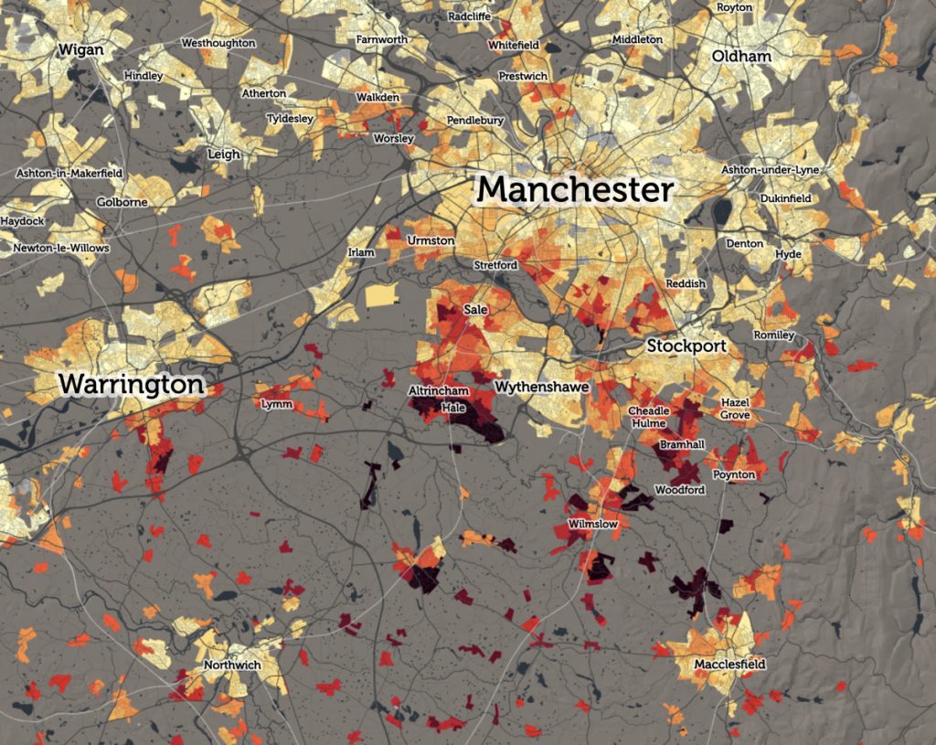
I’ve therefore published an updated map of median house prices on CDRC Data, to use the latest release of data, which is Q3 2018. I’ve also extended the key, to reflect that, since 2015, more of London is now firmly above the £500k level which was the previous highest band theshold on the map. The resulting map shows a “dark red cloud” of high-priced areas across much of London, Oxford and Cambridge, with only small areas of cheaper properties standing out in bright yellows – Dagenham, Edmonton and Hayes in London, and Orchard Park in Cambridge. Strikingly, many other cities and large towns also show a small red/maroon area, typically an enclave of expensive houses in an otherwise cheaper urban area (shown with yellows and oranges) – e.g. Solihull in Greater Birmingham, Clifton in Bristol, Hale in Greater Manchester and Gosforth in Newcastle.
Remember that these are median values – so 50% of the houses in each small area, that sold between Q3 2017 and Q2018, sold for more than the value shown, and 50% sold for less. Grey areas are where there were not enough house sales in the year, for a median value to be reported. These tend to be in older inner city areas where little public property transactions take place. Examples in London include Stamford Hill, the area around the just-opened Tottenham Hotspur stadium, and the area behind Euston station in central London, which is being extensively redeveloped. Large areas of social housing, where there simply aren’t properties available on the housing market, also often show up as grey, such as the Aylesbury and former Heygate Estates in Southwark.
The colour ramp is the inverse of that used by Dr Cheshire in his book London: The Information Capital, which depicted house prices in the city using a “fire” colour ramp, with cooler reds with more expensive areas burning bright with yellows/whites, while the highest price, “unaffordable” areas were shown as being completely burnt away from the map. By inverting the ramp, my map shows light, welcoming colours for more reasonably priced areas while inflated values are darkened out.
- Explore the interactive map on CDRC Maps.
- Download the data at CDRC Data.
- Find the source data files at ONS HPSSA.