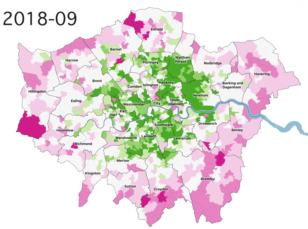
This map shows how different parts of London have over/underperformed with respect to the capital as a whole, with a 1995 baseline. Green areas have increased in price by more than the London median, while pink areas have underperformed, increasing by a smaller percentage from their 1995 baseline price, compared with the rest of London. Because areas are being compared with their own 1995 price, areas already expensive back then will be outperformed by new “hip” parts of the capital.
This animation shows the data across the 23 years, on a quarterly basis: The strongest colours represent a greater than +/-30% performance difference, while white represents a less than 10% variation with London’s median.
In general, dark greens show the areas that have become more fashionable to live in, relatively speaking, and therefore have seen a greater than average house price uplift. There is clearly an inner/outer split, but established “nice” areas in 1995, such as Islington, remain relatively “average”, while their neighbours to the east – Hackney, Tower Hamlets, Walthamstow (the southern half of Waltham Forest) and Stratford (western Newham), have seen significant gains. The Stratford/Newham (2003) and Shoreditch (2007) big increases happened several years before that in central Hackney (around 2013), Walthamstow (around 2015) and Finsbury Park (2018). The southern edge of Hillingdon, blighted by Heathrow expansion plans, has performed poorly, as well as historically expensive non-central areas like Richmond, as luxury city centre living has become more fashionable than the wealthy flight to the suburbs of the 1980s and 1990s.

Data from the ONS HPSSA (House Price Statistics for Small Areas) data files, mapped with QGIS and animated with TimeManager.