Cross-posted from my research blog.
Five years ago, I created a mashup of forthcoming orienteering fixtures in Great Britain, as listed by the sport’s national governing body, British Orienteering, on its website. It was based on the Google Maps v2 API, and a regular scraping of the HTML on their website, and was a set of pins on a map, coloured by the number of weeks to the event. On clicking a pin, you got a popup balloon with details of the event, and a link to the organising club’s website. A postcode locator, based on data from the NPEMap project, was added, so you could focus on events in your local area. You could also filter out far away events.
A couple of years later, British Orienteering’s web developers added their own map to their website – Google Maps v2 API based, with pins coloured by the number of weeks to the event, and a popup balloon, a postcode search and distance filter etc etc… The Unique Selling Point of my fixtures map was lost.
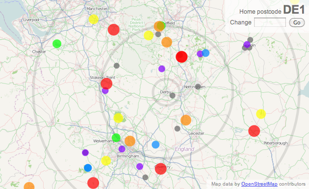
So, when a rewrite of British Orienteering’s website just before Christmas broke my map, I took the opportunity to rewrite it, as a vacation project, using the technologies I’ve been using a lot in 2010 – namely OpenLayers, OpenStreetMap, OS OpenData and coloured vector circles. The map is bigger, brighter, and hopefully more useable than the official map and my previous version.
You can see the new map here – with a mass of dots representing forthcoming fixtures, and circles surrounding the “home” postcode, backed by OpenStreetMap, with the postcode locator based on CodePoint Open from Ordnance Survey OpenData. Only the locator uses a database, the rest of the webpage is constructed on-the-fly from a webpage regularly copied from the British Orienteering website.
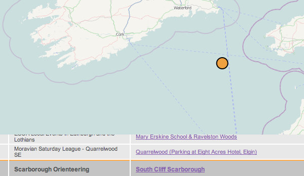 Not Scarborough…
The map remains subject to the quality of the data entered on the corresponding list – there is some limited tidying up of the data, but it’s difficult to correct grid references that result in events being in the sea – there’s currently one in the Irish Sea, as the event registrant entered “GR” as the grid reference letters, and this just so happens to be the location of the GR myriad. There is still work to be done on my new map, such as spotting obvious errors like this, guessing locations where a grid reference isn’t supplied, and perhaps including Northern Ireland’s events.
Incidentally, my original orienteering web map, which inspired my fixtures map, was one showing orienteering maps, it was written way back in August 2004, using a Flash mapping package by Map Bureau, with dots superimposed on top of a map pinched from Wikipedia. We’ve come a long way.


 Not Scarborough…