Categories
Data Graphics London Mashups OpenLayers OpenStreetMap

Tube Line Closure Map

anim

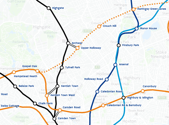
[Updated] The Tube Line Closure Map accesses Transport for London’s REST API for line disruption information (both live and planned) and uses the information there to animate a geographical vector map of the network, showing closed sections as lines flashing dots, with solid lines for unaffected parts. The idea is similar to TfL’s official disruption map, however the official one just colours in the disrupted links while greying out the working lines (or vice versa) which I think is less intuitive. My solution preserves the familiar line colours for both working and closed sections.

My inspiration was the New York City MTA’s Weekender disruptions map, because this also blinks things to alert the viewer to problems – in this case it blinks stations which are specially closed. Conversely the MTA’s Weekender maps is actually a Beck-style (or actually Vignelli) schematic whereas the regular MTA map is pseudo-geographical. I’ve gone the other way, my idea being that using a geographical map rather than an abstract schematic allows people to see walking routes and other alternatives, if their regular line is closed.

Technical details: I extended my OpenStreetMap-based network map, breaking it up so that every link between stations is treated separately, this allows the links to be referenced using the official station codes. Sequences of codes are supplied by the TfL API to indicate closed sections, and by comparing these sequences with the link codes, I can create a map that dynamically changes its look with the supplied data. The distruption data is pulled in via JQuery AJAX, and OpenLayers 3 is used to restyle the lines appropriately.

Unfortunately TfL’s feed doesn’t include station closure information – or rather, it does, but is not granular enough (i.e. it’s not on a line-by-line basis) or incorrect (Tufnell Park is shown only as “Part Closed” in the API, whereas it is properly closed for the next few months) – so I’m only showing line closures, not station closures. (I am now showing these, by doing free-text search in the description field for “is closed” and “be closed”.) One other interesting benefit of the map is it allows me to see that there are quite a lot of mistakes in TfL’s own feed – generally the map shows sections open that they are reporting as closed. There’s also a few quirks, e.g. the Waterloo & City Line is always shown as disrupted on Sundays (it has no Sunday service anyway) whereas the “Rominster” Line in the far eastern part of the network, which also has no Sunday service, is always shown as available. [Update – another quirk is the Goblin Line closure is not included, so I’ve had to add that in manually.]

Try it out

Categories
Orienteering

OOMap 2.4 – Add Plaques from Open Plaques

oomv24

OpenOrienteeringMap can now automatically import the locations and details, of public plaques, as suggested controls, into the area where you are creating a map. The service uses the API from Open Plaques, which is a global open-source database of public plaques. In the London, the most commonly known plaques are the “Blue Plaques“, which are put up by English Heritage and typically mark the houses where the great and good of times past live. However, there are many other types and colours of plaques which are also recorded in the database and accessible now on OpenOrienteeringMap. Thanks to Jez and the team at Open Plaques for building a comprehensive open database, with a fast and flexible API to access it. Once you’ve placed your map, just click “Add Plaques” and a control will be created to represent each plaque. The locations are sometimes imprecise so ground-truthing is always recommended.

If you discover plaques that are not in Open Plaques, then please add them to the project so that OOM and other services can benefit from the extra data. Additionally, if you discover more accurate locations for plaques, you can update Open Plaque with this information. If you take photos, add them to Flickr or WikiCommons, tagging with their Open Plaques ID to link each photo to its corresponding record.

The functionality is similar to importing postboxes, another popular control type for informal Street-O events, which was added in v2.3, except that the plaques are available across the global and other editions of OpenOrienteeringMap, as well as the UK edition. However, please note that, at the time of writing, plaques have been most widely recorded in the UK, USA and Germany, each of which has over 5000 plaques. Other countries have (a lot) fewer, so you are likely to see a “no plaques available” message when you try and import them in to places in other countries, except perhaps in the centre of major cities.

Also for v2.4 I’m using newer versions of the JQuery and JQuery-UI libraries, and have slightly tweaked the user interface for the new Plaques button. The paper orientation toggle also now has some nice logos, and some bugs relating to tip display have been fixed.

Try it out now. As ever, OpenOrienteeringMap is completely free to use, if you find it useful for your event, and it saved a lot of time for you or your club mapper, then feel free to tip, see the links in the pink box.

(N.B. The full plaque text is used as the control description, so this should be edited and partially removed, should you use the automated clue sheet option in OpenOrienteeringMap, so that the competitor has to prove they are there by writing an appropriate part of the text.)

stratford_plaque

Categories
Notes

Going Android with the Huawei Ascend G7

huawei_ascendg7This post is about an Android perspective from the the point-of-view of a long time iPhone user. I’ve been an Apple tech-enthusiast for most of my life and have had an iPhone in my pocket for a good 5-6 years. However I have now acquired a Huawei Ascend G7 phone with Android “KitKit” on it, + the Huawei interface extensions. Huawei are gradually making a name for themselves for producing phones with a premium feel and near-top-range features, for a good price. The Ascend G7 is selling for around £200 in the UK but, in spec and feel, is only a smidgen below the Apple iPhone 6 and Samsung Galaxy S6 which are up at £500+. Apple is making an awful lot of money from phones so clearly there is a cheaper way – this could be it.

Plus it was the right time to move – my current iPhone 4 is working perfectly well, is fast and has a nice screen, but Apple has decided to cut me out of getting the newest software – iOS 8 – and apps are starting to appear that require this version, e.g. Trails, which looks awesome.

N.B. I’ve actually had the phone for a couple of months, but I wrote the below around 48 hours after getting the new phone.

48 Hours into Android

Things I Miss

So, there’s quite a lot I miss from iPhone. This is to be expected, but here goes:

  • Universal “jump to top” gesture. This is what I miss most, oddly. Particularly when reading long webpages, but for other apps too, e.g. Feedly and my mail app. Many apps have a way of doing this but it’s slightly different in each.
  • Web Apps are self-contained rather than being just browser views, so if you want to change to a separate website, you have to go to the browser proper rather than accesssing a URL bar there and then.
  • Combined view for multiple email accounts. This does exist, but only for the inbox, and I can’t move emails to folders, in this view. Solution is to use a better email client than the built-in one.
  • Unread notification numbers attached to app icons. They do exist for the Phone, Mail and Messaging apps but not for, for example, Twitter or Facebook. This inconsistency is really annoying!
  • The clock in the centre at the top, not on the right. I guess I had just got used to it on the right.
  • The phone is less comfortable to hold when reading with one hand, as it’s wider and thinner. I’ve partially fixed this issue by getting a case.
  • Some of the big apps, e.g. Twitter, have a surprisingly different feature set and look-and-feel between iOS and Android. I was expecting the transition to be more seamless.
  • Some apps (e.g. BBC News player) don’t respect the rotation-off setting.
  • Being able to switch the sound completely off – even to the point of no vibration – is worrying. What if I make my alarms completely silent?
  • I initially missed the physical “Home” button, I can live with the virtual one, although it would be nice if it stayed in the same place and was always visible.
  • Intuitive copy-and-paste of text. Text selection tools are clunky, particularly has different apps have different interfaces for copy/paste.
  • In a similar vein, same apps don’t allow me to see where a URL is pointing to, before clicking on it.
  • In-browser display of PDFs and other content.

The Good Bits

Now that that list is out of the way, here’s what I really like:

  • Google Now voice detection has no problem understanding my (rather English sounding) accent and almost always gets it right. It’s a shame however that often it just forward to a regular Google web search.
  • The camera is pretty nice. Initially it seemed to have problems with focusing but that seems to work better now and the quality of the images coming out are generally pretty good. The multi-focus feature, in particular, is a good way to almost guarantee focus.
  • Having files are great. Finally I can see what’s on my phone in an organised way.
  • The battery is good, particularly as I’d anecdotally heard this was Android’s Achilles Heel. It’s happily last more than a day.
  • Bluetooth transfer of media to other nearby phones. Although it’s still not as easy as it should be.
  • Almost every app I liked on my iPhone is also available for Android too.
  • Android is Not Perfect

    On a general (non-iPhone-user) basis, here’s a list of gripes about the phone and about Android:

    • Notification panel. Notifications get truncated and there’s no way to reveal their full text in most case – touching goes to the app concerned which may (or may not) reveal what the notification said.
    • Lots of bundled games which are severely limited (e.g they quit after 3 minutes. That’s not long enough to get hooked on a game!)
    • Apps lurk in the background using a lot of resource. This can be cleared down manually with phone manager but it’s a pain to remember to do this.
    • Google Maps app kept crashing when doing directions. This was fixable by updating to the latest version. It’s odd though that this updating of core apps like Google Maps didn’t get done automatically.
    • Some poorly designed icons clash with the theme icon containers. Facebook Messenger has so far been the worst for this.
    • Pre-installed which seem to do quite similar things. E.g. Settings and Google Settings. Google Now, Voice Search and Voice Dialler. Browser and Chrome. (Why not just Chrome?)
    • The “updater” app doesn’t update apps (see above) but (I think) just the operating system code. Instead, Google Play does the updating. Multiple apps for similar functionality…
    • I haven’t found Process Viewer yet.

    Overall – Android is pretty good, but suprisingly buggy and unintuitive, which is odd considering how much effot has gone into engineering it and how many people now use it. I’ve listed a lot of quirks above. However, looking at the bigger picture, they are nothing I can’t live with and really, considering how die-hard I was as an iPhone user, the transition was pretty painless.

    As a phone, the Ascent G7 is really nice, it feels every bit as good as an iPhone, and is really available at a bargain. Huawei are taking the time to create a high quality product without the silly pricing. In a market full of naff, cheap phones, or hugely expensive market leaders, this is refreshing. I should have switched earlier…