Categories
Orienteering

Nike+ SportWatch GPS Unveiled at CES

Nike’s unveiled a new GPS watch – the Nike+ SportWatch (press release) for runners, today at CES. It gets launched in the US and UK in April, and other countries soon after.

Currently Garmin has a near-monopoly on sophisticated personal GPS-based watches designed for sports users, with their Forerunner 205/305/405s. They are very popular with orienteers, as being able to record your route means you can graphically see mistakes made, and the different leg speed zones, during a race. Often, at orienteering events, a substantial portion of competitors will be wearing a Garmin Forerunner, so the introduction of a major new player in the field could be very interesting for the sport, and the new competition will hopefully bring prices down for the Garmins too.

The “killer feature” must be the integrated USB socket – no more balancing your GPS watch on a cradle and bringing along a USB cable – you can plug the Nike watch straight into a Mac or PC to download your run data. It also records your heart rate, but “separate heart rate monitor required”.

The GPS element of the Nike watch is powered by Tom Tom, Garmin’s main rivals in the personal GPS space.

Engadget has a hands-on video here.

Categories
Mashups OpenLayers OpenStreetMap

More Circles on a Map – Orienteering Fixtures

Five years ago, I created a mashup of forthcoming orienteering fixtures in Great Britain, as listed by the sport’s national governing body, British Orienteering, on its website. It was based on the Google Maps v2 API, and a regular scraping of the HTML on their website, and was a set of pins on a map, coloured by the number of weeks to the event. On clicking a pin, you got a popup balloon with details of the event, and a link to the organising club’s website. A postcode locator, based on data from the NPEMap project, was added, so you could focus on events in your local area. You could also filter out far away events.

A couple of years later, British Orienteering’s web developers added their own map to their website – Google Maps v2 API based, with pins coloured by the number of weeks to the event, and a popup balloon, a postcode search and distance filter etc etc… The Unique Selling Point of my fixtures map was lost.

So, when a rewrite of British Orienteering’s website just before Christmas broke my map, I took the opportunity to rewrite it, as a vacation project, using the technologies I’ve been using a lot in 2010 – namely OpenLayers, OpenStreetMap, OS OpenData and coloured vector circles. The map is bigger, brighter, and hopefully more useable than the official map and my previous version.

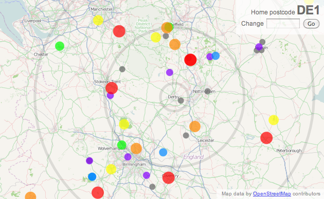
You can see the new map here – with a mass of dots representing forthcoming fixtures, and circles surrounding the “home” postcode, backed by OpenStreetMap, with the postcode locator based on CodePoint Open from Ordnance Survey OpenData. Only the locator uses a database, the rest of the webpage is constructed on-the-fly from a webpage regularly copied from the British Orienteering website.

Not Scarborough…

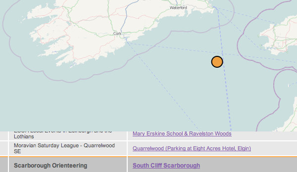
The map remains subject to the quality of the data entered on the corresponding list – there is some limited tidying up of the data, but it’s difficult to correct grid references that result in events being in the sea – there’s currently one in the Irish Sea, as the event registrant entered “GR” as the grid reference letters, and this just so happens to be the location of the GR myriad. There is still work to be done on my new map, such as spotting obvious errors like this, guessing locations where a grid reference isn’t supplied, and perhaps including Northern Ireland’s events.

Incidentally, my original orienteering web map, which inspired my fixtures map, was one showing orienteering maps, it was written way back in August 2004, using a Flash mapping package by Map Bureau, with dots superimposed on top of a map pinched from Wikipedia. We’ve come a long way.
Categories
Bike Share

Italian Cities on the Bike Share Map

I’ve added in eight Italian cities to the list of bike share schemes on my live map. Joining Milan (Bikemi) are Rome (ATAC), Cagliari (Bicincitta), Genova (MoBike), Parma (Punto Bici), Brescia (Bicimia), La Spezia (Speziainbici), Bergamo (Bigi) and Torino (To Bike). Vienna (Citybike) in Austria is also included once again, following contact with the operators there.

Categories
Mashups

Mapping our Tweeting MPs with MapTube

One of the geometries available in MapTube shows the 2010 parliamentary constituencies. I’ve used to create a map, based on the list of MPs’ Twitter pages listed at Tweetminster and updated to reflect the boundary changes earlier this year. The map is clickable – choose a blue constituency, i.e. one which has a tweeting MP, and click on it to get a direct link to their Twitter page.

There’s more MPs on Twitter than you might think – over 200 currently, which is roughly one-third of all the MPs currently in parliament.

The map is OK on its own, but it’s real power comes when you can combine it with another political one, using MapTube’s map search functionality. You have to be careful when combining maps together, as maps with lots of colours will quickly become tricky to interpret when the colours, with varying translucencies, are laid on top of each other. However, with simple maps, it works quite well. There’s currently one showing which MPs have agreed to back an Early Day Motion banning Wild Animals in Circuses.

If you overlay both these maps together, you can interpolate the colours to quickly identify which MPs are on Twitter but (for example) have not agreed to back the motion, and then tweet them! In this example, the “haven’t signed” colour is red, and the “has Twitter” colour is blue, so the “target” list is purple.

The map doesn’t include Northern Ireland as we don’t have the constituency boundary geometries for those.

Categories
Bike Share London

Waiting for the Data

An interesting article on Transport for London (TfL) data has appeared on the London Data Store blog from Anthony Browne – the Greater London Authority’s Policy Director for Economic Development. The article announces the return of Trackernet, the live feed of tube train locations.

TfL must be commended for working on restoring this feed and making it freely availably, particularly as their national counterparts, National Rail, are apparently busy locking down departure board data and insisting on being paid a fee every time someone queries departure information for the (publically subsidised) trains through an app! TfL has made the feed available as part of a redesign and enhancement of their developer area, which also includes a sample (5%) of Oyster card journey data for November last year, potentially very interesting for visualising and analysing how London moves. The enhancements also include moving Trackernet to the cloud so that it scales well with heavy usage.

However, the article is incorrect as it says “…I wouldn’t have found a free docking station in Shoreditch without the bike hire apps that are made possible (at no cost to the public) by the simple expediency of TfL publishing the cycle data. ”

Unfortunately, the cycle data published by TfL wouldn’t have helped – the TfL data available through the developer area/APIs simply is a static list of docking stations, with locations and maximum capacities. The near-live information, used by the apps in order to show full/free status, can only be obtained by regularly “scraping” the HTML source code from the official Google map mashup of the scheme, on the TfL website, or using a third-party API that does the same, such as the excellent BorisAPI. Should TfL decide to redesign their map, there is every chance the coding changes would break these unofficial feeds, simultaneously breaking all the apps, and other cycle visualisations, such as my own. The developer community still awaits an official API for the near-live information, such as is available in Rennes.

On the topic of forthcoming data from TfL, I am also eagerly awaiting the release of the first one million bike share journeys, that has been promised as the result of a freedom of information request.

London is certainly going forwards, as quickly as the rest of the country is going backwards, in terms of opening up public travel data, but we’re not there yet!

Categories
Geodemographics Mashups

OAC Groups on MapTube – A Demographic Map of the UK

The 21 Output Area Classification Groups is a updated version of one of MapTube’s most popular maps of the UK’s geodemographic. The original has had over 17,000 views and the was the first map added to the social mapping website which now has had almost 1,000 maps uploaded to it.

The Output Area Classification takes data from over 50 variables from the 2001 census, and clusters it into 7 supergroups, each subdivided into 2-4 groups to make a total of 21. Each group indicates broadly similar characteristics. Each of the 220,000 output areas in the postcode (typically representing ~300 people, or ~6 postcodes) is assigned to a group best on the “best fit” for that area’s population, bearing in mind only one group can be assigned, regardless of the diversity of the population there.

The new map is improved from the original in several ways:

  • The map is now broken up into the 21 groups, rather than the 7 top-level supergroups, revealing greater detail of the UK’s geodemographic.
  • Taking advantage of new technology built into the latest MapTube release, you can now click on any point on the map, and see the name of the supergroup, group (and subgroup) for that particular area in the resulting popup.
  • The colour scheme has been modified slightly – the groups in the “Countryside” supergroup are sublter shades of green, so the map is not visually dominated by bright green when viewed at a small scale.
  • Each supergroup has a distinct colour, as before, and their constituent groups vary by brightness – e.g. the “Prospering Suburbs” supergroup’s four groups are different shades of red.
  • Northern Ireland is now included.
  • The source data is downloadable as a CSV file – follow the “More Information” link on the key.

Here is a special link to the map, with the “Satellite Hybrid” Google Map layer selected, which provides a contextual overlay to the new OAC Groups choropleth map, and maximum opacity – I think this version is the most useful view.

The new map is also currently the Featured Map on the MapTube homepage. (Disclaimer: this is only because I have access to the Featured Map picker!)

Categories
Bike Share

Bikes, Strikes, Snow and Ice

It’s been a challenging week for the Boris Bikers of London. Friday/Saturday/Sunday were very cold, but dry, days. Then Monday there was a tube strike, meaning many more occasional bike share cyclists would be on the streets. On Tuesday came the snow finally – it wasn’t settling on the streets of the city, unlike further north, but there was plenty of it coming down, and a strong wind made it a quite unpleasant day to be on the bike. Yesterday was a bit more pleasant, although there was some ice around and ongoing general travel disruption, while last night there was more snow, lying this time and causing more transport problems, particularly for the commuters.

The weather has been affecting outer London transport more than that in central London, so the time the Train+Bike commuters make it in has shifted back in the morning – but no such displacement happens in the evenings, as the transport problems don’t hit them until they finish their bike journey and try and get a train.

Some interesting usage patterns appear on the graph below. The graph shows the number of available spaces, the change of which is a good indicator of the number of Boris Bikes coasting around the streets.

Day Peak Morning Usage Peak Afternoon Usage Max No of Bikes In Use Special Events
Friday 26 November 08:52 17:52 599 Cold
Saturday 27 November N/A 12:54 201 Weekend
Sunday 28 November N/A 15:28 281 Weekend
Monday 29 November 11:34 18:20 1143 Tube strike
Tuesday 30 November 08:40 18:14 518 Snowing
Wednesday 1 December 11:50 18:24 735 Icy
Thursday 2 December 08:54 N/A 442* Snowing and Icy

* Based on morning rush-hour figures only.

(N.B The Bikes in Use measure is approximate, as it doesn’t take into account new docking stations added in the same day – there have been several recently – or bikes marked as faulty, which in the current weather conditions is likely to be a significant number.)

The computer system has also been struggling, with a big outage on Friday night and Wednesday morning, a blip at around 7am each day, and some other smaller outages. The system is presumably being upgraded at the moment for the imminent introduction of “casual” (i.e. non-member) hire, and the weather can’t have been helping with the electronics either.

Categories
London

Where is London?

When I was at school, I lived a long way up north. My geography of the much of the rest of the U.K. was limited to the AA road atlas my parents had in the car, which I used to look at compulsively during long journeys. I was fascinated by the schematic diagrams showing the layout of road junctions on each of the motorways. The motorways were represented on the diagrams themselves by dead straight lines – with one exception: the M25. This motorway was shown as a square, apparently enclosing all of London. So, for many years, I assumed that the London boundary was the M25 itself. I was a little disappointed when I moved down to the city and discovered this was not the case. Several large areas – Epsom, Loughton, Watford – are comfortably inside the M25 ring but not within the administrative boundary of Greater London. Similarly, the boundary pushes out beyond the M25 in a few, generally rural, places.

It turns out there are a lot of official and unofficial ways to define London’s extent.

  • Greater London – the administrative extent, made up of the 32 London boroughs and the City of London at its centre. It is the area that is administered by the boroughs and also forms the area of the six concentric Transport for London travelcard zones – although there are some “special” additional zones which go beyond the boundary. Greater London is shown above.
  • Greater London Urban Area (aka Greater London Built-up Area) – the Office of National Statistics defines this as the conurbation area of London (i.e. the continuous urban environment) which is roughly equivalent to Greater London but excludes the large rural areas within the latter boundary, such as Biggin Hill, and includes some towns which “spill over” the Greater London boundary, such as Staines and Dartford.
  • London Travel to Work Area (TTWA) – Travel to Work Areas are contiguous regions within which 75% of people who live there also work there, and vice versa. London is such a region, its TTWA extends slightly beyond Greater London to include places with sufficiently good transport links that, as far as employment is concerned, are “local”, and that don’t themselves have a considerable industrial or commercial base. The map here is the London TTWA from the 2001 census, the areas were defined in 2007 and the map is an extract of one produced by the ONS in 2013: london_2001ttwa
  • The extent of the “020” telephone number prefix – the dialling code for “London”.
  • The London postal district – the extent of the SW, W, NW, N, E and SE postcodes. These miss out a surprisingly large part of the London urban area, except in the north, where they even extend beyond the Greater London boundary.
  • The County of London – this approximately represented inner London and ceased to exist in 1965 with the creation of Greater London. However many older people continue to refer to the counties that were lost or redrawn to accommodate Greater London, such as Middlesex, which is now subsumed by the northern part of Greater London.
  • The City of London – this still exists but only covers the Square Mile – the financial and historic centre of London. It is surrounded by the 32 London boroughs. One of the other boroughs – Westminster – is also a city. Hence the electoral constituency which currently covers both being called “Cities of London and Westminster”.
  • Mayor’s Wider London Boundary – “This is the area within which the Mayor has the right to make increments or decrements to National Rail franchises” according to this document. It appears to be made up of the Greater London administrative boundary plus nearby commuter towns that have direct routes to central London, e.g. Sevenoaks, Dartford, Hertford, Broxbourne. I haven’t been able to find a complete map of it though.

Personally, I still prefer the M25 as the boundary. If I’m heading on a long cycle ride from the centre of London to (say) Brighton, then its when I pass underneath the M25 – a very tangible, physical feature – that I feel I have finally left the city. None of the other borders described above are represented on the ground, other than by road signs. But you can’t miss a huge 6+ lane orbital highway.

The bottom set of pictures are, clockwise from the top right: The London postal district in red, the London Travel To Work Area in dark blue, the former County of London in green, the City of London in bright red, aerial imagery of London’s built up areas, and the London 020 dialling code area in red. Apart from the top picture, which is from OpenStreetMap, all pictures are sourced from Wikipedia. All the picture here are are subject to Creative Commons copyrights of their respective authors. The middle picture shows Greater London, with the boroughs (and the City of London) numbered.

Updated June 2013 to add the Mayor’s Wider London boundary, and in December 2013 to add the ONS TTWA 2001 map.

Categories
London Olympic Park

Everyone’s Putting London 2012 on the Map

The Geographers’ AZ Map Company, makers of those iconic London atlases, got quite a bit of publicity earlier this week for putting out an extract of their latest map, showing the complete Olympic venues and Olympic Park layout, despite the event still being eighteen months away. Indeed the map will only be accurate during summer 2012 itself, as most of the venues will then be dismantled, and the park re-landscaped, after the six weeks of Olympic and Paralympic events.

They weren’t the first in getting their public map up-to-date though – I added in simplified shapes of the key arenas in the Olympic Park to OpenStreetMap, based on first hand observation from the park perimeter fence and the bus tours, several months ago. The Olympic Stadium is very roughly drawn, in particular. However, the Bing Maps announcement, also this week, of donations of its aerial imagery to OpenStreetMap, may mean I can update the shape to match the “bowl” that is visible in the circa 2008 photography available of the park.

The Ordnance Survey also has updated its Landranger map – the new version with the venues appearing on the OS’s own Getamap online survey, but not on the scans used by Bing maps.

Also, the OS has today made available a PDF of a special map – Engineering the Olympic Park – made for the Institute of Civil Engineers (more details). It’s a shame I only heard about this now, as a paper copy would have been a (map-)collector’s item, and they were handing them out at the View Tube which is close by where I live. Oh well.

The OS map’s photo of “Before 2005” is slightly cheeky, implying the entire site was full of rubbish bins, pylons and abandoned caravans. Certainly parts of the site were derelict, but other parts were quite pleasant. As a more thorough representation, Diamond Geezer did a careful survey of the whole area before the fences went up in 2007/8. Actually, having looking at the photos there again now, the dereliction probably did outweigh the beauty.

(As an aside, some of the other details on the A-Z extract are questionable, even without considering representation of buildings that don’t yet exist and might not end up entirely like their planned form. There appears to be a giant “playground” in Victoria Park, in the left-most part of the extract, which is just another part of the park’s grassland area in real life. They’ve also got the old Hackney Marshes sports pavilion, shown as “Pav” on the top-left of the extract, even though this was demolished last year and replaced by a new, larger building, further to the west, which opened last weekend. It seems that in their (quite understandable) rush to capitalise on the Olympic buzz, they’ve forgotten about the local community changes surrounding the park. Hmm, now where have I heard of that before?)

Categories
Mashups

Tracking Flush Tracker or Why Is It Flowing Uphill?

Flush Tracker is an interesting map-based visualisation of a slightly taboo, and therefore amusing, subject. It’s based on Google Maps, and allows you to enter a postcode and elapsed time, and then “track” a toilet flush apparently move through the sewerage network, a blue line gradually extending along twists and turns, to the local treatment works. You can also view existing tracks, which generally appear to have just started their journey from “famous” places, such as 10 Downing Street, Buckingham Palace etc.

The tracks are intriguing, they often appear to be close to the road network, but not exactly on it, with a kink every few hundred metres, suggesting somehow the map is somehow aware of a real pipe network – information which has been traditionally locked away in the GIS databases of the various water companies – not even OS MasterMap has this data, as far as I am aware.

What’s actually happening is a clever bit of Javascript trickery. When you make a request, or load in a current request, the data that comes back to the browser is a simple lat/lon of the start and the end of the “journey”. The start point is based on a Google Maps geocode of a postcode you enter. The end point is a genuine location of the water treatment works that is geographically closest to you – even if it’s uphill, i.e. almost certainly not actually the one you are connected to. For example, west London postcodes generally result in a route moving uphill to the NW, even though London’s treatment works are located “downstream” to the east, at Beckton or Thamesmead.

The clever bit is showing the “route” as a realistic sequence of pipes rather than a straight line between the start and finish. This is achieved doing a Google Maps road routing request from the start to the finish, which sends back a list of coordinates, each corresponding to a turn or other road junction on the route. Twenty or so of these are then picked on a pseudo-random basis, and straight lines are drawn, in sequence, through the twenty turn-points and to the finish.

If you look carefully, you will see that a turn of the “pipe” route always occurs at a road junction, and that the overall route generally corresponds to the Google Maps suggested road route, with road curves and certain junctions missed out and replaced by straight lines.

So – not a sudden opening up of another network dataset by the water companies, but a nice bit of map “trickery” nonetheless.


Left: Flush Tracker route. Right: Google Maps road route.