Here is the new political colour of London for 2014, following the local council elections last week. Rather than applying a simple colour to each of the 32 boroughs as most election maps do, I have instead represented all the 628 wards, across the boroughs, as a coloured circle. The map shows votes, not results. Every one of the 6+ million votes cast has an effect on the colour of one of the circles, in some way. Interactive version.
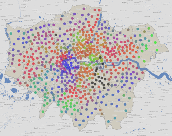
The final colour for each dot is an addition of colours for the votes for each of the political parties in that ward. Red = Labour, Blue = Conservative, Green = everything else (Lib Dems, UKIP, Greens etc). By adding the colours in the correct proportions, in the RGB (Red-Green-Blue) colour space, a single representative colour for each ward can be obtained.
N.B. Lewisham hadn’t published most of its ward results, more than four days after the election, when I took these screenshots, so they are shown with black dots here. There are also three more black dots – two elections have been postponed and one recount is to happen later today. The interactive version of the map has been updated now that the delayed results and recounts has happened.
Here is a version using colours for just the elected councillors (a maximum of three) in each ward, rather than considering all votes cast:
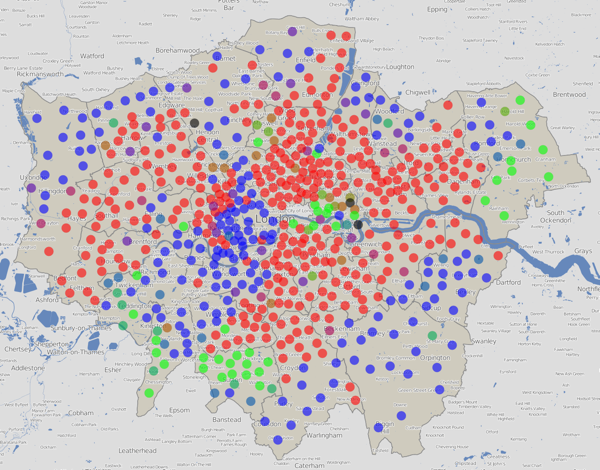
These maps are an update of a website that I built back in 2010 to visualise the election data then. The traditional way of representing an election map – colouring in the wards as solid blocks to make a choropleth – tends to exaggerate the results in the sparser, larger wards on the edge of the capital. A common alternative, a cartogram, tends to distort the map in such a way that makes it “fairer” but at the expense of ending up with something which is difficult to recognise as a map of a familiar place. My “dots in the centres” approach is the best of both worlds – it works by assigning each ward the same amount of “data impact” on the map, while positioning the results in their correct geographical place.

Red + Blue = Purple, so a purple dot is where people voted in roughly equal proportions for Labour and the Conservatives, and very few voted for other parties, which would act to make the colour greener. Similarly Red + Green = Brown – an area with little Conservative support. If all three categories have roughly equal numbers of votes, the colour would be grey.
Note that the colour addition technique has a three major flaws. Firstly, people who are colour-blind will struggle to see some of the contrasts. Secondly, the human eye, even for the non colour-blind, perceives colours of the same intensity differently. So, it is difficult to make quantitative judgements on the proportions, based simply on the colour. The third issue is that there are only three primary colours that can be used, which means a maximum of three categories can be visualised in this way. This means lumping in the Lib Dems and UKIP (amongst others) into the same category, which is I’m sure not where they’d want to be.
Let’s take the major parties individually – and this time, vary the areas of each circle by the number of votes received for that party:
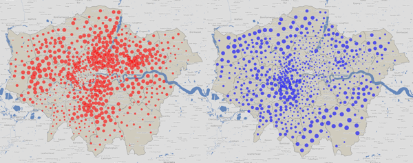
Labour (left) and the Conservatives (right) have strongholds in very different geographies of London – Labour tend to be inner and east, Conservatives outer and west. This tends to mean both parties have a good number of councillors, as their strongly varying popularity, geographically, favours them in the first-past-the-post system.
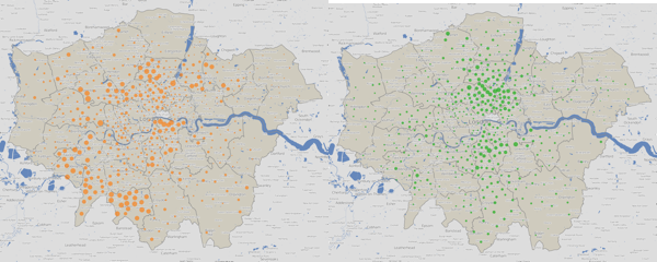
The Lib Dem (left) and Green (right) votes are more closely aligned, running roughly on a north-south axis, through the centre of London.
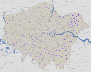
UKIP’s votes are primarily in outer London only. All their elected councillors were in the outer eastern parts of London, but this graphic shows a quite strong, but “hidden” popularity, in the west and, to a lesser extent, south parts of outer London too.
You can view an interactive version of this map which is zoomable and scrollable, and also has the data for the two previous council elections, in 2010 and 2006. Note the 2010 election was during a general election, so the turnout was generally much higher – this is reflected in the increased sizes of the circles for the individual party maps. Some boundaries have changed between 2010 and 2014 so you’ll see some dots move a bit, as well as change colour.
The data behind these maps was collected from the various council websites over the weekend. I will pass comment on the dramatically varying qualities of the data access on the council sites in a subsequent post, but you can download the data that I did manage to collect, tabulate and normalise, as a tab-delimited 1.2MB text file, suitable for importing into Excel. There are almost 7000 candidates included there, and I am hoping to update it as the final few results come in.
This work was carried out as part of the BODMAS project (Big Open Data Mining & Synthesis) at UCL’s Centre for Advanced Spatial Analysis (CASA).
One reply on “London’s New Political Colour: 2014 Elections”
[…] to come up with a single representative colour for the ward. More details on the technique are on my blog. There is also an interactive version of the map where you can view the equivalent map for previous […]