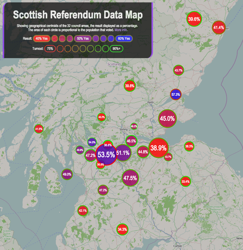
A final update to my Scottish Independence Referendum Data Map – the circle borders now show the turnout percentage, with the highest (>90%) as a solid green, the lowest showing as red.
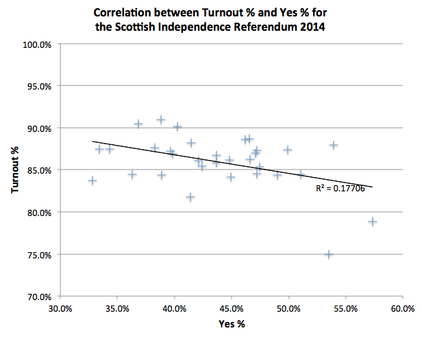
There is a weak (R^2 = 0.177) negative correlation between the Yes vote %, and the Turnout %, suggesting that the Yes campaign had more difficulty in getting its supporters to vote on the day. This may be due to the traditional tendency for older voters to turn out more than younger ones, and the polls suggesting that younger people were more likely to vote Yes. (The BBC has more on the demographics of the Scottish voters.)
You can see this weak correlation on the map, with green-borders (high turnout %) on red circles (low Yes %), and some of the bluer areas (high Yes %) having red borders (low turnout %), although East Dumbartonshire is a noticeable exception.