Categories
Leisure Notes Orienteering

Summer Plans

What I’m planning on doing this summer:

3 June pm LOK Park Race Grovelands Park 5km
5 June parkrun Hackney Marshes 5km
8 June pm SLOW Park Race Battersea Park 5km
11-21 June A wedding/Lakes/Knoydart trip
22 June pm SLOW Trail Challenge Ham 10km
26-27 June A stag
29 June pm SLOW Park Race Tooting Bec Common 5km
3 July parkrun (maybe) Hackney Marshes 5km
3 July North Downs Relay North Downs 10km
4 July LOK London Interclub Addington Hills 7km
7-15 July Sweden training tour
17 July parkrun Hackney Marshes 5km
18 July MV London Interclub Ashtead 7km
20 July pm SLOW Park Race Bishop’s Park 5km
21 July pm DFOK local event Shooters Hill 5km
22 – 31 July Land’s End-London cycling trip
4 August pm DFOK local event Lesnes Abbey 5km
7 August parkrun Hackney Marshes 5km
8 August SAX Trail Challenge Sevenoaks 21.1km
10 August pm SLOW Trail Challenge Richmond Park 10km
11 August pm DFOK local event Bostall Heath 5km
13-15 August Purple Thistle orienteering event
16-22 August Hillwalking/Edinburgh Fringe
28 August parkrun Hackney Marshes 5km
30 August Urban Race Didcot 7km
4 Sept Urban Race Sheffield 7km
5 Sept Urban Race Lincoln 7km
9 Sept pm DFOK local event Jubilee Park 5km
11 Sept Two2Go marathon Lea Valley 42.2km
18 Sept Urban Race City of London 10km
19 Sept LOK local event Hampstead Heath 7km
25 Sept Urban Race St Andrews 7km
26 Sept District event Tentsmuir 10km
2 Oct parkrun Hackney Marshes 5km
3 Oct Urban Race Warwick 7km
Categories
Orienteering Events Log

Marathons

So, I ran my first marathon last Sunday – the Edinburgh Marathon. Although really it’s the East Lothian Marathon, as 19 of the 26 miles are outside the city, and along the East Lothian coastline. Still, the route goes past the village I grew up in, and the coastline is quite scenic.

It was a pretty hot and humid day and the heat really got to me after around 20 miles, but I just about managed to finish without stopping, mainly by running in any available shade, picking up extra water bottles off the road, and taking the pace right down.

The pain in the legs on finishing was noticeably more than any previous running event I’ve done, and the euphoria of finishing didn’t quite cancel it out… indeed it’s taken four days for the quads and hamstrings to stop hurting. My time – 3h 34m 22s (1003rd place out of about 9500 finisher) – was well outside where I would need to be for London (3h 10m) but, after a moment of possible madness last night, I have entered two more – the Lea Valley (Two To Go) Marathon in September, which helpfully finishes about a mile from my house and is very flat, and the Brighton Marathon in April next year, which looks nice and flat, highly organised (they are emulating London by the looks of things) and had rave reviews from almost everyone who ran it last year. Brighton’s also pretty easy to get to and from. I’m not planning on doing more than a couple every year – they aren’t very good for you, and the switch in training doesn’t help the regular running and orienteering.

So now I have a PB that I can aim to beat in the future, now that I know that I can run 42.2km without passing out – my longest training run having been 32.5km.

A friend, Ed, was also up for the weekend and finished in an impressive 22nd place – 2h 48. That’s one time that is definitely out of reach.

Categories
Leisure

Hackney Marshes parkrun

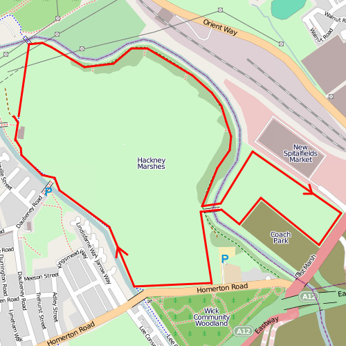
There’s going to be more than just football going on in Hackney Marshes on Saturday mornings in the future – the parkrun series of 5km running races is coming to Hackney and the inaugural is this coming Saturday at 9am – and then every Saturday at 9am. Same time, same place, every week. Simple.

The course is most suited to people who like off-road as well as on-road running. The first 2km is on a tarmac’d track, the next 2km is on grass around the East Marsh, with a great view of the emerging Velodrome in the Olympic Park, and the southern edge of the main Marshes, and the final km is on a tarmac’d track beside the Lee Navigation Canal.

I’ll be helping out at the finish, rather than running it, as my legs won’t quite have recovered from last weekend’s marathon. Once I am back into running, the event should have excellent PB potential (if the grass doesn’t slow things down too much) as it is a completely flat course. Much as I like Finsbury parkrun, the hills do add a good 45 seconds to my run each time. I expect I will alternate between the two, though, as each has its charms.

If you are in south London, Crystal Palace is also starting a parkrun this weekend. Ironically, it’s now pretty easy to get to from Hackney, thanks to the new Overground service that runs from Dalston.

Categories
Olympic Park OpenStreetMap

Mapping the London Olympics

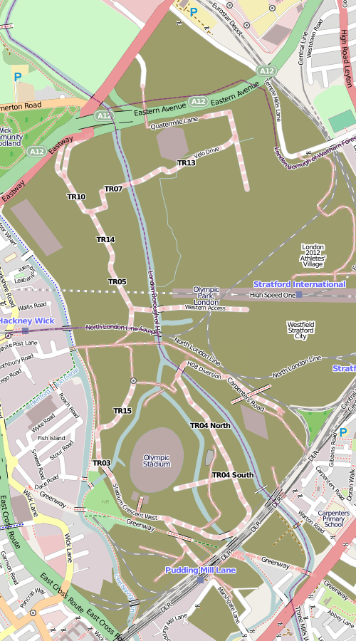
Here’s what the Olympic Park in East London currently looks like on OpenStreetMap, following my recent tour and some other visual guestimating from outside the boundary fence:

The brown areas shows the construction sites, most of which are for the Olympic Park, apart from the eastern area which is the Stratford City development and the southernmost area which is the Crossrail Pudding Mill Lane construction.

The main stadium is a rather unsteady oval, the media centre is the not-quite-rectangular building in the left-hand corner, the velodrome is the hexagon, and the aquatic centre is the diamond. These are all simplified shapes based on what I see, rather than any official plans. There aren’t any buildings yet for the athletes’ village (the fifth of the Big 5 permanent venues) or the Westfield Stratford City mega-development, just POIs. The roads are rather incomplete – although unlike the main venues, these might not be permanent. It’s about as complete as I can get it without privileged access to the site (unlikely) or tracing from detailed aerial or elevated imagery. There’s lots of such imagery out there – the official London 2012 blog has published quite a lot recently, as have some media.

So this is a plea to anyone owning such imagery – if they don’t mind it being used for OpenStreetMap data (i.e. happy to licence it under a Creative Commons Attribution licence) to let the OSM community use it for such purposes, so this high-profile site looks great and up-to-date on the map that everyone can use.

…or I could just wait until the park opens in two years time.

Categories
Mashups

The Political Colour of London

Following on from The Political Colour of Great Britain, and reusing the same code, I have produced a map for London, showing graphically the results of the voting for the local elections in Greater London’s 600-odd wards, for the May 2010 elections and back in 2006.

The “colour” map assigns every vote to one of the three RGB primary colours – red for Labour, blue for Conservative and green for all other parties. It so happens that the three groupings have roughly the same number of votes across the whole of London. These are scaled by the total number of votes for each ward, and then resulting proportions are converted to the hexadecimal “web” colours you see on the dots. An “enhance” function is used to increase the value of the colours away from the mean, to prevent the map from looking muddy.

The advantage of using colour in this way to represent each constituency is every person’s vote counts towards the final colour, rather than just those that elected the three winning councillors in each ward. Use of a single colour is the simplest way to summarise each result. The disadvantage is that it is difficult for human eyes to quantitatively perceive the colour and translate it to a result – although we are quite good at spotting differences in colours, it is more difficult to interpret these.

The voting data is from the London Datastore, the ward and borough boundaries from Ordnance Survey Open Data, and the background map from OpenStreetMap data, rendered using Mapnik. The ward centroids were calculated in ArcGIS and the map is displayed with the OpenLayers framework. Performance is very poor in Internet Explorer because the VML renderer it uses is extremely slow – SVG is used instead in Firefox and the other standards-based browsers and is vastly better.

See it here.

For a different take on the same technique of using colour to show the vote composition for each ward, see the article on Spatial Analysis.

Categories
Data Graphics Mashups OpenLayers

The Political Colour of Great Britain

Following on my UK General Elections 2010 Swings map, where circles represent each constituency, with the sizes and colour describing the metrics, I have used a technique that James has been studying, to combine the vote proportions together to produce a single coloured dot for each constituency. The more blue the dot, the higher the proportion of the vote was Conservative. Similarly, red for Labour and Green for the Lib Dems and the other parties and independents.

A purple constituency represents a Labour/Conservative marginal, as blue+red = purple. There are many of these in the Midlands. Similarly, orange areas indicate likely Labour/Lib Dem (or SNP/PC etc) marginals, such as in South Wales, and turquoise areas indicate Conservative/Lib Dem (& other) margins, there are many of these in SW England. Grey dots show three-way marginals, e.g. Hampstead in London.

Because I am using just three colours, to represent three political groupings, the visualisation does not show the variation in results between the Liberal Democrats and the nationalist parties – the SNP and PC in Scotland and Wales respectively.

Some interesting patterns are revealed – the ring of blue/purple around the red/orange centres of London and Birmingham – with no such corresponding ring around Manchester or Newcastle. Scotland’s lack of blue. The straightforward Labour/Conservative split in NW England. East London isn’t quite as safe-Labour as you might think – with the exception of East Ham standing out in bright red.

The benefit of this visualisation is that every vote is included in it – on a regular election map, if one party just fails to win, then an election map won’t show them at all on it. Here, every vote influences the colour of the map. Each circle represents roughly the same number of people – the populations of constituencies are fairly even, with some notable exceptions such as the Isle of Wight (very populated) and the Scottish Islands (very few people.)

You can see the colour map by going to the election visualisation and choosing “Constituency Colour” from the “Other graphs” drop-down. James has produced a regular choropleth map version, which shows the green (SNP/LD) of northern Scotland and blue (Conservative) of southern England strikingly well.

Categories
Data Graphics Mashups

General Election Swings Visualisation

I’ve created a visualisation of the results from the UK general election this month. By default, it shows the most significant swings between parties, for each constituency. By using the options on the right, you can change it to show simple vote counts, overall results, or swings between any two significant parties. I’m using a circle to represent each constituency. The area of the circle is directly proportional to the metric being shown (number of votes, or percentage point swing) with a dynamic key on the right to help out. Click on a circle to see the vote results.

Some Notes:

By choosing “Winning Party” from the “Other” drop down, you see the simplest map – each circle is the same size, and it simply shows the winning results – with the previous winner shown as the colour on the edge of the circle. I think this kind of view is a “best of both worlds” approach – as long as the circles don’t overlap, it has the “fairness” of cartograms (aka “proportional” maps in the BBC’s coverage) while retaining the geographical familiarity of the choropleth (“normal”) map of the UK.

Only Great Britain is included, not Northern Ireland, as the OS Open Data release, which provides the parliamentary boundaries from which the centroids were calculated for the circle locations, does not at the moment include Northern Ireland.

The definition of swing is tricky – swing can only be described as being from one party to another. Choosing which two parties to use for the “headline” swing was tricky. In the end, I’ve chosen to show the swing between the losing and winning party where the seat changed hands, and where it didn’t, the swing between the two parties with the highest number of votes. This means “interesting” swings like in Bethnal Green & Bow are still included. It does however mean that the largest swing is not necessarily shown.

There were a large number of parties contesting seats – in the end I’ve only included parties that got at least 30,000 votes in total, to prevent the lists becoming too long. I’ve also excluded swings where either party in the swing had less than 5% of the vote (i.e. losing their deposit) as such a swing is probably not very meaningful.

In general, a swing between a “small” party and a “large” party is not meaningful anyway, because any voting changes that a large party suffers/gains from are probably to/from another large party, rather than to/from the small party. So, bear this in mind when viewing the swings between (for example) Labour and UKIP. UKIP appears to have gained almost everywhere but actually it was probably another “large” party (Conservatives or Liberal Democrats) that actually got the floating votes.

The background imagery was custom-rendered to show the constituency boundaries and be entirely grey – so that the only colours are those representing the party results. Because the boundaries generally run to the low-water mark and estuary mid-lines, whereas OpenStreetMap boundaries generally run to the high-water mark and consider estuaries to be sea rather than river, there are some odd looking estuarine areas (e.g. the Bristol Channel and the Thames Estuary.)

Said another way, this is because of a mismatch between where OpenStreetMap and the parliamentary boundaries commission consider the rivers to stop and the coast to start. I have manually edited two boundaries – NW Bristol sticks far out into the Bristol Channel, and the Medway boundaries also stick far out. NW Bristol’s centroid was also manually moved. There are other, lesser quirks with the data, and being OSM data, not every village is on there yet. I consider the background imagery overall to be “good enough” for the visualisation at hand.

No fancy AJAX was used – the data (about 120KB) is simply loaded into the browser at the start – the visualisation being done entirely on your browser using the OpenLayers API.

It’s not very easy to draw circles in Javascript, so I’ve let OpenLayers do it for me. The two circles that make up the key are actually miniature OpenLayers maps themselves, with a single point feature at the origin of the map. They update in sync with the main map.

The visualisation was ready to go last week but the way Internet Explorer draws the vector graphics (using VML rather than SVG) was causing considerable performance problems, when trying to show all 650-odd constituencies at once. As a work around, the map starts by being zoomed in if you visit the site in IE. Zoom out at your peril!

If you spot any bugs (apart from the IE chronic slowness!) please let me know.

Categories
Leisure Olympic Park

Inside the Olympic Park

A couple of weeks ago, I went on one of the daily tours of the Olympic Park in London, organised by the Olympic Delivery Authority. Anyone can now go on these tours, rather than just local residents, but you do need to book a couple of months in advance. This summer is probably the best time to take the tour, as the “big build” of all the main venues is in its busiest phase. In theory, everything should be built by next summer, with a clear year to then test the venues.

The day I chose ended up being a grey and cold Sunday – not great for taking photographs – but it was still very worthwhile touring the site. The tours are on a single-decker bus, with a Blue Badge guide giving an interesting narration. After being picked up from Stratford and given a fold-out map of the site, we were then driven right around the A12 to Hackney Wick and the northern plaza entrance, where the bus was subjected to an elaborate sniffer-dog search, presumably just for show as the bus had already done several other tours on the day – and because we had no such check on re-entering the site from the southern plaza. It was a good opportunity for a safety and security briefing, though. (The northern plaza is where building materials are generally delivered – workers arrive several miles away at the southern plaza, generally from a DLR station there.)

First up was the Velodrome, aka the Pringle because of the distinctive shape of its roof. It’s close to the northern edge of the site and is very visible from the A12. Beside it is a billboard with an illustration of how it will look when complete:
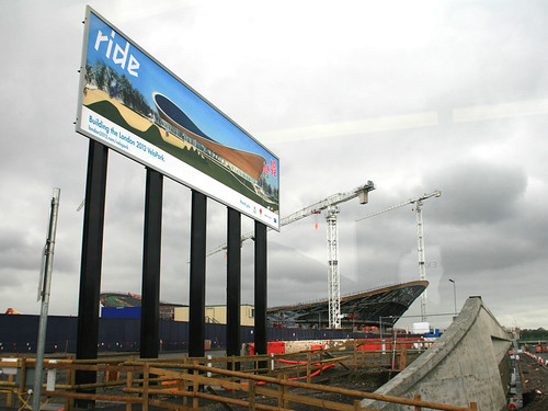
Velodrome - Soon and Now (7628)

The Velodrome is one of the “Big 5” construction projects for the permanent buildings, along with the stadium, aquatic centre, athletes’ village and broadcast centre.

We then headed south, passing the basketball venue, a temporary building which has appeared from nowhere in just one month – already the “crazy paving” white plastic cladding is going on:

Basketball Arena (7650)

The Olympic Park isn’t the only building project going on in the area – along with Crossrail, the other big construction site is for the Stratford City Westfield development, which is more advanced and is due to open next year. A giant pedestrian bridge is being built between the two, and there is also a link road – the “Western Access”. The boundary between the two, with construction in all directions, is marked by a blue box:

Boundary between the Olympic Park and Stratford City (7654)

The stadium is visible from the northern section we were in, but the main construction road was blocked due to some temporary works on one of the many bridges bisecting the numerous rivers, canals and channels in the site:

The Way to the Stadium is Closed (7660)

So we headed back onto the A12, around to Stratford, and back into the site through the southern plaza, an electronic sign there showing an impressive safety record:

Safety Record (7671)

Firstly, we went up close to the stadium itself, the basic shape of which is complete. The black section is the “temporary” section, although it might be around for longer than planned after the Olympics depending on what the stadium gets used for:

Olympic Stadium (7689)

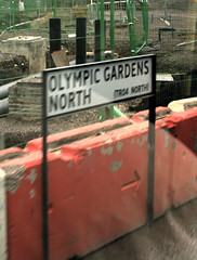
Olympic Road Sign! (7702)We then went round to the eastern part of the site, where the aquatic centre is. On the way I spotted many of the road signs which have appeared on the site – as well as Olympic Gardens North and South, and Stadium Crescent East and West, I had earlier spotted Handball Way, Handball Approach, Velo Drive, Stadium Aquatics Link, Plaza Approach, Soc Highway, Waterden Road Works South, Wetlands Avenue East, H08 Diversion and the intriguingly named Norman Corner.

All of these signs are mounted on “permanent” metal signposts and look like regular street-name signs. Rather than also showing the first part of the postcode, and is traditionally done for London street-name signs, these signs include reference numbers starting with “TR”. (Trunk road?) I’ve added all the names I spotted to OpenStreetMap.

The aquatic centre is being built by first placing the roof on its supports, and then filling in the space beneath it. The dramatic Zaha Hadid wave shape of the roof looks brilliant up close:

Aquatic Centre - Side View (7724)

From one angle, it appears to hang over one of the water channels:
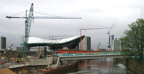
Aquatic Centre beside the River Lea (7719)

From another, it looks like a futuristic space ship:

Aquatic Centre - End-on View (7716)

I headed back home along the Greenway, a raised route through the site, open to the public and the best way to see the site if you aren’t on the bus tour. Along the way, I noticed the mysterious concrete posts, that appeared a few months ago, have finally revealed their purpose – they are rather fancy signposts:

Greenway Sign (7738)

You can see more pictures I took in my Flickr album.
Categories
OpenStreetMap

National Library of Scotland Historical Maps

The National Library of Scotland’s high-quality scans of historical Scottish mapping have been made available under an Attribution licence, which means they can now be used to trace features for OpenStreetMap in Scotland. While the maps themselves were already out of copyright, the high quality scanned imagery itself was still subject to copyright.

You might think that, with the recent releases of up-to-date(ish) Ordnance Survey mapping in various scales and formats for the whole of the UK, historical mapping is less useful for OpenStreetMap. After all, why use 60-year-old mapping, available in raster form and available at (relatively) low resolutions, when resolution-free vector data, and 1:10000 rasters of the same area are similarly available. But these beautiful old maps contain a lot of detail not on the newer ones, and for large parts of rural Scotland, where roads, rivers and mountain features very rarely change, they will still be enormously useful for completing the more remote parts of the country.

The historical maps can be viewed here. As you zoom in a few levels, the projection changes into the regular EPSG900913 (the tilted north lines are a tell-tale sign) that can be used directly in OpenStreetMap editors such as Potlatch.

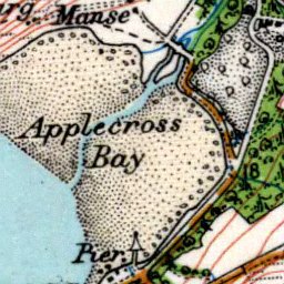
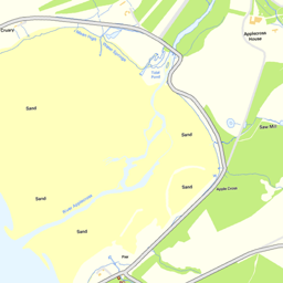
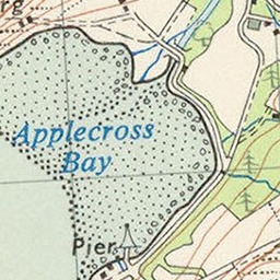
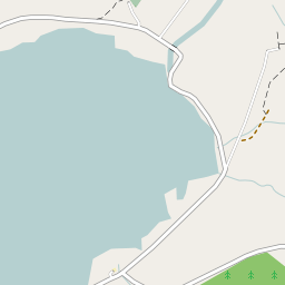
Here’s Applecross, a place near Skye in North-West Scotland that I have long wanted to visit. In this particular area, historical imagery (OS 7th Edition) is already available on OpenStreetMap, allowing for tracing, but this is not the case for most of Scotland, as many of the sheets are still in copyright.

National Library of Scotland (Historical):

Ordnance Survey Street View:

Ordnance Survey 7th Edition (Historical):

The current OpenStreetMap Mapnik render: