
I’ve created a visualisation of how the TFL Cycle Hire scheme in London is being used – the so-called “Boris Bikes”. Around 4000 bikes have been placed in 400 cycle parking stands in the centre of the city, and people have been using them to get from A-B.
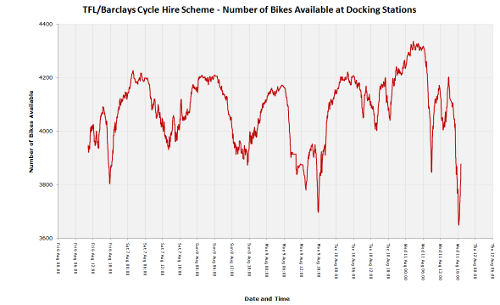
Some distinctive if not entirely surprising patterns have appeared already – with heavy usage (~10% of total bikes out on the streets) during the rush-hours, which occur in a strikingly small time interval – a narrow, sharp dip appearing only between 5:30pm to 6pm. Usage is much less in rainy weather, such as has happened today, and weekend use is both lower, and quite different in “shape”. During weekday days, the City tends to have a lot of the bikes, while in the evening, the bikes end up at the cycle parking stands near the big terminal train stations and in Pimlico in the south-west of the area – probably the biggest residential area covered by the scheme, and also a popular place for city workers to live…

10am Tuesday: Straight after a sunny morning rush-hour, before redistribution kicks in – many of the central stands are now completely full of bikes (red with yellow borders.)

8pm Tuesday: A typical evening pattern – the bikes are on the edge, and at the terminal stations, particularly around Waterloo and King’s Cross, while the centre is short of bikes…
The visualisation consists of coloured dots, which change from blue to red as each stand fills up with docked bikes. A purple dot indicates a half-full stand. The size of the dots corresponds to the total capacity of the stand.
You can click on a stand’s dot to see information about its current status, as well as its use over the last 24 hours, represented as a minimalistic graph. A graph of overall usage can also be viewed. Both get updated as the new data comes in.
The data comes from TFL’s own map of the stands in central London, and is updated at source typically every six minutes – my own visualisation updates every two minutes, so you should never be more than ten minutes out of date, looking at the map.
The background is a bespoke render of central London, from OpenStreetMap data.
Here’s how the total number of available bikes has fluctuated, since Friday morning (click for larger version):
[Update: Some articles about the visualisation – Telegraph, Londonist, Road.cc, Real Cycling, Bikeradar]
15 replies on “London Cycle Hire Visualisation”
[…] disproportionate number of bikes tend to end up in Pimlico, which O’Brien notes in a related blog post, is perhaps the most populated residential area covered by the […]
[…] at Suprageography made some really neat maps. Originally just for London, Now for fifteen cities around the […]
Re extra zoom level: Excellent! Thanks!
Really great work – well done!
I am toying with building an app for mobile phone users who don’t have mobile web access, or prefer not to use it.
The idea is to send a text with a location (TBD) and get a text response back with the Docking Station Unique Name of (say) the 3 nearest racks with no. of bikes & spaces at each.
Any suggestions as, from the sound of it your app, has 80% of that work done.
JoeW – an extra zoom level is now available.
This map is fantastic, but it would be *perfect* if we could zoom in a bit closer, and see street names in more detail (e.g. google maps)
Any plans to change?
James – we can only map the data we have – should this data start to become available online, then it should be reasonably straightforward to add it in.
Richard – I have been thinking about a historical data replay but it’s quite slow to run as the browser has to do all the computation of each circle’s colours and sizes for each time interval. However, see this video: http://vimeo.com/14087663
Lloyd – Not at the moment, but I am storing it so long-term trends should be possible to see in the future.
Dave – Indeed, the commuter flow would be expected. There are several types of users of the bikes – and some of the placings of the docks (Natural History Museum, Museum of London) suggests they are gearing up for occasional tourist use too. I think they do have at least one redistribution vehicle, which works overnight.
Sam – The data is coming from TFL’s own map of the docking stations, on their website. There are a number of third-party feeds packaging this data, such as the Boris API – see http://borisapi.heroku.com/
[…] hugely popular London Cycle Hire Status Map. How the map works is explained on Ollie’s blog. I have picked 24 hours (from midnight Tuesday 10th to midnight Wednesday 11th) to demonstrate the […]
This is really cool. Sorry, this is a stupid question but where are tfl supplying the live data you’re updating the map with?
Brilliant, I hope TfL (or Serco) are using something similar with their data, or maybe they should be paying you.
The study for the original report advised against placing bikes at London Rail termini for the reasons highlighted here (tidal flows) and the level of service challenge of dispensing to surges of users delivered by each train, every one demanding immediate access to the bikes.
The original RATP-backed bike hire scheme in Paris (roughly 2 decades old) solved this by hiring the bikes from converted busesm pplacing full buses at hire points and empty ones to collect bikes and remove them or return the bikes for re-hiring.
Lovely job, well done, thank you.
Are you re-publishing the data behind these anywhere for further analyses?
This is really incredible and super useful. If I could suggest a new feature it would be the ability to replay historic data (speeded up of course) and watch the circles changing colour as time ticks by.
Very well done, looks like a fabulous resource! Interesting and visually appealing.
So one thing I’m curious about, in the data that TfL are providing, is that they don’t seem to be detailing the third, important number – how many have had ‘needs maintenance’ pressed and are therefore unavailable (but taking up spaces.)
I’ve seen situations “on the ground”, where TfL’s own map mash-up seems to say bikes available, out of – indicating spaces. Yet the stands are full.
Your own visualisation, and everyone else’s presentation, of the data always just gives Bikes and Spaces, or Bikes out of Capacity. Thoughts?
[…] This post was mentioned on Twitter by Mun-Keat Looi, Martha Henson and Dawn Foster, Christian Hunt. Christian Hunt said: Any #BorisBike users in LDN. Fascinating visualisation of where the bikes are being used: http://bit.ly/bTx2zo […]