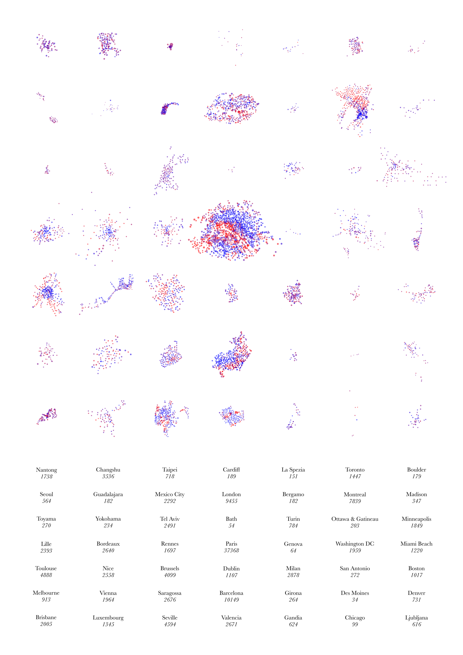
Above is the image I submitted to this year’s UCL Research Images as Art exhibition. You can see it, and around 300 other entries, in the South Cloisters on the UCL campus in central London, for the next few days. The image purposely has no explanatory text as it is intended as a piece of “infogeographic art” rather than as a map. It is derived from the dots for the various cities on my Bike Share Map.
It shows the “footprint” of the docking stations making up 49 bike share systems around the world. The colours represent the empty/full state of each docking station at the particular moment in time when the image was made. The numbers show the total number of docking points – each docking station being made up of one or more docking points, each of which may or may not have a bike currently parked in it.
The geographies and topographies of the cities themselves inform the shape of the systems – particularly coastal cities (e.g. Nice, Rio, Barcelona, Miami Beach) and ones with large lakes mountains near their centres (e.g. Montreal).
A subtle but important point on the scaling: The scales of the systems (i.e. each system footprint and the spacing between docking stations) are roughly comparable – they actually vary by the cosine of the latitude – these means that the more tropical systems, e.g. Mexico City’s, appear to be up to ~20% smaller than they actually are, relative to the majority which are generally at temperate latitudes. However, the sizes of the circles themselves are directly comparable across all the systems, i.e each pixel on the graphic represents an equal number of docking points, regardless of which system it is in.
10 replies on “A Glimpse of Bike Share Geographies Around the World”
[…] and cycle hire schemes (by Oliver O’Brien). […]
[…] Oliver O’Brien. 2012. A Glimpse of Bike Share Geographies Around with World. Suprageography, 9 Jan) Like this:LikeBe the first to like this post. Filed under: photo […]
Steven/jpv – The numbers show the number of docking points rather than the number of docking stations – the latter are on the maps. I agree this is slightly confusing.
I realise now that Neil Freeman’s graphic was my subconscious inspiration for my graphic, I had seen that a while back and thought it was pretty good.
Good to know the difference between stations and points. By the way, I was thinking of making an automated version of this graphic by just using PHP to do the math (I’m not good at JavaScript) and CSS. (This is the graphic you originally commented on that was originally created using radius instead of area.)
With the automated version it will be faster to add cities.
http://www.flickr.com/photos/jamesbondsv/6261064381/
That would be a nice idea. I’ve been using JPGraph for an (internal) webpage that automatically graphs my bike share data, I’m quite impressed with it. It does various kinds of graphs and charts so may well be able to produce an automated version of your infographic. It’s specified with PHP.
This is great! I look forward to seeing an edition with New York in a few months.
My subway map shows cities in their local UTM projection. I use ArcGIS to accomplish this, I’m not sure if there’s a good PHP library to do the transformation.
It looks gorgeous. Have you seen Neil Freeman’s “subways at scale” maps/graphics?
http://fakeisthenewreal.org/subway/
How come Chicago has 99 stations in this graphic? Your real-time bike sharing map says Chicago only has 4 stations.
No way Chicago has that many stations, should be more like 6. The real bike share system won’t roll out until this summer.
Aidan – d’oh, thanks!
Montreal’s “lake” is Mount Royal, not a body of water. There is a large river (St. Lawrence) that forms a barrier though.