Categories
Conferences Data Graphics London

The London Data Table

The London Data Table was one of my personal favourites from the exhibition accompanying the CASA “Smart Cities” conference which took place at the University of London last Friday. The concept was thought up by Steven Gray and it consists of a wooden table, cut by programmable lathe into the outline of London. A special “short throw” projector with a fish-eye lens was purchased. It was mounted vertically on a converted basketball hoop stand, pointing downwards and outwards, allowing the content to be approached and examined without the projector getting in the way. Steven has blogged about the construction process.

I created a generic dark grey background map (from Ordnance Survey OpenData) with a blue River Thames as the main identifying feature. This was used by several authors, including myself, to create either Processing “sketches” in Java, or pre-recorded videos, which were displayed on the table during the exhibition. A simple Javascript script running on Node.JS was written to automatically cycle through the animations.

By ensuring that the background map and accompanying sketches/videos where “pixel perfect”, we were able to take advantage of having control of every individual pixel, producing the quite pleasing pixellated effect as seen in the below closeup of one of the sketches (a photo taken of a part of the table) – it is showing a bike share station animation that I created, based on the same data that powers the equivalent website.

The photo above shows the table running another Processing sketch, showing point information from CityDashboard and similar to the map view on the website, except that points are randomly and automatically selected to be displayed, as people stand beside and watch the table.

The most interesting sketch presented on the table (and shown on the right – photo by Helen) was built by Steven Gray and connected to a airplane sensor box, that picked up near-real-time broadcasts of location, speed and aircraft ID, of planes flying over London. The sketch stored recently received information, and so was able to project little images of plans, orientated correctly and with trails showing their recent path. Attached to each plane image was a a readout of height and speed, and most innovatively of all, a QR code was programmatically generated and rendered behind each plane, allowing smartphone users to scan it. QR codes are normally encoded URLs, and these ones were set to point to a flight information website, with the aircraft’s details preloaded, showing a photo, and the origin and destination at a glance.

The QR codes were able to be made very small – using a single projector pixel per QR code pixel and little error correction. Various smoothing and blurring digital effects having been switched off, and a digital connection between computer and projector used, to allow the sharpest possible representation. As a result, my iPhone was able to tell me more about the planes I was seeing fly, in near real time, around the table.

Categories
Data Graphics London

On Colour Ramps and City Dashboards

Here are the colour ramps I am using for numeric measures in the recently launched CityDashboard (which by the way now has a new URL – http://citydashboard.org/):

The colours have been designed to be clearly distinguishable from the white text that is on top of them.

Here is the PHP code that I’m using to choose the appropriate colour for each measure, and which I also used to produce the above ramps – the reverse colour and bad value handling is only implemented where I currently needed, ideally these would be implemented for all the ramps:

$na_rgb = 128;

function getGreyRedHex($val, $min, $max, $reverse=false, $processing=false)
{
	$val_0_255 = getNormalisedVal($val, $min, $max);
	$r = 128 + 0.5*intval($val_0_255);
	$g = 128 - 0.5*intval($val_0_255);
	$b = 128 - 0.5*intval($val_0_255); 
	return getHex($r, $g, $b, $processing);
}

function getGreyBlueHex($val, $min, $max, $reverse=false, $processing=false)
{
	$val_0_255 = getNormalisedVal($val, $min, $max);
	$r = 128 - 0.5*intval($val_0_255);
	$g = 128 - 0.5*intval($val_0_255);
	$b = 128 + 0.5*intval($val_0_255); 
	return getHex($r, $g, $b, $processing);
}

function getColdWarmHex($val, $min, $max, $reverse=false, $processing=false)
{
	$val_0_255 = getNormalisedVal($val, $min, $max);
	$r = intval($val_0_255);
	$g = 255 - 2*abs(127.5 - $r); 
	$b = 255 - $r;	
	if ($reverse)
	{
		$r_temp = $r;
		$r = $b;
		$b = $r_temp;
	}	 
	return getHex(0.8*$r, 0.8*$g, 0.8*$b, $processing);
}

function getGreenYellowRedHex($val, $min, $max, $reverse=false, $processing=false)
{
	global $na_rgb;
	if ($val === "n/a") { return getHex($na_rgb, $na_rgb, $na_rgb, $processing); }
	if ($val === "?") { return getHex($na_rgb, $na_rgb, $na_rgb, $processing); }
	$val_0_255 = getNormalisedVal($val, $min, $max);
	$r = intval($val_0_255);
	$g = 255 - intval($val_0_255);
	if ($g > 128) { $g = 128; }	
	$b = 0; 
	return getHex($r, $g, $b, $processing);
}

function getRedGreyGreenHex($val, $min, $max, $reverse=false, $processing=false)
{
	global $na_rgb;
	if ($val === "n/a") { return getHex($na_rgb, $na_rgb, $na_rgb, $processing); }
	$val_0_255 = getNormalisedVal($val, $min, $max);
	$r = 255 - intval($val_0_255);
	$g = intval($val_0_255);
	if ($g > 128) { $g = 128; } 
	$b = 128 - abs(127.5 - $val_0_255);
	return getHex($r, $g, $b, $processing);
}

function getNormalisedVal($val, $min, $max)
{
	if ($val < $min) { $val = $min; }
	if ($val > $max) { $val = $max;	}
	$range = $max - $min;
	return ($val - $min)*(255/$range); 
}

function getHex($r, $g, $b, $processing)
{
	$hex = str_pad(dechex($r), 2, "0", STR_PAD_LEFT) 
		. str_pad(dechex($g), 2, "0", STR_PAD_LEFT) 
		. str_pad(dechex($b), 2, "0", STR_PAD_LEFT);

	if ($processing) { return "FF" . $hex; }
	else { return "#" . $hex; }
}

I’ll be presenting CityDashboard at the forthcoming Wherecamp EU unconference which is taking place in Amsterdam this weekend.

Categories
Data Graphics London

CityDashboard

CityDashboard is the main project that I have been working on for the last few months. It aims to summarise quantitative data (both officially provided and crowd-sourced) for the major UK cities, in a single screen. Point data is also shown in an alternate map view.

It was launched at the CASA Smart Cities conference last Friday, for eight cities – London, Cardiff, Edinburgh, Glasgow, Manchester, Leeds, Birmingham and Newcastle. London has the most dashboard “modules” at present, with a number of London-specific modules from Transport for London, the Port of London Authority, and CASA’s own sensors. Other cities have several more generic modules (such as weather and Twitter trends) and more city-specific modules will be added to these in due course. I am also looking at improving the overall look and feel of the website, possibly by using the BBC Glow API that was suggested to me at the conference (but just now took me half an hour to find on the web!)

CityDashboard features specially curated Twitter lists. For each city, there is a general news list, featuring tweets from local newspapers, local correspondents for the BBC and other TV and radio channels, tourist organisations and the official accounts for the relevant local authorities. There is also a universities list, with the official Twitter accounts for the main universities in each city, as well as their student unions. It is hoped that this latter list with detail the latest university research outputs, coming out of that city. The account that manages the lists is CityDB and the lists take the form of, for example, http://twitter.com/citydb/london and http://twitter.com/citydb/london-uni. Anyone can subscribe to these lists, you don’t have to only view them through CityDashboard.
You can visit CityDashboard live, right now, at http://citydashboard.org/

The project is an output of NeISS, which is funded by JISC.

Categories
Olympic Park Orienteering

Stratford City Race

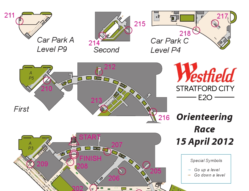
Yesterday was the Stratford City orienteering race, organised and planned by Josh Jenner, with the map done by myself. The map was a real fiddle to do, requiring four site visits and many hours in front of the computer to build up the six mapped levels (the top half of the is shown above) but the race went well in the end, with no major complaints, only minor ones (a few people found the level change arrows hard to spot, and some people didn’t spot some Out of Bounds areas and so ended up in an area that wasn’t mapped to detail.)

The weather was great (cold and clear outside, warm inside!) and nearly 100 people raced in five waves, including, notably, a wheelchair competitor. Not many “regular” orienteering areas are both wheelchair friendly and traffic free. I did have to hang some of the controls very high though – a couple over six foot off the ground – to use suitable mounting points. The centre management were enthusiastic about the race, and another edition is possibly in the future – possibly using a different format to keep the idea fresh.

After the race, two of the controls were missing – it turns out that one of the collectors had kept one by mistake, and the other had been retrieve by a concerned member of the public (it wasn’t locked down to the chair) and handed in to security, so eventually we were reunited with them all – a good thing as the control boxes are very expensive! The centre was, as expected, almost deserted for the earlier waves, but from 11am it started to get a good busy and it was a good thing the orienteering was out of the way.

I managed to get a run in myself, taking part in the last wave. I was strictly non-competitive, as I knew exactly where all the controls where and the best route to take between them. Despite this I was still beaten by Ed. My route was around 5.5km, I don’t think it would have been possible to visit all the controls and run in under 5km, which is not bad for a site that is only 400m across. The format of the race was score, i.e. controls could be visited in any order.

Some photos from me are here, and more photos and the results are on Josh’s website.

Thanks to Josh for the concept and organisation, and Westfield centre management for letting it happen and giving us full reign through the centre and even control suggestions!

Categories
Conferences London

CASA Smart Cities

[Updated x2] Just a note to say that I will be presenting some of my work, at the CASA Smart Cities free one-day conference. Over 200 tickets have already gone, but there are, at the time of writing, a few left.

There will be an exhibition at the conference, some people in the department have been building some very cool things which will be unveiled there. Unfortunately I’m not allowed to talk about the very coolest one of all, but I have been allowed to post the above graphic which has got something to do with it…

(If you want to have a guess at what it is, leave a comment!)

[Update 3/4 – Tickets are sold out, however I think an extra batch will be available soon.]
[Update 13/4 – A few more tickets now available.]