Categories
Bike Share

NYC’s Bike Share Approaches

New York City last week released a preliminary map showing the proposed sites for the launch of its bike sharing scheme, now named Citi Bike (with Citigroup being the lead sponsor along with Mastercard).

Citigroup’s sponsorship is crucial for the scheme, which has promised no public subsidy on at least operating costs, and is a rather convenient sponsor in terms of its name. In several other cities around the world, their bike share schemes are known as City Bikes, such as Stockholm and Vienna, so Citi Bike has a good chance of becoming the “on the street” name for the scheme, unlike the unwieldy “Barclays Cycle Hire” name we have here in London – most people here know them as the snappier, if politically incorrect “Boris Bikes”.

NYC’s scheme is clearly influenced by London’s – its of a similar size, it has a big sponsor from financial services and a mayor fully behind it, and a Boris Bike from London even appears on the front cover of the NYC DOT presentation to communities. The technology used is the same and the bikes are also the same design.

I’ve extracted the data from the official map and added it to my own set of maps for 50+ bike share cities across the world allowing for a direct comparison between the scheme and the existing ones. The initial map has 413 stands – the districts either side of Central Park are missing, as is central Brooklyn, as these areas are still undergoing consultation and will gain coverage next year. The scheme should be opening this summer and is then due to expand by 50% by Autumn 2013.

The stand sizes and descriptions are also from the official map, and I’ve simulated the empty/full status of each stand, based on the distance from Wall Street and random perturbation. This results in just under 7000 bikes, based on a roughly 1:1 empty to occupied stand ratio, which is fairly standard around the world.

New York vs London

New York London
System Name Citi Bikes Barclays Cycle Hire
Bicycle design Devinci/PBSC Devinci/PBSC
Operator Alta Bicycle Share Serco
Lead sponsor deal $41m over 5 years £25m ($40m) over 5 years
Bikes (at launch) 7000* 4200
Docks (at launch) 13639 7685
Stations (at launch) 413 345
Largest station size 128 126
Average station size 33 19
Ratio bike:docks 1:1.95 1:1.83
System footprint (at launch) 53 km2 42 km2
Annual membership $95 £45 ($72)
24 hour membership $4 £1 ($1.60)
Max free journey time (24h mmbr) 30 minutes 30 minutes
Max free journey time (annual mmbr) 45 minutes 30 minutes
Single metro journey (smartcard) $2.25 £2** ($3.20)
Single metro journey (cash) $2.50 £4.30 ($6.90)

* Announced figure. Actual figure may be less due to bikes in maintenance and temporary storage. London’s equivalent figure was 6000 bikes. ** Zone 1 only. Cost higher if travelling to Zone 2 (which has bike share bikes in it). Cost lower if only in Zone 2.

What stands out for me, when comparing New York‘s and London‘s bike share schemes, which are roughly similar in terms of number of bikes and stands, is that NY’s footprint is similar in size to London’s at launch , but with many more bikes, and the scheme is accordingly more dense. Certainly, New York will have the critical mass of stand locations, so allow the scheme to work efficiently – you’ll never have to travel very far, if your destination stand is full, to find another one.

The other thing that strikes me is that all the stands are quite big – very few of them have less than 20 docks. The biggest, on Pershing Square (by Grand Central Station) has 128 docks – this is ever so slightly larger than our own “superdock” at Waterloo Station and presumably designed with a similar purpose of satisfying the commuter “tide”. The other big commuter station in NYC, Penn Station, has three large docks surrounding it. The coverage is also fairly uniform, my only surprise is that there are only two docks in Battery City, which is surely full of people likely to use the scheme – or perhaps they just walk to work? Also there are none in Central Park – although perhaps these will be included in the Upper East/Upper West areas for next year’s expansion?

One big difference is the fee structure – at $10 a day but only $95 a year, this suggests that tourists and public-transport-based commuters are the target users, rather than local residents and errand users. This is a pity – the latter group tends have more heterogenous usage flows and help “mix” the scheme up and redistribute it organically, requiring less redistribution of bikes trucks by the operator.

$10 is four times more than the cost of the New York subway ($2.50/trip with Metrocard) so you would need to do at least four journeys a day to save money. In London, our tube in Zone 1 is £2 per journey with Oystercard) or £1 a day on the Boris Bikes. So end up often using the latter simply on cost, even for one journey. The over-30-minute journey extra cost is also significantly more – $4 compared with £1 here. Subscribers get 45 minutes free rather than 30 minutes. This gives those commuters a chance to travel further in the busy rush hour – although surely this increase the redistribution challenge even further.

NYC’s CitiBikes are thinking big, and the design of the scheme suggests that it is expected to be wildly successful at launch. Hopefully this will prove to be the case!

You can see my map here.

Photo credit: Edward Reed / NYC Mayor’s Office

Categories
Conferences

WhereCampEU 2012

I was at the third WhereCampEU “unconference” which took place in Amsterdam over the last weekend of April, following previous editions in London and Berlin which I was also at. The meeting was an ideal opportunity for me to feature CityDashboard which I unveiled at the CASA Smart Cities conference a week before, and to show a couple of the items that were popular at the exhibition that accompanied Smart Cities – namely the London Data Table and PigeonSim.

Amsterdam proved to be a challenging city (financially) to visit for the conference, as it was the weekend before Queen’s Day – which is essentially a massive party throughout central Amsterdam, resulting in expensive transport to get there and all the central hotels being booked up or extremely pricy. So it was that I ended up on the outskirts of the city, overlooking a motorway, although this did mean I got to use the very fast and efficient metro service into town each day. Pre-conference drinks were held upstairs in De Waag, the oldest non-religious building in Amsterdam and a fantastically atmospheric venue. The conference venue was a short walk from here.

To get to Amsterdam I took the Eurostar to Brussels, spent an hour and a half cycling around the city on one of the Villo bike-share bikes, and then got another high-speed train to Amsterdam. A nice way to see the countryside, but it did take six hours in total. My return was a 40-minute flight.

Unconferences have no set speaker schedule, but instead participants put a post-it note with their talk title on a grid of times and rooms, and everyone looks at the grid to determine what to go to next. The plan had been to present early on the Saturday and then just relax and enjoy the rest of the meeting, but the Saturday grid was very quickly full, and it wasn’t until Sunday lunchtime that I was able to squeeze in my talk. Although 26 minutes of my 30 minute slot was spent on CityDashboard, most of the tweeted photos were of PigeonSim (that I squeezed in the last four minutes) and my attempts at demonstrating the flying gestures…

There was as usual a wide range of geo and tech talks, one of the most unusual being a psychogeography session with Tim Waters – this unexpectedly involved a practical where we went out in groups and followed and observed pedestrians going about their business (an initial “meta” idea to follow the followers having been vetoed by Tim). I also enjoyed Jeremy Morley’s update on the OSM-GB project at Nottingham to quantify the quality of OpenStreetMap in the UK, and Peter Miller’s peek at a 2.5D rendering of OSM data. Peter also showed behind the scenes of ITO Map’s map layer scripts, these produce simple overlays highlighting particular OpenStreetMap content – these were the inspiration for similar functionality I incorporated into GEMMA. Finally, a short Geo-yoga (mimicing the shapes of countries) session was certainly an eye-opener. Parallel sessions meant I missed some more interesting talks, including one from Google on why Google can work with OSM.

Thanks to all the organisers for putting on another excellent, and free, WhereCampEU!

Categories
Geodemographics

Modal Council Tax Bands in England

Here’s a map of England, overlaid on it is a choropleth map showing the modal (i.e most common) council tax band within each Census Output Area (OA) in England, based on March 2011 data released by the Office of National Statistics and listed on data.gov.uk.

I’m using a manually created colour ramp instead of a “standard” (i.e. ColorBrewer) diverging or sequential ramp, to emphasise the outliers (the big, expensive Band H houses and the small, cheap Band A ones) and try and reduce the “patchwork quilt” effect that you get when looking at such a map (which has nearly 170000 areas.) Another way to minimise this effect would have been to use larger geographies (LSOAs and MSOAs) at the smaller scales.

The map shows a swathe of light blue Band A housing across the north of England, and in Birmingham. In London, generally this doesn’t happen, and indeed a band of very large, expensive houses, protrudes from the affluant commuter belt right into the centre of London, from the south-west and north.

The map was created using UCL CASA’s MapTube, with a CSV file, descriptor file and stylesheet being the inputs. Welsh council tax bands use a different scale so are not included here. The Scotland/N.I. data is not available through the ONS website.

A gotcha when producing this map is that the file uses the new (2011) identifiers for OAs. Thankfully I found a file that maps the old to the new ones, although it took a bit of sleuthing to find it on the ONS website.

A zoomable, explorable version of the map is available..

Categories
Conferences Data Graphics London

The London Data Table

The London Data Table was one of my personal favourites from the exhibition accompanying the CASA “Smart Cities” conference which took place at the University of London last Friday. The concept was thought up by Steven Gray and it consists of a wooden table, cut by programmable lathe into the outline of London. A special “short throw” projector with a fish-eye lens was purchased. It was mounted vertically on a converted basketball hoop stand, pointing downwards and outwards, allowing the content to be approached and examined without the projector getting in the way. Steven has blogged about the construction process.

I created a generic dark grey background map (from Ordnance Survey OpenData) with a blue River Thames as the main identifying feature. This was used by several authors, including myself, to create either Processing “sketches” in Java, or pre-recorded videos, which were displayed on the table during the exhibition. A simple Javascript script running on Node.JS was written to automatically cycle through the animations.

By ensuring that the background map and accompanying sketches/videos where “pixel perfect”, we were able to take advantage of having control of every individual pixel, producing the quite pleasing pixellated effect as seen in the below closeup of one of the sketches (a photo taken of a part of the table) – it is showing a bike share station animation that I created, based on the same data that powers the equivalent website.

The photo above shows the table running another Processing sketch, showing point information from CityDashboard and similar to the map view on the website, except that points are randomly and automatically selected to be displayed, as people stand beside and watch the table.

The most interesting sketch presented on the table (and shown on the right – photo by Helen) was built by Steven Gray and connected to a airplane sensor box, that picked up near-real-time broadcasts of location, speed and aircraft ID, of planes flying over London. The sketch stored recently received information, and so was able to project little images of plans, orientated correctly and with trails showing their recent path. Attached to each plane image was a a readout of height and speed, and most innovatively of all, a QR code was programmatically generated and rendered behind each plane, allowing smartphone users to scan it. QR codes are normally encoded URLs, and these ones were set to point to a flight information website, with the aircraft’s details preloaded, showing a photo, and the origin and destination at a glance.

The QR codes were able to be made very small – using a single projector pixel per QR code pixel and little error correction. Various smoothing and blurring digital effects having been switched off, and a digital connection between computer and projector used, to allow the sharpest possible representation. As a result, my iPhone was able to tell me more about the planes I was seeing fly, in near real time, around the table.

Categories
Data Graphics London

On Colour Ramps and City Dashboards

Here are the colour ramps I am using for numeric measures in the recently launched CityDashboard (which by the way now has a new URL – http://citydashboard.org/):

The colours have been designed to be clearly distinguishable from the white text that is on top of them.

Here is the PHP code that I’m using to choose the appropriate colour for each measure, and which I also used to produce the above ramps – the reverse colour and bad value handling is only implemented where I currently needed, ideally these would be implemented for all the ramps:

$na_rgb = 128;

function getGreyRedHex($val, $min, $max, $reverse=false, $processing=false)
{
	$val_0_255 = getNormalisedVal($val, $min, $max);
	$r = 128 + 0.5*intval($val_0_255);
	$g = 128 - 0.5*intval($val_0_255);
	$b = 128 - 0.5*intval($val_0_255); 
	return getHex($r, $g, $b, $processing);
}

function getGreyBlueHex($val, $min, $max, $reverse=false, $processing=false)
{
	$val_0_255 = getNormalisedVal($val, $min, $max);
	$r = 128 - 0.5*intval($val_0_255);
	$g = 128 - 0.5*intval($val_0_255);
	$b = 128 + 0.5*intval($val_0_255); 
	return getHex($r, $g, $b, $processing);
}

function getColdWarmHex($val, $min, $max, $reverse=false, $processing=false)
{
	$val_0_255 = getNormalisedVal($val, $min, $max);
	$r = intval($val_0_255);
	$g = 255 - 2*abs(127.5 - $r); 
	$b = 255 - $r;	
	if ($reverse)
	{
		$r_temp = $r;
		$r = $b;
		$b = $r_temp;
	}	 
	return getHex(0.8*$r, 0.8*$g, 0.8*$b, $processing);
}

function getGreenYellowRedHex($val, $min, $max, $reverse=false, $processing=false)
{
	global $na_rgb;
	if ($val === "n/a") { return getHex($na_rgb, $na_rgb, $na_rgb, $processing); }
	if ($val === "?") { return getHex($na_rgb, $na_rgb, $na_rgb, $processing); }
	$val_0_255 = getNormalisedVal($val, $min, $max);
	$r = intval($val_0_255);
	$g = 255 - intval($val_0_255);
	if ($g > 128) { $g = 128; }	
	$b = 0; 
	return getHex($r, $g, $b, $processing);
}

function getRedGreyGreenHex($val, $min, $max, $reverse=false, $processing=false)
{
	global $na_rgb;
	if ($val === "n/a") { return getHex($na_rgb, $na_rgb, $na_rgb, $processing); }
	$val_0_255 = getNormalisedVal($val, $min, $max);
	$r = 255 - intval($val_0_255);
	$g = intval($val_0_255);
	if ($g > 128) { $g = 128; } 
	$b = 128 - abs(127.5 - $val_0_255);
	return getHex($r, $g, $b, $processing);
}

function getNormalisedVal($val, $min, $max)
{
	if ($val < $min) { $val = $min; }
	if ($val > $max) { $val = $max;	}
	$range = $max - $min;
	return ($val - $min)*(255/$range); 
}

function getHex($r, $g, $b, $processing)
{
	$hex = str_pad(dechex($r), 2, "0", STR_PAD_LEFT) 
		. str_pad(dechex($g), 2, "0", STR_PAD_LEFT) 
		. str_pad(dechex($b), 2, "0", STR_PAD_LEFT);

	if ($processing) { return "FF" . $hex; }
	else { return "#" . $hex; }
}

I’ll be presenting CityDashboard at the forthcoming Wherecamp EU unconference which is taking place in Amsterdam this weekend.

Categories
Data Graphics London

CityDashboard

CityDashboard is the main project that I have been working on for the last few months. It aims to summarise quantitative data (both officially provided and crowd-sourced) for the major UK cities, in a single screen. Point data is also shown in an alternate map view.

It was launched at the CASA Smart Cities conference last Friday, for eight cities – London, Cardiff, Edinburgh, Glasgow, Manchester, Leeds, Birmingham and Newcastle. London has the most dashboard “modules” at present, with a number of London-specific modules from Transport for London, the Port of London Authority, and CASA’s own sensors. Other cities have several more generic modules (such as weather and Twitter trends) and more city-specific modules will be added to these in due course. I am also looking at improving the overall look and feel of the website, possibly by using the BBC Glow API that was suggested to me at the conference (but just now took me half an hour to find on the web!)

CityDashboard features specially curated Twitter lists. For each city, there is a general news list, featuring tweets from local newspapers, local correspondents for the BBC and other TV and radio channels, tourist organisations and the official accounts for the relevant local authorities. There is also a universities list, with the official Twitter accounts for the main universities in each city, as well as their student unions. It is hoped that this latter list with detail the latest university research outputs, coming out of that city. The account that manages the lists is CityDB and the lists take the form of, for example, http://twitter.com/citydb/london and http://twitter.com/citydb/london-uni. Anyone can subscribe to these lists, you don’t have to only view them through CityDashboard.
You can visit CityDashboard live, right now, at http://citydashboard.org/

The project is an output of NeISS, which is funded by JISC.

Categories
Olympic Park Orienteering

Stratford City Race

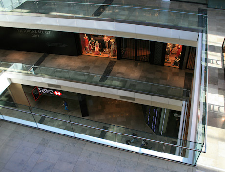
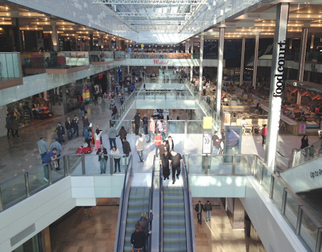
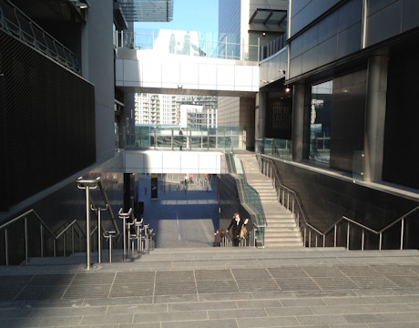
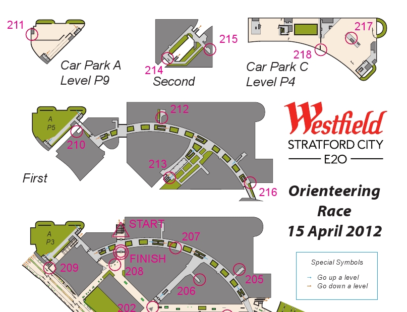
Yesterday was the Stratford City orienteering race, organised and planned by Josh Jenner, with the map done by myself. The map was a real fiddle to do, requiring four site visits and many hours in front of the computer to build up the six mapped levels (the top half of the is shown above) but the race went well in the end, with no major complaints, only minor ones (a few people found the level change arrows hard to spot, and some people didn’t spot some Out of Bounds areas and so ended up in an area that wasn’t mapped to detail.)

The weather was great (cold and clear outside, warm inside!) and nearly 100 people raced in five waves, including, notably, a wheelchair competitor. Not many “regular” orienteering areas are both wheelchair friendly and traffic free. I did have to hang some of the controls very high though – a couple over six foot off the ground – to use suitable mounting points. The centre management were enthusiastic about the race, and another edition is possibly in the future – possibly using a different format to keep the idea fresh.

After the race, two of the controls were missing – it turns out that one of the collectors had kept one by mistake, and the other had been retrieve by a concerned member of the public (it wasn’t locked down to the chair) and handed in to security, so eventually we were reunited with them all – a good thing as the control boxes are very expensive! The centre was, as expected, almost deserted for the earlier waves, but from 11am it started to get a good busy and it was a good thing the orienteering was out of the way.

I managed to get a run in myself, taking part in the last wave. I was strictly non-competitive, as I knew exactly where all the controls where and the best route to take between them. Despite this I was still beaten by Ed. My route was around 5.5km, I don’t think it would have been possible to visit all the controls and run in under 5km, which is not bad for a site that is only 400m across. The format of the race was score, i.e. controls could be visited in any order.

Some photos from me are here, and more photos and the results are on Josh’s website.

Thanks to Josh for the concept and organisation, and Westfield centre management for letting it happen and giving us full reign through the centre and even control suggestions!

Categories
Conferences London

CASA Smart Cities

[Updated x2] Just a note to say that I will be presenting some of my work, at the CASA Smart Cities free one-day conference. Over 200 tickets have already gone, but there are, at the time of writing, a few left.

There will be an exhibition at the conference, some people in the department have been building some very cool things which will be unveiled there. Unfortunately I’m not allowed to talk about the very coolest one of all, but I have been allowed to post the above graphic which has got something to do with it…

(If you want to have a guess at what it is, leave a comment!)

[Update 3/4 – Tickets are sold out, however I think an extra batch will be available soon.]
[Update 13/4 – A few more tickets now available.]

Categories
Olympic Park Orienteering Orienteering Events Log

Five Level Orienteering – Stratford City Race

If you thought the Barbican’s three levels were tricky to orienteer through, then you haven’t seen anything yet – there will a race taking place in and around the Westfield Stratford City retail complex in east London, on Sunday 15 April. The race will be over five levels of the indoor shopping centre area, plus the surrounding outside area.

The race is being organised by Josh Jenner, his website has full details and entries are open. I’m doing the map, which will be a 1:4000 A4 full-colour ISSOM map on waterproof paper. As you would expect, there are a number of special measures need for the event. The event is pre-entry only and it will be a mass start 45 minute score, with five “waves” starting between 9am and 10am – the early finish is needed to ensure that orienteers will have the space to run in, before the crowds arrive for the midday opening of the larger stores. Stratford City gets amazingly busy inside on a Sunday afternoon!

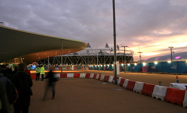
This will be the closest you will be able to get to the Olympic Park on an orienteering race for a few years to come – the park surrounds the triangular site on two sides, with the Athletes Villages to the north and the Olympic Stadium and the Aquatic Centre to the west. It’s the first orienteering race to take place here (the development has only been open for a few months) but it may well also be the last ever race here – with Sunday trading laws due to be relaxed for the Olympics and possibly becoming permanent after them, there may never be another opportunity to run around Westfield Stratford City free of crowds!

Categories
Olympic Park

Games Maker

Yay! I finally heard today that I have been accepted as a volunteer for the Olympic Games in London this summer. It won’t be a particularly glamorous role – I’m not going to be the guy that hands Usain Bolt his towel on the finish line – but I should be within the Olympic Park at least some of the time during my 10 days of volunteering.

Following my interview I had heard nothing, while various other members of SLOW (my orienteering club) had been accepted into various roles and had subsequently gone through the induction training programme, so I assumed the worst. Nice that it came through in the end.

I’ve managed to spend a little bit of time in the Olympic Park already – attending test events at the Copper Box (formerly the Handball Arena) and at the Velodrome. Plus I am also working on a very interesting project in and around the Stratford City retail complex that is surrounded on two sides by the Olympic Park – more on that soon.