Categories
BODMAS Data Graphics London

London Borough Websites and their Election Data

lewishamdata

Lewisham’s “data”

I’ve been looking at a lot of London Borough council websites recently, for the Election Map. I’d rather I hadn’t – just one website would be better – but in London, each borough council publishes its local election results first and foremost to its own website, rather than it being pushed to a more central location such as London Councils which only holds aggregate data. It is also likely that the London Data Store, run by the Greater London Authority, will publish the combined results in due course.

So I’ve been visiting the 32 council websites in order to obtain the full (i.e. number of votes for every candidate in every ward) election data for 2014, for some forthcoming work. It’s striking how differently the data is presented, from site to site. A number of councils use the same software to show the data, but even there there are slight differences – and the other council websites do entirely their own thing.

Perhaps of most surprise is that – in 2014, only 1 of the 32 councils provide their election results in a machine readable data (e.g. CSV). Step forward the London Borough of Redbridge and their excellent data website – its interactive and database-driven nature meant that it struggled to show the live results on election night itself (judging by some now-deleted Tweets they sent out) but now that the “surge” of interest has passed, it means it is very easily to obtain the full dataset, even including geographical IDs that are critically important when creating a map – matching by name is fraught with errors due to punctuation and abbreviation variations.

hounslowdata
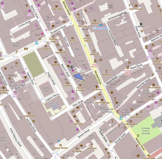
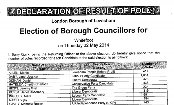
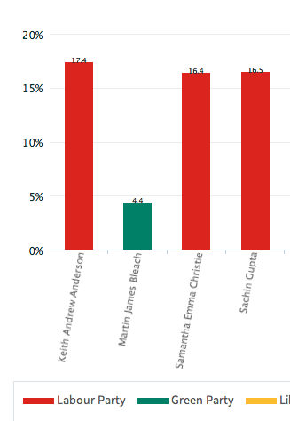
At the other end of the scale, Lewisham and Bromley councils only provide the data as PDFs. The tables contained with these does not indicate the winners – only the prose below it does. In Lewisham’s case the PDFs were scanned in so the text is not even copyable. Hounslow was a narrow second worst – while they did list all the candidates for all the wards on a single page (yay!) this information does not include the party that the candidates were representing (boo!). You have to go to another page for that and read the party name off a bar chart, as shown on the right here…

In the table below, I’ve awarded each council up to 5 stars on the following basis. This was inspired by Tim Berners-Lee’s Open Data deployment star system which uses a similar (but more nuanced) approach.

  • One star if the individual counts for most of the borough’s wards are available on the council’s main website or a dedicated subdomain, four days after the end of the election, in a searchable form (i.e. not as an image). Speedy and official publication is important for maximum transparency of the process. Only Lewisham failed have published their data by Monday evening. Croydon was pretty slow but got there in the end. Tower Hamlets results dribbled in but only one ward missed the deadline, which is not ideal but sufficient here.
  • Two stars if the data in available as structured data which is straightforward to manually extract for further processing. Examples where are good: HTML tables and Excel documents. Bromley’s results were supplied in the form of vector PDFs which made their tables difficult to copy. Hounslow’s results were presented in an attractive way, with maps and graphs, but no table containing both the candidate’s votes and their party.
  • Three stars if the data is free of errors and typos, such as punctuation problems (stray commas/hyphens, parts of candidate names in the party column, inconsistent ways of referencing which candidates were elected (or missing altogether) or party names, suggesting that it was input into the system in a structured/managed way.
  • Four stars if the data is supplied as a downloadable datafile in a standard machine-readable format, e.g. CSV, JSON, XML. Only Redbridge makes the data available in this way.
  • Five stars if the data contains ward and borough geographical identifier ONS GSS codes. Only Redbridge has this facility.
Rating Borough(s)
0 Lewisham
* Bromley, Hounslow
** Ealing, Hammersmith, Islington, Barking & Dagenham, Southwark, Kingston upon Thames^
*** Barnet, Bexley^, Brent^, Camden, Croydon, Enfield, Greenwich, Hackney, Hammersmith & Fulham, Haringey, Harrow^, Havering^, Hillingdon, Kensington & Chelsea, Lambeth^, Merton^, Newham^, Richmond upon Thames^, Sutton, Tower Hamlets^, Waltham Forest^, Wandsworth, Westminster
****
*****       Redbridge

^ = Councils that appear to use a common technology package for displaying their election results.

redbridgedata

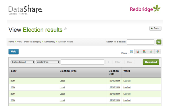
Redbridge’s excellent data website.

A number of councils, mainly in the 3* category above and marked with a ^, seem to use the same software for displaying their election results on their webpages. The software outputs the results as tables, and includes graphs. If this one piece of software was improved to allow a data download (e.g. as a CSV with ONS GSS codes) of the tabular data, and was then pushed out to the relevant sites, then a lot of councils could move to give stars with a minimum of effort.

Categories
BODMAS London

London’s New Political Colour: 2014 Elections

Here is the new political colour of London for 2014, following the local council elections last week. Rather than applying a simple colour to each of the 32 boroughs as most election maps do, I have instead represented all the 628 wards, across the boroughs, as a coloured circle. The map shows votes, not results. Every one of the 6+ million votes cast has an effect on the colour of one of the circles, in some way. Interactive version.

votecolour

The final colour for each dot is an addition of colours for the votes for each of the political parties in that ward. Red = Labour, Blue = Conservative, Green = everything else (Lib Dems, UKIP, Greens etc). By adding the colours in the correct proportions, in the RGB (Red-Green-Blue) colour space, a single representative colour for each ward can be obtained.

N.B. Lewisham hadn’t published most of its ward results, more than four days after the election, when I took these screenshots, so they are shown with black dots here. There are also three more black dots – two elections have been postponed and one recount is to happen later today. The interactive version of the map has been updated now that the delayed results and recounts has happened.

Here is a version using colours for just the elected councillors (a maximum of three) in each ward, rather than considering all votes cast:

electedcolour

These maps are an update of a website that I built back in 2010 to visualise the election data then. The traditional way of representing an election map – colouring in the wards as solid blocks to make a choropleth – tends to exaggerate the results in the sparser, larger wards on the edge of the capital. A common alternative, a cartogram, tends to distort the map in such a way that makes it “fairer” but at the expense of ending up with something which is difficult to recognise as a map of a familiar place. My “dots in the centres” approach is the best of both worlds – it works by assigning each ward the same amount of “data impact” on the map, while positioning the results in their correct geographical place.

colourtriangle

Red + Blue = Purple, so a purple dot is where people voted in roughly equal proportions for Labour and the Conservatives, and very few voted for other parties, which would act to make the colour greener. Similarly Red + Green = Brown – an area with little Conservative support. If all three categories have roughly equal numbers of votes, the colour would be grey.

Note that the colour addition technique has a three major flaws. Firstly, people who are colour-blind will struggle to see some of the contrasts. Secondly, the human eye, even for the non colour-blind, perceives colours of the same intensity differently. So, it is difficult to make quantitative judgements on the proportions, based simply on the colour. The third issue is that there are only three primary colours that can be used, which means a maximum of three categories can be visualised in this way. This means lumping in the Lib Dems and UKIP (amongst others) into the same category, which is I’m sure not where they’d want to be.

Let’s take the major parties individually – and this time, vary the areas of each circle by the number of votes received for that party:

labourconservatives

Labour (left) and the Conservatives (right) have strongholds in very different geographies of London – Labour tend to be inner and east, Conservatives outer and west. This tends to mean both parties have a good number of councillors, as their strongly varying popularity, geographically, favours them in the first-past-the-post system.

libdemgreen

The Lib Dem (left) and Green (right) votes are more closely aligned, running roughly on a north-south axis, through the centre of London.

ukip

UKIP’s votes are primarily in outer London only. All their elected councillors were in the outer eastern parts of London, but this graphic shows a quite strong, but “hidden” popularity, in the west and, to a lesser extent, south parts of outer London too.

You can view an interactive version of this map which is zoomable and scrollable, and also has the data for the two previous council elections, in 2010 and 2006. Note the 2010 election was during a general election, so the turnout was generally much higher – this is reflected in the increased sizes of the circles for the individual party maps. Some boundaries have changed between 2010 and 2014 so you’ll see some dots move a bit, as well as change colour.

The data behind these maps was collected from the various council websites over the weekend. I will pass comment on the dramatically varying qualities of the data access on the council sites in a subsequent post, but you can download the data that I did manage to collect, tabulate and normalise, as a tab-delimited 1.2MB text file, suitable for importing into Excel. There are almost 7000 candidates included there, and I am hoping to update it as the final few results come in.

This work was carried out as part of the BODMAS project (Big Open Data Mining & Synthesis) at UCL’s Centre for Advanced Spatial Analysis (CASA).

Categories
Munros

The Munros: 2 – Mayar & 3 – Ben Lomond

Mayar is a bump on the high ground between Linn of Dee and the Angus Glens, not a classic Munro by any means but it was conveniently close to my school’s outdoor activity centre, Blair House, which made it a good hill to introduce to people. It was my second Munro, climbed sometime in March 1994. Being part of a Geography field trip, our route to the Munro was rather interesting – rather than taking the normal path up from Glen Doll (at the head of Glen Clova), we climbed into a hanging corrie – Corrie Fee – which is one of a number of distinctive features in this heavily glaciated area. I remember a walk through glacial moraine in the corrie itself, before a challenging exit up through the head – more a scramble than a walk, I remember. The high plateau was then reached, and the Munro was some way behind.

I was perhaps starting to get the Munro bug though, and a month later I managed to persuade my dad to drive over to Loch Lomond, to climb Ben Lomond, my third. The most southerly Munro, and easily accessible from Glasgow, it is one of the most popular. I was expecting an easy climb, and the first part was – up a very eroded path through woodland and then along a broad ridge. I however wasn’t expecting the quite sharp summit itself. It was also quite icy, and, although there was no view from the top, I got a sense of being on top of a real mountain – certainly one more sharply defined than Mayar a month earlier. Ptarmagen, the neighbouring top, would have made for an interesting extension and a more novel way back down to the shores of Loch Lomond, but instead I think we simply retraced our steps. We might have been a bit tired. The loch being at just 50m above sea level meant that it was a relatively large amount of climbing for a single peak.

Categories
London Technical

Centre of London – the Debate Rumbles On

londoncentre

There’s a lot of ways you can define the centre of London.

The Londonist had a good go last month, and CASA geographer Adam Dennett has a shot too, following an article in today’s Evening Standard newspaper.

  • The former site of the Charing Cross, marked by a plaque in front of the Charles I statue at the small roundabout in Trafalgar Square. It is where distances to “London” are measured to on the UK road network.
  • Trafalgar Square itself as the “focal point” of London events.
  • Centre Point by Tottenham Court Road station (because of the building’s name).
  • Bank junction (because a lot of roads converge at a single point there, and it is the heart of the historic City of London).
  • Farringdon station because that is where Thameslink and Crossrail, London’s two major cross-capital railway lines, will meet.
  • Oxford Circus as this is the busiest tube station on the network.
  • The Londonist definition of Frazier Street near Waterloo, based on the centroid of the Greater London administrative boundary.
  • The Evening Standard definition of a bench on the Victoria Embankment, based on the centroid of the inner London ring road.
  • Adam’s definition which is between Jubilee Gardens and Waterloo, based on the centroid of a weighted population distribution (so the dense inner city populations affect the location more than the sparse surburbs). Jubilee Gardens is just by the London Eye.
  • There are, I’m sure, many others.

I offer an alternative definition – the place which is within London but furthest from the Greater London boundary as the crow flies. A few negative Buffer operations in QGIS reveal that this place, 16.77 km or 10.42 miles from three places on the Greater London border (to the north-east, north and south-west), is Tyler’s Court in Soho , just off Wardour Street – see map above. There is nowhere else in London that is further away from its borders. I don’t think my definition is as geographically appropriate as some of the others above (as it is subject to the whims of the meandering London border more than its area or its population), but certainly if you are ever wandering around Soho on a Saturday evening, it feels a long way from the Great British Countryside.

Image background mapping © OpenStreetMap contributors.

Categories
Cycling Leisure

Zone 3 Orbital

14105958511_e24c3dfc40_z

London’s travel zones dictate how much your journey will cost, but their radial nature forms an interesting geography for London in general. While zones actually only apply to stations and not the space between them (the official tube map distorts distance, and you won’t see an official geographical map with zones on it), you can squint at a map and approximate where each zone lies.

Zone 3 is the “hinterland” between inner London (Zones 1 & 2, or thereabouts) and outer London (roughly Zones 4-6). Zone 1 has an orbital tube line (the Circle Line) and Zone 2 has the circular part of the London Overground. I reckon there’s another circuit to be made – this time by bicycle. So, last weekend, I decided to do a complete circuit of London, staying entirely in Zone 3.

zone3map

Route as zoomable, downloadable map.

It’s a 59 mile circuit, I chose to start and end it in the Lea Valley by Tottenham Hale, but there’s several other obvious points to start it from, including Kew Bridge which is where I broke the route over two days – the distance is certainly doable in a day, but cycling in London traffic for a sustained period is quite exhausting. It took around seven hours in total – I was going very slowly.

Starting from Tottenham Hale, I headed down the canal towpath beside the River Lea, passing many moored canal boats (noticeably more than just a few years ago), the Lea Rowing Club and Springfield Marina. Crossing to the eastern side of the Lea Valley, is this extremely low bridge. The cycle path is good all the way down to Hackney Marshes, where the taller buildings in the newly opened Queen Elizabeth Olympic Park appear on the horizon. Not all the entrances to the park are quite open yet, including my intended entry by the Velodrome, but a short road section leads to the “lower” routes through the park, via new paths down at the riverside. The park is also a bit tricky to exit out of at the other end, with both the long-standing closure of a section of the Greenway, still in place. Then onto the Greenway proper, passing the impressively Victorian Abbey Mills Pumping Station. Then down to ExCeL, dodging the obstruction of the Crossrail building works, and onto the Connaught Bridge, squeezing past London City Airport.

The first crossing of the Thames is via the Woolwich Foot Tunnel which is quite atmospheric – definitely the quieter, edgier version of its Greenwich cousin. I then followed (in reverse) the route of the first three miles of the London Marathon, via Charlton House, which I failed to notice during the run itself! The view from Greenwich Park is one of the most famous in London, but looking the other way is also striking, with a glimpse of the church at Blackheath. I was heading into south London sururbia now, trying to avoid the South Circular as much as possible, but this section was unexpectedly pleasant and interesting, despite being largely residential. A Zone 3 highlight is the Horniman Museum, its lovely Victorian conservatory currently closed but with another great view to London’s skyscrapers. South London’s Zone 3 has much green space including Dulwich Park, Tooting Common, Wimbledon Common with its windmill, and the eastern part of Richmond Park (which is huge), complete with deer, but also this rebuilt church and a rather old railway bridge, as well as this distinctive looking tube station. Then I was back to the bank of the River Thames at Mortlake.

14118494704_5faefcd3db_z

For the second day I started by redoing the Thames path section, it was more enjoyable this time as there were fewer swarms of flies! Crossing at Kew Bridge, my route through north London was, on the whole, less interesting, although I did pass this attractive pub (spot the animal on the roof) at Ealing, and it was good to see the odd bit of decent cycle infrastructure. The parks here are smaller but Hanger Hill Park was a pleasant diversion – Hanger Lane Gyratory less so. Park Royal is a fading and grim part of town – note the poster on the right urging people to fill in the census (three years ago!) and the canal is unattractive here – and the towpath cramped. However, within the north-west London dullness (thanks for nothing, North Circular Road!) there is this dramatic building which I’d been meaning to visit for years. Gladstone Park in Dollis Hill (above) is very hilly, and lovely, but Hampstead Garden Surburb was an odd place, clogged with cars and not living up to its billing of being the most expensive and desirable place in the whole of Zone 3 (I would rather live in Lee or Hither Green if I had a choice!). Ally Pally is dramatic, as are the views, but it’s a shame that it is still little used, given its illustrious history. Broadwater Farm is also dramatic looking, in a very different way. The whole estate is built on stilts, because of the nearby brook. Finally, back to Tottenham and bit of history – here’s the town’s High Cross.

38 Photos of the most interesting things I saw
Map of the photos – scroll right for the last few.

Squinting at this map on Londonist, and this one, I deduced that I had managed to stay in Zone 3 all the way around. The Woolwich Foot Tunnel is nearly (but not quite) in Zone 4, Bellingham is also close, and the southern part of Wimbledon Common is definitely on the outer edge. Richmond Park is an interesting one, going all the way from Zone 3 in the north and east, to Zone 4 in the west and Zone 6 in the south. So I stayed in the eastern part of the park.

My highly unscientific and overly sweeping observations from the route (remember, based on Zone 3 only!) can be summed up as:

  • I found East London more interesting than West London
  • I found South London was prettier than North London

This is based on the Olympic Park canals, and parks of the Lea Valley – and Greenwich Park – being a lot more interesting places than the various tired looking parks in west London (Gunnersbury Park in particular) and the Grand Union Canal is pretty industrial in north-west London. South London is prettier as it isn’t spoilt by the nightmare that is the North Circular road, which acts to cut off outer North London from the inner part, in a way that the South Circular road doesn’t.

13922510417_60f3d3228a_z

Categories
Bike Share

More Cities, More Bikes, More Data

Screen Shot 2014-05-06 at 16.06.21

I presented some research I’ve carried out at CASA, at the Cycle City conference in Leeds last week. The research shows how the numbers of bikeshare bikes and docking stations have varied between 2010 and 2014, for 46 systems across the world (not all systems have numbers for whole period of study). The numbers are from the database which backs my live global map.

View the slides from my presentation here.

The work has been written up into a CASA Working Paper (#196). The appendix includes the numbers of bikes and docking stations, for the 46 systems, across eight periods of collection in six-monthly intervals from October 2010. You can view the paper as a PDF by following the link above.