Categories
Technical

Behind the Code in Tube Heartbeat

Cross-posted to the 360 Here blog.

As a follow-up to my intro post about Tube Heartbeat, here’s some notes on the API usage that allowed me to get the digital cartography right, and build out the interactive visualisation I wanted to.

The key technology behind the visualisation is the HERE JavaScript API. This not only displays the background HERE map tiles and provides the “slippy map” panning/zoom and scale controls, but also allows the transportation data to be easily overlaid on top. It’s the first project I’ve created on the HERE platform and the API was easy to get to grips with. The documentation includes plenty of examples, as well the API reference.

The top feature of the API for me is that it is very fast, both on desktop browsers but also on smartphones. I have struggled in the past with needing to optimise code or reduce functionality, to show interactive mapped content on smartphones – not just needing to design a small-screen UI, but dealing with the browser struggling to show sometimes complex and large-volume spatial data. The API has some nice specific features too, here’s some that I used:

Arrows

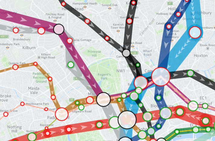
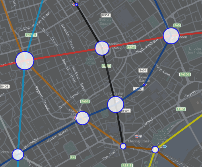
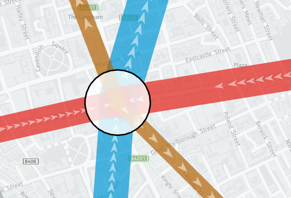
One of the smallest features, but a very nice one I haven’t come across elsewhere, is the addition of arrows along vector lines, showing their direction. Useful for routing, but also useful for showing which flow is currently being shown on a bi-directional dataset – all the lines on Tube Heartbeat use it:

var strip = new H.geo.Strip();
strip.pushPoint({ lat: startLat, lng: startLon });
strip.pushPoint({ lat: endLat, lng: endLon });

var polyline;
var arrowWidth = 0.5; /* example value */

polyline = new H.map.Polyline(
	strip, { 
		style: { ... }, 
		arrows: { 
			fillColor: 'rgba(255, 255, 255, 0.5)', 
			frequency: 2, 
			width: arrowWidth, 
			length: arrowWidth*1.5 
		}
	}
);

polyline.zorder = lines[lineID].zorder;

The frequency that the arrows occur can be specified, as well as their width and length. I’m using quite elongated ones, which are 3 times as long as they are wide, and occupy the middle half of the arrow (above/below certain flow thresholds, I used different numbers). A frequency of 2 means there is an arrow-sized gap between each one. Using 1 results in a continuous stream of arrows. (N.B. Rendering quirks in some browsers mean that other gaps may appear too.) Here, the blue and red segments have a frequency of 1 and a width of 0.2, while the smaller flows in the brown segments are shown with the frequency of 2 and width of 0.5 in the example code above:

tubeflows

Z-Order

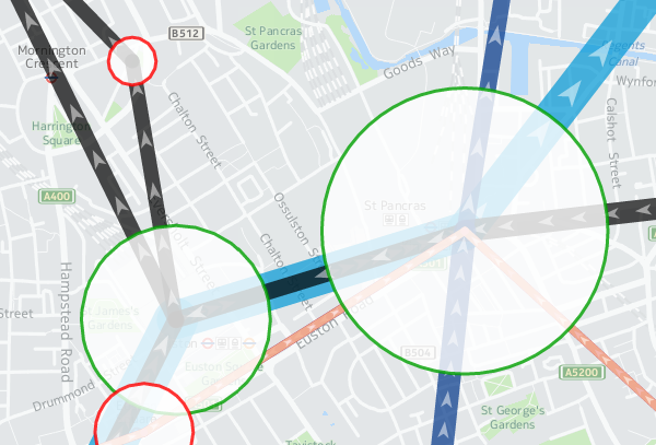
Z-order is important so that the map has a natural hierarchy of data. I decided to use an order where the busiest tube lines were generally at the bottom, with the quieter lines being layered on top of them (i.e. having a higher Z-order). Because the busier tube lines are shown with correspondingly fatter vector lines on the map, the ordering means that generally all the data can be seen at once, rather some lines being hidden. You can see the order in the penultimate column of my lines data file (CSV). I’m specifying z-order simply as a custom object “zorder” on the H.map.Polyline, as shown in the code sample above. This then gets used later when assembling the lines to draw, in a group (see below).

Translucency

I’m using translucency both as a cartographical tool and to ensure that data does not otherwise become invisible. The latter is simply achieved by using RGBA colours rather than the more normal hexadecimals; that is, colours with a opacity specified as well as the colour components. In the code block above, “rgba(255, 255, 255, 0.5)” gives white arrows which are only 50% opaque. The tube lines themselves are shown as 70% opaque – specified in lines data file along with the z-order – this allows their colour to appear strongly while allowing other lines or background map features/captions, such as road or neighborhood names, to still be observable.

While objects such as the tube lines can be made translucent by manipulating their colour values, layers themselves always display at 100% opacity. This is probably a good thing because translucent map image layers could look a mess, if you layered multiple ones on top of each other, but it means you need to use a different technique if you want to tint or fade a layer. Because even the simplified “base” background map tiles from HERE for London have a lot of detail on them, and the “xbase” extra-simplified ones don’t have enough for my purposes, I needed a half-way house approach. I acheived this by creating a geographical object in code and placing it on top of the layers:

var tintStyle = {
	fillColor: 'rgba(240, 240, 240, 0.35)'
};
var rect = new H.map.Rect(
	new H.geo.Rect(	42, -7, 58, 7 ), 
	{ style: tintStyle }
);
map.addObject(rect);

The object here is a very light gray box, at 35% opacity, with an extent that covers all of the London area and well beyond. In HERE JavaScript API, such objects automatically go on top of the layers. My tint doesn’t affect the lines or stations, because I add two groups, containing them, after my rectangle:

var stationGroup = new H.map.Group();
var segGroup = new H.map.Group();
map.addObject(segGroup);
map.addObject(stationGroup);  

Object Groups

I can add and remove objects from the above groups rather than directly to the map object, and the groups themselves remain in place, ordered above my tint and the background map layers. Objects are drawn in the order they appear in the group, the so-called “Painters Algorithm“, hence why I sort using my previously specified “zorder” object’s value, earlier:

function segSort(a, b)
{
	var lineA = parseInt(a.zorder);
	var lineB = parseInt(b.zorder);
	if (lineA > lineB) return 1;	
	if (lineA < lineB) return -1;
	return 0;
}

var segsToDraw = [];
segGroup.removeAll();

...

segsToDraw.sort(segSort);	
for (var i in segsToDraw)
{
	segGroup.addObject(segsToDraw[i]);									
}		 

Circles

There are super easy to create and illustrate the second reason that I very much like the HERE JavaScript API. The code is obvious:

var circle = new H.map.Circle(
	{	
		lat: Number(stations[i].lat), 
		lng: Number(stations[i].lon)
	}, 
	radius, 
	{ 
		style: { 
			strokeColor: stationColour, 
			fillColor: 'rgba(255, 255, 255, 0.8)', 
			lineWidth: 3 
		} 
	}
);

These are my station circles. They are thickly bordered white circles, as is the tradition for stations on maps of the London Underground as well as many other metros worldwide, but with a little bit of translucent to allow background map details to still be glimpsed. Here you can see the circle translucencies, as well as those on the lines, and the arrows themselves, the lines also being ordered as per the z-order specification, so that the popular Victoria line (light blue) doesn't obscure the Northern line (black):

translucency

Other Technologies

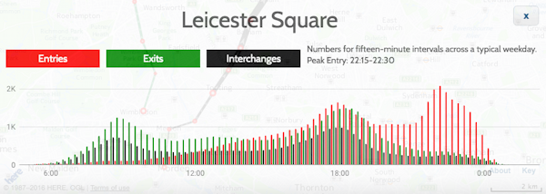
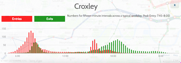
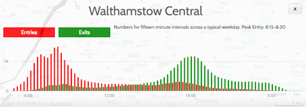
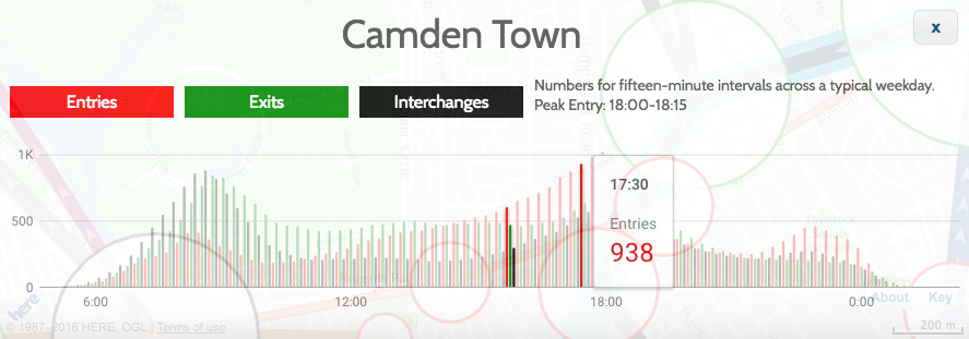
As well as the HERE JavaScript API, I used JQuery to short-cut some of the non-map JavaScript coding, as well as JQueryUI for some of the user controls, and the Google Visualization API (aka Google Charts) for the graphs. Google's Visualization API is full-featured, although a note of caution: I am using their new "Material" look, which works better on mobile and looks nicer too than their regular "Classic" look - but it is still very much in development - it is missing quite a few features of the older version, and sometimes requires the use of configuration converters - so check Google's documentation carefully. However, it produces nicer looking charts of the data, a trade-off that I decided it was worth making:

google_material_chart2

These are just some of the techniques I used for Tube Heartbeat, and I only scratched at the surface of the HERE APIs, there are all sorts of interesting ones I could additionally incorporate, including some you might not expect, such as a Weather API.

Try out Tube Heartbeat for yourself.

Background map tiles shown here are Copyright HERE 2016.

Categories
London

Crossrail: Tottenham Court Road Station

tcr1

Thanks to spotting a notification for a tour of several Crossrail stations as part of a get-parents-and-kids-into-construction day, I was able to visit a space deep beneath Oxford Street and Tottenham Court Road, back in July, to look around the huge Crossrail station there which is rapidly taking shape, with Crossrail (aka the Elizabeth line) due to start through the centre of London in only a couple of years.

There is lots of activity on the site, as would be expected, and at times it was tricky for the tour to move around, but eventually we made it to level minus 4 – platform level, and were able to walk the length of the platforms, as well as an intermediate tunnel that runs between them, to get an appreciation of the scale of underground Crossrail stations, which are noticeable bigger than their regular tube equivalents.

One real surprise for me was to see the distinct curve on the eastbound platform. It’s the only underground one in the Crossrail network, and was necessitated by the tight nature of threading the stations and tunnel tubes through the area – at one point, less than a metre from the Northern Line platforms there. The curve will no doubt provide challenges for the station cladding, as well as the automatic platform-edge doors that will be on all the underground stations on Crossrail.

tcr2

We also got a glimpse of the huge bank of escalators which will take people up and down from the station level. Pouring the huge slab of concrete to set not horizontally, but at the 30 degree angle of the escalators themselves, was another considerable engineering challenge.

Level -4 is not the lowest level, and we also got a quick look at Level -5, which runs underneath the platforms themselves and provides all the cabling and pipe infrastructure for the station and indeed the running lines themselves. No more cables running along the nice new tunnel tubes, or disfiguring the space age, Star Wars-like stations with their white acrylic panel sections and organic looking curves rather than corners.

tcr2a

It was also nice to see a glimpse of some rather pleasing looking concrete ceilings – they reminded me of the bold Euston Station ceiling that hardly anyone spots – sadly I suspect they will not appear “raw” in the finished station, but the green and orange glows of the worklights on them looked great.

tcr3

(By the way, I’ve been into the station construction site before, in March 2015.)

All in, a great tour of one of the stations that will be a significant addition to London’s transport capability, and looking forward to seeing the finished product at the end of 2018.

Categories
London

Open Doors: Bermondsey Dive-Under

diveunder1

The third tour I managed during the Construction Open Doors week of events back in June was to the site of the Bermondsey Diveunder. After visiting the (re)beginnings of a skyscraper, and a huge building development – this was something very different – a project building downwards, reusing old Victorian arches and the space between tracks on a very busy junction near London Bridge station, to allow for a “metro” frequency service into London Bridge and up through the centre of the capital to St Pancras – the so-called Thameslink Programme.

The project is building a “diveunder” – letting certain inbound services pass beneath outbound services elsewhere, so allowing a greater frequency of service. Essentially it is “grade separating” a busy junction, which happens to be part of the world’s oldest railway viaduct and once the longest viaduct of any kind, stretching over four miles from London Bridge to Greenwich.

diveunder2

From a historical perspective, it is nice to see that as much use of the existing, historic arches as possible is being made – the main part of the diveunder itself sitting on them until it ducks too low and they are replaced with smaller, modern ones, and eventually solid concrete. With the first big part of the new London Bridge station concourse opening up this weekend, things are starting to gear up and hopefully the extra capacity created by the diveunder will, in the short term, help to repair the currently badly suffering Southern services through the area, once it is opened in just a few short months.

diveunder3

The tour ended personally for me with a sour note – I returned back to find my bike was stolen. I’m happy to put South Bermondsey on my list of places to avoid in London in the future, except perhaps looking out of a train window at the new, sweeping lines that have been installed here.

Categories
Data Graphics London

Tube Heartbeat

tubeheartbeat

Tube Heartbeat is a interactive map that I recently built as part of a commission by HERE, using the HERE JavaScript API. It visualises a fascinating dataset that TfL makes available sporadically – the RODS (Rolling Origin Destination Survey) – which reveals the movements of people on the London Underground network in amazing detail.

The data includes, in fifteen-minute intervals throughout a weekday, the volume of tube passengers moving between every adjacent pair of stations on the entire tube network – 762 links across the 11 lines. It also includes numbers entering, exiting and transferring within each of the 268* tube stations, again at a 15 minute interval from 5am in the morning, right through to 2am. It has an origin/destination matrix too, again at fine-grained time intervals. The data is modelled, based on samples of how and where passengers are travelling, during a specimen week in the autumn – a period not affected either by summer holidays or Christmas shopping. The size of the sample, and the careful processing applied, means that we can be confident that the data is an accurate representation of how the system is used. The data is published every few years – as well as the most recent dataset, I have included an older one from 2012, to allow for an easy comparison.

As well as the animation of the data, showing the heartbeat of London as the the lines pulse with passengers squeezing along them, I’ve including graphs for each station and each link. These show all sorts of interesting stats. For example, Leicester Square has a huge evening peak, when the theatre-goers head for home:

leicestersquare

Or Croxley, in suburban north-west London, with a very curious set of peaks, possibly relating to the condensed school day:

croxley

Walthamstow (along with some other east London stations) has two morning rush-hours with a slight lull between them:

walthamstow

Check the later panels in the Story Map, the intro which appears when first viewing Tube Heartbeat, for more examples of local quirks.

This is my first interactive web map produced using the HERE JavaScript API – in the past, I have extensively used the OpenLayers, as well as, a long while back, Google Maps API. The API was quick to pick up, thanks to good examples and documentation, and while it isn’t quite as full-featured as OpenLayers in terms of the cartography, it does include a number of extra features, such as being quickly able to implement direction arrows along lines, and access to a wide variety of HERE map image tiles. I’m using two of these – a subdued gray/green background map for the daytime, and an equivalent darker one for the evening data. You’ll see the map transition between the two in the early evening, when you “play” the animation or scrub the slider forwards.

Additionally, I’ve overlayed a translucent light grey rectangle across the map, which acts to further diffuse the background map and highlight the tube data on top. The “killer” feature of HERE JavaScript API, for me, is that it’s super fast – much faster than OpenLayers for displaying complex vector-based data on a map, on both computer and smartphone. Being part of the HERE infrastructure makes access to the wide range of HERE map tiles, with their distinctive design, easy, and gives the maps a distinctive look. I have previously used HERE mapping for some cities in the Bike Share Map (& another example), initially where the OpenStreetMap base data was low in detail for certain cities, but now for all new cities I “onboard” to the map. The attractive cartography works well at providing context for the bikeshare station data there, and the tube flow data here.

There is some further information about the project on the HERE 360 blog, and I am looking to publish a more deatiled blogpost soon about some of the technical aspects of putting together Tube Heartbeat.

Stats

Number of stations Number of lines Number of line links between stations
268* 11 762

Highest flows of people in 15 minutes, for the four peaks:

Between stations (all are on Central line)
Morning 8208 0830-0845 Bethnal Green to Liverpool Street
Lunchtime 2570 1230-1245 Chancery Lane to Holborn
Afternoon 7166 1745-1800 Bank/Monument to Liverpool Street
Evening 2365 2230-2245 St Paul’s to Bank/Monument
Station entries
Morning 7715 0830-0845 Waterloo
Lunchtime 1798 1130-1145 Victoria
Afternoon 5825 1730-1745 Bank/Monument
Evening 2095 1015-1030 Leicester Square
Station interchanges
Morning 5881 0830-0845 Oxford Circus
Lunchtime 2060 1330-1345 Oxford Circus
Afternoon 5043 1745-1800 Oxford Circus
Evening 1109** 2215-2230 Green Park
Station exits
Morning 6923 0845-0900 Bank/Monument
Lunchtime 2357 1145-1200 Oxford Circus
Afternoon 7013 1745-1800 Waterloo
Evening 1203 1015-1030 Waterloo

* Bank/Monument treated as one station, as are the two Paddington stations.
** Other stations have higher flows at this time but as a decline from previous peak.

I’m hoping to also, as time permits, extend Tube Heartbeat to other cities which make similar datasets available. At the time of writing, I have found no other city urban transport authority that publishes data quite as detailed as London does, but San Francisco’s BART system is publishes origin/destination data on an hourly basis, there is turnstyle entry/exit data from New York’s MET subway, although only at a four-hour granularity, and Washington DC’s metro also publishes a range of usage data. I’ve not found an equivalent dataset elsewhere in Europe, or in Asia, if you know of one please do let me know below.

tubeheartbeat2

The data represented in Tube Heartbeat is Crown copyright & database right, Transport for London 2016. Background mapping imagery is copyright HERE.

Categories
London

Open Doors: Battersea Power Station

batt5
I’ve been slow to write about all my Open Doors week construction-site visits back in June, but as well as seeing a soon-to-be-skyscraper, I also made it to two other sites, the largest of which far-and-away was Battersea Power Station – more specifically, the “Phase 1” work beside it, which is the construction of two huge 20-story-high blocks that will surround the venerable power station – itself also a building site right now as part of the “Phase 2” work.

batt3

The blocks were all sold off-plan long ago, and construction is taking place at a frenetic pace, as the developer aims to deliver the accommodation as soon as they can. The sheer amount of activity is breathtaking, with over 2000 workers on site.

batt2

The tour included a visit to the basement infrastructure of the new blocks, as well as looking inside a couple of the flats (which include pre-fabricated bathrooms that have been just dropped in), and – the definite highlight – a journey up a hoist to the roof, from which you looked down to the roof of the old power station, or across the Thames to central London, and to the garden of the £4m+ penthouse that will be there soon.

batt6

There were a few additional surprises, such as a spiral staircase being constructed, and a close-up view of the power station in transformation (the route to the Phase 1 work is along a narrow pathway between the station and the river).

batt7

batt1

It was great to see too the chimneys of Battersea Power Station being restored – having disappeared from the skyline at the beginning of the project (sulphur damage had made them structurally unstable), the first of the four replacements, constructed with the same techniques and materials, has now reappeared.

batt4a