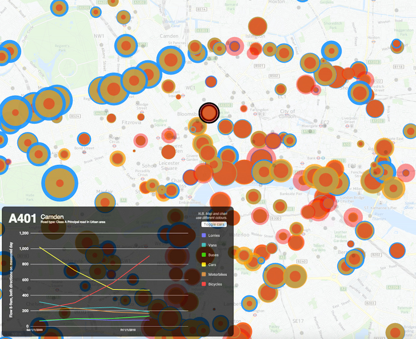
My latest London data visualisation crunches an interesting dataset from the Department of Transport (there’s also a London Borough of Southwark version using their local observation data). The data is available across England, although I’ve chosen London in particular because of its more interesting (i.e. not just car dominated) traffic mix. I’ve also focused on just the data for 8am to 9am, to examine the height of the morning rush hour, when the roads are most heavily used. 15 years worth of data is included – although many recording stations don’t have data for each of those years. You can choose up to three modes of transport at once, with the three showing as three circles of different colours (red, yellow and blue) superimposed on each other. The size of each circle is proportional to the flow.
It’s not strictly a new visualisation, rather, it’s an updated version of an older one which had data from just one year, using “smoothed” counts. But it turns out that the raw counts, while by their nature more “noisy”, cover a great many more years and are split by hours of the day. I’ve also filtered out counting stations which haven’t had measurements made in the last few years.
Note also the graph colours and map colours don’t line up – unfortunately the Google Material API, that I am using for the charting, does not yet allow changing of colours.
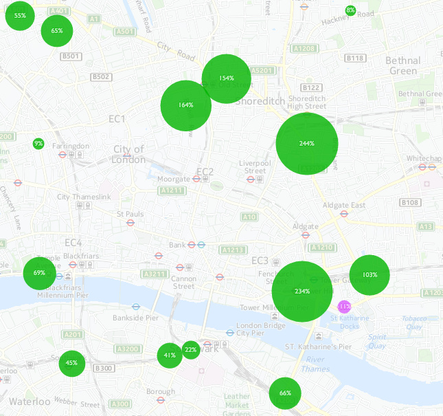
An alternate mode for the map, using the second line of options, allows you to quantify the change between two years, for a single selected type of transport. Green circles show an increase between the first and second year, with purple indicating decreases.
5 replies on “Evolution of London’s Rush Hour Traffic Mix”
Hi Oliver, I’m getting in touch to ask if there’s any chance you can offer me any help/advice to find/create a slightly different graphical representation of motor vehicle traffic in London. I’m after something like a heat map showing levels of traffic along roads in the ULEZ. I’d like to generate a graphical representation something like this one https://twitter.com/_hugh_c/status/1208450326216486913?s=20 but showing traffic data rather than pollution. I know the data is available (at https://t.co/CQla22p1St?amp=1 e.g.) but I don’t know what tools I can use to produce a graphical representation of this data.
Any help/advice you can offer will be much appreciated!
Festive best wishes,
Hugh
Hi Hugh, I replied to your email, but yes this is a challenge – you need to get data from two sets of LAs – TfL (red routes) and each borough council (minor roads) and then try and stitch things together. Or alternatively use the DfT traffic data but be aware this doesn’t cover all roads. You then need to get it in a GIS (e.g. QGIS) to visualise it and process the geospatial data.
Very nice visualization.
Unfortunately, the background map is not visible….
Makes the interpretation of the map somehow impossible
Looks OK here and have tested with various browsers/computers – what browser/computer are you using?
[…] from the author’s research blog. Data DfT, TfL and LB Southwark. Background map from HERE […]