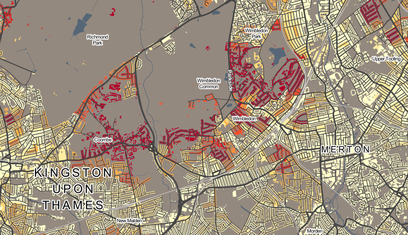
This week, James and I launch DataShine: Census. This is part of the ESRC BODMAS project, here at UCL’s Centre for Advanced Spatial Analysis, that is led by James, and which started at the beginning of this year.
DataShine: Census shows web maps of the Quick Statistics aggregate tables of Census data for England/Wales for 2011, that were published last year by the Office of National Statistics.
DataShine: Census is the successor to CensusProfiler which I put together when I was at UCL’s Department of Geography in 2009. The main difference, apart from being a more modern website with updating URLs, geolocation etc, is that the data maps presented are “shone” through buildings, rather than covering all the land area. This has two advantages, and two disadvantages. The two advantages are that it means the countryside doesn’t dominate, and that the urban form (building blocks, parks, road structures) is more recognisable – so it looks more like a map of real places rather than a complicated patchwork of bright colours with abstract boundaries. The two disadvantages are that buildings can be individually represented, implying a greater level of spatial precision than is the case.
For the Census data, I wanted to come up with a good way of showing an interesting map, for all ~900 census aggregate variables, without having to make 900 decisions manually. To do this, I calculated the average percentage population, based on the populations across the output areas (~150 houses each), and the standard deviation of the percentage population. When you do this, and then plot the two statistics for each variable against each other, you get a graph like this:
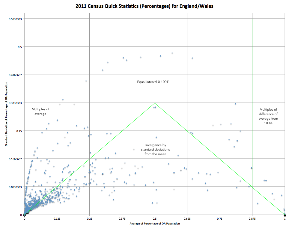
Most variables have very small averages and so cluster at the bottom left hand side. The distinctive line of variables with small averages and high standard deviations are where the overall population is care homes and other institutions, rather than people or standard households.
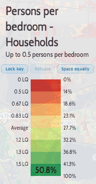
I have split the variables into four sections, each of which is grouped differently for the key. The ones under the main triangle are mapped using a divergent colour scheme (red/green by default) from the average, which always appears in the middle of the key:
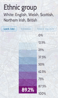
The ones above it (high standard deviations) are mapped as simple equal intervals of eighths, between 0 and 100%:
Finally, variables with very small/large averages, and large standard deviations, are mapped as multiples of the average (or 1-average) – here the average will always appear one from the beginning or the end of the key:
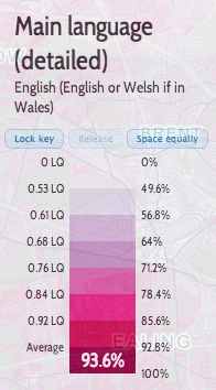
|
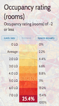
|
(The other three are using sequential colour ramps.)
DataShine is a platform for creating these kinds of web maps. As well as the initial census example, we are hoping to use it create other sorts of web maps, I hope to release and blog about those soon! I am also running a dedicated DataShine blog, which currently features some examples of particularly interesting maps coming from DataShine: Census, as well as some technical detail of the “geostack” behind the platform.
James has also written about the project.
One reply on “Introducing DataShine”
[…] of UCL who have been doing very clever things with OS Maps and 2011 Census Data. More of which is here. On a […]