Categories
OpenStreetMap

Wheelmap – The Right Way for the World to Tag OpenStreetMap

I recently came across Wheelmap, a website (and also an associated iPhone app) specifically built to display – and accumulate – wheelchair accessibility information for points of interest (POIs) such as pubs, cafes, shops on OpenStreetMap. As you move around the map, an overlay highlights the POIs and colour-codes their accessibility for wheelchair users. Adding or changing the accessibility for a POI is as easy as clicking on it and clicking one of three options – job done! The data is then fed back to OpenStreetMap (so the whole community gets the benefit of this extra “tagging” information) and Wheelmap itself updates the colour.

The website is not perfect – the location finder is not yet fully localised from its German origin, for example, also the map controls aren’t styled like the rest of the site and the default OpenStreetMap map also shows its own symbols for many POIs, so they really need their own custom render – but this is nonetheless a great implementation targeting very specific data in the OpenStreetMap database and making it absolutely trivial for anyone to enhance the map in this way. I’m a firm believer that the easier it is to do something, the greater number of people will contribute.

Categories
London OpenStreetMap

Friday Review: London Crumpled City Map

I got the London Crumpled City Map as a Christmas pressie. It is a large scale map of central London – covering most, but not all, of Zone 1 – the eastern edge of the City is chopped off. It is designed and produced by an Italian company, and is one of a series of maps that also includes New York, Paris, Tokyo, Berlin and Rome.

The big feature about the map is you can scrunch it up into a ball and keep it in the soft pouch that comes with it – unraveling for later use is straightforward. The map is printed on a very thin and light plastic waterproof sheet, kind of like a synthetic tablecloth. The map remains very creased when it is flattened out – naively I was expecting it to spring back to its perfect condition which it was in when I opened the present – but is still very readable.

The cartography is simple and clear – grey roads with black text, on white. Large buildings are shown in lighter grey, parkland is in olive and the Thames is an unusually light blue. It’s too simple in places – paths in parks and on the Thames’s pedestrian bridges appear just like the roads, and bridges and tunnels are not shown, which means the Victoria Embankment appears to end abruptly as Blackfriars, rather than continuing under it as Upper Thames Street. Surface railway lines are present as narrow lines. Only the TfL stations are shown – City Thameslink is missing, for instance.

As a some-time contributor to the project, I’m pleased to see (thanks to the prominent credit on the map) that the data is from OpenStreetMap. Unfortunately the map does have a number of typos, more so than you would normally expect for a central London map. I’m not sure if these are due to the OpenStreetMap data – in which case the data must have been sourced a long time ago, as OpenStreetMap is pretty good in central London these days – or from an independent list of points of interest which have been superimposed on the top.

From the nature of the mistakes, I’m pretty sure OSM is not at fault here. For example, UCL appears as the University College of London, and Russel(l) Square station is missing an “l”. The Diana memorial fountain in Kensington Gardens appears as “Diana, Princess of Wales Memorial Fund”. A mysterious second “Paddington” station appears where the Bakerloo Line’s Edgware Road station is, and the other Edgware Road station doesn’t appear at all. Some of the landmarks are a bit dubious – the Royal Agricultural Hall is actually better known these days as the Business Design Centre in Islington and has been as such for at least 15 years. There are some prominent landmarks missing too, such as the Globe theatre on Bankside, the Old Bailey and the BFI IMAX cinema in Waterloo.

So – it’s probably not a particularly useful map for anyone – for tourists it leaves off too many attractions and stations, for cyclists and drivers it doesn’t distinguish between paths and roads, and for walkers, it doesn’t show the route of the underground lines. You would probably be better off looking at the many “minilith” map slabs that are starting to appear all around the city. However, it is very light, easy to store (there’s something very satisfying about crumpling it up) and completely waterproof. And it’s another real-world use of OSM. So I like it. Link to it on Amazon.

Categories
Reviews

Reviews: Nike Lunarglide+ 2s

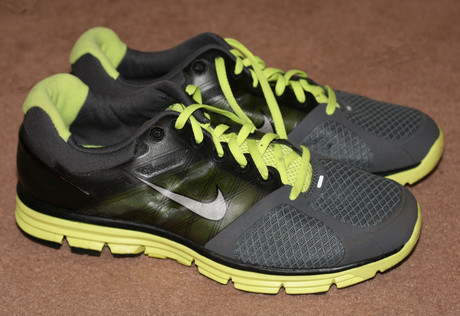
I’ve recently acquired a pair of Nike Lunarglide+ 2 running shoes, thanks to some quick decision making and a carefully timed run during the Nike Grid challenge back in November. These are the first Nike running shoes I’ve owned, and they certainly are very different – both to look at and to wear – than the standard “white/stripe padded” shoes I normally have, such as my Adidas adiStar Salvations.

The first thing that struck me – after noticing that they are luminous yellow and black – no white bits at all! – is they are very light indeed, the sides in particular are very thin, made in part seemingly from a single layer of translucent plastic, with no padding. Contrasting this, however, the heel is very firm, with a hard plastic “cup” on the outside and a bit of padding on the inside. At the top of the heel is a significant bit of padding. Having occasionally got blisters here from hard-heeled shoes, I was quite pleased to have this. The front of the shoe again is very thin, with little padding, and so looks very breathable.

I wouldn’t want to wear these shoes in an orienteering race, or even in a muddy field, as they are so light – the apparent lack of stitching means I wouldn’t want to subject them to rough terrain that would scratch the side of the shoe.

The back of the shoes have a small vertical reflective strip which is useful for being seen, particularly at night in urban areas, which just so happens to be the time of day and location that my club, SLOW, runs its regular Street-O events. There was one earlier this week, so I wore the Lunarglides to give them a road test. Other SLOW members were also sporting their Grid-won shoes, including some customised Nike+s with their initials on the back – nice! Anyway the race proved to be an ideal road-test, the terrain being purely tarmac, very hilly (Crystal Palace) and with lots of sharp corners allowing for some good grip testing.

Despite the shoes not being particularly padded, the heel is quite deep and they are extremely comfortable to wear and run in. I had no problems at all – after a few minutes of getting used to the lightness of the step. The initial part of the race was steeply downhill, on a tarmaced path which was damp from recent rain. The grip seemed to be fine on the shoes, with no slipping on the potentially treacherous slope. On the flat road they also seemed very responsive, and they coped with the twists and turns of the course – feeling fine after an hour of running.

To sum up, I think these shoes are excellent road shoes. I wouldn’t want to take them on terrain, but I have plenty of road training coming up for a marathon later this year, and will be alternating these with my Salvations as much as possible. Crucially, the light design and breathability means they should remain comfortable when running in warmer conditions this summer. Hopefully they should stay in one piece until then too.

Categories
Bike Share Data Graphics London

Barclays Cycle Hire – Extending East

Alexander Baxevanis, maker of the excellent free Cycle Hire Map app for the iPhone, has obtained a list of 227 proposed sites for the eastwards extension (and expansion of the existing area) of the Barclays Cycle Hires scheme through a Freedom of Information request on MySociety’s What Do They Know. Unfortunately TfL didn’t provide the exact locations of the proposed new docks, rather just the street names, or occasionally junctions.

I have taken the list and geocoded it – using Google Maps and Google Fusion Tables as a first pass, then manually geocoding the 40 or so that failed using OpenStreetMap data.

Red dots show the proposed new locations, with yellow dots showing the existing stands as of January 2011.

You can download the locations from the Google Fusion table here or view a larger version of the map here. See the FOI response for the source data set.

Very important caveats: Because the names are often only street names, the “dot” representing the new dock is placed fairly arbitrarily along the street – in reality, the actual location may be quite far along the street from this place. Consider that these locations are simply my guesses. Also, it is really important to emphasise these are the proposed locations – TfL has not yet started the planning process or consulted with the councils/residents yet. It is likely that quite a few of these will not actually be built, or will be relocated elsewhere, come later this year or early 2012 when the expansion goes live.

Along the way I discovered a number of curiosities, such as:

  • the official name for College Green – the bit of grass outside the Palace of Westminster where MPs are often interviewed – being Abingdon (or Abington?) Street Gardens.
  • a street that has just been born (photo) and doesn’t appear on any public web maps except OSM (now).
  • the various “marketing” names for the new residential skyscrapers appearing around Canary Wharf, such as Streamlight, Ability Place and Pan Peninsula.

Indeed, many of the proposed sites are outside these large new residential blocks, and also outside many of the DLR and train/tube stations in Tower Hamlets – unlike the initial launch of the scheme, there seems to be no shying away from placing stands right next to the stations, where commuters are likely to be piling onto them.

(I was very impressed with Openlayers/Canvas heatmaps the other day, so the first picture above is a heatmap showing dock density, for the fully extended scheme. The background for that picture is OpenStreetMap.)

Categories
Orienteering Events Log

Maze-O Challenge at The Outdoors Show

I was at The Outdoors Show yesterday, which is taking place over the next few days at the gigantic ExCeL exhibition centre in East London, at the same time as The Bike Show and The Boat Show (the latter, incidentally, being at least three times as large as the others put together.)

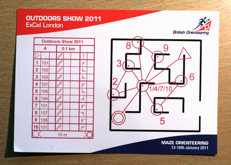
British Orienteering are taking part, they are running a “Maze-O” challenge which involves running a short “butterfly”-style gaffled course – distance 0.1km according to the control descriptions! – in a “maze” made out of crowd barriers. The controls have small flags and the standard “slimline” control boxes. I was given a new SI card (Type 8?) to race with, but was a little surprised to find the controls were slow to punch – taking at least a second and occasionally two seconds to bleep.

Despite this delay I managed to do the course in 1:09. The day’s winner, according to the leaderboard, was Ben Stevens, who ran the course in 1:08. This is probably the closest I’ll ever come to beating a former Varsity Match Champion. It probably helped that I was coincidently wearing running shoes. Pete H, who ran a different gaffle at the same time as me (and inadvertently blocked a couple of controls) managed 1:16 in his work brogues.

It being Thursday evening, and the location of the course being somewhat tucked away behind the Bushcraft stand, meant the Maze-O was rather quiet when we visited. However it should be popular with the weekend crowds as long as they can find it – if you coming to The Outdoors Show don’t miss it! You also get map-on-a-postcard to keep, as pioneered at the Trafalgar Square orienteering “art event”.

If you don’t want to know the course in advance, look away now:

Top marks to British Orienteering for organising the event and producing some excellent, professional looking event banners, flag, branded polo-shirts for the marshals, and the map postcards and associated literature. Thanks also to the club volunteers that are manning the stand over the next few days. One thing missing was details of forthcoming local events, but hopefully the maze event will get a few new people to look up the sport and then come along to some club events such as SLOW’s Street-O series.

Categories
Mashups OpenLayers

Heatmaps are Simple with HTML 5 and Canvas

Cross-posted from my orienteering blog.

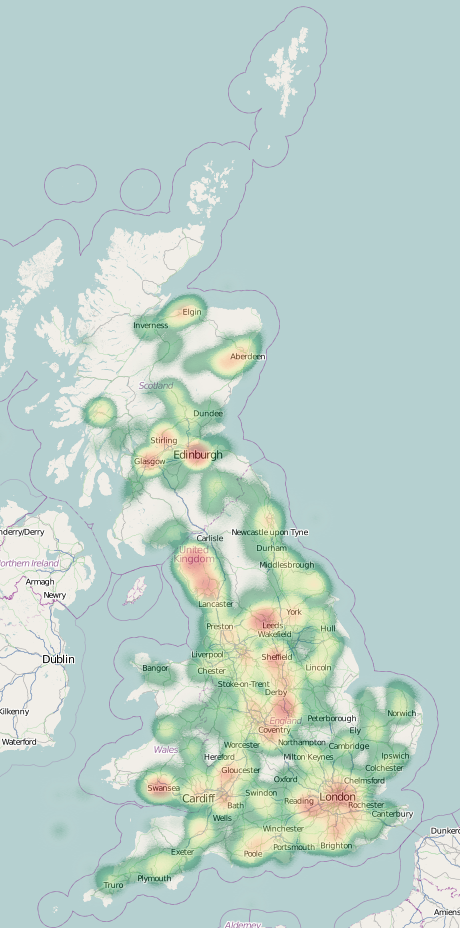
As a Saturday-lunchtime project, I have created a heatmap of where the 2700-odd geolocated orienteering races have been held in Great Britain in the last two years.

The heatmap quickly shows clusters around the main urban areas, where the population sizes supply participation for many local events being put on. Another major bright-spot is the Lake District extract on the right – which contains a large amount of high quality terrain for events. Other areas, such as the Cotswolds NW of Oxford, seem to be somewhat underused.

If you have a browser than can handle the HTML5 Canvas tag (i.e. not Internet Explorer!) you can view the heatmap here. Zoom into your local town or city to see if events have been held there – when zooming in, you’ll need to adjust the two sliders most of the way to the right, so that individual events show up. With the individual settings, a single, isolated event will have very little impact on the heatmap.

The heatmap was possible thanks to the excellent Heatmap library produced for OpenLayers by Bjoern Hoehrmann. The map is powered by OpenLayers, with an OpenStreetMap basemap. I’ve used a custom colour ramp, based on one supplied by Colorbrewer. The custom map adornments are supplied by MapBox.

Creating a heatmap like this is very easily, with just a few lines of Javascript needed to add objects in. The Heatmap library does the rest. See Bjoern’s example for the documentation.

Categories
Orienteering

Where in Britain are the Orienteering Races?

As a Saturday-lunchtime project, I have created a heatmap of where the 2700-odd geolocated orienteering races have been held in Great Britain in the last two years.

As you would expect, clusters appear around the main urban areas, where the population sizes supply participation for many local events being put on. Another major bright-spot is the Lake District, generally recognised to be the finest orienteering area in England. Other areas, such as the Cotswolds NW of Oxford, seem to be somewhat underused.

If you have a browser than can handle the HTML5 Canvas tag (i.e. not Internet Explorer!) you can view the heatmap here. Zoom into your local town or city to see if events have been held there – when zooming in, you’ll need to adjust the two sliders most of the way to the right, so that individual events show up. With the individual settings, a single, isolated event will have very little impact on the heatmap.

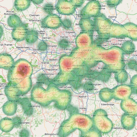
A look at the London area:

The heatmap was possible thanks to the excellent Heatmap library produced for OpenLayers by Bjoern Hoehrmann. The map is powered by OpenLayers, with an OpenStreetMap basemap. I’ve used a custom colour ramp, based on one supplied by Colorbrewer. The custom map adornments are supplied by MapBox.

Categories
Bike Share London

The Most Popular Bike Share Routes in London

Following on from my map of all the first million or so bike routes, Here are the most popular bike share routes in London, based on flow data for August, September and October 2010.

Weekdays – the map below shows where there were more than 200 journeys (in either direction) in the weekdays during the period. The line thickness grows by one pixel for each 100 journeys:

Flows here are dominated by commuters going to/from King’s Cross station to Bloomsbury, and Waterloo and London Bridge stations to the City. A short hop to Notting Hill Gate station, in the far west of the scheme, is also popular, as is the Broad Walk route through Kensington Gardens.

The top 5 weekday journeys are:

  • Finsbury Circus, Liverpool Street Newgate Street, St. Paul’s
  • Queen Street, Bank Concert Hall Approach 2, South Bank
  • Turquoise Island, Notting Hill Notting Hill Gate Station, Notting Hill
  • Lexham Gardens, Kensington Wright’s Lane, Kensington
  • Holborn Circus, Holborn Concert Hall Approach 2, South Bank

Weekends – the map below shows where there were more than 50 journeys in total (in either direction) in the weekends during the period. The line thickness grows by one pixel for each 50 journeys:

The parks – Hyde Park and Regent’s Park in particular – are much more popular at the weekends, as is Angel and London Bridge. Docks around the British Museum and the Museum of London are also popular. The City itself is, as expected, virtually dead at weekends for Bike Share users.

The top 5 weekend journeys are:

  • Black Lion Gate, Kensington Gardens Palace Gate, Kensington Gardens
  • Hyde Park Corner, Hyde Park Black Lion Gate, Kensington Gardens
  • Warwick Avenue Station, Maida Vale Clifton Road, Maida Vale
  • Turquoise Island, Notting Hill Notting Hill Gate Station, Notting Hill
  • Westbourne Grove, Bayswater Turquoise Island, Notting Hill
Categories
Bike Share Data Graphics London Mashups OpenLayers

The First Million London Bike Share Journeys

Thanks to a FOI request from Adrian Short, Transport for London have recently released to their developers area details of 1.4 million bike share journeys. The data is believed to include all the journeys between 30 July 2010 and 3 November 2010, except those starting between midnight and 6am.

I’ve created a map which visualises these journeys – select a docking station and a time, and it will show the journeys that start/end at that dock, depending on the options chosen.

You can see the map here. On launching the site, an initial docking station – one outside Waterloo station – is selected, and an “interesting” timeframe is chosen – the morning of 4 October, which was a day impacted by a tube strike.

Heavy usage along the Broad Walk through Kensington Gardens, particularly at weekends:

The predominant flows from a docking station near King’s Cross station, in weekday mornings, are outwards (red lines), particularly south towards the river. Only a few inbound journeys happen (blue lines):

The reverse is true in weekday evenings, as commuters head back to the stations:

The map bears a resemblance to my live Barclays Cycle Hire scheme status map, as I’m reusing a lot of the same code and graphics.

Categories
Orienteering

UK Orienteering Fixtures Map – New Version

Cross-posted from my research blog.

Five years ago, I created a mashup of forthcoming orienteering fixtures in Great Britain, as listed by the sport’s national governing body, British Orienteering, on its website. It was based on the Google Maps v2 API, and a regular scraping of the HTML on their website, and was a set of pins on a map, coloured by the number of weeks to the event. On clicking a pin, you got a popup balloon with details of the event, and a link to the organising club’s website. A postcode locator, based on data from the NPEMap project, was added, so you could focus on events in your local area. You could also filter out far away events.

A couple of years later, British Orienteering’s web developers added their own map to their website – Google Maps v2 API based, with pins coloured by the number of weeks to the event, and a popup balloon, a postcode search and distance filter etc etc… The Unique Selling Point of my fixtures map was lost.

So, when a rewrite of British Orienteering’s website just before Christmas broke my map, I took the opportunity to rewrite it, as a vacation project, using the technologies I’ve been using a lot in 2010 – namely OpenLayers, OpenStreetMap, OS OpenData and coloured vector circles. The map is bigger, brighter, and hopefully more useable than the official map and my previous version.

You can see the new map here – with a mass of dots representing forthcoming fixtures, and circles surrounding the “home” postcode, backed by OpenStreetMap, with the postcode locator based on CodePoint Open from Ordnance Survey OpenData. Only the locator uses a database, the rest of the webpage is constructed on-the-fly from a webpage regularly copied from the British Orienteering website.

Not Scarborough…

The map remains subject to the quality of the data entered on the corresponding list – there is some limited tidying up of the data, but it’s difficult to correct grid references that result in events being in the sea – there’s currently one in the Irish Sea, as the event registrant entered “GR” as the grid reference letters, and this just so happens to be the location of the GR myriad. There is still work to be done on my new map, such as spotting obvious errors like this, guessing locations where a grid reference isn’t supplied, and perhaps including Northern Ireland’s events.

Incidentally, my original orienteering web map, which inspired my fixtures map, was one showing orienteering maps, it was written way back in August 2004, using a Flash mapping package by Map Bureau, with dots superimposed on top of a map pinched from Wikipedia. We’ve come a long way.