
I attended a one-day workshop last week, hosted by IFSTTAR’s GERI Animatic research group at École des Ponts ParisTech just east of Paris. The workshop was on Bicycle Sharing Systems, and as I have recently been working with a couple of colleagues, Dr Martin Zaltz-Austwick and Dr James Cheshire, on research relating to bicycle sharing data, and mapping the systems currently live in various cities around the world, I was keen to attend, particular as the agenda was packed with interesting sounding talks.
My rush-hour commute through Paris proved to be slightly more traumatic than planned (I wonder if Parisian visitors find London Underground stations as confusing as I find those on the Paris metro?) but I arrived at the École des Ponts ParisTech in time to hear the workshop organiser introducing the sessions. First up was Pierre Borgnat talking about network analysis of Lyon’s system. I had seen a paper by him on Lyon before, and the popularity and density of Lyon’s system has allowed for a rich and interesting dataset for mining and community detection. The community detection has been done using both spatial and temporal variables. Pierre’s thorough and technical treatment of the data was backed up with some excellent mapping of the data, which you can see above and below.

Next up was Jon Froehlich. Jon’s talk was underpinned by a discussion of the different data sources and types available in the field. He focussed on temporal cluster analysis of the Barcelona bicycle sharing system (below) – a particularly interesting city for me as, along with London and Zurich, it is a case study for the EU project I have recently started working on, EUNOIA. Barcelona’s bicycle sharing system is not unlike London’s, in terms of its size, shape and usage characteristics – although the general downward slope of the city causes headaches for its operator. Jon gets bonus points for including not only a quote from this blog on his presentation, but Martin’s beautiful routed bike-flow animation for London, and Dr Jo Wood’s more recent bi-directional flow animation, again of London.

Etienne Côme, from the hosting school, was next on, with an analysis of the biggest system (outside of China) of all – the Vélib in Paris. The Vélib is perhaps the holy grail of academic research in the field as its size, and Paris’s multiple commercial and residential zones, means that community and network analysis is likely to be eye-opening. Similar to Pierre, Etienne outlined eight detected communities, by looking at temporal variations in the origin-matrix between the 1200-odd stations on the Vélib network.

After lunch, Vincent Aguilera was first on, with a switch away from bicycle sharing systems but showing some techniques that have potential for the field – Vincent looked at using mobile phone network data to detect station dwell times and true journey durations on a section of the RER metro in Paris. He compared this data with Twitter messages with appropriate hashtags (below), and the real-time running supplied by the operator on its website. The availability and structure of the cell-towers on the network allowed a direct comparison to be made – indeed, such data may actually be of better quality than that currently available at the operator’s disposal, allowing more fine-tuned operation and monitoring.

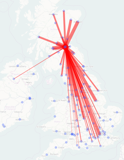
Neal Lathia was next with a look at London’s system – specially effects caused by the addition of casual (i.e. non-key, non-member) availability in December 2010. The additional option did see some changes in the usages of certain docking stations. The comparison was done by clustering the network’s docking stations by time, before and after the transition, and then seeing which stations changed cluster. One of the main areas of change was in the very heart of London, around the Trafalgar Square area, suggesting a slight shift away from the (still dominating) railway station-based usage patterns.

Fabio Pinelli’s talk was wide-ranging – it included system design, routing for Dublin’s (over)used system, a look at the reliability of the Vélib fleet.

Finally, Francis Papon from the hosting school took a step back from the modern electronically managed bicycle sharing systems and mobile/social data sources, and looked at change in uses of urban cycling more generally. His dataset stretched over a hundred years, rather than the typically five-year maximum historical range that bicycle sharing systems have. A key trend is that in the largest French cities studied, including Paris, there is a recent (post-2000) renaissance in urban cycling usage, but this is not matched in many of the country’s smaller cities.
The workshop concluded with a general discussion of the research field to date and its direction. What was particularly interesting was that several bike sharing operators were in attendance, they were fully engaged with the academic research being carried out, asking questions but also revealing some nuggets of information about how the systems are rebalanced, relative costs of operations and why they thought some systems were more successful than others.
Hopefully there will be more such workshops in the future in Europe – with UCL CASA, Cambridge, City University London and LSHTM all involved in the field, maybe there should be one taking place in London next year?


