
As part of a presentation I gave yesterday at the RSAI-BIS (Regional Science Association International – British & Irish Section) annual conference, on DataShine Travel to Work maps, I outlined the following eight techniques to avoid swamping origin/destination (aka flow) maps with masses of data, typically shown as straight lines between each pair of locations.
Lines tend to obscure other lines, making the flows of interest and significance harder to spot, and creating an ugly visual impact. See above for an extreme example which shows (all) cycle-to-work flows in inner-city London. Large numbers of flow lines, if delivered as vectors to a web browser, can also cause the web browser to run slowly or run out of memory, affecting the user experience.
To avoid this, I generally try to use one or several of the following techniques.
1. Restrict to a single origin or a single destination. This does require the user to first click on a location of interest before any flow can be seen:
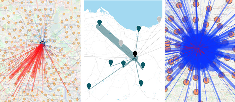
From L to R, DataShine Commute, Understanding Scotland’s Places (USP) and DataShine Region Commute, the last one showing that, in some cases, this can still produce an overload of lines.
2. Only show flows above a threshold. This could be a simple minimum value threshold (e.g. 10 people), a set number of lines (e.g. 1000 largest flows) or dynamic value-based limit (e.g. only where flow is 1% of the origin population), the latter generally only working if a single origin is shown at a time:
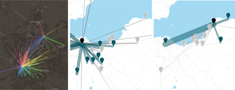
From L to R, The Great British Bike To Work (with a simple flow-size threshold) and Understanding Scotland’s Places, which uses a dynamic origin-based theshold, shown here with the constrasting number of bidirectional flows visualised from a large city (centre) with those from a small town (right), each being selected in turn.
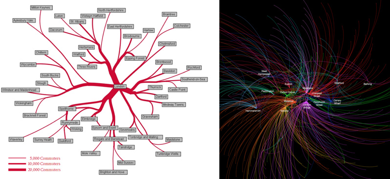
3. Minimise the overall number of possible origins/destinations. What you lose in detail you might gain in clarity and simplicity. DataShine Region Commute only shows flows between LAs, rather than the spatial detail of flows within them.
4. Restrict the geography. The Propensity to Cycle Tool (Lovelace R et al, 2017) shows the main flows (based on a threshold) on a county-by-county basis, with easy and clear prompts to allow the user to move to a neighbouring county if they wish.
5. Bend the lines. Tools, such as the Stanford Flow Map Layout tool or Gephi with the “Geo Layout” and curved lines, allow flow lines to be clustered or curved in a way that reduces clutter, while retaining geography. The first approach clumps pairs of flow lines together in a logical way, as soon as they approach each other. The second approach simply curves all the lines, on a clockwise basis, generally removing them from the central area unless that is their destination. See also this paper by Bernhard Jenny (Jenny B. et al, 2017) which details the benefits of curving lines and further cartographic modifications, and this paper by Stefan Hennemann (Hennemann S. et al, 2015) which outlines a sophisticated approach to grouping together flow lines, on a world-wide basis.
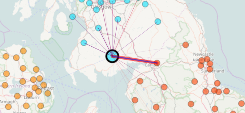
From L to R: Commutes into London from districts outside London, from the 2001 census, by Alastair Rae (Rae A., 2010) using the Stanford Flow Map Layout tool, and top destination for each origin tube station, based on Oyster card data, by Ed Manley (Manley E., 2014) using a particular Gephi flow layout.
6. Route the flow. Snap the lines to roads or other appropriate linear infrastructure, using shortest-path or sensible-path routing, and combining the segments of lines that meet together, either by increasing the width or adjusting the hue or translucency.
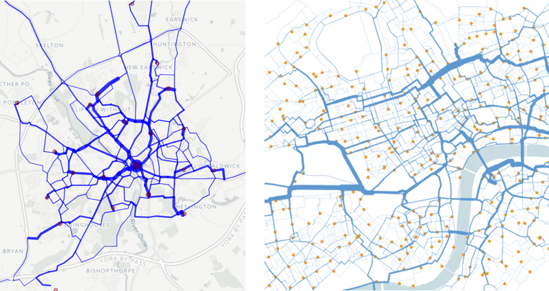
From L to R: The Propensity to Cycle Tool (Lovelace R et al, 2017) routed for shortest path, and journeys on the “Boris Bikes” bikeshare system in central London, routed with OSM data to the shortest cycle-friendly route. In both cases, journeys meeting along a segment cause the segment to widen proportionally.
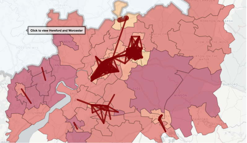
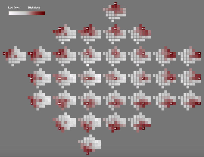
7. Don’t use a simple geographical map. This map, created by Robert Radburn at City University (Radburn R, 2015) in Tableau, is a “small multiple” style map of car commutes between London boroughs, with a map of London being made up itself of miniature maps of London. Each inner map shows journeys originating from the highlighted borough to the other boroughs. These maps are then arranged in a map themselves. It takes a little getting used to but is an effective way to show all the flows at once, without any potentially overlapping lines.
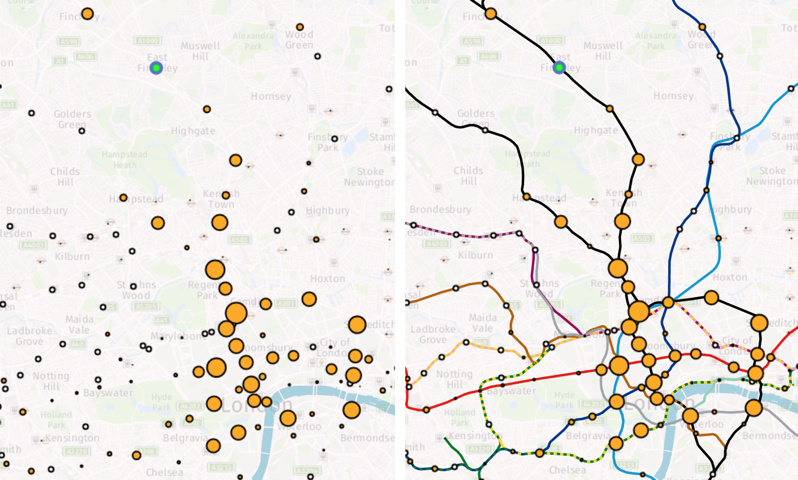
8. Miss out the flow lines altogether. Here, a selected origin (in green) causes the destination circles to change in size and colour, depending on the flow to them. In this case, the flow is modelled commutes on the London Underground network – made clearer by the addition of the tube lines themselves on the second map – but just as a background augmentation rather than flow lines.
One reply on “Eight Ways to Better Flow Maps”
Great post and great ideas about visualising the data.