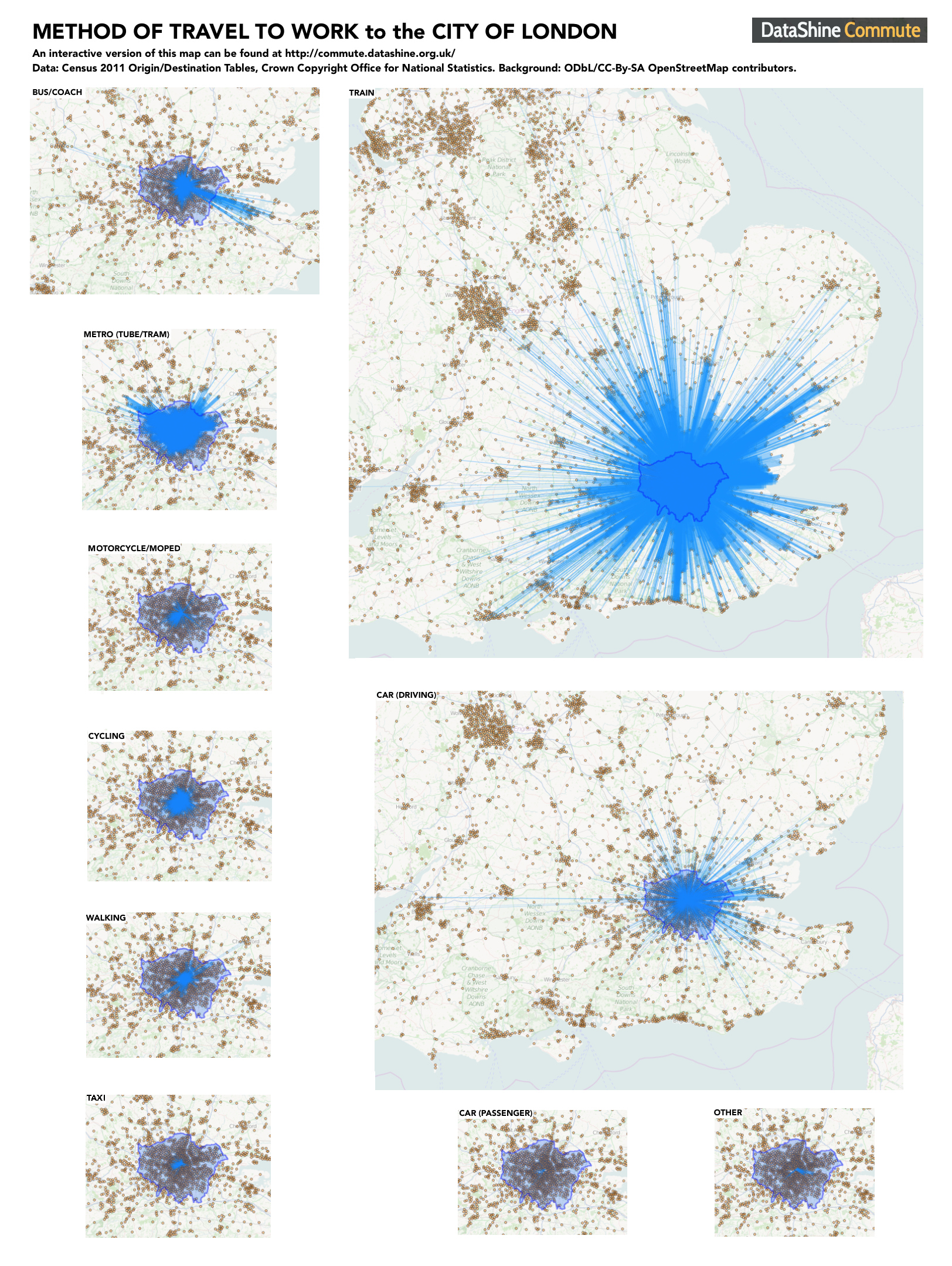
Here’s a graphic I’ve made by taking a number of screenshots of DataShine Commute graphics, showing the different methods of travelling to work in the City of London, that is, the Square Mile area at the heart of London where hundreds of thousands and financial and other employees work.
All the maps are to the same scale and the thickness of the commuting blue lines, which represent the volume of commuters travelling between each home area and the City, are directly comparable across the maps (allowing for the fact that the translucent lines are superimposed on each other in many areas). I have superimposed the outline of the Greater London Authority area, of which the City of London is just a small part at the centre.
There’s lots of interesting patterns. Commuter rail dominates, followed by driving. Car passenger commutes are negligible. The biggest single flow in by train is not from another area of London, but from part of Brentwood in Essex. Taxi flows into the City mainly come from the west of Zone 1 (Mayfair, etc). Cyclists come from all directions, but particularly from the north/north-east. Motorbikes and mopeds, however, mainly come from the south-west (Fulham). The tube flow is from North London mainly, but that’s because that’s where the tubes are. Finally, the bus/coach graphic shows both good use throughout inner-city London (Zones 1-3) but also special commuter coaches that serve the Medway towns in Kent, as well as in Harlow and Oxford. “Other” shows a strong flow from the east – likely commuters getting into work by using the Thames Clipper services from Greenwich and the Isle of Dogs.
Try it out for your own area – click on a dot to see the flows. There is also a Scotland version although only for between local authorities, for now.
Click on the graphic above for a larger version. DataShine is part of the ESRC-funded BODMAS project at UCL. I’ll be talking about this map at the UKDS Census Applications conference tomorrow in Manchester.

One reply on “The City of London Commute”
[…] […]