Categories
London Orienteering

London City Race Mega-Map

Below is a low-resolution view of the London City Race orienteering maps that have been used since the race was first held in 2008, arranged geographically to show their relative position. The maps were drawn by myself (initially) and Remo Madella (subsequently) who joined them together and assembled this image. Dark grey represents buildings, with olive green for private gardens and other off-limits land, and pink showing construction sites. The map is not entirely up-to-date, as only the relevant section is updated/extended, for each race.

There are only a couple of small gaps, between Covent Garden and Aldwych, and between Wapping and Limehouse. These aside, it would be possible to run on a proper urban (ISSOM) orienteering map, from Oxford Circus in the West End, right down to Island Gardens on the tip of the Isle of Dogs. Such a run would be well over 10km, and the accompanying map would be over two metres long at its 1:5000 native scale.

Here’s where each area was first used. 2014 was the only edition of the race, to date, that did not expand the map:

The maps contain OS data which is Crown Copyright and database right Ordnance Survey, 2007-16, with licence # 100015287 for non-OGL content.

Categories
Bike Share

How Mexico City Does Bikeshare

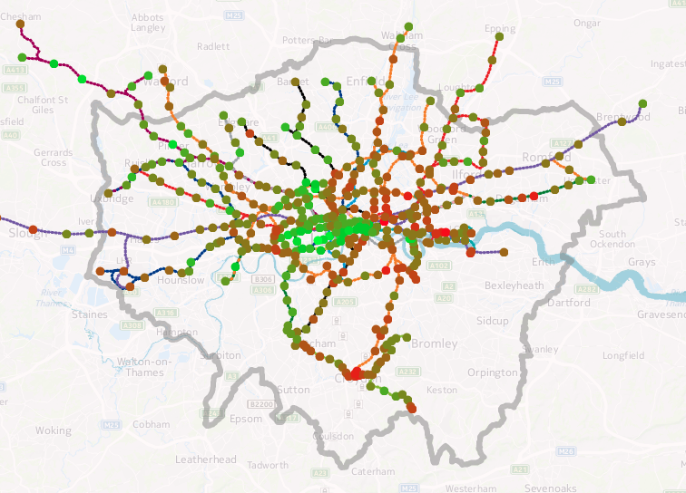
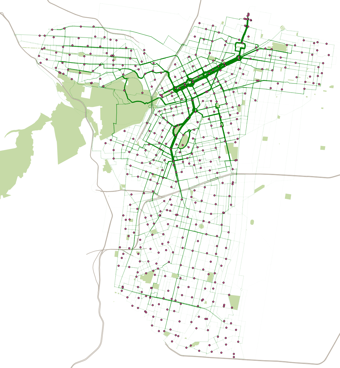
The above map shows the estimated routes and flows of over 16 million users of the bikeshare in Mexico City, “ECOBICI“, across the 22 months between February 2015 and November 2016, using data from their open data portal. The system has been around since 2011 but its most recent major expansion, to the south, was in early February 2015, hence why I have show the flows from this date. The wider the lines, the more bikeshare bikes have been cycled along that street. The bikes themselves don’t have GPS, so the routes are estimated on an “adjusted shortest route” basis using OpenStreetMap data on street types and cycleways, where any nearby cycleway acts as a significant “pull” from the shortest A-to-B route. Having cycled myself on one of the bikes in November (and hence my journey is one of the 16.6 million here) I fully appreciate the benefits of the segregated cycle lanes along some of the major streets. As my routes are estimates, they don’t account for poor routes taken by people, or “tours” which end up at the same places as they started. So, the graphic is just a theoretical illustration, based on the known start/end data.

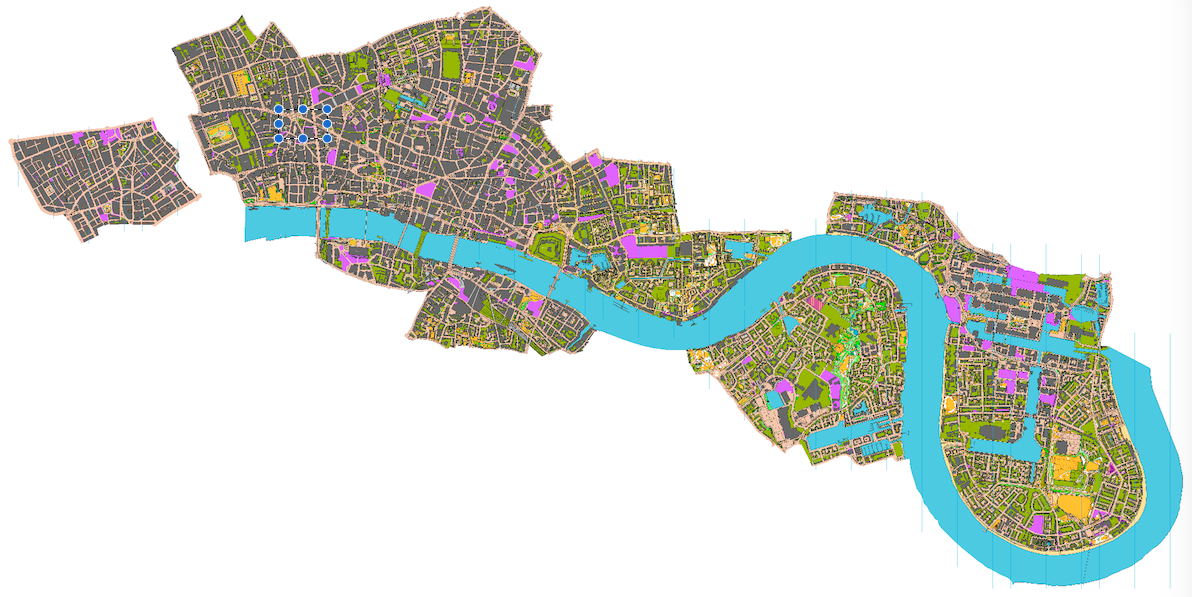
The bikeshare journeys are in a dark green shade, ECOBICI’s brand colour, with docking stations shown as magenta dots. Magenta is very much the colour of CDMX, the city government, and it consequently is everywhere on street signs and government employee uniforms. Mexico City doesn’t have rivers, which are the “natural” geographical landmark for cities like London and New York where I’ve created similar maps, so I’ve used the motorways (shaded grey) and parks (light green), to provide some context. Mexico City extends well beyond the ECOBICI area.

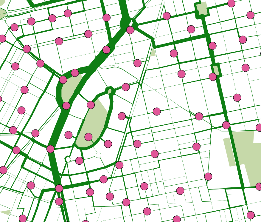
The maps shows huge flows down the “Paseo de la Reforma”. This route is always popular with cyclists, thanks to large, segregated cycle lanes in both directions, on the parallel side roads. On Sunday mornings, the main road itself is closed to motor traffic, along with some other link routes. This is not reflected in my routing algorithm but also acts to increase the popularity of the flow in this general area. To the north, a cluster of docking stations and a large flow indicates the location of Buena Vista station, the only remaining commuter rail terminal in Mexico City. Further south, the curved roads around Parque México and Parque España are also popular with bikeshare users, in this leafy area that very much feels like the “Islington” of Mexico City:

Mexico City’s ECOBICI is one of the 150+ systems I’m tracking live on Bike Share Map. You can see the live situation, or an animation for the last 48 hours.

Categories
Data Graphics London

Lives on the Line v2: Estimated Life Expectancy by Small Areas

livesontheline_district

I’ve produced an updated version of a graphic that my colleague Dr James Cheshire created a few years ago, showing how the estimated life expectancy at birth varies throughout the capital, using a geographical tube map to illustrate sometimes dramatic change in a short distance.

You can see an interactive version on my tube data visualisation platform. Click a line colour in the key on the bottom right, to show just that line. For example, here’s the Central line in west London.

The data source is this ONS report from 2015 which reports averages by MSOA (typical population 8000) for 2009-2013. I’ve averaged the male and female estimates, and included all MSOAs which touch or are within a 200m radius buffer surrounding the centroid of each tube, DLR and London Overground station and London Tram stops. I’ve also included Crossrail which opens fully in 2019. The technique is similar to James’s, he wrote up how he did it in this blogpost. I used QGIS to perform the spatial analysis. The file with my calculated numbers by station is here and I’m planning on placing the updated code on GitHub soon.

livesontheline_alllondon

My version uses different aggregation units (MSOAs) to James’s original (which used wards). As such, due to differing wards and MSOAs being included within each station’s buffer area, you cannot directly compare the numbers between the two graphics. An addition is that I can include stations beyond the London boundary, as James’s original dataset was a special dataset covering the GLA area only, while my dataset covers the whole of England. The advantage of utilising my data-driven platform means that I can easily update the numbers, as and when new estimates are published by the ONS.

Estimating life expectancies at birth for small areas, such as MSOAs, is a tricky business and highly susceptible to change, particularly due London’s high rates of internal migration and environmental change. Nevertheless it provides a good snapshot of a divided city.

View the interactive version.

livesontheline_dlr

Data: ONS. Code: Oliver O’Brien. Background mapping: HERE Maps.