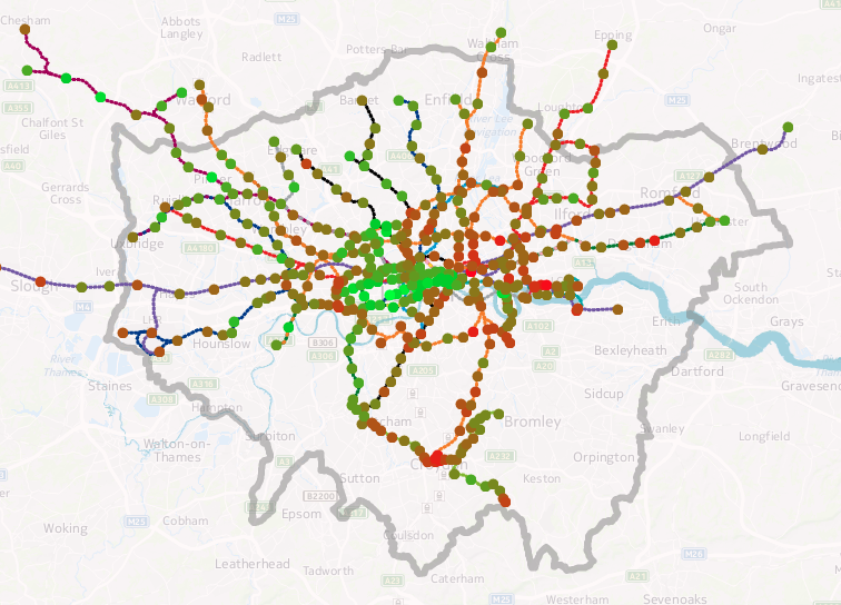
I’ve produced an updated version of a graphic that my colleague Dr James Cheshire created a few years ago, showing how the estimated life expectancy at birth varies throughout the capital, using a geographical tube map to illustrate sometimes dramatic change in a short distance.
You can see an interactive version on my tube data visualisation platform. Click a line colour in the key on the bottom right, to show just that line. For example, here’s the Central line in west London.
The data source is this ONS report from 2015 which reports averages by MSOA (typical population 8000) for 2009-2013. I’ve averaged the male and female estimates, and included all MSOAs which touch or are within a 200m radius buffer surrounding the centroid of each tube, DLR and London Overground station and London Tram stops. I’ve also included Crossrail which opens fully in 2019. The technique is similar to James’s, he wrote up how he did it in this blogpost. I used QGIS to perform the spatial analysis. The file with my calculated numbers by station is here and I’m planning on placing the updated code on GitHub soon.
My version uses different aggregation units (MSOAs) to James’s original (which used wards). As such, due to differing wards and MSOAs being included within each station’s buffer area, you cannot directly compare the numbers between the two graphics. An addition is that I can include stations beyond the London boundary, as James’s original dataset was a special dataset covering the GLA area only, while my dataset covers the whole of England. The advantage of utilising my data-driven platform means that I can easily update the numbers, as and when new estimates are published by the ONS.
Estimating life expectancies at birth for small areas, such as MSOAs, is a tricky business and highly susceptible to change, particularly due London’s high rates of internal migration and environmental change. Nevertheless it provides a good snapshot of a divided city.
Data: ONS. Code: Oliver O’Brien. Background mapping: HERE Maps.