Categories
Bike Share

Dockless Continues to Expand – Here’s the Data

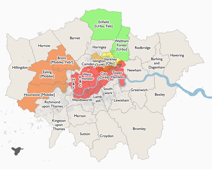
It looks like Brent will be the next London borough to get dockless bikeshare, with Mobike likely to be setting up in the borough within the next few weeks. The operator is not confirmed, although strongly hinted at, including by the council themselves. The choice of Mobike makes sense, as the operator already has a fleet of bikes in the two boroughs to its south, allowing journeys across quite a wide area of west London – although if you want to journey to the centre of the capital on a Mobike, you will still need to finish your journey in Islington or the City, or return the bike back to the three West London boroughs.

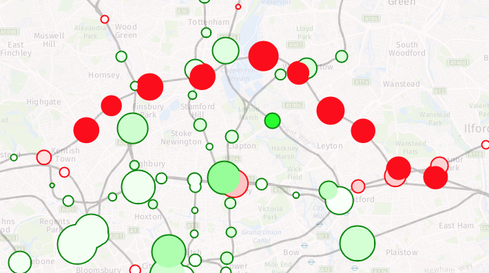
Above is my latest map of London boroughs, showing bikeshare provision. The red circles show Santander Cycles docking stations, while the other colours show the spread of dockless bikeshare – yellow (Ofo), orange (Mobike) and green (Urbo). Darker grey shades show areas of the capital with a high proportion of the resident population cycling to work (2011 census).

As well as these maps, I have now published interactive maps of the Ofo, Mobike and Urbo current operating areas in London (for all three) and other UK cities (for Ofo). Ofo were kind enough to supply me with their boundary files, for the others, which define their areas by borough boundaries in London, I have simply dissolved these boundaries. Simple spatial analysis shows the current area, in square kilometres, of these systems. See the “Numbers” tab for the latest numbers.

Currently, there are:

There are also individual dock maps for other operators in London (Santander Cycles, 110km2) and Oxford (Oxonbike, 8km2).

Operators do not supply consistent numbers of bikes operating in their areas, so I am not currently listing those. Various press quotes suggest 230 Urbos, 1000 Mobikes and 400 Ofos in London, 150 Ofos in Cambridge, 100 Ofos in Oxford and 200 Ofos in Norwich. This numbers likely include significant numbers that are not currently on the streets and available for use.

In parts of Islington, there are noticeably fewer Ofo bikes than a few weeks back, where they were previously very visible on on the main roads, while Mobikes are very visible but lined up in neat, operator-placed rows, rather than in the more organic placement you would expect from bona-fide users. There have been no London usage numbers released by the operators so far, despite having been operating for nearly half a year, which suggests they are perhaps not great. To be fair – it is wintertime and it is still early days.

Categories
Data Graphics

Railway Station Numbers

You can click on all the images in this blogpost to go explore each view further on the interactive map.

The ORR publishes station entry/exit numbers on an annual basis, on a “best guess” basis, using ticket sales, gate information and modelling. The data is split by ticket type – full fare, reduced fare (off-peak tickets, tickets bought with railcards, advance tickets, child tickets etc) and season tickets. They make this data available as an Excel spreadsheet, so I’ve crunched it and have produced a couple of maps based on this data. I have also consolidated the total counts and ticket type counts data on CDRC Data.

The first shows the total numbers of entries/exits across the last year that the data is available for (2016-7), with a blended colour, with different red/green/blue strengths proportional to the % numbers for season tickets (red), full fare (blue) and reduced fare (green) entering/exiting National Rail services at that station. The area of the circle is proportional to the total numbers, combined across the ticket types. I’m using a minimum circle size, as otherwise some stations would be practically invisible on the map, as they can see days go by without any passengers – or trains.

Some interesting patterns – blues for many of the airport stations, where off peak tickets generally aren’t available, and most people don’t think to get advance tickets, such as to/from Stansted:

…and almost no-one pays full fare for some of the remotest stations:

Purples on the Welsh valleys lines, showing mainly commuters and peak time users:

Bright greens for stations serving major destinations where advance tickets are readily available, such Newcastle-upon-Tyne:

…popular tourist places, where many people will be visiting outside of the rush hours and at weekends, such as Oxford and Bicester Village retail outlet:

…and areas well covered by discounted travelcards, like Liverpool’s Merseyrail:

Reds where the season ticket holders dominate, such as Chelmsford and Colchester to the north-east of London:

Browns showing an “urban mix” of season ticket commuters and travelcard local journey makers, like in Straford, London:

See this map on TubeCreature.

The second map looks at the change in numbers between 2015/6 and 2016/7 (a major methodological change means I cannot use data from earlier years, for a more complete time series). You can view the absolute numbers for both years, but what is of more interest is looking at the changes. The circle fill colour is the % change (with 100% green for a doubling of numbers and 100% for a halving of numbers). The area of the circle represents the absolute change in numbers. The border colour emphasises whether the change is an increase or decrease. Stations with little change will show up as small circles. The biggest trends are the new lines to Oxford via Bicester, and from Edinburgh to Tweedbank. In both cases, the lines were only open for part of the first year, so an increase would be expected even if the day-by-day numbers were flat:

Big drops show in parts of London – the Goblin line having been closed for much of 2016/7 due to a bungled overhead line installation:

There is also a big drop at Kensington Olympia’s however the source reports says this is due to a methodological change – i.e. it may not have actually been a significant drop at all. This is somewhat puzzling, as there are ticket gates at this station, so in/out numbers should be pretty solid, but it may be relating to due to many fewer people, than previously thought, transferring in-barrier to the sparse District line services at this station. When they do this, they are no longer considered to be National Rail passengers and so have “exited” the station here, from a National Rail perspective.

Most parts of the country see a steady increase (light greens):

The big exception being area served by Southern trains – with them being on strike for much of the second year, the fall in numbers in this region is almost universal:

See this map on TubeCreature. You can also download all the total counts and ticket type counts data from CDRC Data.