Categories
Bike Share London

Population Analysis of London Bikeshare Systems

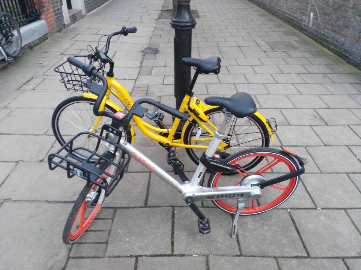
Mobike, one of London’s four bikeshare operators (with Urbo, Ofo and Santander Cycles) as today expanded to Newham. The operators are being driven by different borough approaches and priorities, which is resulting in a patchwork quilt of operating areas, although the London Assembly is today pushing for a more London-wide approach to regulation of the field.

Over and above the map linked above, I’ve done some population analysis to look at how the four different operators compare in London. Demographic figures are from the 2011 Census so total population will have gone up a bit, and cycle-to-work population up a lot. Nonetheless, the figures still allow for a useful comparison. The populations here are working age (16-74) populations. The differences across the operators are dramatic:

Operator
 
# of
Boroughs
Area
/km2
# of
Bikes
Average
Day/Night
Pop
Bikeshare
Bikes per
Person
Pop
Density
pax/km2
Cycle
To Work
Pop %
Santander Cycles  5, + 6 (part) 112 10200 1,520,000 1:150 13500 4.8%
Mobike  6 196 1800 1,425,000 1:800 7300 3.5%
Ofo  5 123 1300 1,040,000 1:1000 8500 4.0%
Urbo  3 177 500 570,000 1:2800 3200 1.2%

I have calculated the populations by averaging the day-time workplace population and the night-time residential population, making a very rough assumption that people spend their waking hours split roughly between work and home. Santander Cycles, the dock-based system, has been around since 2010. The others are all dockless operators and launched in 2017.

The high population density where Santander Cycles works in its favour, as does its high bikes/population ratio, with one bike available for every 150 person who lives and/or works in the area. Urbo, on the other hand, is mainly targetting populations that both have a low population density, and a low cycle-to-work percentage – two factors that would work against it. Mobike and Ofo sit in the middle, with the former quite a bit larger than the latter at the moment, but the latter operating areas with a more established tradition of cycling (using here the Cycle to Work population as a proxy for cycling in general).

Categories
CDRC

Changing Broadband Speeds in the UK

The Broadband Speed map has been one of the most popular maps that the Consumer Data Research Centre has ever published on our CDRC Maps platform. The map is based on data from Ofcom, the UK’s digital connectivity and broadcast media regulator, and I was invited to talk at their Innovation Workshop event, hosted by ODI Leeds, earlier this month. My brief was to demonstrate the Broadband map but also critique Ofcom’s open data offering (which provided the data for the map). The talk slides can be found below:

As part of the preparation for the event, I produced a new version of the the Broadband map, showing 2017 data from the Connected Nation report (the original was based on the 2016 data). This gave the opportunity to therefore prepare a third map, showing the change between 2016 and 2017. Note that this is showing the change in the average broadband download speed experienced across both business and residential premises conneections, averaged by postcode with each postcode averaged then averaged again across the local output area (which typically contains five postcodes for residential areas, but many more than this for business areas.) The metric population numbers displayed when you mouse across each area, therefore, is the number of business and residential connections – typically 50-150 for the latter.

The map shows a general light green gradient across the country, showing broadband connection speeds are gradually increasing, as more and more fibre to the cabinet (FTTC) is installed and people change organically contracts to providers with better service. The places where other colours appear are the interesting results. Large increases are seen in rural Lancashire, near Kendal in the Lake District, as a community-driven ultra-high-speed rural service there continues to roll out. More dramatic improvements are seen just to the east of Cheltenham, again a rural area with specialist high technology and defensive industries.

Cranham, for example, has seen a 11000% improvement, from 1.7mbit/s to 190mbit/s, as new business connections have come online:

Appleton, on the other hand, has seen a 99% decrease, from 540mbit/s to 2.3mbit/s:

In London, the drop around King’s Cross, the previous year’s fastest postcode, is almost certainly not due to a general decrease in available speed, but actually because residential connections have come online, and demonstrates the problem with aggregating by the residentially defined “Output Area” geography. The previous, ultrafast result was likely due to dedicated ultra-highspeed links into Google’s new UK office, and other high-technology businesses opening there. Since then, the residential blocks nearby have opened. These still have pretty nice connections, but not the business-level infrastructure needed. So, it shows as an average fall in London.

Rotherhithe is always an interesting area:

A traditionally very poorly connected area, both in transport but also digital connectivity, it has seen dramatic improvements in many areas. but also big falls in the newest area – again possibly due to an increased residential component in the mix.

Explore the broadband difference interactive map.

Categories
CDRC Conferences Data Graphics London OpenLayers

FOSS4G UK 2018 Meeting and OpenLayers 4

I attended and presented at the FOSS4G UK conference in central London, in early March. I was scheduled to present in the cartography track, near the end of the conference, and it ended up being an excellent session, the other speakers being Charley Glynn, digital cartographer extraordinaire from the Ordnance Survey, who talked on “The Importance of Design in Geo” and outlined the release of the GeoDataViz Toolkit, Tom Armitage on “Lightsaber Maps” who demonstrated lots of colour compositing variants and techniques (and who also took the photo at the top which I’ve stolen for this post):

…and finally Ross McDonald took visualising school catchment areas and flows to an impressive extreme, ending with Blender-rendered spider maps:

My talk was originally going to be titled “Advanced Digital Cartography with OpenLayers 4” but in the end I realised that my talk, while presenting what would be “advanced” techniques to most audiences, would be at a relatively simple level for the attendees at FOSS4G UK, after all it is a technology conference. So, I tweaked the tittle to “Better…”. The main focus was on a list of techniques that I had used with (mainly) OpenLayers 4, while building CDRC Maps, Bike Share Map, TubeCreature and other map-based websites. I’m not a code contributor to the OpenLayers project, but I have been consistently impressed recently with the level of development going on in the project, and the rate at which new features are being added, and was keen to highlight and demonstrate some of these to the audience. I also squeezed on a bonus section at the end about improving bike share operating area maps in London. Niche, yes, but I think the audience appreciated it.

My slides (converted to Google Slides):

Some notes:

  • My OpenLayers 2/Leaflet/OpenLayers 3+4 graphic near the beginning was to illustrate the direction of development – OpenLayers 2 being full-featured but hard to work with, Leaflet coming in as a more modern and clean replacement, and then OpenLayers 3 (and 4 – just a minor difference between the two) again being an almost complete rewrite of OpenLayers 2. Right now, there’s a huge amount of OpenLayers 4 development, it has momentum behind it, perhaps even exceeding that of Leaflet now.
  • Examples 1, 3, 4 and 5 are from CDRC Maps.
  • Example 2 is from SIMD – and there are other ways to achieve this in OpenLayers 4.
  • Examples 5, 6 and 9 are from TubeCreature, my web map mashup of various London tube (and GB rail) open datasets.
  • Regarding exmaple 6, someone commented shortly after my presentation that there is a better, more efficient way to apply OpenLayers styles to multiple elements, negating my technique of creating dedicated mini-maps to act as key elements.
  • Example 7 is from Bike Share Map, it’s a bit of a cheat as the clever bit is in JSTS (a JS port of the Java Topology Suite) which handily comes with an OpenLayers parser/formatter.
  • Example 8, which is my London’s New Political Colour, a map of the London local elections, is definitely a cheat as the code is not using the OpenLayers API, and in any case the map concerned is still on OpenLayers 2. However it would work fine on OpenLayers 4 too, particularly as colour values can be specified in OpenLayers as simply as rgba(0, 128, 255, 0.5).
  • Finally, I mention cleaning the “geofences” of the various London bikeshare operators. I chose Urbo, who run dockless bikeshare in North-East London, and demonstrated using Shapely (in Python) to tidy the geofence polygons, before showing the result on the (OpenLayers-powered) Bike Share Map. The all-system London map is also available.

FOSS4G UK was a good meeting of the “geostack” community in London and the UK/Europe, it had a nice balance of career technologists, geospatial professionals, a few academics, geo startups and people who just like hacking with spatial data, and it was a shame that it was over so quickly. Thanks to the organising team for putting together a great two days.

Categories
Cycling London

Modal Choices for the London Commute

..and why I’m excited about the rollout of dockless bicycle sharing systems in London.

My commute is around 11km long, it is Zone 3 to Zone 1. Generally I avoid peak times.

Ofo and Urbo are the dockless systems listed here. (Mobike doesn’t yet work for me, in terms of their borough rollout). Their current footprints don’t include either my start or finish location, so a walk is required at each end (and between them, when changing).

ModeTime      CostNotes/section times
Walk130 min£0.0045 mins to jog (or 60 mins via the scenic route) – can’t do that every day though!
Santander Cycles membership + walk100 min£0.2320+80. £90/year, 200 jnys
Dockless membership (future?)35 min£0.27Door to door. Based on £10/month for 11 months (Mobike). However is high risk as requires high bike availability.
Dockless (future?) + walk45 min£0.5030+15
Ofo (current) + day walk60 min£0.5015+30+15
Ofo (current) + night walk75 min£0.5015+30+30
My bicycle30 min£0.75Get through a £300 bike (or parts)/year
Dockless (future?)35 min£1.00Door to door
Ofo + Urbo (current) + walk70 min£1.0015+30+5+15+5
Santander Cycles + walk100 min£1.0020+80
Tube Z3-2 + walk55 min£1.5030+25. 20p more for peak.
Bus65 min£1.502 buses – hopper fare
Tube Z3-2 + Santander Cycles membership40 min£1.7330+10. 20p more for peak.
Tube Z3-2 + a bike for commute40 min£2.2530+10. 20p more for peak.
Tube Z3-2 + Santander Cycles40 min£2.5030+10. 20p more for peak. SC £2/day = £1/jny
Tube Z3-2 + bus season45 min£2.5530+15
Tube Z3-1 + walk25 min£2.8015+10. 50p more for peak.
Tube Z3-2 + bus45 min£3.0030+15. 20p more for peak.

Some notes:

  • Annual membership of Santander Cycles is scandalously cheap. If you are lucky enough to live in the Santander Cycle zone, then you really are getting a very good deal.
  • Sure I could save a lot of money (or time) by jogging twice a day, but my legs would probably give out after a few days of that!
  • Tube travel, avoiding Zone 1, remains a great bargain London. It’s a pity my work is just a bit too far inside the Zone 1 boundary – but then, that’s why the boundary is where it is.
  • I’m not including commute options that cost more than £10 (taxis, Uber etc). This includes driving, as the London Congestion Charge is £12/day and it is hard to park cheaply (or for free) just outside it!
  • It suprised me that it costs nearly £1 to cycle on my own bike each time, until I realised I spend around £300 a year, either on a new bike, or on repairs/components/tools for the existing one.