Categories
Data Graphics Mashups

Dials and Levers Overload

Steve, here in the lab at CASA, has adapted his popular Tweet-O-Meter display of Twitter activity in cities around the world, for my bike hire maps, to create Bike-O-Meter. Now, on a single screen, you can see lots of Google-powered gauges, showing how busy the bike share schemes around the world are right now. Some show massive spikes during their rush hours, while others are more popular at weekends. Most dials will move every two minutes, a few (the Velib ones) update every 10 or 20 minutes.

At the time of writing, the bike share schemes of the Spanish cities, particularly Barcelona, Girona and Valencia, are the ones being most actively used. Spanish rush-hours at lunchtimes seem generally to be as big as the morning/evening ones! Biking home for the siesta?

There’s a second mode, accessed here, that shows how unbalanced the schemes are – high values indicate that a lot of the bikes are concentrated in one part of the city, and there’s a lot of empty docking stations in another part. The metric is the percentage of bikes that would need to be moved to balance out the docking stations across the city.

Thanks Steve for making this awesome visualisation!

Categories
Data Graphics

Girona’s Commuters the Perfect Bike Hire Users?

An interesting pattern spotted on the bike hires this morning – I’m not reading too much into it as obviously Girona’s scheme is far smaller than London’s, but it appears that Girona’s commuters this morning managed to almost perfectly distribute the bikes around the town – a marked constrast to London’s who bunch them all in the City and the West End after each morning commute. Either that, or no one’s using them at all in Girona and the redistribution vehicle got to work very efficiently.

The key measure is the grey graph – this shows the number of bikes that would need to be moved to another dock, in order for all the docks to have same proportion of full and empty slots, i.e. a perfectly balanced system.

Girona at 10:50 BST (11:50 local time):

London at 10:50 local time:

The drop in the imbalance figure in Girona started at about 9am local time – London’s rise started at about 8am local time.

Categories
Data Graphics

A Month of Bike Docks in London

The TfL cycle hire scheme has been up and running for around six weeks, and I’ve been collecting data from the TfL map for around a month – let’s have a look at it.

Here’s a graph, in ‘calendar’ format, showing how the number of bikes available to hire fluctuates each day. As use increases, fewer bikes are available to use and the line dips. Most weekdays have three narrow dips, a medium-sized one representing the morning rush hour, a small one at lunch and a large one for the evening rush hour. Weekends have a single broad dip, lasting throughout the late morning and afternoon. The Sunday dip starts slightly later than the Saturday one (maybe people have longer lie-ins on Sunday?) but apart from that the weekend pattern is broadly similar.

A more useful indicator of wherever you are going to have problems finding free or docks or bikes, is to measure how uneven the distribution of bikes is. The distribution imbalance graph describes how many bikes would need to be moved in order for every docking station to have the same proportion of bikes and spaces. A high value indicates a very skewed distribution, e.g. most central docks full and most peripheral ones empty. A low value indicates a more even flow.

The TfL distribution teams presumably work to even out the distribution except in key commuter hubs, i.e. around stations. You can see this with a gradual dip in the graph during the spell between morning and evening rush hours. There are also short-lived sharper dips at the beginning of the two main rush hours as full docks start to empty before the destination ones become completely full. Weekends generally have a more even distribution, which also changes less abruptly. An “ideal” usage of the scheme would probably have a constant and low value for the distribution imbalance.

Finally, here’s a graph which also includes rain data from the CASA weather station here in central London Aidan Slingsby’s weather station which is based just north of the hire zone. The data is a little suspect – particularly as it didn’t record any last night and I got soaked on the way home. However, apart from the last week or so, I think it is a good indication of when it was raining. The higher the blue bar, the heavier the rain.

As you would expect, rain during the three main weekday cycle usage times, or during the weekend day, tends to diminish the number of bikes being used and so increase the number available, causing the dips in red to decrease in size or disappear altogether.

Here’s one further version of the above graph, with a narrative for key cycle-related events happening in central London during the last month, which may or may not explain changes in the pattern compared to the same day of the week elsewhere in the month.

Categories
Data Graphics Mashups

London Cycle Hire Vis – New Colours and Stats

I’ve made a couple of enhancements to my live London cycle hire map – you can now choose from several colour sets. A couple of the sets also change the circle sizes, so that these correspond to the number of bikes (or spaces) rather than the dock size. This means the circles grow or shrink as the bikes get used, rather than remaining static as before.

Using value-based colour ramps and/or circle size changes, rather than the standard hue-based colour ramp, are are a more “correct” way to show quantitative data graphics such as the hire map, as the data values aren’t distorted by “colour bias” (where a particular hue has more of an impact to the viewer).

I’ve also added a couple of panels to show how busy the hire scheme currently is, and how this compares to the same time 24 hours ago, and added a ticker which lists changes as they happen (e.g. docks becoming full or emptying quickly), in the style of the old BBC Grandstand vidi-printer.

Very few people have been using the bikes to commute home this evening (and yesterday evening) as it’s been raining a lot here in London! We have a weather station here at CASA, with historical data, so it should be possible to quantify the relationship between how hard it’s raining and what proportion of people decide to try another way to get home.

Categories
Data Graphics Mashups

24 hours of London Cycling

[A final word on my cycle hire visualisation – which you can see here.]

James has posted a video showing how the colours (i.e. bike usage patterns) changed during Wednesday – a typical day with good weather (so high usage) and sharply defined rush hours. The video shows one hour every second and starts at midnight (so look out for the main changes at 9s and 18s in.)

Another quirk is a characteristic move from red to purple of several stations overnight (i.e. in the first 5s of the video) in the northern edge of the zone, i.e. around Angel, travelling from east to west. A redistribution vehicle at work?

Today’s evening rush hour is showing quite a different pattern – a much less pronounced spike in usage, spread out over a longer time interval. This is probably because of the rain showers this afternoon and correspondingly damp roads, but possibly because Thursdays are traditionally team drinks nights in the City for many people, and so people will either be delaying the journey home, or deciding not to take the bike at all after a few drinks (not a bad idea really.) Certainly I’ve noticed a large difference in the numbers of people spilling out of the traditional City drinking dens on Thursday (and to a lesser extent Friday) evenings, compared with Monday-Wednesday.

Aidan’s sparklines, showing yesterday’s data as grey lines and today’s in orange, show this lag effect strikingly.

Neal Lathia, a research fellow here at UCL alerted me to a study carried out on usage patterns of a very similar scheme in Barcelona – even the dock numbers and scheme shape match London – clustering and categorising docking stations based on their usage patterns. Their method of data capture is also very similar to what I’m doing and the resulting dataset should lend itself to an equivalent categorisation in London. Things will only get more interesting when “casual” (i.e. non-registered) users get access to the scheme, which may happen next month, and new user types, such as foreign tourists, get involved, and the seasons (and weather) will also probably play a part, as different user types have different levels of willingness to use the system based on daily conditions.

The BBC’s Tom Edwards has an interview with the operators of the scheme, which includes at one point a screenshot of the internal (Google-maps based) map used by them to see what docking points are on their way to becoming full or empty.

Categories
Data Graphics Mashups

London Cycle Hire Visualisation

I’ve created a visualisation of how the TFL Cycle Hire scheme in London is being used – the so-called “Boris Bikes”. Around 4000 bikes have been placed in 400 cycle parking stands in the centre of the city, and people have been using them to get from A-B.

Some distinctive if not entirely surprising patterns have appeared already – with heavy usage (~10% of total bikes out on the streets) during the rush-hours, which occur in a strikingly small time interval – a narrow, sharp dip appearing only between 5:30pm to 6pm. Usage is much less in rainy weather, such as has happened today, and weekend use is both lower, and quite different in “shape”. During weekday days, the City tends to have a lot of the bikes, while in the evening, the bikes end up at the cycle parking stands near the big terminal train stations and in Pimlico in the south-west of the area – probably the biggest residential area covered by the scheme, and also a popular place for city workers to live…


10am Tuesday: Straight after a sunny morning rush-hour, before redistribution kicks in – many of the central stands are now completely full of bikes (red with yellow borders.)


8pm Tuesday: A typical evening pattern – the bikes are on the edge, and at the terminal stations, particularly around Waterloo and King’s Cross, while the centre is short of bikes…

The visualisation consists of coloured dots, which change from blue to red as each stand fills up with docked bikes. A purple dot indicates a half-full stand. The size of the dots corresponds to the total capacity of the stand.

You can click on a stand’s dot to see information about its current status, as well as its use over the last 24 hours, represented as a minimalistic graph. A graph of overall usage can also be viewed. Both get updated as the new data comes in.

The data comes from TFL’s own map of the stands in central London, and is updated at source typically every six minutes – my own visualisation updates every two minutes, so you should never be more than ten minutes out of date, looking at the map.

The background is a bespoke render of central London, from OpenStreetMap data.

See it here.

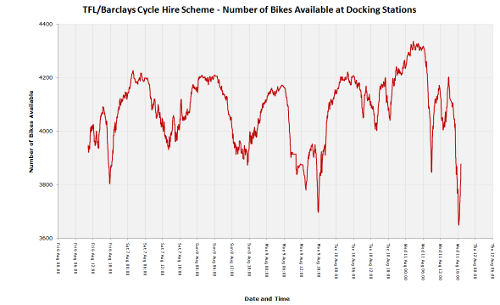
Here’s how the total number of available bikes has fluctuated, since Friday morning (click for larger version):

totalavail_thumb

[Update: Some articles about the visualisation – Telegraph, Londonist, Road.cc, Real Cycling, Bikeradar]

Categories
Data Graphics Mashups OpenLayers

The Political Colour of Great Britain

Following on my UK General Elections 2010 Swings map, where circles represent each constituency, with the sizes and colour describing the metrics, I have used a technique that James has been studying, to combine the vote proportions together to produce a single coloured dot for each constituency. The more blue the dot, the higher the proportion of the vote was Conservative. Similarly, red for Labour and Green for the Lib Dems and the other parties and independents.

A purple constituency represents a Labour/Conservative marginal, as blue+red = purple. There are many of these in the Midlands. Similarly, orange areas indicate likely Labour/Lib Dem (or SNP/PC etc) marginals, such as in South Wales, and turquoise areas indicate Conservative/Lib Dem (& other) margins, there are many of these in SW England. Grey dots show three-way marginals, e.g. Hampstead in London.

Because I am using just three colours, to represent three political groupings, the visualisation does not show the variation in results between the Liberal Democrats and the nationalist parties – the SNP and PC in Scotland and Wales respectively.

Some interesting patterns are revealed – the ring of blue/purple around the red/orange centres of London and Birmingham – with no such corresponding ring around Manchester or Newcastle. Scotland’s lack of blue. The straightforward Labour/Conservative split in NW England. East London isn’t quite as safe-Labour as you might think – with the exception of East Ham standing out in bright red.

The benefit of this visualisation is that every vote is included in it – on a regular election map, if one party just fails to win, then an election map won’t show them at all on it. Here, every vote influences the colour of the map. Each circle represents roughly the same number of people – the populations of constituencies are fairly even, with some notable exceptions such as the Isle of Wight (very populated) and the Scottish Islands (very few people.)

You can see the colour map by going to the election visualisation and choosing “Constituency Colour” from the “Other graphs” drop-down. James has produced a regular choropleth map version, which shows the green (SNP/LD) of northern Scotland and blue (Conservative) of southern England strikingly well.

Categories
Data Graphics Mashups

General Election Swings Visualisation

I’ve created a visualisation of the results from the UK general election this month. By default, it shows the most significant swings between parties, for each constituency. By using the options on the right, you can change it to show simple vote counts, overall results, or swings between any two significant parties. I’m using a circle to represent each constituency. The area of the circle is directly proportional to the metric being shown (number of votes, or percentage point swing) with a dynamic key on the right to help out. Click on a circle to see the vote results.

Some Notes:

By choosing “Winning Party” from the “Other” drop down, you see the simplest map – each circle is the same size, and it simply shows the winning results – with the previous winner shown as the colour on the edge of the circle. I think this kind of view is a “best of both worlds” approach – as long as the circles don’t overlap, it has the “fairness” of cartograms (aka “proportional” maps in the BBC’s coverage) while retaining the geographical familiarity of the choropleth (“normal”) map of the UK.

Only Great Britain is included, not Northern Ireland, as the OS Open Data release, which provides the parliamentary boundaries from which the centroids were calculated for the circle locations, does not at the moment include Northern Ireland.

The definition of swing is tricky – swing can only be described as being from one party to another. Choosing which two parties to use for the “headline” swing was tricky. In the end, I’ve chosen to show the swing between the losing and winning party where the seat changed hands, and where it didn’t, the swing between the two parties with the highest number of votes. This means “interesting” swings like in Bethnal Green & Bow are still included. It does however mean that the largest swing is not necessarily shown.

There were a large number of parties contesting seats – in the end I’ve only included parties that got at least 30,000 votes in total, to prevent the lists becoming too long. I’ve also excluded swings where either party in the swing had less than 5% of the vote (i.e. losing their deposit) as such a swing is probably not very meaningful.

In general, a swing between a “small” party and a “large” party is not meaningful anyway, because any voting changes that a large party suffers/gains from are probably to/from another large party, rather than to/from the small party. So, bear this in mind when viewing the swings between (for example) Labour and UKIP. UKIP appears to have gained almost everywhere but actually it was probably another “large” party (Conservatives or Liberal Democrats) that actually got the floating votes.

The background imagery was custom-rendered to show the constituency boundaries and be entirely grey – so that the only colours are those representing the party results. Because the boundaries generally run to the low-water mark and estuary mid-lines, whereas OpenStreetMap boundaries generally run to the high-water mark and consider estuaries to be sea rather than river, there are some odd looking estuarine areas (e.g. the Bristol Channel and the Thames Estuary.)

Said another way, this is because of a mismatch between where OpenStreetMap and the parliamentary boundaries commission consider the rivers to stop and the coast to start. I have manually edited two boundaries – NW Bristol sticks far out into the Bristol Channel, and the Medway boundaries also stick far out. NW Bristol’s centroid was also manually moved. There are other, lesser quirks with the data, and being OSM data, not every village is on there yet. I consider the background imagery overall to be “good enough” for the visualisation at hand.

No fancy AJAX was used – the data (about 120KB) is simply loaded into the browser at the start – the visualisation being done entirely on your browser using the OpenLayers API.

It’s not very easy to draw circles in Javascript, so I’ve let OpenLayers do it for me. The two circles that make up the key are actually miniature OpenLayers maps themselves, with a single point feature at the origin of the map. They update in sync with the main map.

The visualisation was ready to go last week but the way Internet Explorer draws the vector graphics (using VML rather than SVG) was causing considerable performance problems, when trying to show all 650-odd constituencies at once. As a work around, the map starts by being zoomed in if you visit the site in IE. Zoom out at your peril!

If you spot any bugs (apart from the IE chronic slowness!) please let me know.

Categories
Data Graphics Mashups OpenLayers OpenStreetMap

Tube Stations in London – Visualisation

I was inspired by seeing this map and associated article on the New York Times website, linked from Going Underground, to create a similar mashup/visualisation of entry/exit volumes from the 300-odd tube stations in London. On their website, Transport for London provide the metrics for entries/exits from the stations, between 2003 and 2008, broken up into rush-hour, regular and weekend travel.

Each circle’s area is directly proportional to the flow numbers for that station (click on the circle to see the numbers.) The circles are rescaled between the first metric (total flows) and the rest, so direct comparison of metrics is possible except between the first and others, Blue circles represent an increase in flow and red a decrease.

If the mass of circles are obscuring each other, zoom in!

You can try it out here.

Some technical notes:

The background map is a custom render of OpenStreetMap data, with the tube lines highlighted in their traditional colour – it doesn’t always look quite “right” when you zoom in, due to the way the lines are tagged in my own copy of the OpenStreetMap database. The stations are even harder to disambiguate, so I’m using a free source from Wikimedia Commons, this means they don’t always line up.

Because your browser gets a copy of all the flow data when you load the page (yes I’ve heard of AJAX) it does run a little slowly in Internet Explorer, particularly the slider bars – these allow you to “drag” through the range of metrics or years.

Categories
Data Graphics Technical

Forests of Great Britain

From the OS OpenData’s Meridian 2 dataset, which was released under a free licence today, here is the extent of forest cover across Great Britain – there is a dedicated polygon shapefile within the distribution showing just this:

As a general rule for orienteering, areas with good forest cover have the best orienteering maps. Scotland and Wales beat England hands down for cover, although Surrey’s doing not too badly at all. The rule doesn’t always hold though – there’s a big patch near Cambridge – more so, it appears than the Lake District, but the latter is considerably finer for orienteering in.

The map contains Ordnance Survey data © Crown copyright and database right 2010.