Categories
London

The Micrarium at the Grant Museum

mic1

I was at the Grant Museum of Zoology, one of UCL’s public museums in Bloomsbury, last week, helping install a new set of iPads for some interactive exhibits in there. The museum a small but fascinating space, it has been around since the 1820s but recently moved into a, larger space, although it still has a lovely old-fashioned feel to it, with display cabinets and drawers full of unusual stuffed or pickled animals, such as the Jar of Moles.

Anyway, I was delighted to finally visit the Micrarium, a new exhibit dedicated to the very small, it consists of three walls crammed full of slides of tiny things, displayed around a booth that you can walk into, with a mirror on the ceiling to complete the effect. While looking at the tiny specimens is an interesting exercise in itself, I was particularly taken with the design. Unlike the rest of the museum, which is mainly made of varnished wood cases and dimly lit for preservation reasons, the Micrarium is strikingly lit and immediately invites closer investigation – you have to get up close and personal with these tiny specimens in order to simply see what they are.

The idea of having a “all around you” booth in a museum reminds me of the “interactive Booth map” at the Museum of London, which I visited shortly after it opened a couple of years back.

The museum and Micrarium are free to visit and are open on weekdays from 1-5pm, located at the junction of Gower Street and University Street (I do love that there is a street with that name in London). If you do manage to visit, take a moment to answer one of the philosophical questions on the iPads, or tweet #GrantQR.

mic2

Cross-posted from my leisure blog.

Categories
Data Graphics London

Google Maps 2013 – A Few Steps Forward, A Few Steps Back

googlemapsnew

So Google has released an invitation-based beta of their new Google Maps version for 2013, at their developer conference (I/O) last week. I’ve been trying it out over the last few days. Compare the new version above, with the old version at the bottom of this post.

The good:

  • The new fonts used look great.
  • Covering the whole page with the map is great.
  • The cartography has improved a lot. I particularly like the slighty text buffering, and the subtle shading effects at the edge of areas of water. The world looks a lot more beautiful.
  • Fewer red pins – now, selected features show up in a bold, dark red font.
  • The old green and orange road major road colours have just been replaced with yellow and light orange. Much more soothing to the eye.
  • All vector based, so generally is more responsive (snappier) to use. Zooming in and out is very smooth.
  • Public transport display is much improved, both with timetables and route option itineraries, and the display of metro/rail networks and “sign” labels along the routes you take for journeys.
  • Selecting bicycle mode is much more obvious.

The bad:

  • I cannot specify a specific point on the map any more for a pin – it tends to jump to.
  • I cannot switch off display of my “home” and “work” points on the map.
  • I cannot view the (large) map and Street View at the same time, or navigate around the map and have Street View move at the same time.
  • No Pegman any more! I cannot see what streets are on Street View, except by navigating around Street View itself.
  • The image carousel at the bottom seems unnecessary and a waste of bandwidth – although it’s easy enough to switch off.
  • When selecting a POI quite near where I live, Google automatically draws a recommended road route from my home to it, and there seems to be no way to switch this off.
  • “My Maps” seems to have disappeared.
  • Terrain view seems to have gone.
  • Little explanation of symbology or colour meanings – I think this is deliberate, to reduce clutter, but it can be annoying. However key colours do have keys that pop up when needed, e.g. cycle route type, congestion scale.
  • The internal maps for major buildings (stations, shopping centres) seem to have gone.
  • You cannot zoom into the aerial imagery as far as before.
  • There are two few area/district names appearing at many zoom levels, e.g. in central London.
  • Overall feeling is that Google has stripped away too many features, and made doing anything more than a basic look at the map (or finding directions) a bit harder, requiring long mouse clicks or options that are hidden away.

So it looks prettier, and it’s easier to use. But some key features for me (such as the split screen between map and Street View) have disappeared – hopefully only temporarily – so for day-to-day use I find my self using the old map.

googlmapsold

Categories
Data Graphics London

London’s Oyster Card Tidal Flow

Here is an animation I created a couple of years ago, one of a number I created for the “Sense and the City” exhibition at the London Transport Museum, which ran from Summer 2011 to Spring 2012. A version of this animation was branded appropriately for the exhibition and shown upstairs in the interactive section. I also created a similar animation of the Barclays Cycle Hire, and colleagues created other map-based visualisations of the moving city.

The animated map shows the touch-ins (going into the network) and touch-outs (leaving the network) of Oyster cards at London’s tube and train stations, including a few beyond the Greater London boundary which still accept Oyster cards. Oyster cards are London’s travel smartcards. As the animation moves forwards in 10-minute intervals during the typical weekday, the balance between touch-ins and touch-outs is shown by a colour scale. Red indicates the great majority of taps are touch-ins, and green indicates mainly touch-outs. White is the “neutral” colour, indicating that roughly as many people are entering the network as leaving it, at that period in time.

Categories
London

Rename a Tube Station!

If you could rename a London tube (or DLR/Overground) station, what would you rename it to and why?

I would rename the following:

5641085817_6f9c5c1460_n

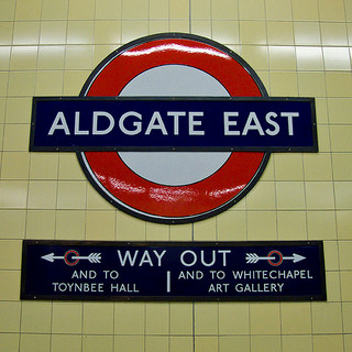
  • Aldgate East to Brick Lane
    Why? To promote a famous street and important tourist attraction for Tower Hamlets, and to distinguish it better from the nearby “Aldgate” station. (link)
  • Stratford International to East Village
    Why? International trains aren’t going to be stopping at Stratford International any time soon, so why not name it after what is surrounding it – East Village (formerly the Athletes’ Village) or Queen Elizabeth Olympic Park – although the latter is a bit long. Alternatively Stratford Olympia?
  • Paddington (H&C/Circle) to Paddington Basin
    Why? The two Paddington Underground stations a separate and a long walk from each other. Importantly, tourists getting going to the other Paddington Underground station, to go east, will have to get off after one stop anyway, and change at Edgware Road – a hassle.
  • Paddington (Bakerloo/District) to Praed Street
    Why? Same reason as above – to distinguish the stations more and make it less confusing to tourists arriving from Heathrow Airport. It used to be called Paddington (Praed Street) anyway.
  • Euston Square to Gower Street
    Why? It used to be called Gower Street, and it’s on the latter street, not Euston Square. Plus it’s a block away from Euston station, although it might be connected in the future if/when High Speed 2 happens.
  • Tottenham Court Road to Centrepoint
  • Why? It’s at the far end of Tottenham Court Road – so not much use for someone wanting to be at the north end of the road. Plus it’s right by the Centrepoint tower and could be considered to be the centre station on the tube network – the crossing point of the North-South Northern Line (Charing Cross Branch) and the East-West Central Line.

Photo CC-NC-By-SA-ND Chris Beckett.

Categories
Bike Share London

The London Bike Share Marches North

bbike_nexpansion

It’s not just Wandsworth and Fulham that will be getting Barclays Cycle Hire in the next year or so when Phase 3 goes live – Hackney and Islington will be getting a few too. The iconic “Boris Bikes” will be heading up Mare Street towards central Hackney – although not quite getting there – plus there’ll be various new docking stations in Haggerston, just north of the Regent’s Canal. There will also be a docking station on Islington Green, and a few around the Canal Museum on Calendonian Road. In all, if planning permission is forthcoming, there will be up to 15 new docking stations, all north of the Regent’s Canal. It’s a modest increase – 3% – but the communities affected will doubtless enjoy the new facility. It’s still a long way south from myself though!

I’ve adapted my Bike Share Map to show the proposed locations, above. The potential docking stations appear in green.

It’s great to see that the system is continuing to expand in all directions – but now the central London demand is being sated, it would be nice if Transport for London relaxed their requirement for docking stations to be within 300m of each other. The most successful bike share systems generally have a dense core and a well spaced out periphery, which accommodates commuters, tourists and locals equally well. I would much rather have the system properly penetrating Zone 2 and 3, even if there’s a 1km gap between each docking station. Then it becomes more useful for the utility users who unlike the commuters (going from stations to skyscrapers) and tourists (concentrating on the bigs parks and markets) act as useful re-distributors in their own right by the nature of their diverse journey directions.

Thanks to Loving Dalston for spotting a planning application for the docking station by London Fields. I had a quick trawl through the Hackney and Islington council planning websites to spot the others.

Categories
London Technical

Me, Geolocated on Twitter

tweets_london

I was prompted by the excellent Twitter Tongues map, where geolocated tweets in London (including mine, and those from hundreds of thousands of others) were mined by Ed Manley over the summer, and then mapped by James Cheshire, to see where I had left my own Twitter footprint.

Many people would probably be quite alarmed to learn that the data, on the exact locations they have tweeted at – if they’ve allowed geolocation – is freely accessible to anyone, not just themselves, through the Twitter API.

tweets_chancerylane

It’s a bit of a faff to get the data – Twitter is starting to rollout a “download my Tweets” option which may make the first few steps here easier – but here’s how I did it.

  1. I used the user_timeline call on the Twitter API, repeatedly, to pull in my last 3200 tweets (the maximum) in batches (“pages”) of 200. The current Twitter API (1.1) requires OAuth authentication – not of the person whose tweets you are mining, but simply yourself, so that rate limits can be correctly applied. Registering a dummy application on the Twitter gives access to OAuth credentials, and then using the OAuth tool generates a CURL string that can then be run – the result is put in a file ( > pageX.json), and I do this 16 times to get all 3200 tweets, using the count, page and include_rts parameters. For this particular case, I’m interested in the locations of my own account but – to stress again – you can do this for anyone else’s account, unless their account is protected and you are not a follower.
  2. The output is as various JSON files. Lacking a JSON parser, or indeed the skill, I had to do a bit of manual text processing. Those with a flexible JSON parser can therefore skip a few steps. I then merged together the files (cat *.json > combined.txt), and in a text editor, put a line break between each },{"crea and replaced ," with ,^" with the caret being an otherwise unused character.
  3. I opened up the file as a text file (not CSV!) in Excel and did a text-to-column on the caret. I then extracted three columns – the date/time, tweet text, and the first coordinates column that occurred. These were the 1st(A), 4th (D) and 28th (AB) columns. I did further find/replace and text-to-columns to remove the keys and quotes, and split the coordinates column into two columns – lat and long.
  4. I removed all the rows that didn’t have a lat/long location. Out of 3186 (14 less than 3200 due to deleted tweets) I had 268 such tweets. I also added a header row.
  5. I created a new Google Fusion Table on the Google Drive website, importing in the Excel file from the above step, and assigning the latter two columns to be a two-column location field.
  6. I marked the table as public (viewable with a link). This is necessary as Google doesn’t allow the creation of a map from a private file, except though a paid (business) account. The flip side of course is this gives Google themselves the right of access to the file contents, although I can’t imagine they are particularly interested in this one.
  7. Finally, I added a tab to the Google Fusion Table which was a map tab, and then zoomed in and around and took the screenshots below. The map is zoomable and the points clickable as normal. It should be possible to colour-code the dots by year, if the categories are set appropriately and the appropriate part of the datetime feed is reformatted appropriately in Step 3.

The whole process, including some trial-and-error, took a little over an hour – not so bad.

In the images above and below, you can see the results – 268 geolocated tweets over the course of two and a half years from my account – many of them precisely and accurately located.

tweets_nweurope

All screenshots from Google Maps.

Categories
Data Graphics London

A Periodic Table for London

Here is a webpage that uses my own CityDashboard API*, to build a Periodic-Table inspired “data artwork” of live London information, as a series of coloured square panels on a website. The squares update regularly with fresh information, and throb red (or blue) if there are particularly extreme values present.

As an artwork, it’s deliberately not 100% clear what it shows. A key on the bottom right will help a bit, but a degree of guesswork will be needed for some of the panels. With a bit of thought, almost all of the panels should be decipherable.

It’s a super-simple webpage. I’m using CSS3 for the animations – no Javascript used. The page is customised to be most relevant to the CASA office here in central London – the chosen weather station, bike share stands, air quality monitor and variable message road sign have been chosen accordingly. A more sophisticated version – which doesn’t currently exist but would be simple to do – would use a combination of the location information in the CityDashboard feeds, and the HTML5 geolocation functionality of many browsers, to show a version more relevant to where in London the viewer is.

As the page is so simple, it displays well on mobile browsers – on my iPhone, the webpage shows four panels on each row. On larger displays, it will rearrange appropriately. See the acknowledgements link on the page to see where the data’s coming from – the same sources as CityDashboard, including TfL, DEFRA, Yahoo! Finance and Mappiness, as well as CASA’s own sensors.

I created the piece for the ODI’s recent Data as Art installation competition – I didn’t win, but decided to do it anyway.

Live version here.

*Strictly, I’m using my Bike Share Map data for the individual docking station information – this could be easily added to the CityDashboard API in due course.

Categories
Data Graphics London Mashups

Update to CityDashboard CSV API & iPad Wall!

I’ve made some minor alterations to the CSV API for CityDashboard. The main changes are in the metadata rows (the top two) rather than the subsequent rows. Specifically, the top metadata row has now split out the description, source and source URL – which were previously rather messily combined into a bit of HTML – into three text fields; and the second metadata row now uses properly formatted names for value titles, i.e. including spaces, and units, for example “broken_pc” now becomes “% docks/bikes broken”.

The reason for these changes is to accommodate a new and exciting use of the API here at CASA – our lab hardware specialist has recently been hard at work building an “iPad wall” and one of the visualisations in it is of CityDashboard data. Here’s what the uncompleted – but operational – iPad wall looks like (source):

It’s a physical CityDashboard!

I also took the opportunity to fix a few bugs and typos – mainly just cosmetic, but including a pretty silly one for the Mappiness-sourced data that was over-reporting the true value by a large and variable amount. Entirely my fault. That will serve me right for doing a coding change during a colleague’s Ph.D viva drinks reception! I also handle temporarily unavailable source feeds a little better – they’ll now appear unavailable for one complete update cycle but it means the source server doesn’t get repeatedly hammered until it comes back up again.

Categories
Data Graphics London

The Electric Tube

[Update – An updated version of this is currently available as a limited edition A2 print.]

In six weeks time, London will have a second orbital railway. The Circle Line has been running for just over 100 years, and on 9 December will be joined by the latest addition to Transport for London (TfL)’s Overground network – a link between Clapham Junction in the south-west and Surrey Quays in the south-east. This means that the West London Line, North London Line, East London Line and South London Line will all be linked up (you won’t be able to travel 360 degrees on one train though – you’ll need to change at both Highbury & Islington and Clapham Junction, and often Willesden Junction, to complete a circuit). Should you travel around the complete loop, you’ll pass through areas as varied as Imperial Wharf, Dalston Junction, Whitechapel and Peckham Rye.

Anyway this was a tenuous excuse for me to produce a diagram – above – of London’s TfL-owned network – the Underground, the Overground, the DLR, Tramlink and the Cable Car. Click the graphic for a larger version. My starting principles for the diagram were concentric circles for the orbital sections of the Circle Line and the Overground network, and straight lines for the Central and Piccadilly Lines, with the latter two converging in the centre of the circles. I then squeezed everything else in. I realised that the Northern Line’s Bank branch passed the Circle Line three times so was going to need something special, so I added a sine wave for this section, and extended this north and south as much as possible.

The River Thames is on there – because any tube diagram doesn’t look correct without the river – and the diagram is topologically accurate – everything connects correctly, and features are in an approximately correct geographical position relative to their neighbours, but not to the diagram overall. Only stations that are designated intersections, or have connections with National Rail stations, are shown. I haven’t labelled anything. It’s art.

I was also thinking about physics when creating the diagram – specifically Feynman diagrams, bubble chamber traces, particle physics collisions, magnetic flow lines and electrical circuit diagrams (as was Beck himself). Hence why I’ve called it the Electric Tube.

The work was also inspired by the likes of Fransicso Dans (more) and Project Mapping, as well as of course the famous Official Tube Map. [Update – I’ve updated the map slightly to add in Tramlink and a few more connections.]

Categories
Data Graphics London

Prism: A Real-life CityDashboard

I was at the V&A earlier today to see Prism, a new installation by digital artist Keiichi Matsuda which is part of the London Design Festival.

Prism uses data from UCL CASA’s CityDashboard and other London open data sources, to visualise London in a novel way. The exhibit, which consists of triangular sails joined together in an irregular pattern, and lit from within, slowly pulses and evolves as the data that the patterns and colours are showing, changes. The visualisations are derived from fast-changing weather, travel and other London data sources. There is no key at all so you have to use your imagination to hypothesise what each panel is showing – although a couple have TfL roundels and bike share bikes on them, hinting at their purpose. Prism’s shape and positioning makes it look slightly organic, as it appears to about to burst through the floor and into the gallery space below.

Seeing Prism is a bit of a mission – it requires first going to the sixth floor of the V&A – not immediately obvious to find – then signing a disclaimer, ascending – in small groups of just 6 – a tiny spiral staircase. You then move across a narrow ledge, before finally you enter the darkened room. Prism is suspended in the middle, allowing a 360-degree inspection, and also a glimpse of the galleries beneath. Another spiral staircase, in one corner, then allows visitors to get a different, surprise view.

If you want to see Prism you need to book a timed ticket (free) in advance, and be aware it’s only on for the next 10 days. If you don’t manage to get a ticket, you can still see a glimpse of the base of Prism, as it is suspended over one of the galleries on the sixth floor of the museum.