Categories
BODMAS London

London Tube Stats

londontubestats

London Tube Stats maps data about how the London Underground is used – how many people use each station at various times of the day, and where they go once they are on the tube.

Transport for London, the city’s public transport authority, have a huge amount of data available in their Developers’ Area website, much of which is regularly updated. I’ve used the bike sharing system data fairly regularly, however I’m keen to take advantage some of their other datasets.

Back in 2010 I built a map mashup of the entries/exits data that, at the time, TfL made available on a (now defunct) performance website. The mashup consisted of varying the sizes of circles over each station, to represent how many people entered/exited the station, at certain times of the day, days of the week, or years, depending on the options selected. I wrote about the mashup here and also mentioned an update when the 2009 data was released, but the site languished. TfL changed the way that the data is formatted as it was moved across to the developer website, so adding future years wasn’t going to be straightforward, and also I never liked the rather stark black and white background map, with the tube lines “baked in” to it, and including various tube depots and other running lines that weren’t part of the passenger network, that I had created quickly.

londontubestats_keySo, I’ve rewritten the mashup from scratch. The main view shows the entry/exit data, by time of day, for 2003-2012. Choosing an option from the drop-down menu at the top will vary the circle sizes, the area of each circle representing the numbers. Clicking on a station will reveal a table of the underlying numbers, with colours showing trends. Then there is an additional view that uses the TfL RODS (Rolling Origin Destination Survey) data for 2012, to show journeys. RODS is based on surveyed data that is then scaled up to match the recorded entries/exits from the barriers, and the numbers represent a typical day. Click on a station to mark the place people enter the system, the other stations then shift in size to show where people exit. You can change between the two datasets using the Metric drop-down menu.

The background map is based on OpenStreetMap data, and the station locations and coloured tube lines are also based on this data – but I’ve tweaked it to show just one line per service, rather then individual tracks and depots.

Gist on GitHub

As part of creating this map, I’ve released the first in what I hope will be an increasingly large set of CASA open data releases. The release, as a Gist on GitHub, is of two files, in GeoJSON format – one for the tube lines, and one for the stations. The files also contain routes and stations for Overground, DLR, Tramlink, Emirates Airline and Crossrail (which starts in 2018) services. These are hidden from the London Tube Stats map, as stats are not available for these at the moment, although you can see them by setting all three dropdowns to the blank option.

I particularly like that GitHub spots that the files are GeoJSON, and effortlessly displays them as a map, rather than presenting the underlying JSON data by default.

[Update 1I’ve tweaked some colours – I now am using yellow vs blue when showing entries and exits for the journey metric. I’ve also added a new metric which compares the ratio of entries vs exits for the AM Peak numbers. Choosing the journey metric now always defaults to showing a selected starting station – currently Finchley Road. Click another station to show the stats.]

Categories
London

The Flat Tyre Tube Map

flattyretubemap

Ever been stuck with a bicycle with a flat tyre, in London but far from home? This has happened to me, many times, including twice in the last week, thanks to the usual combination of rain, grime and broken glass that seems to be endemic at this time of year here. & I don’t generally carry a spare inner tube, tyre levers and mini-pump.

Normally, I’m just aiming to get the bike home, where the toolset awaits, but how to do that? Full-size bikes are not allowed on buses, Tramlink, or “deep level” (i.e. bored) sections of tube lines – and until recently they weren’t allowed on the DLR either. TfL have this useful map showing where you can take them on their network, but this doesn’t include “heavy” rail lines which are generally more accommodating. Here is an equivalent map, but for First Capital Connect trains only.

So, I’ve modified the combined Rail & Tube Map to get the best of both worlds, and be sure of getting my bike home. Because I’m always looking for the cheapest way to complete such a recovery journey, I’ve included the Zone 1 area, as a place to try and avoid if possible. The orange-coloured London Overground lines then become very useful. I’ve also included, as red dots, a number of the “out-of-station interchanges” which aren’t normally shown on tube or rail maps, but which allow a by-street transfer between lines while counting as the same Oyster card journey. These make, for example, the GOBLIN (Gospel Oak to Barking LINe) a lot more useful, should you find yourself with a broken bike in north or east London, adding six valid connections which are otherwise unmarked on the main maps.

Most striking is the “hole” in central London, only one line passing through the Circle Line’s main loop. The Victoria and Waterloo & City lines are completely gone. A few less useful tube line sections are scattered to the north – I can’t imagine many people have ever taken a bike on a train from Cockfosters to Oakwood, for example. Your Oyster card also won’t get you to Heathrow with a bike – but then you presumably don’t live there anyway. The Central Line terminates just short of Stratford, which is annoying if you are trying to get back from Epping – but an out-of-station interchange at Leytonstone means there is a viable connection after all.

I “fiddled” with the original map in Illustrator – first deleting the banned sections, then rearranging station blobs so that they were connecting with blank space. It should be noted also that, if you end up with a flat tyre and are planning the tube method of recovery, that full-size bikes are banned from pretty much the whole tube network, and most of the rail network, during the weekday rush-hours.

This is a strictly unofficial mashup/modification of the original map which was produced by, and is the copyright of, Transport for London and ATOC. Here is a larger version.

[Update 1: Have added the Dalston OSI as multiple people have asked for it!]

Categories
Data Graphics London

Data Windows Update

datawindows

The charity auction for the artwork/map that I created with Dr James Cheshire, Data Windows, took place last night, at the Granary Building in King’s Cross. Our work was part of the silent auction section and received four bids, going eventually for £140. James and I are delighted that our map sold, and contributed to the fundraising effort.

Having looked at the other artworks that were on display, I was a little worried ours wouldn’t sell at all. There were many very impressive works, many that went for well above my budget, including a few for over £1000. The pieces by Dame Zaha Hahid and Lord Richard Rogers went for over £2000. The theme this year was drawing the area around Shoreditch, and the Hawksmoor-designed church of Christchurch Spitalfields appeared numerous times. My personal favourite work was Cycledelious, which was a bright multicolour stylised drawing of a Barclays Cycle Hire docking station. However it approached £200 before I had even got to it to put a bid down. The organisers’ strategy of very regularly topping up our wine glasses meant that I did very nearly end up bidding on several items…

You can find out more about how Data Windows was made in this earlier post.

Photo courtesy of Isla.

Categories
London Mashups OpenStreetMap

Ironways of London

london_ironways

It’s always irked me slightly that many online maps of London show the various tube services as straight lines between stations, or as idealised Bezier curves. Perhaps the regimented lines and angles of the official “Beck-style” tube diagram has meant that, when translating into a “real life” geographical map, people have tended to keep the simplifications. After all, if you are travelling around London on the tube or railways, only the location of the stations are important – not how you travel between them.

Focusing on the section of the DLR just south of Canary Wharf:

Google Public Transit view, using Bezier curves between stations:
iw_google

A typical “straight lines between stations” map – from CASA’s own MapTube:
iw_maptube

One of DLR’s own official diagrammatic maps:
iw_official

Where the line actually goes:
iw_actual

OpenStreetMap contributors have faithfully mapped most of London’s railways, including best-guess alignments for tube tunnels, using ventilation shafts on the service and “feeling” corners and curves that tube trains take – bearing in mind that GPS does generally not work underground. There are a couple of minor mistakes, such as orientations of the Northern Line curves near Mornington Crescent, and a part of the Piccadilly Line in north London.

I’ve taken this now excellent dataset, and as part of work to produce a comprehensive vector file of Transport for London (TfL) service routes, I’ve produced this interim map – the Ironways of London. TfL’s public service routes are highlighted in green. Lines in red are other train operator routes, sidings and depots, freight rail routes, disused lines, unusual chords and the odd ornamental railway. Many of these are obscured by the green lines of TfL routes, where the two coincide. There are a few missing sections, e.g. a couple of tunnels to the south of London are not shown.

The map here uses Google aerial imagery as a background, Ordnance Survey Open Data to show the boundary of Greater London, and OpenStreetMap to show the rail routes themselves. As such, it’s a nice mashup of the three major sources of free-at-point-of-use spatial datasets for London.

Here is the full size version.

There are a few other examples around on the net of the same thing – here’s an ESRI one. The Carto Metro one is excellent and is a level of detail beyond what I am aiming for.

In the new year I hope to complete and release the tidied vector data. [Update: Data released, more info.]

Categories
London

A Proposed Redesign for the Bow Roundabout

The Bow Roundabout is a busy and unpleasant junction in east London, with large volumes of traffic, including many bicycles and lorries. It forms a key part of the trunk network in London, distributing road-haulage around the city. River channels of the Lea Valley, industrial complexes, and the developing Olympic Park, block suitable alternative cycle routes.

boxarea

Bicycles generally only want to travel between central London to the SW and Stratford to the NE. Lorries and other motorised traffic generally want to travel in all directions, but because of both a flyunder (NW to/from SE) and a flyover (SW to/from NE) they only need to use the roundabout if wanting to turn right or left. The exception is local bus services between central London and Stratford, which have a bus stop on the approach slip roads.

This fundamental difference in the routes between lorries and other motorists (who are always turning left or right) and cyclists (who are always going straight ahead) has likely been a factor that led to three cycling fatalities in the last year, at least two due to “left hooks” (lorries on a cyclist’s right turning left across them). The junction approaches have been remodelled several times, most recently introducing a traffic-light-controlled advanced stop box for cyclists, to ensure they get to the front of the queue to enter the roundabout. However, the design is non-standard and confusing for cyclists – tellingly there is an official video showing how to use it. The design results in a forest of traffic lights, and the “safe” advance stop box and subsequent cycle lane refuges are too often blocked with motor traffic, stopped by numerous further traffic lights, during busy periods. This video from The Guardian shows this to dramatic effect – skip to 3 minutes in.

The layout is also unpleasant for pedestrians, who have to cross two slip roads, but the first of the pair is uncontrolled – there is no traffic light for them. The junction is still not fit for purpose, but, crucially, redesigns cannot reduce the overall flow of traffic through the junction, as it is at capacity. Diamondgeezer has detailed the problem from a pedestrian’s viewpoint.

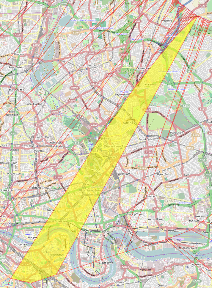
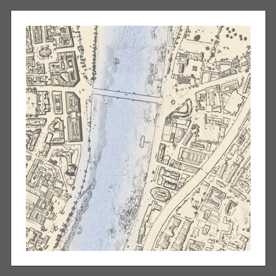
Here is the current layout:

bowcurrent

Traffic lights are shown as black blobs. The pedestrian crossing points are showing with blue/white squares, and the pedestrian only section is shown as a dashed blue/orange line. To the east of the junction is a water channel, with a “floating towpath” beside it, shown with black dashes as a tunneled section. This route is not considered further here.

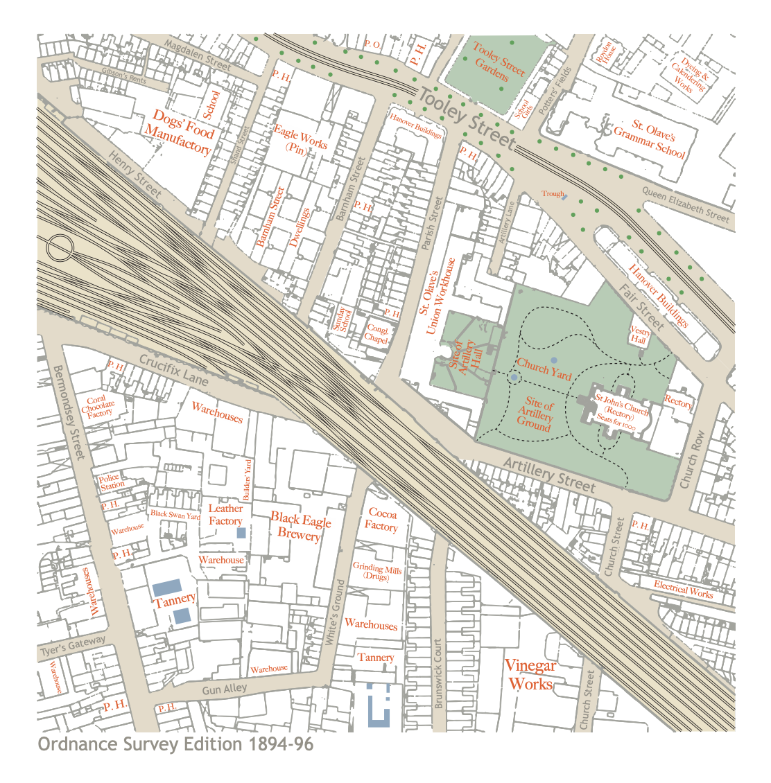
Here is my proposal:

bowfixed

Again, black dots are traffic lights, blue squares are crossing points, with an additional two blue squares showing bus stops, moved from the SW and NE slip roads. The road links to these bus stops are accessed only by buses and are shown in yellow. The cycle/pedestrian paths are shown as orange/blue dashed lines.

At first glance it somewhat looks like a roundabout in reverse, but this is not the case – there are four traffic-light-controlled “diamond” crossings, and traffic may only proceed straight across these.

This design improves on pedestrian and cyclist safety by properly segregating them from the road routes. For each direction, pedestrians/cyclists must make two crossings, both at right angles to traffic. At each crossing, there are two single-lane roads to cross, controlled by traffic lights which stop traffic on both roads at the same time, plus at the first crossing there is a bus road link which would be crossed via a raised zebra crossing, due to its low traffic levels.

Traffic negotiating the roundabout and turning left will meet just one traffic light, which would be green for just under 50% of the time. Traffic turning right will meet two traffic lights. Both will be red or both green, at the same time. This means that, again, nearly 50% of the time, traffic turning right would have green lights all the way through. There is no need for a dedicated pedestrian phase, with this design.

The only traffic which would not benefit from this design is the small amount of non-bus traffic travelling to/from the side-roads off the slip-roads to the NE, to/from the SW, and traffic travelling from the MacDonalds in the SW. This traffic would no longer be able to proceed straight across the roundabout to the NE unless it was allowed to use the small bus link-roads.

Disclaimer: I am (obviously) not a professional planner or traffic modeller, I am approaching this problem purely one of many regular cyclists on busy roads in London. Credits: The design was created in the Potlatch 2 editor on OpenStreetMap.org, and includes existing data from OpenStreetMap contributors and background aerial imagery from Bing. If trying this yourself be sure not to save your changes to the OpenStreetMap database. You can see the roundabout on an interactive map.

Categories
London

Pan-London London Traffic Flows Map

traffic2

[Updated] As an update to the London Cycling Census map that I mentioned in the last post, here is a map based on similar data collected by the Department of Transport during 2012. The map covers the whole of London, over 3000 datapoints – in fact the underlying data is available for the major road network across Great Britain.

My earlier work was based on the Transport for London cycle census which was carried out in April this year, covering around 170 locations in central London only, mainly the major road network plus some cycle-specific routes. The DfT dataset is older, and is major roads only, but by covering the whole of London, it puts cycling (and the other modes of transport covered) in context.

By default, the map shows cyclists vs buses vs lorries. You can change any of the three colours to show cars, but these are generally very large values so the arrows for cars tend to dominate the map. Zooming in may improve clarity when this happens.

Looking across London, for initial set of just bikes, buses and lorries, it is striking to see how closely the lorries follow just the trunk road network. Bicycles also dominate the centre of the city, their levels dropping dramatically between inner and outer London.

The work is an output produced while working on the EUNOIA project. It is one of the datasets that the project will use, when calibrating a MATSim-based travel demand model of London, to check that the numbers in the model roughly match those seen in this dataset.

View the visualisation here.
The data comes from here.

[Update: I produced a major update to the map in January 2017 – it now includes data from 2000-2015, includes data on some minor roads, removes the arrows (as they don’t reveal much, for full-day counts), and allows a comparison between years instead of between modes. The data table has also been replaced with an interactive graph.]

Categories
Data Graphics London

Mapping London’s Cycling Census Dataset

londontraffic

The London Cycling Census Map is an interactive map I’ve created, showing traffic flows on key corridors in central London. The counts were collected by Transport for London in around 170 locations, in April. TfL released some sample statistics from the dataset in a report published on their website, but the original dataset was not released – however Andrew Gilligan, the Greater London Authority’s cycling commissioner, obtained the data and forward it on to a number of people, including (indirectly) me. I took the data, consolidated it, and created this map. The most tedious bit was pointing the arrows in the right direction!

There are three time periods for which you can show data: AM Peak (7am to 10am), PM Peak (4pm to 7pm) and All Day (which is, I believe, a 24-hour sample.) which is from 6am to 8pm. The locations chosen are generally ones where high numbers of cyclists travel, so some roads which have high numbers of other vehicles, but not bicycles, e.g. Oxford Street, are not included.

Cycling along key corridors in London is highly time dependent – in the below extract, morning (red) and evening (green) flows for cyclists are compared. Cyclists generally travel away from Clerkenwell, to the east and the west, in the morning, returning to it in the evening. The other travel modes generally don’t show this directionality on this road – cars in particular generally travel in both directions during both peaks. I would hypothesis that the cyclists are accessing this road from Goswell Road, which unfortunately wasn’t included in the census.

london_ampm

So what does the data show?

  • There are several roads where there are more bikes on the streets than any other type of vehicles.
  • Bicycle flow is highly direction, unlike that for most other forms of transport.
  • There are certain routes which are popular with certain kinds of traffic. There are four main east/west corridors in central London. Cars dominate the north-most (Euston Road) and the south-most (Victoria Embankment) ones. Taxis heavily use Holborn, while cyclists mainly use Old Street/Theobald’s Road. You can see all four of these corridors in the map extract at the top of this article.
  • Equivalent north-south links show little separation of vehicle types.
  • Elephant & Castle remains a complicated junction with large numbers of cyclists and buses, depending on the direction, road and time of day.

A note on the arrows

The map uses the vector styling capabilities of OpenLayers, with a custom SVG “arrow” symbol. Symbols in OpenLayers are always positioned with their centre over the location point, so to have them pointing away from the location, I had to add a hidden stalk to each arrow – you can see the stalk when clicking on it. My custom SVG for the arrows is:


OpenLayers.Renderer.symbol.arrow = [1, 0, 0, -3, -1, 0, 0, -0.5, 0, 3, 0, -0.5];

I’m using 0, 0 as the point on the arrow that corresponds to the underlying location – but it doesn’t need to be that, i.e. the location of 0, 0 does not affect where OpenLayer actually pins your symbol on your point location.

And finally…

Red arrows are taxis, blue arrows are buses. Proof, perhaps, of the oft-quoted saying that it’s a battle to find a London taxi driver willing to go south of the river:

londontaxis

The map was created as an output of EUNOIA, a European Union funded project to model travel mobility in major European cities using novel datasets. UCL CASA is the UK university partner for the project.

You can view the map here.
View alternative version of the map – uses OpenCycleMap as a basemap.
Download the data here which I have augmented with bearings.

Categories
Data Graphics Geodemographics London

Data Windows

datawindows
Our 10×10 artwork for 2013.

This is a data visualisation artwork created by Dr Cheshire (@spatialanalysis) and myself. We were invited to submit an entry to 10X10 Drawing the City London, run by the building design charity Article 25. The submissions, including various from “real” artists and architects, will then be auctioned in November to raise funds for the charity’s projects.

Our technological, cartographical and geographical skills are almost certainly better than our artistic ability, so we decided to let technology create our artwork. We took the 2011 census data for the target area (Shoreditch) and combined it with building data from Ordnance Survey Vector Map District, creating a 3×3 panel. Colorbrewer colour ramps, supplied in QGIS 2.0, were used, to colour each panel differently.

The resulting artwork is completely based on open data, licensed under the Open Government Licence.

A single physical copy was printed directly onto white canvas, using specialised equipment operated by Miles Irving at the Drawing Office in UCL Geography. He mounted it onto a wooden frame. The resulting artwork can be seen above and has now been passed to Article 25 for their exhibition and auction next month.

Update: They invited us back for 2014 and 2015, and we produced maps for these latter two editions too.

2014 was taken from an old high-resolution Ordnance Survey map, which we vectorised and stylised:

Our 10×10 artwork for 2014.

Our 2015 map was from GIS digital raster data – using a high-resolution DEM for our square, and styling it in Illustrator:

Our 10×10 artwork for 2015.
Categories
Data Graphics London Mashups

CityDashboard makes it to the Mayor of London’s Office and the BBC!

bbcipad1

bbcpiad2

CASA colleague Steven James Gray used the API from CityDashboard, which I created early last year by aggregating various free London-centric data feeds into a single webpage, to power the data for a 4×3 array of iPads, mounted in a wooden panel, itself iPad-esque in shape. The “iPad wall” was mounted in the Mayor of London’s private office high up in City Hall, so that the mayor, Boris Johnson, can look over the capital digitally as well as physically. The idea of having the digital view directly adjacent to the physical view was also captured in the fleeting but beautiful Prism exhibition by Keiichi Matsuda at the V&A, another use of the CityDashboard API.

Today the BBC has picked up on the iPad wall and featured it as London’s example of emerging smart city technology. Scrolling down the article reveals it in all its glory. It’s somewhat flattering for the iPad wall and CityDashboard to be included this way, seeing as it’s just a number of HTML scrapes regularly running from various webpages, bundled together with pretty colours. The concept only works because of the many London-centric organisations that make their data available for reuse like this, not least Transport for London. It’s not going to change the way London operates like grander Smart City ideas might, but crucially it’s already out there. The BBC emphasises that it’s cheaper than Rio’s (well, yes, because the physical bit was built in CASA on a cost-of-materials basis, as part of a UCL Enterprise grant) and that it’s available to all, not just the Mayor. Almost true – CityDashboard doesn’t quite look like the physical iPad wall, but I’m minded to tweak the design and produce a version that does.

Anyway nice to know, via the BBC, that the wall is running and the data is ticking. The Mayor of London’s team can change the content on a number of the panels to show their own custom statistics. I was pleased to see, looking carefully at the photo in the article, that my Bike Sharing Map also makes an appearance.

Categories
London

The Micrarium at the Grant Museum

mic1

I was at the Grant Museum of Zoology, one of UCL’s public museums in Bloomsbury, last week, helping install a new set of iPads for some interactive exhibits in there. The museum a small but fascinating space, it has been around since the 1820s but recently moved into a, larger space, although it still has a lovely old-fashioned feel to it, with display cabinets and drawers full of unusual stuffed or pickled animals, such as the Jar of Moles.

Anyway, I was delighted to finally visit the Micrarium, a new exhibit dedicated to the very small, it consists of three walls crammed full of slides of tiny things, displayed around a booth that you can walk into, with a mirror on the ceiling to complete the effect. While looking at the tiny specimens is an interesting exercise in itself, I was particularly taken with the design. Unlike the rest of the museum, which is mainly made of varnished wood cases and dimly lit for preservation reasons, the Micrarium is strikingly lit and immediately invites closer investigation – you have to get up close and personal with these tiny specimens in order to simply see what they are.

The idea of having a “all around you” booth in a museum reminds me of the “interactive Booth map” at the Museum of London, which I visited shortly after it opened a couple of years back.

The museum and Micrarium are free to visit and are open on weekdays from 1-5pm, located at the junction of Gower Street and University Street (I do love that there is a street with that name in London). If you do manage to visit, take a moment to answer one of the philosophical questions on the iPads, or tweet #GrantQR.

mic2

Cross-posted from my leisure blog.