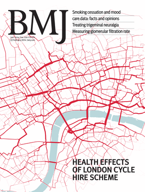
Having co-founded and been heavily involved in the organisation of the London City Race over the last six years, this year I’m taking a step back and looking forward to being a competitive runner at the seventh event, for the first time. After five years rotating around various parts of the City, and last year over at Canary Wharf, this year, it’s back to the centre of the City. The London City Race is just one of a whole series of urban races in major European cities this autumn, including Brussels (on the same day), Paris (the weekend after), and Porto, Edinburgh, Stirling and Barcelona in the following weeks. Four of these races form part of the City Race Euro Tour, with Barcelona acting as the final race with series prizes. It is in fact quite possible to run both Brussels and London, despite them being on the same day, thanks to wide start intervals, a well timed Eurostar train, and both events being near their respective termini.
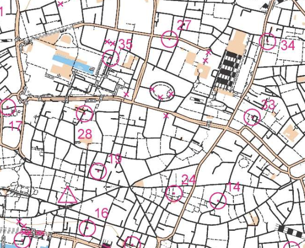
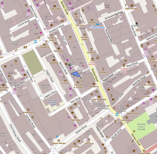
The first official London City Race was back in 2008, but in fact there were a couple of “prequel” races, although those running them may not have realised that. The first was a SLOW Street-O race taking place in the City in late 2007, on a Tuesday evening during the rush-hour. (An example of the “barebones” style map used is below – this is actually one from a later Street-O in the same area.) Amid the post-race analysis in the pub, it was agreed by all that the alleyways of the City were a lot of fun to run around. Conveniently I had taken a year out to study a MSc and therefore had the appropriate amount of free time to draw up a map. Being a Mac user, I needed a different solution to OCAD, so used Illustrator/MapStudio.
The process of producing the completed map, with courses, was a bit convoluted, so there was a second “prequel” race at Queen Mary University, using a map prepared in an identical way. This, my first ISSOM-standard map, proved to be fine, and so I and my co-organiser (Brooner) moved on to the race itself. Our controller, Simon Errington, proved invaluable, going well beyond the bounds of a traditional controller’s role to ensure the best possible event was put on. Having a large and experienced club (SLOW) was also immensely useful, with an army of volunteers to draw on for the race day itself. After the first, successful event, it was just a case of adding a new bit to the map each year (roughly one square kilometre a year has been added) and also moving the start and finish each time, to ensure that competitors could take part year after year, having a new experience running through the City with each race. We have also always tried to ensure the race has had a high profile as possible to the general public, choosing highly visible finish arenas, using race bibs which display the name of the race, making marshals very visible (red t-shirts!) and marketing the event as widely as possible, including to running clubs and the mainstream media. With have been lucky enough to have been sponsored by Clif Bar, from the very first race, which means we have now given out over 5000 complimentary Clif Bars to finishers.
I purposely know little about the club’s plans for this year’s race except that it is back in the City, likely the core part, and will hopefully include the classic Barbican Estate, famously so hard to navigate through that yellow lines used to be painted on the ground to guide people to the nearest exit! I would love it to also include a loop past the iconic Gherkin skyscraper, but have absolutely no knowledge of if this is the case. Probably the most iconic view of the London City Race, the Gherkin appears on the Walsh Trophy, BOF’s award for the best sprint/urban map of the year, and also appeared on the front cover of their Focus national magazine a few years back.
This year’s race has the map in OCAD – the conversion from Illustrator was pretty painful, but this does allow other members of the club the ability to update it. Sadly the City evolves around us year by year and some of the classic alleyways are being lost as the City authorities realise that fully segregating roads and people doesn’t work (except for orienteering!) Those who ran in the 2012 event, which started near, and finished in, the Barbican Estate, might be interested to know that the whole start area has now been demolished, including several nearby footbridges. The replacement buildings will have less of a “public realm”. Nonetheless there is still plenty of interest in the City, for orienteers and urban explorers alike. The Barbican Estate itself isn’t going anywhere, and the alleyways around Lombard Street, where the medieval coffee houses of the City used to be, are still very much intact.
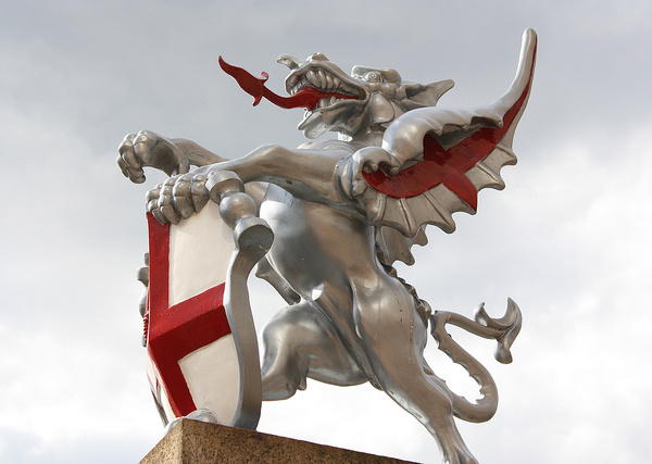
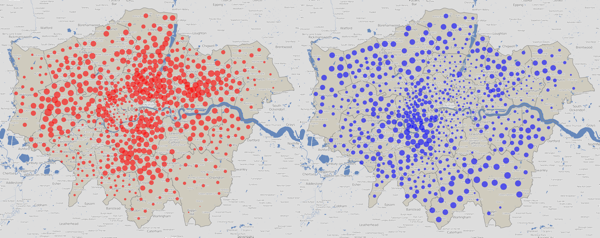
Entries are now open and already there are nearly 100 entered, including a strong overseas entry which should make this the most international of the UK’s now numerous urban races. The theme for this year’s race is the City of London dragons which guard each of the main entrances to the Square Mile. Be sure to order a limited edition technical top when you enter. See you in London (and maybe Brussels too!)
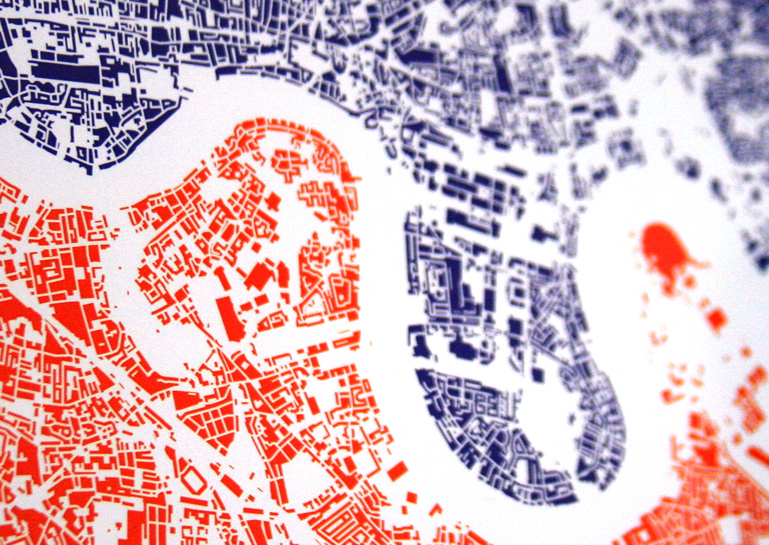
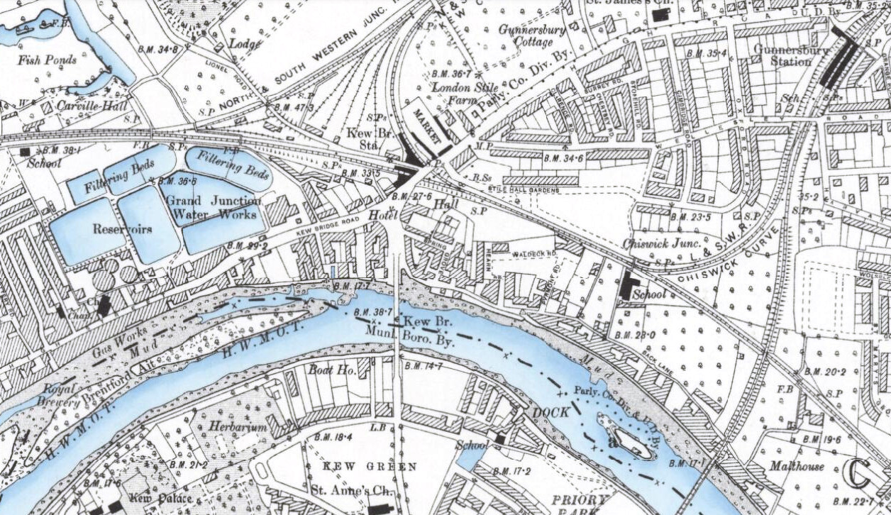
Photo above by Darkdwarf on Flickr. Below: A Street-O map of the City, based on OpenStreetMap data.
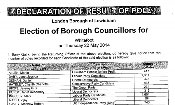
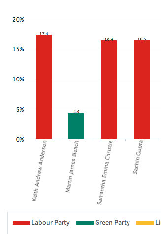 At the other end of the scale, Lewisham and Bromley councils only provide the data as PDFs. The tables contained with these does not indicate the winners – only the prose below it does. In Lewisham’s case the PDFs were scanned in so the text is not even copyable. Hounslow was a narrow second worst – while they did list all the candidates for all the wards on a single page (yay!) this information does not include the party that the candidates were representing (boo!). You have to go to another page for that and read the party name off a bar chart, as shown on the right here…
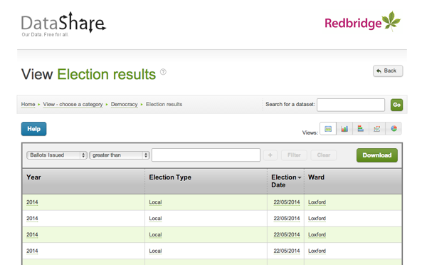
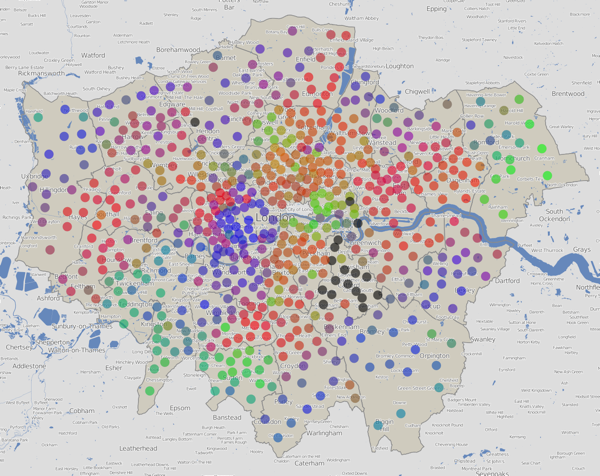
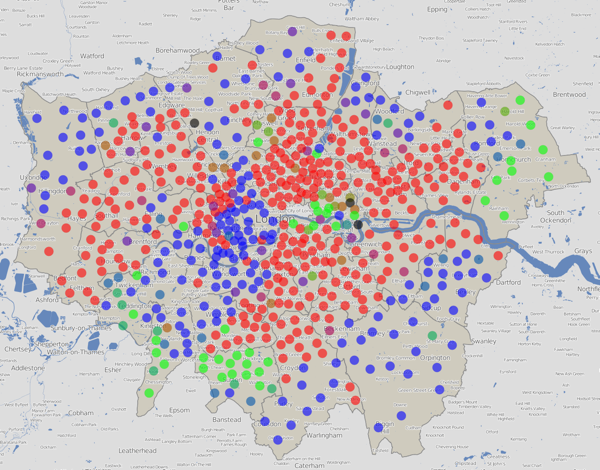

 Over the last couple of days,