Categories
Data Graphics London

Tube Tongues – The Ward Edition

wardwords

If you are a Londoner but felt that Tube Tongues passed you by, maybe because you live in south-east London or another part of the city that doesn’t have a tube station nearby, then here’s a special version of Tube Tongues for you. Like the original, it maps the most popularly spoken language after English (based on 2011 Census aggregate tables released by the ONS, via NOMIS) but instead of examining the population living near each tube station, it looks at the population of each ward in London. There are 630* of these, with a typical population of around 10000. I’ve mapped the language as a circle lying in the geographic centroid of each ward. This is a similar technique to what I used for my local election “Political Colour” maps of London.

A few new languages appear, as the “second language” (after English) in particular wards: Swedish, Albanian and Hebrew. Other languages, which were previously represented by a single tube station, become more prominent – Korean around New Malden, German-speaking people around Richmond, Nepalese speakers in Woolwich, Yiddish in the wards near Stamford Hill and Yoruba in Thamesmead. Looking at the lists of all languages spoken by >1% of people in each ward, Swahili makes it on to a list for the first time – in Loxford ward (and some others) in east London. You can see the lists as a popup, by clicking on a ward circle. As before, the area of the circles corresponds to the percentage of people speaking a language in a particular ward. The very small circles in outer south-east London don’t indicate a lack of people – rather that virtually everyone there speaks English as their primary language.

English remains the most popularly spoken language in every ward, right across London. Indeed, there are only a three wards, all in north-west London, where it doesn’t have an absolute majority (50%). London may seem very multilingual, based on a map like this, but actually it is very much still Europe’s English-speaking capital. See the graphic below, which shows the equivalent sizes the circles are for English speakers, or click the “Show/hide English” button, on the interactive map.

Here’s the interactive map. There’s also a ward version of Working Lines.

* I’ve ignored the tiny City of London ones except for Cripplegate, which contains the Barbican Estate.

Background map uses data which is copyright OpenStreetMap contributors. Language data from the ONS (2011 Census).

wardwords_english

Categories
London

Working Lines

workinglines_northern

As a followup to Tube Tongues I’ve published Working Lines which is exactly the same concept, except it looks at the occupation statistics from the 2011 census, and shows the most popular occupation by tube station. Again, lots of spatial clustering of results, and some interesting trends come out – for example, the prevalence of teachers in Zones 3-4, that there is a stop on the central line in north-east London which serves a lot of taxi drivers, and that bodyguards really are a big business for serving the rich and famous around Knightsbridge.

The northern line (above) stands out as one that serves a community of artists (to the north) and less excitingly a community of business administrators (to the south). Tottenham/Seven Sisters has a predominance of cleaners, and unsurprisingly perhaps plenty of travel agents live near Heathrow. I never knew that the western branch of the central line, towards West Ruislip, was so popular with construction workers. Etc etc.

Only the actively working population is included, rather than the full population of each area. This makes the numbers included in each buffer smaller, so I’ve upped the lower limit to the greater of 3% and 30 people, to cut down on small-number noise and minimise the effect of any statistical record swapping.

Categories
Data Graphics London

Tube Tongues

tubetongues

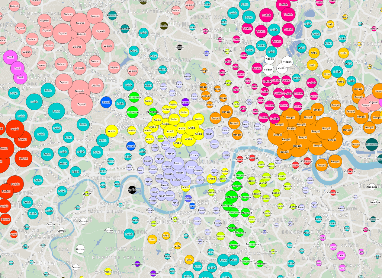
I’ve extended my map of tube journeys and busy stations (previous article here) to add in an interesting metric from the 2011 census – that of the second most commonly spoken language (after English) that people who live nearby speak. To do this I’ve analysed all “output areas” which wholly or partly lie within 200m radius of the tube station centroid, and looked at the census aggregate data for the metric – which was a new one, added for the most recent census.

See the new map here.
Also available as an A2 print.

tubetongues_vic
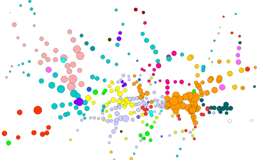
Each tube station has a circle coloured by, after English, the language most spoken by locals. The area of the circle is proportional to the percentage that speak this language – so a circle where 10% of local people primarily speak French will be larger (and a different colour) than a circle where 5% of people primarily speak Spanish.

Language correlates well with some ethnicities (e.g. South Asian) but not others (e.g. African), in London. So some familiar patterns appear – e.g. a popular, and uniform, second language appearing at almost all Tower Hamlets stations. Remember, the map is showing language, not origin – so many of the “Portuguese” speakers, for instance, may be of Brazilian origin.

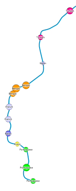
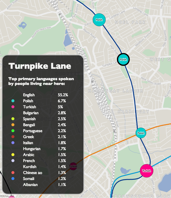
Click on each station name to see the other languages spoken locally – where at least 1% of local speakers registered them in the census. There is a minimum of 10 people to minimise small number “noise” for tube stations in commercial/industrial areas. In some very mono-linguistic areas of London (typically in Zone 6 and beyond the GLA limits) this means there are no significant second languages, so I’ve included just the second one and no more, even where it is below 1% and/or 10 people.

This measure reveals the most linguistically diverse tube station to be Turnpike Lane on the Piccadilly Line in north-east London, which has 16 languages spoken by more than 1% of the population there, closely followed by Pudding Mill Lane with 15 (though this area has a low population so the confidence is lower). By contrast, almost 98% of people living near Theydon Bois, on the Central Line, speak English as their primary language. English is the most commonly spoken language at every tube station, although at five stations – Southall, Alperton, Wembley Central, Upton Park and East Ham – the proportion is below 50%.

turnpikelane

A revealing map, and I will be looking at some other census aggregate tables to see if others lend themselves well to being visualised in this way.

I’ve also included DLR, Overground, Tramlink, Cable Car and the forthcoming Crossrail stations on the map. Crossrail may not be coming until 2018 but it’s very much making its mark on London, with various large station excavations around the capital.

The idea/methodology is similar to that used by Dr Cheshire for Lives on the Line. The metric was first highlighted by an interesting map, Second Languages, created by Neal Hudson. The map Twitter Tongues also gave me the idea of colour coding dots by language.

One quirk is that speakers of Chinese languages regularly appear on the map at many stations, but show as “Chinese ao” (all other) rather than Cantonese, whereas actually in practice, the Chinese community do mainly speak Cantonese (Yue) in London. This is likely a quirk of the way the question was asked and/or the aggregate data compiled. Chinese ao appears as a small percentage right across London, perhaps due to the traditional desire for Chinese restaurant owners to disperse well to serve the whole capital? [Update – See the comments below for an alternative viewpoint.]

The TfL lines (underground, DLR etc), station locations and names all come from OpenStreetMap data. I’ve put the collated, tidyed and simplified data, that appears on the map, as GeoJSON files on GitHub – see tfl_lines.json and tfl_stations.json. The files are CC-By-NC, licensing information is here.

Categories
Cycling London

An East-West and North-South Cycle Superhighway for London?

eastwest

TfL is currently consulting on a couple of proposed “Cycle Superhighways” – an East-West route from Paddington to Tower Hill and a North-South route from St Pancras to Elephant & Castle. The consultations close on 12 October.

The Cycle Superhighways punch right through the centre of London, they are generally wide and properly segregated from traffic. The space is often being made available by reclaiming a traffic lane. The Mayor has referred to them as a “Crossrail for Bikes”, which is a fair description. The two routes meet at the Blackfriars junction.

The east-west route has some curious quirks – it takes a circuitous route around Hyde Park, whereas a new lane going right through the park, or the existing cycle track in the north-east, would surely work better. I expect this is thanks to a lack of cooperation from the Royal Parks authorities – they really should travel to Central Park in New York City to see how world city parks are done properly. It also has a strange section where it takes another tunnel alongside the Blackfriars Tunnel, even though the latter is having one lane closed anyway to keep the traffic lane count consistent. But overall it is a well planned route. Cyclists retain right-of-way over most of the side streets, they don’t have annoying chicanes around the “floating” bus stops, and the “early start” lights (which actually simply act to ensure a cyclist will never get a green light right through) are few and far between.

The north-south route is less completely planned – the core section from Farringdon to Elephant & Castle however is ready for the detailed consultation. A strange dogleg on the approach to Elephant & Castle is unfortunate – “Superhighway” cyclists are always going to be looking for the fastest route, which the route does not take here – but apart from that it is a good, and straight, route.

I very much hope these two routes get built in their planned form and the proposals don’t get watered down. But also I would like Transport for London to focus on improving the busiest existing infrastructure too. Today on my research blog I publish a map showing estimated routes for 12 million bikeshare trips earlier this year. It shows the “Route 0” cyclepath, south of and parallel to Euston Road, as being the busiest of all. There is a good section of segregated two-way cycleway, but it’s horribly cramped, with queues of cyclists at rush-hour often so long that they back onto the next junction. The roadway alongside is normally less busy and therefore often makes for a quicker cycle route. I would also like many more one-way streets to be made two-way for cycles only – the “Sauf Vélo” popular in France, but for London. This can be done on a “lightweight” basis with minimal signage change, so there should be many, many more streets allowing such flows. After all, we don’t make pedestrians walk in a single direction!

Categories
Bike Share London

From Putney to Poplar: 12 Million Journeys on the London Bikeshare

london_barclayscyclehire

The above graphic (click for full version) shows 12.4 million bicycle journeys taken on the Barclays Cycle Hire system in London over seven months, from 13 December 2013, when the south-west expansion to Putney and Hammersmith went live, until 19 July 2014 – the latest journey data available from Transport for London’s Open Data portal. It’s an update of a graphic I’ve made for journeys on previous phases of the system in London (& for NYC, Washington DC and Boston) – but this is the first time that data has been made available covering the current full extent of the system – from the most westerly docking station (Ravenscourt Park) to the the most easterly (East India), the shortest route is over 18km.

As before, I’ve used Routino to calculate the “ideal” routes – avoiding the busiest highways and taking cycle paths where they are nearby and add little distance to the journey. Thickness of each segment corresponds to the estimated number of bikeshare bikes passing along that segment. The busiest segment of all this time is on Tavistock Place, a very popular cycle track just south of the Euston Road in Bloomsbury. My calculations estimate that 275,842 of the 12,432,810 journeys, for which there is “good” data, travelled eastwards along this segment.

The road and path network data is from OpenStreetMap and it is a snapshot from this week. These means that Putney Bridge, which is currently closed, shows no cycles crossing it, whereas in fact it was open during the data collection period. There are a few other quirks – the closure of Upper Ground causing a big kink to appear just south of Blackfriars Bridge. The avoidance of busier routes probably doesn’t actually reflect reality – the map shows very little “Boris Bike” traffic along Euston Road or the Highway, whereas I bet there are a few brave souls who do take those routes.

My live map of the docking stations, which like the London Bikeshare itself has been going for over four years, is here.

[Update – A version of the map appears in Telegraph article. N.B. The article got a little garbled between writing it and its publication, particularly about the distinction between stats for the bikeshare and for commuter cyclists in London.]

Categories
Conferences London Mashups

On City Dashboards and Data Stores

Earlier this month, I gave a short presentation at the Big Data and Urban Informatics Workshop, which took place at UIC (University of Illinois in Chicago). My presentation was an abridged version of a paper that I prepared for the workshop. In due course, I plan to publish the full paper, possibly as a CASA working paper or in another open form. The full paper had a number of authors, including Prof Batty and Steven Gray.

Below are the slides that formed the basis of my presentation. I left out contextual information and links in the slidedeck itself, so I’ve added these in after the embedded section:

Notes

Slide 3: MapQuest map showing CASA centrally located in London.
Slides 4-5: More information.
Slide 6: More information about my Bike Share Map, live version.
Slide 7: More information.
Slide 8: More information about CityDashboard, live version.
Slide 10: Live version of CityDashboard’s map view.
Slide 11: More information about the London Periodic Table, live version.
Slide 14: More information about Prism.
Slide 15: London and Paris datastores.
Slide 16: Chicago, Washington DC, Boston data portals.
Slide 17: The London Dashboard created by the Greater London Authority. Many of its panels update very infrequently.
Slide 18: Washington DC’s Open Government Dashboard and Green Dashboard, these are rather basic dashboards, the first being simply a graph and the second having just three categories.
Slide 19: The Amsterdam Dashboard created by WAAG, a non-profit computer society based in the heart of the city.
Slide 20: The Open Data City Census (US version/UK version) created by OKFN – a great idea to measure and compare cities by the breadth and quality of their open data offerings.
Slide 21: More information.
Slide 22: More information.
Slide 23: Pigeon Sim.
Slide 24: Link to iCity, More information on DataShine, live version.
Slide 25: More information on DataShine Travel to Work Flows, live version.

Some slides contain maps, which are generally based on OpenStreetMap (OSM) or Ordnance Survey Open Data datasets.

Categories
London Technical

Borough Tops

Screen Shot 2014-08-05 at 14.49.16

The Diamond Geezer is, this month, climbing the highest tops in each one of London’s 33 boroughs.

To find the highest points, he’s used a number of websites which list the places. These derive the data from contour lines, perhaps supplemented with GPS or other measurements. However, another interesting – and new – datasource for calculating this kind of metric, is OS Terrain 50. Released as part of the Ordnance Survey Open Data packages, it is a gridded DEM (Digital Elevation Model). It’s right up to date, at 50m x 50m horizontal resolution, and 10cm vertical resolution, and it should correct for buildings, so showing the true ground height.

Looking at the DEM for Newham, I think it reveals a new highest point – not Wanstead Flats at 15m above sea level, as Diamond Geezer’s lists suggest, but Westfield Avenue, the new road that runs through the Olympic Park. Beside John Lewis, the road rises, to a highest point of 21.6m. It shows as purple in the graphic above. Nearby, the new “bowl” of the lower part of the Olympic Stadium can be seen, as well as the trench through which High Speed 1 runs, at Stratford International Station.

I can’t argue with the Chancery Lane/Holborn junction as being the highest ground-point in the City of London, at 21.9m. In Tower Hamlets, it’s more tricky. The old railyards between Shoreditch High Street and the lines into Liverpool Street look like they are at 21.7m, however the ground here is not publically accessible, and the DEM is quite noisy here, with only part of the railyard showing this height.

I’m looking for a way to do this programatically – calculating the highest DEM value for each borough. I’ve tried using QGIS’s Zonal Statistics plugin, with polygon shapefiles of London’s boroughs, but this only shows the mean value of the DEM for that borough.

Here’s the list I’ve created by measuring – the main issue with my dataset is that the measurements are only at the centre of each 50m x 50m cell.

Borough Hgt (m) 50m cn 10-digit grid ref Description of
approximate location
By edge?
Barking and Dagenham 45.3 TQ_48590_89948 Industrial area just E of northern part of Whalebone Lane North.
Barnet 146.1 TQ 21955 95622 Just south of the water tower to the east of Rowley Lane, near Rowley Green.
Bexley 81 TQ 45737 71256 Langdon Shaw, southwest side. Yes
Brent 91.2 TQ 20732 88877 Junction of Wakemans Hill Avenue and The Grove.
Bromley 246.5 TQ 43637 56487 A233 – where Main Road changes name to Westerham Hill Yes
Camden 135.6 TQ 26277 86225 Lower Terrace, just off Heath Street in Hampstead. Yes
City of London 21.9 TQ 30970 81612 NW edge – junction of Holborn and Chancery Lane.
Croydon 175.7 TQ 34330 61827 Sanderstead Plantation, SW path crossroads.
Ealing 81.5 TQ 16177 84398 Horsenden Hill
Enfield 118.7 TQ 25632 97674 Just north of Camlet Way, Hadley Wood, opposite Calderwood Place. Yes
Greenwich 131.1 TQ 43831 76583 Southern end of Eaglesfield Recreation Ground on Shooters Hill.
Hackney 39.8 TQ 32025 87574 In Finsbury Park, beside Green Lanes, opposite No. 330. Yes
Hammersmith and Fulham 45.9 TQ 22960 82756 Harrow Road at north end of bridge over the railway line near Kensal Green station. Yes
Haringey 129 TQ 28326 87479 Ground by Highgate School Chapel, just north of Highgate High Street.
Harrow 153.4 TQ 15288 93808 Magpie Hall Road, between The Common and Alpine Walk. Yes
Havering 106 TQ 51192 93055 Churchyard of St John the Evangelist church (also Broxhill Road by the cricket pitch)
Hillingdon 130.5 TQ 10585 91678 Junction of South View Road and Potter Street Hill Yes
Hounslow 33.6 TQ 11320 78815 Western Road – bridge over the Grand Union Canal.
Islington 99.9 TQ 28874 87217 Highgate Hill and Hornsey Lane junction. Yes
Kensington and Chelsea 45.7 TQ 23014 82728 Kensal Green Cemetery, northern edge, beside the Harrow Road, above the railway line. Yes
Kingston upon Thames 91.3 TQ 16644 60376 Telegraph Hill
Lambeth 110.9 TQ 33620 70729 Westow HIll and Japser Road junction. Yes
Lewisham 111.2 TQ 33918 71779 Sydenham Hill and Rock Hill junction. Yes
Merton 56 TQ 23627 70823 Lauriston Road and Wilberforce Way NW junction.
Newham 21.6 TQ 37967 84530 Westfield Avenue, outside John Lewis in Westfield Stratford City.
Redbridge 91.5 TQ 47945 93784 Cabin Hill
Richmond upon Thames 56 TQ 18779 73065 Bridleway/path junction just east of Queens Road, opposite the Pembroke Lodge car-park and to the NE of it.
Southwark 111.5 TQ 33926 71686 Sydenham Hill, between Chestnut Place and Bluebell Close. Yes
Sutton 146.4 TQ 28383 59986 Middle of rectangle of land south-east of Corrigan Avenue and south-west of Richland Avenue.
Tower Hamlets 21.7 TQ 33720 82184 Railway yards between Shoreditch High Street station and the railways lines leading to Liverpool St Station.
Waltham Forest 92.2 TQ 38415 95010 Pole Hill (north top)
Wandsworth 60.7 TQ 22881 72780 Big Alp, Wimbledon Common
Westminster 53 TQ 26627 18386 Finchley Road and Boundary Road junction. Yes
Categories
Data Graphics London

London Words

Screen Shot 2014-07-21 at 15.46.02

Above is a Wordle of the messages displayed on the big dot-matrix displays (aka variable message signs) that sit beside major roads in London, over the last couple of months. The larger the word, the more often it is shown on the screens.

The data comes from Transport for London via their Open Data Users platform, through CityDashboard‘s API. We now store some of the data behind CityDashboard, for London and some other cities, for future analysis into key words and numbers for urban informatics.

Below, as another Wordle, are the top words used in tweets from certain London-centric Twitter accounts – those from London-focused newspapers and media organisations, tourism organisations and key London commentators. Common English words (e.g. to, and) are removed. I’ve also removed “London”, “RT” and “amp”.

Screen Shot 2014-07-21 at 15.56.57

Some common words include: police, tickets, City, crash, Boris, Thames, Park, Festival, Bridge, bus, Kids.

Finally, here’s the notes that OpenStreetMap editors use when they commit changes to the open, user-created map of the world, for the London area:

Screen Shot 2014-07-21 at 16.10.50

Transport and buildings remain a major focus of the voluntary work on completing and maintaining London’s map, that contributors are carrying out.

There is no significance to the colours used in the graphics above. Wordle is a quick-and-dirty way to visualise data like this, we are looking at more sophisticated, and “fairer” methods, as part of ongoing research.

This work is preparatory work for the Big Data and Urban Informatics workshop in Chicago later this summer.

Thanks to Steve and the Big Data Toolkit, which was used in the collection of the Twitter data for CityDashboard.

Categories
London Orienteering

London City Race 2014

9641029424_9771316fec_z

Having co-founded and been heavily involved in the organisation of the London City Race over the last six years, this year I’m taking a step back and looking forward to being a competitive runner at the seventh event, for the first time. After five years rotating around various parts of the City, and last year over at Canary Wharf, this year, it’s back to the centre of the City. The London City Race is just one of a whole series of urban races in major European cities this autumn, including Brussels (on the same day), Paris (the weekend after), and Porto, Edinburgh, Stirling and Barcelona in the following weeks. Four of these races form part of the City Race Euro Tour, with Barcelona acting as the final race with series prizes. It is in fact quite possible to run both Brussels and London, despite them being on the same day, thanks to wide start intervals, a well timed Eurostar train, and both events being near their respective termini.

The first official London City Race was back in 2008, but in fact there were a couple of “prequel” races, although those running them may not have realised that. The first was a SLOW Street-O race taking place in the City in late 2007, on a Tuesday evening during the rush-hour. (An example of the “barebones” style map used is below – this is actually one from a later Street-O in the same area.) Amid the post-race analysis in the pub, it was agreed by all that the alleyways of the City were a lot of fun to run around. Conveniently I had taken a year out to study a MSc and therefore had the appropriate amount of free time to draw up a map. Being a Mac user, I needed a different solution to OCAD, so used Illustrator/MapStudio.

The process of producing the completed map, with courses, was a bit convoluted, so there was a second “prequel” race at Queen Mary University, using a map prepared in an identical way. This, my first ISSOM-standard map, proved to be fine, and so I and my co-organiser (Brooner) moved on to the race itself. Our controller, Simon Errington, proved invaluable, going well beyond the bounds of a traditional controller’s role to ensure the best possible event was put on. Having a large and experienced club (SLOW) was also immensely useful, with an army of volunteers to draw on for the race day itself. After the first, successful event, it was just a case of adding a new bit to the map each year (roughly one square kilometre a year has been added) and also moving the start and finish each time, to ensure that competitors could take part year after year, having a new experience running through the City with each race. We have also always tried to ensure the race has had a high profile as possible to the general public, choosing highly visible finish arenas, using race bibs which display the name of the race, making marshals very visible (red t-shirts!) and marketing the event as widely as possible, including to running clubs and the mainstream media. With have been lucky enough to have been sponsored by Clif Bar, from the very first race, which means we have now given out over 5000 complimentary Clif Bars to finishers.

I purposely know little about the club’s plans for this year’s race except that it is back in the City, likely the core part, and will hopefully include the classic Barbican Estate, famously so hard to navigate through that yellow lines used to be painted on the ground to guide people to the nearest exit! I would love it to also include a loop past the iconic Gherkin skyscraper, but have absolutely no knowledge of if this is the case. Probably the most iconic view of the London City Race, the Gherkin appears on the Walsh Trophy, BOF’s award for the best sprint/urban map of the year, and also appeared on the front cover of their Focus national magazine a few years back.

This year’s race has the map in OCAD – the conversion from Illustrator was pretty painful, but this does allow other members of the club the ability to update it. Sadly the City evolves around us year by year and some of the classic alleyways are being lost as the City authorities realise that fully segregating roads and people doesn’t work (except for orienteering!) Those who ran in the 2012 event, which started near, and finished in, the Barbican Estate, might be interested to know that the whole start area has now been demolished, including several nearby footbridges. The replacement buildings will have less of a “public realm”. Nonetheless there is still plenty of interest in the City, for orienteers and urban explorers alike. The Barbican Estate itself isn’t going anywhere, and the alleyways around Lombard Street, where the medieval coffee houses of the City used to be, are still very much intact.

Entries are now open and already there are nearly 100 entered, including a strong overseas entry which should make this the most international of the UK’s now numerous urban races. The theme for this year’s race is the City of London dragons which guard each of the main entrances to the Square Mile. Be sure to order a limited edition technical top when you enter. See you in London (and maybe Brussels too!)

Photo above by Darkdwarf on Flickr. Below: A Street-O map of the City, based on OpenStreetMap data.

Screen Shot 2014-06-01 at 20.15.04

Categories
BODMAS Data Graphics London

London Borough Websites and their Election Data

lewishamdata

Lewisham’s “data”

I’ve been looking at a lot of London Borough council websites recently, for the Election Map. I’d rather I hadn’t – just one website would be better – but in London, each borough council publishes its local election results first and foremost to its own website, rather than it being pushed to a more central location such as London Councils which only holds aggregate data. It is also likely that the London Data Store, run by the Greater London Authority, will publish the combined results in due course.

So I’ve been visiting the 32 council websites in order to obtain the full (i.e. number of votes for every candidate in every ward) election data for 2014, for some forthcoming work. It’s striking how differently the data is presented, from site to site. A number of councils use the same software to show the data, but even there there are slight differences – and the other council websites do entirely their own thing.

Perhaps of most surprise is that – in 2014, only 1 of the 32 councils provide their election results in a machine readable data (e.g. CSV). Step forward the London Borough of Redbridge and their excellent data website – its interactive and database-driven nature meant that it struggled to show the live results on election night itself (judging by some now-deleted Tweets they sent out) but now that the “surge” of interest has passed, it means it is very easily to obtain the full dataset, even including geographical IDs that are critically important when creating a map – matching by name is fraught with errors due to punctuation and abbreviation variations.

hounslowdataAt the other end of the scale, Lewisham and Bromley councils only provide the data as PDFs. The tables contained with these does not indicate the winners – only the prose below it does. In Lewisham’s case the PDFs were scanned in so the text is not even copyable. Hounslow was a narrow second worst – while they did list all the candidates for all the wards on a single page (yay!) this information does not include the party that the candidates were representing (boo!). You have to go to another page for that and read the party name off a bar chart, as shown on the right here…

In the table below, I’ve awarded each council up to 5 stars on the following basis. This was inspired by Tim Berners-Lee’s Open Data deployment star system which uses a similar (but more nuanced) approach.

  • One star if the individual counts for most of the borough’s wards are available on the council’s main website or a dedicated subdomain, four days after the end of the election, in a searchable form (i.e. not as an image). Speedy and official publication is important for maximum transparency of the process. Only Lewisham failed have published their data by Monday evening. Croydon was pretty slow but got there in the end. Tower Hamlets results dribbled in but only one ward missed the deadline, which is not ideal but sufficient here.
  • Two stars if the data in available as structured data which is straightforward to manually extract for further processing. Examples where are good: HTML tables and Excel documents. Bromley’s results were supplied in the form of vector PDFs which made their tables difficult to copy. Hounslow’s results were presented in an attractive way, with maps and graphs, but no table containing both the candidate’s votes and their party.
  • Three stars if the data is free of errors and typos, such as punctuation problems (stray commas/hyphens, parts of candidate names in the party column, inconsistent ways of referencing which candidates were elected (or missing altogether) or party names, suggesting that it was input into the system in a structured/managed way.
  • Four stars if the data is supplied as a downloadable datafile in a standard machine-readable format, e.g. CSV, JSON, XML. Only Redbridge makes the data available in this way.
  • Five stars if the data contains ward and borough geographical identifier ONS GSS codes. Only Redbridge has this facility.
Rating Borough(s)
0 Lewisham
* Bromley, Hounslow
** Ealing, Hammersmith, Islington, Barking & Dagenham, Southwark, Kingston upon Thames^
*** Barnet, Bexley^, Brent^, Camden, Croydon, Enfield, Greenwich, Hackney, Hammersmith & Fulham, Haringey, Harrow^, Havering^, Hillingdon, Kensington & Chelsea, Lambeth^, Merton^, Newham^, Richmond upon Thames^, Sutton, Tower Hamlets^, Waltham Forest^, Wandsworth, Westminster
****
*****       Redbridge

^ = Councils that appear to use a common technology package for displaying their election results.

redbridgedata

Redbridge’s excellent data website.

A number of councils, mainly in the 3* category above and marked with a ^, seem to use the same software for displaying their election results on their webpages. The software outputs the results as tables, and includes graphs. If this one piece of software was improved to allow a data download (e.g. as a CSV with ONS GSS codes) of the tabular data, and was then pushed out to the relevant sites, then a lot of councils could move to give stars with a minimum of effort.