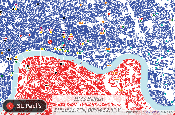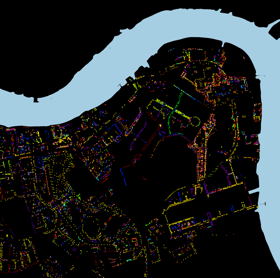
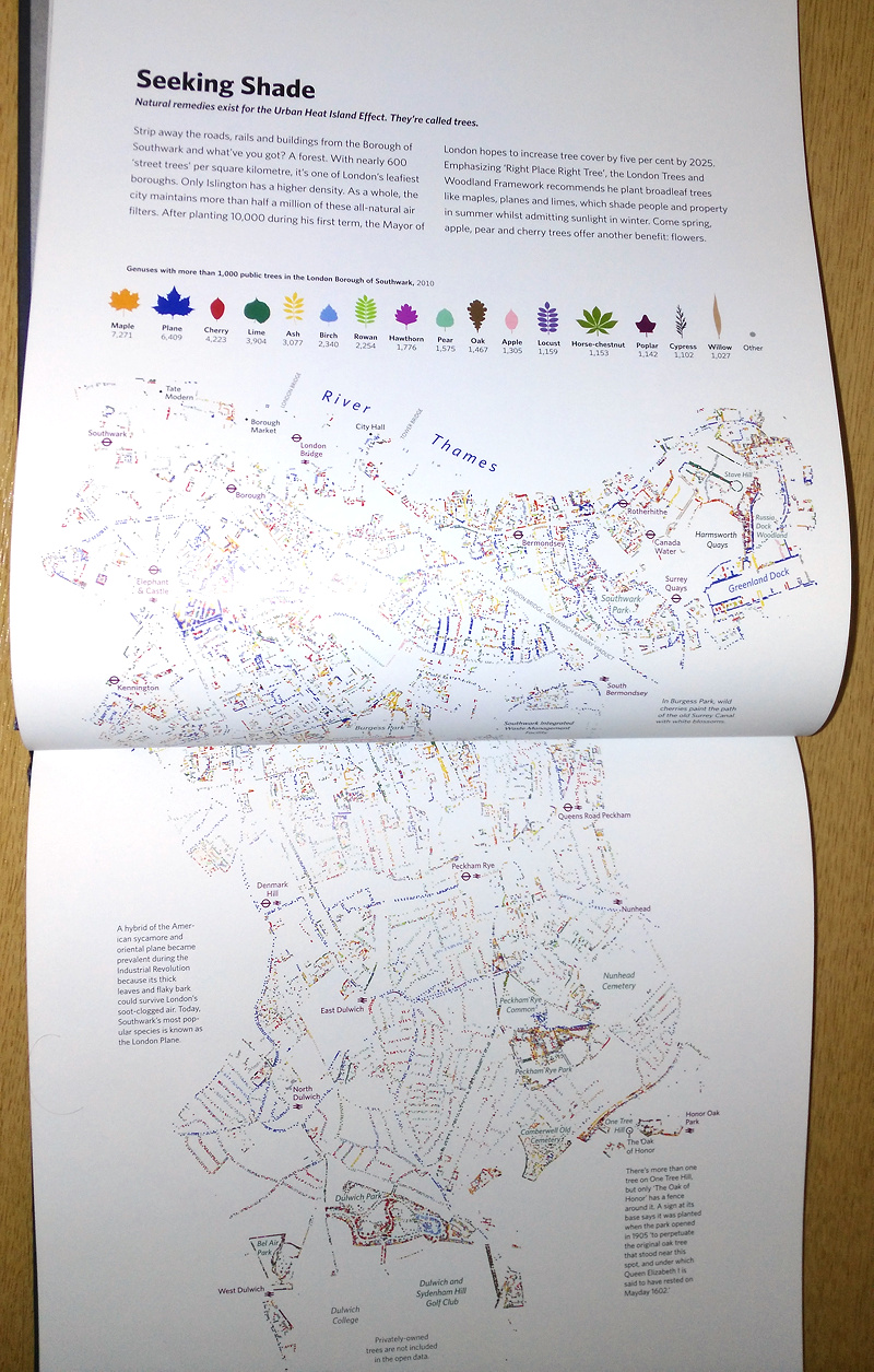
Above is an excerpt of a large, coloured-dot based graphic showing the locations of street trees in Rotherhithe, part of the London Borough of Southwark in London, as released by them to the OpenStreetMap database back in 2010. You can download the full version (12MB PDF). Street trees are trees on public land managed by LB Southwark, and generally include lines of trees on the pavements of residential streets, as well as in council housing estates and public parks. By mapping just the trees, the street network and park locations are revealed, due to their linear pattern or clumping of many types of trees in a small area, respectively. Trees of the same genus have the same colour, on this graphic.
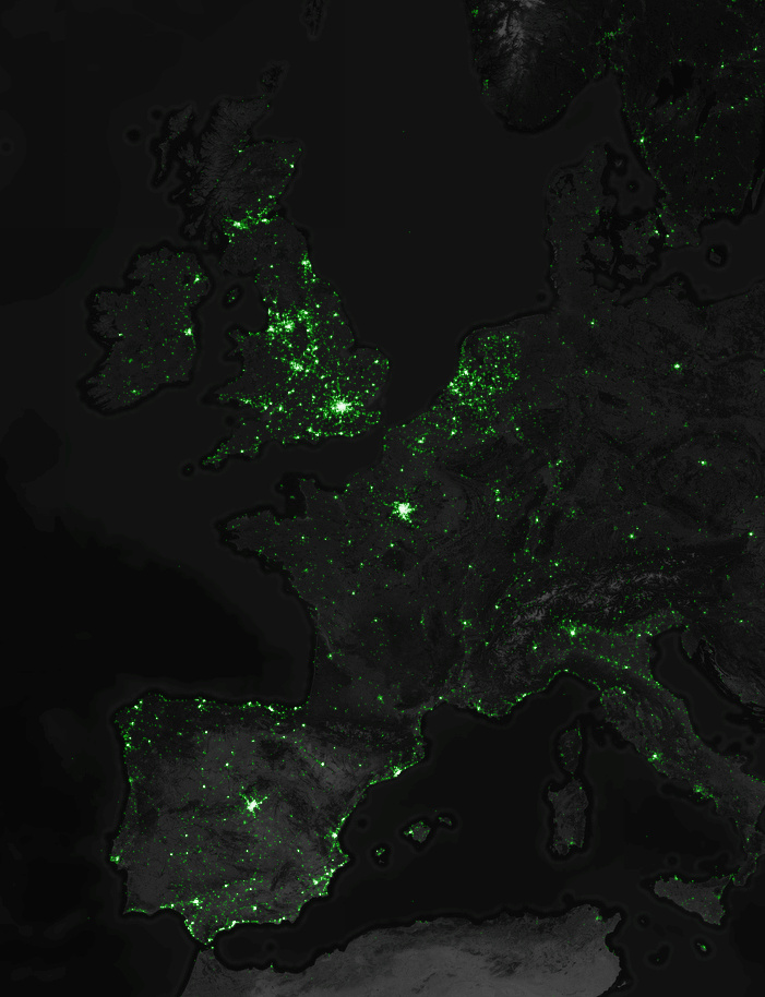
Why did I choose Southwark for this graphic? Well, it was at the time (and still is) the only London borough that had donated its street tree data in this way. It is also quite a green borough, with a high density of street trees, second only to Islington (which ironically has the smallest proportion of green space of any London borough). There are street tree databases for all the boroughs, but the data generally has some commercial value, and can also be quite sensitive (tree location data can useful for building planning and design, and the exact locations of trees can also be important for neighbourly disputes and other damage claims. It would of course be lovely to have a map of the whole of London – one exists, although it is not freely available. There are street tree maps of other cities, including this very pretty one of New York City by Jill Hubley. There’s also a not-so-nice but still worthy one for Washington DC.
Also well as a PDF version, you can download a zip-file containing a three files: a GeoJSON-format file of the 56000-odd street trees with their species and some other metadata, a QGIS style file for linking the species to the colours, and a QGIS project file if you just want to load it up straight away. You may alternatively prefer to get the data directly from OpenStreetMap itself, using a mechanism like Overpass Turbo.
A version of this map appears in London: The Information Capital, by James Cheshire and Oliver Urberti (who added an attractive colour key using the leaf shapes of each tree genus). You can see most of it below. I previously talked about another contribution I made to the same book, OpenStreetMappers of London, where I also detailed the process and released the data, so think of this post as a continuation of a very small series where I make available the data from my contributions to the book.
The data is Copyright OpenStreetMap contributors, 2015, under the Open Database Licence, and the origin of most of the data is a bulk-import supplied by Southwark Council. This data is dated from 2010. There are also some trees that were added manually before, and have been added manually since, by other OpenStreetMap contributors. These likely include some private trees (i.e. ones which are not “street” trees or otherwise appear on private land.) Many of these, and some of the council-data trees, don’t have information their genus/species, so appear as “Other” on the map – orange in the above extract.

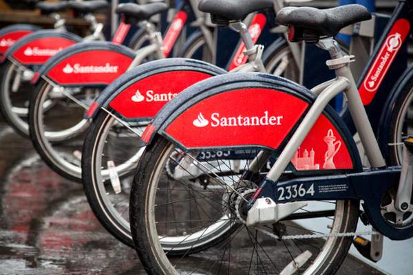
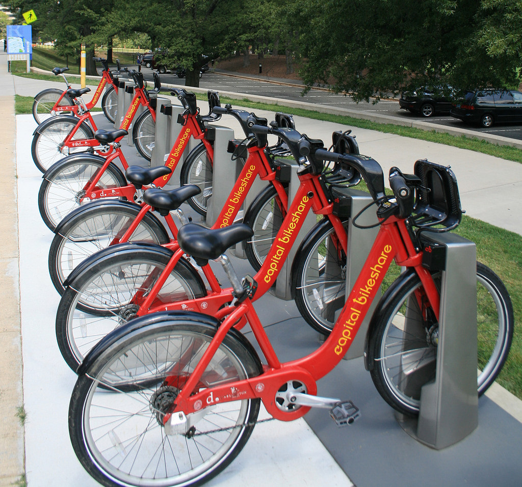
 It’s great that London’s system can attract “big” sponsors – £7m a year with the new deal – but
  Have “
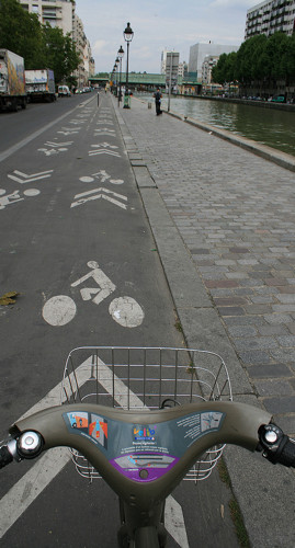
 Remove the density rule (one docking station every ~300 metres) except in Zone 1. Having high density in the centre and low density in the suburbs works well for many systems – e.g.
 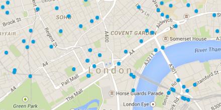 A better online map
  Encourage innovative use of the bikeshare data, via online competitions – e.g. Boston’s