This is one in a series of posts about possible High Lines for London. Look out for the next one tomorrow.
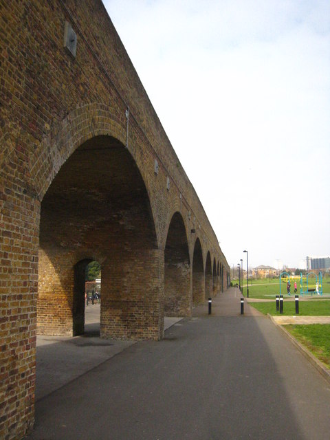
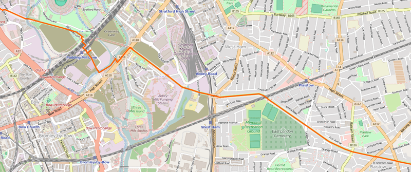
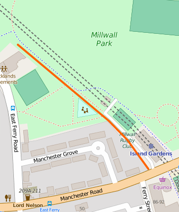 Before the DLR came along in the 1980s, there was an abandoned railway route (the Millwall Extension of the London & Blackwall Railway) running through the Isle of Dogs and ending on a viaduct just south of the current Island Gardens station, at a terminus station called North Greenwich – several miles from the station currently with that name. Almost whole route, including the viaduct, was then reused when the DLR was built, the new terminus “Island Gardens” being just north of the old one. When the DLR was extended under the River Thames to Greenwich, the route needed to drop down more quickly so that it could tunnel under the Thames, so this short section, at the southern tip of the Isle of Dogs, was abandoned for a second time, but the structure remains to this day, running across Millwall Park, starting shortly after Mudchute Station and ending shortly before the old Island Gardens station.
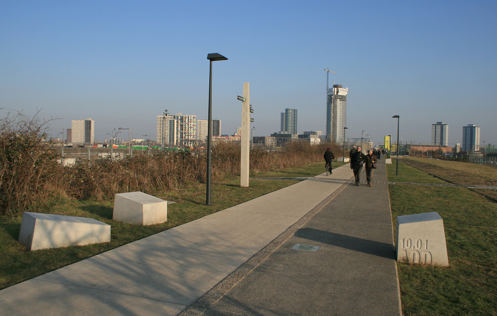
It would make a lovely High Line if it wasn’t for (a) being a little too short, (b) not going anywhere unique, as there’s a public footpath beneath/beside it all the way, (c) being in a park rather than crossing over roads and around/through buildings, and (d) being quite a long way from the crowds and buzz of inner city London. Still, it would be lovely to be able to walk about up there again – not possible since the original Island Gardens terminus station (nee North Greenwich) re-closed in the 1990s. Aerial imagery suggests it’s just a nice strip of grass and shrubbery these days.
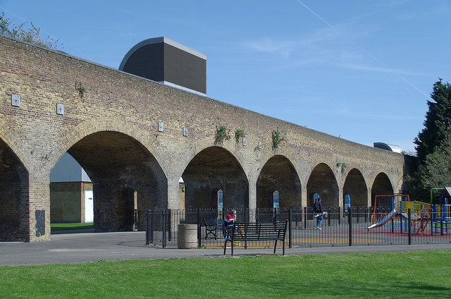
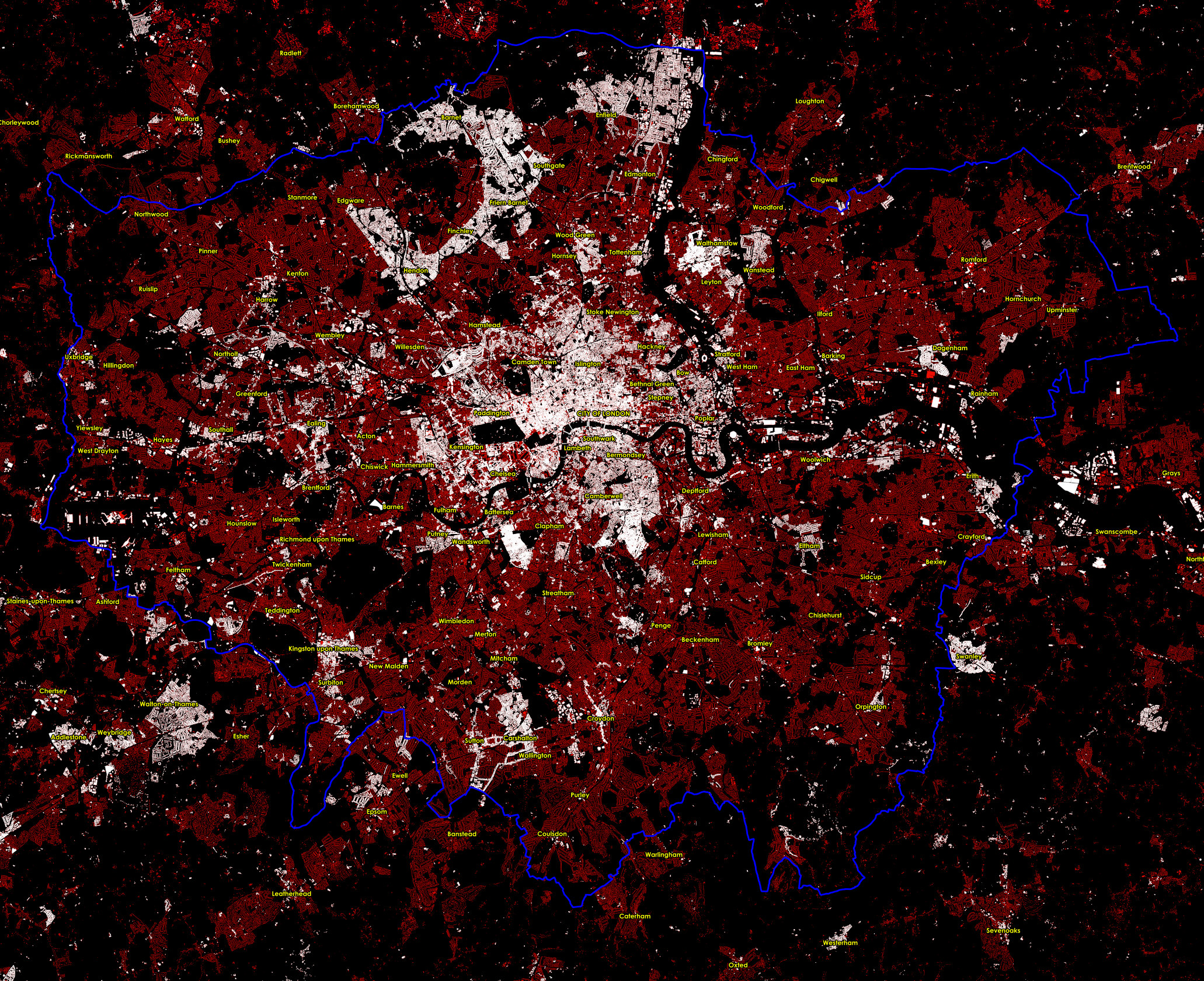
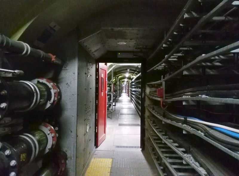
Top photo: Copyright (CC-By) Rod Allday. Bottom photo: Copyright (CC-By) Matt Buck. Map is Copyright OpenStreetMap contributors, ODbL, with cartography CC-By OpenStreetMap.
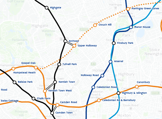
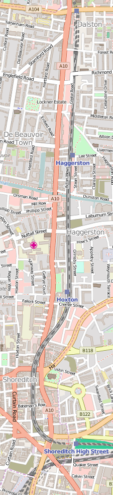 Perhaps the most promising candidate for a High Line was one of the few lines that were closed – the elevated railway between Broad Street (beside Liverpool Street Station) and Dalston in north inner-city London. In fact, the line survived Beeching, but succumbed to closure

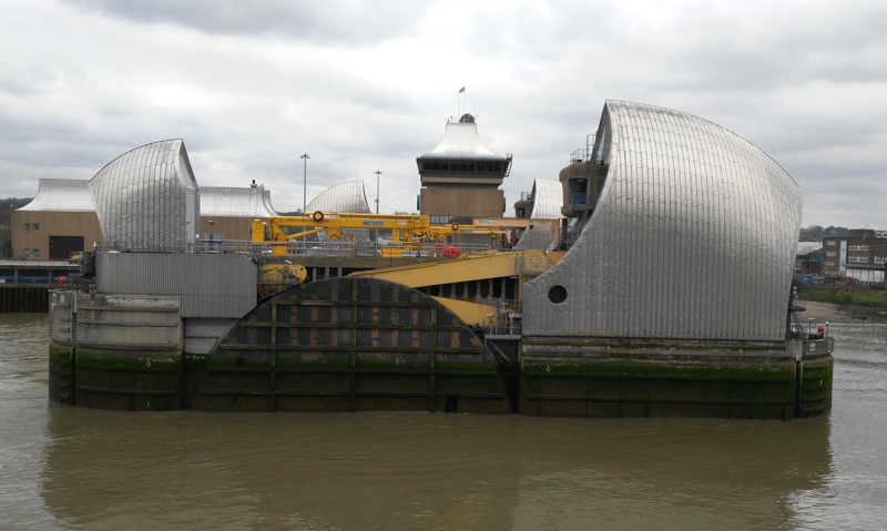
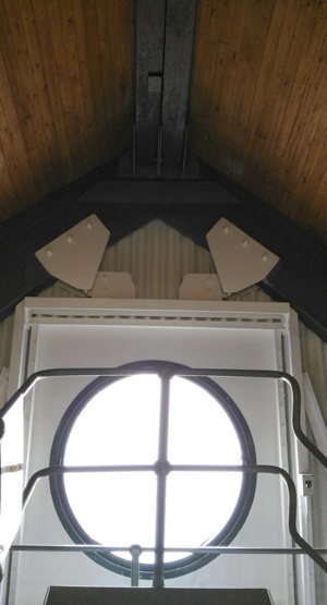 Each pier has two “hull like” buildings which are silvery on the outside, but surprisingly made of wood on the inside. The smaller one houses the top of the aforementioned lift shafts, while the larger one houses the machinery for rotating the huge barrier pieces. Normally, a close or open event takes a couple of hours – in fact, the barrier is quite capable of closing in a couple of minutes, but this is never used, partially because tidal events are fairly predictable with around 24 hours notice (being based on tide, wind direction, upstream flow and air pressure) and partially because a sudden closure/opening would have a negative impact on the ecosystem of the river – likely impacting flora/fauna in the river, and structures on the the banks (I presume this is from sudden changes in water salinity, level or pressure).