London Tube Stats maps data about how the London Underground is used – how many people use each station at various times of the day, and where they go once they are on the tube.
Transport for London, the city’s public transport authority, have a huge amount of data available in their Developers’ Area website, much of which is regularly updated. I’ve used the bike sharing system data fairly regularly, however I’m keen to take advantage some of their other datasets.
Back in 2010 I built a map mashup of the entries/exits data that, at the time, TfL made available on a (now defunct) performance website. The mashup consisted of varying the sizes of circles over each station, to represent how many people entered/exited the station, at certain times of the day, days of the week, or years, depending on the options selected. I wrote about the mashup here and also mentioned an update when the 2009 data was released, but the site languished. TfL changed the way that the data is formatted as it was moved across to the developer website, so adding future years wasn’t going to be straightforward, and also I never liked the rather stark black and white background map, with the tube lines “baked in” to it, and including various tube depots and other running lines that weren’t part of the passenger network, that I had created quickly.
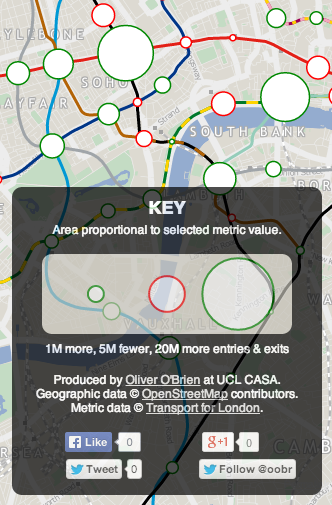
 So, I’ve rewritten the mashup from scratch. The main view shows the entry/exit data, by time of day, for 2003-2012. Choosing an option from the drop-down menu at the top will vary the circle sizes, the area of each circle representing the numbers. Clicking on a station will reveal a table of the underlying numbers, with colours showing trends. Then there is an additional view that uses the TfL RODS (Rolling Origin Destination Survey) data for 2012, to show journeys. RODS is based on surveyed data that is then scaled up to match the recorded entries/exits from the barriers, and the numbers represent a typical day. Click on a station to mark the place people enter the system, the other stations then shift in size to show where people exit. You can change between the two datasets using the Metric drop-down menu.
The background map is based on OpenStreetMap data, and the station locations and coloured tube lines are also based on this data – but I’ve tweaked it to show just one line per service, rather then individual tracks and depots.
Gist on GitHub
As part of creating this map, I’ve released the first in what I hope will be an increasingly large set of CASA open data releases. The release, as a Gist on GitHub, is of two files, in GeoJSON format – one for the tube lines, and one for the stations. The files also contain routes and stations for Overground, DLR, Tramlink, Emirates Airline and Crossrail (which starts in 2018) services. These are hidden from the London Tube Stats map, as stats are not available for these at the moment, although you can see them by setting all three dropdowns to the blank option.
I particularly like that GitHub spots that the files are GeoJSON, and effortlessly displays them as a map, rather than presenting the underlying JSON data by default.
- London Tube Stats
- London Tube Stats (showing journeys)
- TfL lines and stations (Gist on GitHub)
- TfL RODS & passenger counts data
[Update 1 – I’ve tweaked some colours – I now am using yellow vs blue when showing entries and exits for the journey metric. I’ve also added a new metric which compares the ratio of entries vs exits for the AM Peak numbers. Choosing the journey metric now always defaults to showing a selected starting station – currently Finchley Road. Click another station to show the stats.]
6 replies on “London Tube Stats”
[…] « London Tube Stats maps data about how the London Underground is used – how many people use each station at various times of the day, and where they go once they are on the tube ». (via London Tube Stats | Suprageography) […]
[…] extended my map of tube journeys and busy stations (previous article here) to add in an interesting metric from the 2011 census – that of the second most commonly […]
Crossrail has been extended to Reading. At the moment this isn’t reflected in your map.
Thanks, yes that’s on my todo list.
[…] In the new year I hope to complete and release the tidied vector data. [Update: Data released, more info] […]
[…] More information about the map […]