<rant> Three maps with glaring errors which I came across yesterday. I’m hesitant to criticise – many of my own maps have, I am sure, issues too (i.e. my Electric Tube map, on the right, is deliberately way off.) But I couldn’t resist calling out this trio which I spotted within a few hours of each other.
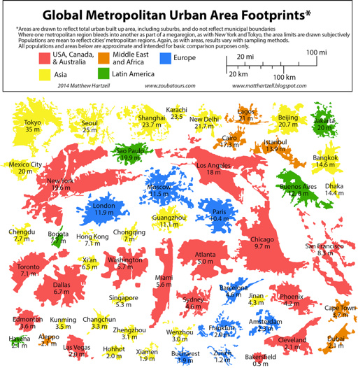
1. Global Metropolitan Urban Area Footprints

This is, in itself, a great concept. I particularly like that the creator has used the urban extent rather that administrative boundaries, which rarely follow the true urban extent of a city. The glaring error is scale. It looks like the creator traced the boundaries of each city’s urban extent in Google Maps (aerial view) or similar. All well and good, but a quirk of representing a 3D globe on a 2D “slippy” map means that the scale in Google Maps (and OpenStreetMap and other maps projected to “WebMercator”) varies with latitude, at a fixed zoom level. This hasn’t been accounted for in the graphic, with the result that all cities near the equator (i.e. most of the Asian and African ones) are shown on the map smaller relative to the others, while cities near the poles (e.g. London, Paris, Edmonton, Toronto) are shown misleadingly big. This is a problem because the whole point of the graphic is to compare footprints (and populations) of the major cities. In fact, many of those Chinese and African cities are quite a bit bigger relative to, for example, London, than the graphic suggests.
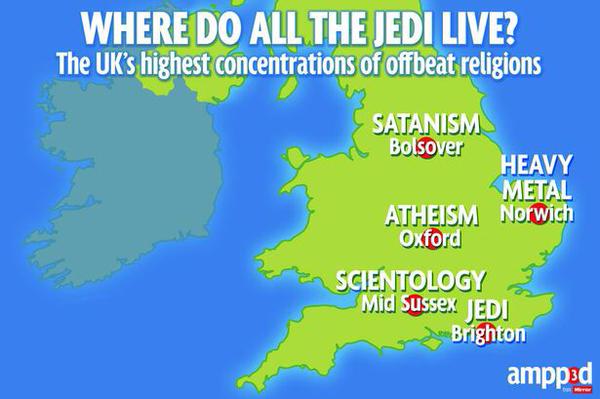
2. Where Do All The Jedi Live?

The map is in the Daily Mirror (and their online new media) so it doesn’t need to be a pinnacle of cartographic excellence – just a device to get a story across.However, Oxford and Mid Sussex – 40% of the datapoints – are shown in the wrong place – both are much closer to London than the map suggests. The author suggests they did this to make the text fit – but there better ways to accommodate text while having the centroid dots in the correct location. It might take a little longer but then it wouldn’t be – quite simply – wrong. I’m somewhat disappointed that the Mirror not only stoops to the level of Fox News in the accuracy of their mapping, but appears to have no problem with maintaining such an error, even when readers point it out. It’s sloppy journalism and a snub to the cartographic trade, that just relocating whole cities for artistic purposes is not an issue, particularly as so many people in the UK have relatively poor spatial literacy and so can be potentially easily manipulated.
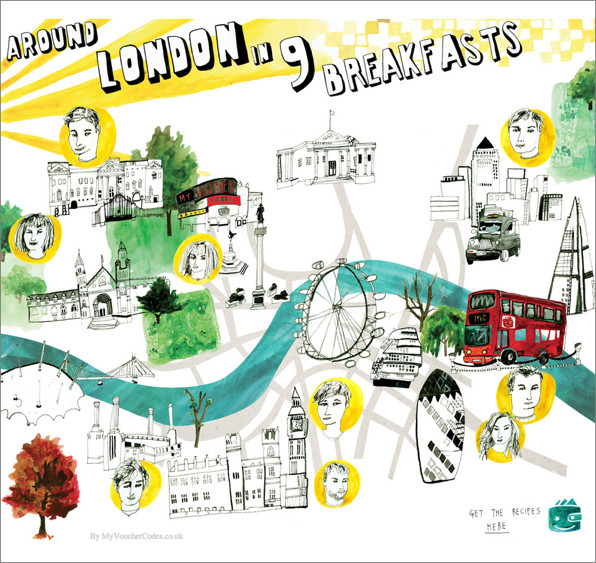
3. A London map…

I’m not really sure where to begin here. I’m not sure if any of the features are in fact in the right place!