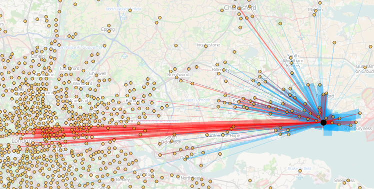
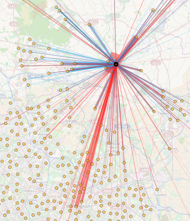
Today, the Office for National Statistics (ONS) have released the Travel to Work Flows based on the 2011 census. These are a giant origin-destination matrix of where people commute to work. There are various tables that have been released. I’ve chosen the Method of Travel to Work and visualised the flows, for England and Wales, on this interactive map. The map uses OpenLayers, with an OpenStreetMap background for context. Because we are showing the flows and places (MSOA population-weighted centroids) as vectors, a reasonably powerful computer with a large screen and a modern web browser is needed to view the map. The latest versions of Firefox, Safari or Chrome should be OK. Your mobile phone will likely not be so happy.
Blue lines represent flows coming in to a selected place, that people work in. Red lines show flows out from the selected location, to work elsewhere.
The map is part of the DataShine platform, an output of the BODMAS project led by Dr Cheshire, where we take big, open datasets and analyse them. The data – both the travel to work flows and the population-weighted MSOA centroids – come from from the ONS, table WU03EW.
View the interactive map here.
5 replies on “DataShine Travel to Work Flows”
How are the size of the bars normalized? Depending on the question being asked, I could imagine different methods being reasonable:
1. # of commuters = area. This would give each commuter approximately the same visual weight, independent of the distance traveled.
2. # of commuters = width. This would given farther-traveling commuters more visual weight. This might be useful for visualizing the “stress” placed on transportation networks by commute travel (or something like that).
Hi Jacob, it’s # = width. Yes, this does mean that further-out commuters get more “data ink” on the graphic, but this is countered by commutes in general dropping off strongly with distance. Therefore, the further away commutes are more unusual (in general) and therefore interesting (where they occur in significant numbers) and so it is right to draw the eye to these!
The map looks great, I was wondering whether there is the possibility of looking at locations and working out not just who goes to & from, but also through the area?
Councils primarily seem to think about their residents, occasionally about the workers and rarely about people who have to pass through every day. It would be great if somehow this could also be represented.
I imagine such information could be inferred by using road/rail/path/bus-route networks, assuming people take the shortest route on each network, and then calculating each journey and seeing where it passes through. Accuracy wouldn’t be 100% (unlike the census data itself which is intended to be definitive) but likely good enough for the numbers to be pretty close.
In a way, I do this for the bikeshare flows maps – utilising the cycle-allowed network in a city on OpenStreetMap, then assuming people go the shortest sensible route, making certain places (large roads, steps) less desirable. See the one I most recently did, which was for New York City: http://oobrien.com/2014/04/5-5-million-journeys-at-nyc-bike-share/
[…] Today the Office for National Statistics released the long awaited journey to work data collected by the 2011 Census in England and Wales. Here it is in all its glory. En masse you can really see the dominance of London in the South East as well as the likes of Manchester, Liverpool and Birmingham further north. If you want to pick out specific flows between areas you can use our “Commute.DataShine” tool developed by Oliver O’Brien. […]