Scotland’s population is heavily skewed towards the central belt (Glasgow/Edinburgh) which will affect likely reporting times of the independence referendum in the early hours of Friday 19 September, this being dependent both on the overall numbers of votes cast in each of the 32 council areas, and the time taken to get ballot boxes from the far corners of each area to the counting hall in each area. Helicopters will be used, weather permitting, in the Western Isles!
There is also likely a significant variation in the result that each area declares – with regions next to England (so dependent on trade with them) and furthest away from them (so benefiting most from support) likely to strongly vote “No”, the major cities being difficult to call, and the rural areas and smaller, less affluent cities of the central vote much more likely to vote “Yes”. Note that unlike a constituency election which is “first past the vote” for each area, the referendum is a simple sum-total for everyone, so while it will be interesting hearing each individual results, ultimately we won’t know the result until almost every area has declared the result, and the lead for one side becomes unassailable (areas will declare the size of the vote well before the result, which will make this possible).
A screenshot of a table, in a report “Scotland referendum: Looking through the mist” from the Credit Suisse Economics Research unit, was circulating Twitter a couple of days ago:
Expected #indyref declaration times for every council area. Good find by @gerrybraiden. pic.twitter.com/ryzCtDbRCQ
— Scott Reid (@scottreid1980) September 12, 2014
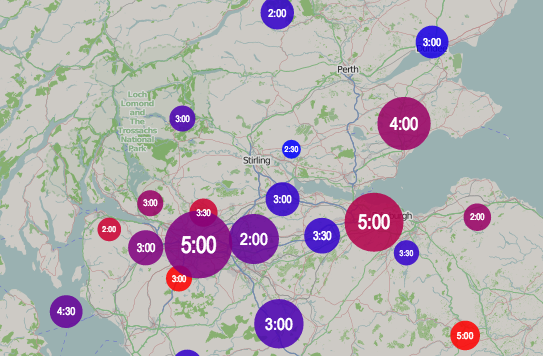
It has estimates on all three of these metrics, so I’ve taken this, combined it with centroids of each of the council areas, and produced a map. Like many of my maps these days, coloured circles are the way I’m showing the data. Redder areas are more likely to vote no, and larger circles have a larger registered population. The numbers show the estimated declaration times. Looks like I’ll be up all night on Thursday. Mouse over a circle for more information.
View the live #indyref map here.
ps. I’ve subsequently got hold of a copy of the report concerned. To quote the methodology for determining the “Yes” rating, it’s
“derived from support for the Scottish National Party in the 2012 local elections. We… show a range from 0 (the lowest local vote [share] for SNP in 2012, excluding Orkney and Shetland where the vote was negligible) to 10 (highest local vote share for SNP).”
This implies the Orkney/Shetland results were not used in the 0-10 scaling, as their very low results for the SNP overly skewed the metric.
6 replies on “Scottish Independence Referendum: Data Map”
[…] I’ve created an Election 2015 Time Map which maps the estimated declaration times that the Press Association have published. It follows on from a similar map of the Scottish independence referendum. […]
Hi,
I like what you’ve done here! Hope you don’t mind me including this post in a review of data visualisation around the Scottish referendum on my blog?
Thanks!
Sure, please go ahead.
[…] He’re is an excellent resource to follow the results. It comes from Oliver O’Brien’s Suprageography Blog – Scottish Independence Referendum: Data Map […]
Hi Oliver,
Thanks for an very interesting table – where can I get a copy of this Credit Suisse report? I have looked everywhere…
Thanks.
I found it here: http://www.mnfinance.com/economy/scotland-referendum-looking-through-mist