I was interviewed by OpenCageData recently, the article appears on their blog and I have reproduced it here:
Continuing in our series of interviews with folks doing interesting things in the open geo world, today we enter the realm of domain specific OpenStreetMap variants by talking with Oliver O’Brien, maker of Open Orienteering Map.
1. Who are you and what do you do? What got you into OpenStreetMap?
I’m Oliver O’Brien (“Ollie” on OpenStreetMap). I’m a researcher and software developer at the Department of Geography at UCL in London, specialising in geovisualisation and demographic mapping.
I’ve been a contributor to the OpenStreetMap project since 2007. I first learnt about it when a friend was keen to try out lots of different routes around Edinburgh during the Hogmanay festival, recording them with a GPS receiver. He explained he was uploading them to a project – OpenStreetMap – a map that anyone can edit. At the time it was nearly blank in the Edinburgh area. When I got back to London I discovered that many of the roads in my local area were missing too, so got down to filling them in. At the time, the project did not have access to high-resolution aerial imagery, so GPS traces were very useful – as were annotating note by hand on various scraps of paper! I then discovered the thriving London OpenStreetMap community – we organise mapping parties, though now, as London is largely “done”, it’s generally pub meets. I’m lucky enough to regularly use OpenStreetMap data for my day job at UCL, sometimes including my own contributions.
2. What is Open Orienteering Map? What is the goal of the project?
My orienteering club (South London Orienteers, aka SLOW) has been running informal “Street-O” evening training events in various parts of London, for many years. The idea is that you have to visit as many points, marked on a printed map that you run with, as possible within one hour, and get back to the start. The route you take is up to you, so it’s vital that the map you use doesn’t get you lost. Many of the maps being used at the time I first joined the club were created in fiddly (and expensive) bespoke software used for professional maps, typically by hand, tracing in A-Z or Ordnance Survey paper maps. The process was prone to error and very slow.
Having seen OpenStreetMap data being used in various other projects, such as Andy Allan’s OpenCycleMap, I realised there was potential for it to be used for orienteering mapping too. While regular orienteering maps contain a lot of specialist features not on OpenStreetMap (such as forest thickness and crag detail), basic Street-O maps are simpler, and for many areas, OpenStreetMap likely has sufficient level of detail. Initially I set up a system which required GIS software to use, with appropriate orienteering styles and filters, but that was still hard to use for people outside the GIS world, so I then realised I could go one step further and build a website – http://oomap.co.uk– that performed the same function. So OpenOrienteeringMap was born.
The goal of the project is to make it as easy as possible for the volunteer Street-O organisers to create maps for their events. This has two main benefits – firstly, with less spent time on drawing the map, and no cartography skills needed – the website generates a PDF map to print, at the click of a button – more new people can get involved and organise their own event, taking time to plan great courses rather than draw a map. Additionally, it encourages new people into the OpenStreetMap community. By making the only easy way for organisers to update the roads, paths and other features on the Street-O map being via OpenStreetMap – with a regular refresh of the database back to OpenOrienteeringMap – the website has got a few people hooked on being “regular” OpenStreetMap editors, as well as orienteers. (N.B. if I rebuilt the service now from scratch I would probably use something the Overpass API and vector tiles directly in the browser, rather than have my own copy of the database and an image tiler and PDF generator.)
There are three versions of the website: British (with OS Open Data contours), Irish and worldwide, and two main mapping styles, “StreetO”, used for Street-O races, and “PseudO”, which is an attempt to create a “regular” orienteering map style in OpenOrienteeringMap, following the colour and symbol standards defined by the sport. It has a distinctive look but is of less use for orienteering events except in a few very well-mapped places. The styles are on GitHub.
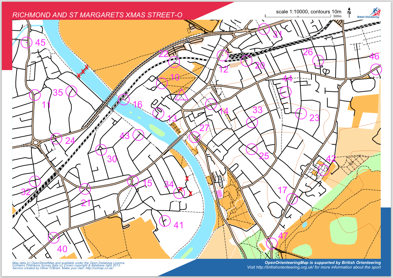
Above is the map that is being used for the next South London Orienteers’ Street-O event, in December 2014, with around 100 people taking part. Further details of the events can be found at http://slow.org.uk/about/streeto/. Map data Copyright OpenStreetMap contributors.
3. What are the unique needs of a map designed for orienteering? How has using OSM to meet those needs worked out?
Orienteering maps need to be highly detailed, clear and accurate, as competitors run through unfamiliar terrain at speed and the accuracy of navigation is as important as speed, when it comes to getting a good result. This general principle applies to Street-O events, where it is important that all navigable roads, tracks and paths are included and that the map is as uncluttered as possible. Other datasets can often neglect tracks and paths in particular, but OpenStreetMap has historically had a good record in this regard, being a grassroots community comprised of many enthusiastic walkers and cyclists, amongst others. The data isn’t perfect, but for areas in London that my local club users, it’s worked out pretty well. Sometimes missing detail is spotted by the organiser and they edit OpenStreetMap to fix it. Occasionally it isn’t spotted and competitors report back missing paths at the race finish – edits can then be made which will benefit future races there. Both these processes improve OpenStreetMap itself (for everyone) while also improving OpenOrienteeringMap (for racers), so everyone benefits.
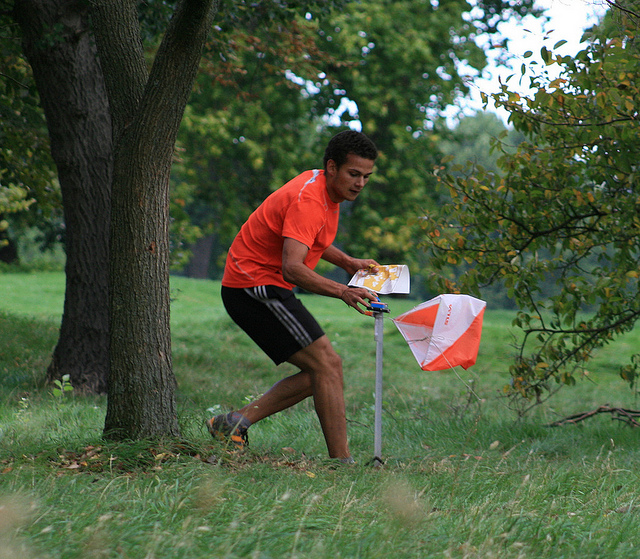
Competitor in a London park. Although he is using a custom drawn map for this particular race, the level of detail in some London parks on OpenStreetMap means that OpenOrienteeringMap is a possibility for more informal events here. Copyright Oliver O’Brien.
4. What steps could the global OpenStreetMap community take to help support the use of OSM in unique communities like this?
One feature which would be of great use, would be the ability to “sign off” certain areas has achieving a particular level of completeness, e.g. a local contributor confirming that, to their knowledge, an area in a particular bounding box has all the roads and paths on it. Such a mechanism was created by ITOWorld with their OSM Quality tool, for Great Britain, using complementary data from the national mapping agency, however a global version, using experienced OpenStreetMap editors as the authority, would very useful in encouraging Street-O event organisers to use OpenOrienteeringMap or other tools for using the data in orienteering events.
5. OSM recently celebrated its 10th birthday, where do you think the project will be in 10 years time?
It will be a map with virtually every building and road in the world on it. Improving and more accessible satellite and imagery will greatly help with this process. Detail will increase too, but I don’t think it will end up mapping every tree or lamppost – there will be spinoff projects which will cover things like that. The project’s licence does ensure that the data will always be as good as it is currently and so can only get better still. I think also, the project emphasis will shift away from the standard “openstreetmap.org” front page map and become more known as the definitive map data store for the world, with other websites becoming the primary way the data is viewed. The project is sometimes described as the “Wikipedia of mapping” and I think it will encounter the same problems, and come up with the same solutions, that Wikipedia did – such as dealing with vandalism of the dataset by having different levels of editors, area guardians and protected places. More generally, I see many more projects like OpenOrienteeringMap filling particular niches and the parent database continues to expand. Perhaps the database will form the start of a global postcode system?
Many thanks Ollie! A great example of a practical application of open geo data. Anyone who is interested in the project can learn more here. OpenOrienteeringMap is just one of many geo related projects Ollie is involve in, I highly recommend everyone follow him on twitter and read his blog.