Skip straight to the 3D graph!
When people decide to move to London, one very simple model of desired location might be to work out how important staying somewhere nice, cheap, and well located for the centre of the city is – and the relative importance of these three factors. Unfortunately, like most places, you can’t get all three of these in London. Somewhere nice and central will typically cost more, for those reasons; while a cheaper area will either be not so nice, or poorly connected (or, if you are really unlucky, both). Similarly, there’s some nice and cheap, places, but you’ll spend half your life getting to somewhere interesting so might miss out on the London “experience”. Ultimately, you have to pick your favoured two out of the three!
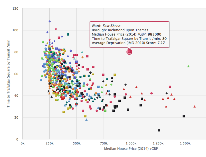
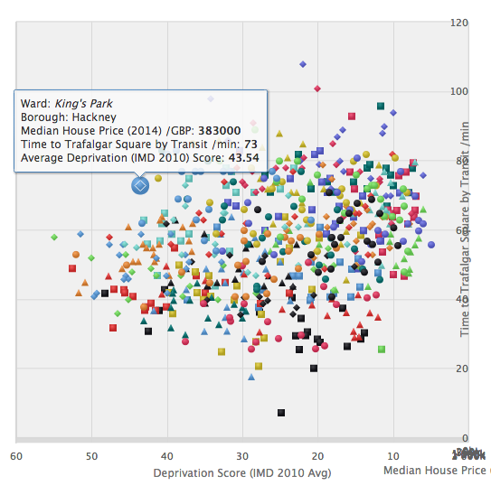
Is it really true that there is no magic place in London where all three factors score well? To see the possible correlations between these three factors, I’ve calculated the ward* averages for these, and have created a 3D plot, using High Charts. Have a look at the plot here. The “sweet” spot is point 0,0,0 (£0/house, 0 score for deprivation, 0 minutes to central) on the graph – this is at the bottom left as you first load it in.
Use your mouse to spin around the graph – this allows you to spot outliers more easily, and also collapse down one of the variables, so that you can compare the other two directly on a 2D graph. Unfortunately, you can’t spin the graph using touch (i.e. on a phone/tablet) however you can still see the tooltip popups when clicking/hovering on a ward. Click/touch on the borough names, to hide/show the boroughs concerned. Details on data sources and method used are on the graph’s page.
The curve away from the sweet spot shows that there is a reasonably good inverse correlation between house prices and deprivation, and house prices and nearness to the city centre. However, it also shows there is no correlation between deprivation and nearness. Newington is cheap and close in, but deprived. Havering Park is cheap and a nice area, but it takes ages to get in from there. The City of London is nice and close by – but very expensive. Other outliers include Merton Village which is very nice – but expensive and a long way out, while Norwood Green (Ealing) is deprived and far out (but cheap). Finally, Bishop’s in Lambeth is expensive and deprived – but at least it’s a short walk into the centre of London.
Try out the interactive graph and find the area you are destined to live in.
p.s. If you are not sure where your ward is, try clicking on the blobs within your borough here.
* Wards are a good way to split up London – there are around 600 of them, which is a nice amount of granularity, and importantly they have real-world names, unlike the “purer” equivalent Middle Super Output Areas (MSOAs). Using postcode “outcodes” would be even better, as these are the most familiar “coded” way of distinguishing areas by non-statisticians, but statistical data isn’t often aggregated in this way.
2 replies on “Living Somewhere Nice, Cheap and Close In – Pick Two!”
Interesting. I suspect the real way to gain value/find the magic place is to look at areas on the “bottom” of the surface, and then look for micro-neighbourhoods which buck the trend- as house prices do tend to reflect perceptions of wards or bigger, but some micro-areas can be a lot “nicer” for the same money.
So maybe a visualisation like this, but that lets you click on a ward, and see another visualisation of small areas within it, bringing out crime coldspots, localised countryside accessibility, distance to nearest deli. Now, there’s a challenge…
Maybe a GIS would be better for that