Categories
CDRC Conferences

Mapping Data: Beyond the Choropleth

I recently gave a presentation as part of an NCRM Administrative Data Research Centre England course: Introduction to Data Visualisation. The presentation focused on adapting choropleths to create better “real life” maps of socioeconomic data, showing the examples of CDRC Maps and named. I also presented some work from Neal Hudson, Duncan Smith and Ben Hennig.

Contents:

  • Technology Summary for Web Mapping
  • Choropleth Maps: The Good and the Bad
  • Moving Beyond the Choropleth
  • Example: CDRC Maps
  • Example: named – KDE “heatmap”
  • Case example: Country of Birth Map – concerns of the data scientist & digital cartographer

Here’s my slidedeck:

(or you can view it directly on Slidedeck).

Categories
London

TubeHacker: 10 Ways to Optimise Travel in London

wtt

1. Tube trains do run to a strict timetable, rather than just “saturating” the tunnels with trains, as can appear to be the case on many lines during the rush hour.

This is not normally useful because the gap between trains is so small, so TfL doesn’t publish the timetables, except for first/last trains and, for train geeks, the Working Timetables are hidden away on their website. However, the timetables (which are accurate to quarter-minutes) are useful near the start or end of the day – particularly around midnight, where the frequencies drop right down. Journey Planners, such as Google Maps, make use of the hidden timetables. Case in point – a recent journey suggested a Circle Line train arriving at 0002 at Paddington, going eastwards. Sure enough, as I ran down the stairs a hundred seconds after midnight, it was just pulling in. For less frequent services, such as Metropolitan Line trains to Amersham, the timetables become event more important. Crossrail will also likely be relatively infrequent, especially for services to the far ends.

tube_osi

2. Out of Station Interchanges (OSIs) can be useful for saving money (i.e. avoiding Zone 1) or time (as distances can be much smaller between other lines than the tube map can suggest). They are “free” transfers which are not shown on the tube map, but which count as only one journey, even if you go out through ticket barriers and back in at the other station. The system does the maths so you don’t end up paying for too. Each OSI has a time limit between the two sets of barriers, so don’t go shopping in between the stations! You can see the current OSIs between tube/DLR/Overground stations on this map, or see this page for the complete list.

3. You don’t have to flag down, hail or otherwise signal TfL buses. This has been the case for a few years. Bus drivers will always stop if they see you at the stop and you show a vague interest towards the bus – such as facing it and looking at it. Save your weary arms and don’t give passing cyclists frights!

london_bikeshare

4. The Santander Cycles (a.k.a Boris Bikes, or generically, the London Bicycle Sharing System bikes) stretch across a wide area of central London. They charge £2 for every 30 minutes after the first half hour. You can save money on a long journey by docking just before the 30 minutes is up, waiting at least 5 minutes, and then starting the next leg of the journey, either from the same docking station or a nearby one. (N.B. Santander Bikes are not included in the Oyster/Contactless/travelcard system – yet. They may be included from summer 2017 onwards.)

5. Oyster/Contactless is always cheaper than paper tickets when travelling in Zone 1-6, or on any TfL services outside of these zones, but not necessarily when on non-TfL services travelling outside of Zone 1-6. For example, paper tickets from Gatwick Airport to London Bridge/Blackfriars or to London Victoria can sometimes be cheaper than Oyster/Contactless – particularly at weekends with “Super Off-Peak” paper tickets and especially if you have a railcard that you can’t use with Oyster/Contactless. I can travel from Gatwick to Blackfriars for £5 on Sundays with a buy-on-the-day paper ticket and a Network Railcard, but it’s £8+ with Oyster. N.B. In rare cases, the end-of-day batch calculation that Contactless uses, compared to Oyster with its immediate charging, means that Contactless can work out cheaper than Oyster. Geoff Marshall (Londonist) investigated this.

6. 2-for-1 to top London Attractions: If you have a paper train ticket (i.e. for National Rail and London Overground, not the tube) to the stations nearest the attraction then you can get a 2-for-1 on entry (e.g. Richmond to Kew Gardens for visiting the aforementioned gardens is £3 for 2 people – save £16+ on getting in). You don’t actually have to do the journey though, and you don’t need to buy the tickets from the start of your theoretical journey – buy it at the station nearest the attraction if there’s a ticket office there. Buy a journey which is very short, as then it will be cheap!

tube_shortcuts

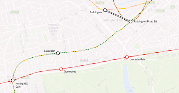
7. The tube map is far from geographical. Here are some journeys that are shorter by walking, than by taking the tube:

  • Leicester Square to Covent Garden (450 people a day do this journey by tube! Don’t!)
  • Bayswater to Queensway
  • Paddington to Lancaster Gate (i.e. Hyde Park)
  • Farringdon to St Paul’s

8. Sometimes, you don’t need to get the tube. A day bus pass is £4.50, but you get a free one automatically put on your Oyster/Contactless after 3 bus journeys that day, and then you can go on unlimited other TfL buses for free until 0430 the following morning. A “Hopper” ticket giving you two journeys in an hour for £1.50, is coming in September. In both cases, you pay for the electronic ticket through Oyster or a contactless credit/debit card – buses don’t take paper tickets.

9. Buses don’t have zones, but are included in any travelcard. So you can have a Zone 1-2 travelcard and then travel out from Zone 2 on a bus, to Zone 3 or right to the edge of London etc, then back into Zone 2 from Zone 3 on a bus, all on the travelcard.

singlefarefinder

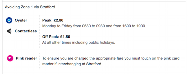
10. If you avoid Zone 1, long journeys can be extremely cheap. For example, stay on TfL rail services (Underground, Overground, TfL Rail, Tramlink) and it’s just £1.50 off-peak, no matter how far you go – you’ll need to touch on pink Oyster card readers when changing trains, to prove you went that way. Uxbridge to Upminster is just £1.50 off-peak with Oyster/contactless, despite being over 31 miles as the crow flies. Just touch the pink reader at Stratford’s Overground platforms. This doesn’t always work – if you have to travel back on yourself then you may not get the discount. For example, Earl’s Court to Highbury and Islington doesn’t work (despite both being in Zone 2), but very close by West Brompton to Highbury and Islington does, because you leave the same direction as you arrive, when changing at West Brompton. The single fare finder is extremely useful as it will always tell you if there’s an avoid Zone 1 option for your journey, and where you may need to touch a pink reader to prove it.

To complicate things even more, there’s certain journeys where touching a pink reader, will *increase* the fare you made – even if you didn’t go into Zone 1. A pink reader acts as proof you were at that place, and TfL will apply rules about logical/sensible journeys, based on this information. For example: Canada Water to Tottenham Hale: Single Fare finder says it’s £1.50 if you end at the National Rail gates there, and £2.80 if you end at the Underground gates.

pinkvalidators

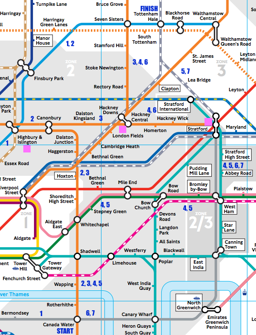
There are, I think, seven sensible off-peak routes, based on Zone 1/not Zone 1 choice, whether you have a bike and that the Stratford-to-Tottenham line being very infrequent – below, I’ve assumed leaving Canada Water as soon as possible after 8pm on a normal Friday and got the times from TfL’s Journey Planner or Google Maps:

Route Change At Zone 1? Bikes allowed? Pink Readers How Long (mins)? Fare
1 Green Park Yes No 33 £2.80
2 Highbury & Islington Yes No 33 £2.80
3 Canonbury, Hackney Central Yes Yes 45 £1.50
3 Canonbury, Hackney Central Yes Yes Hackney Central 45 £2.80
4 Whitechapel, West Ham, Stratford, Hackney Central No Yes £1.50
4 Whitechapel, West Ham, Stratford, Hackney Central No Yes Hackney Central £2.80
4 Whitechapel, West Ham, Stratford, Hackney Central No Yes Stratford £1.50
4 Whitechapel, West Ham, Stratford, Hackney Central No Yes Stratford, Hackney Central £1.50
5 Whitechapel, West Ham, Stratford No Yes £1.50
6 Stratford, Hackney Central No No £1.50
7 Stratford No No 34 £1.50

Cheaper than it should be, Pink validator increases your fare, more expensive than it should be, Pink validator increases your fare, correctly

There are other possible routes, but they are less sensible (i.e. not as fast), such as taking the Overground circle the long way around (via Clapham Junction).

If you go via Canonbury and Hackney Central/Downs (route 3), you pass through Zone 1 (Shoreditch High Street station), however the default off-peak fare is £1.50 as you finish at the National Rail gates. Touching at the interchange between Hackney Central and Hackney Downs will increase the fare to £2.80, because you proved you’ve gone that way, not via another route changing at Stratford only, which does avoid Zone 1. You could go in fact still change at Stratford and Hackney Downs/Central, which avoids Zone 1, but touching at Hackney Downs/Central will charge you the Zone 1 fare. This route is sensible, because the direct Stratford trains are only once every 30 minutes (and often not running at all). An even more convoluted route, changing at Whitechapel, West Ham, Stratford and Hackney Downs/Central, is still viable for me, as if I’m taking a bike on the train, I can’t do the Mile End to Stratford or Canada Water to Canning Town sections…

Categories
BODMAS OpenLayers

The Great British Bike to Work

Cross-posted from the DataShine blog.

cycle_thumbnail

Here’s a little visualisation created with the DataShine platform. It’s the DataShine Commute map, adapted to show online cycle flows, but all of them at once – so you don’t need to click on a location to see the flow lines. I’ve also added colour to show direction. Flows in both directions will “cancel out” the colour, so you’ll see grey.

London sees a characteristic flow into the centre, while other cities, like Oxford, Cambridge, York and Hull, see flows throughout the city. Other cities are notable for their student flows, typically to campus from the nearby town, such as Lancaster and Norwich. The map doesn’t show intra-zone (i.e. short distance) flows, or ones where there are fewer than 25 cyclists (13 in Scotland as the zone populations are half those in England/Wales) going between each origin/destination zone pair – approximately 0.15% of the combined population.

Visit the Great British Bike to Work Map.

Categories
CDRC Geodemographics

A Map of Country of Birth Across the UK

eastse_countryofbirth

Above: Areas of east and south-east London with more than 8% of inhabitants being originally from (from top to bottom) India (in East Ham), Lithuania (in Beckton) and Nigeria & Nepal (in Abbey Wood).

[Updated] Ever wondered why some branches of Tesco, the ubiquitous supermarket, have an American food section, while others have a Polish food chiller? Alternatively, it might have a catch-all “World Food” aisle, or it might not. The supermarket is, of course, catering to the local community. Immigrants to the UK do not uniformly spread out across the country, but tend to cluster in particular localities.

The latest map that I’ve published on CDRC Maps is a Country of Birth map, which attempts to summarise such communities in one view. It uses the same technique as Top Industry, it maps the most common country of birth (excluding the home nation) of residents in each small area, as of the 2011 Census. The purpose of the map is to identify and map the approximate extent of single-country communities within the UK. For example, to see how big London’s Chinatown is, or whether a Little Italy in the capital still exists.

This map reveals such communities although there is an important caveat when looking at it. I have set out below the rules I applied when constructing it, the most important of which is that only 8% of inhabitants need to share a single country of birth, for it to appear on the map. Bear in mind that, across the UK, 87% of people were born here. These people do not appear on the map, unless they are outside their home nation (and not at all if they are English).

countryofbirth_key
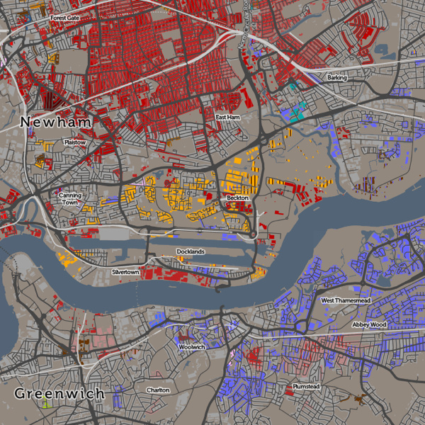
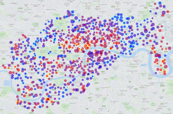
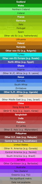
There are a number of rules I have needed to apply to make this a map that tells an interesting story in a measured and fair way:

  • I don’t map native births – the English-born people in England, Welsh-born in Wales, Northern-Irish born in Northern Ireland or Scottish-born in Scotland. There are almost no areas anywhere in the UK where people born in a single foreign-born country outnumber the native-born. If I did map such native births, then the map would be almost completely dominated by them, and would not tell much of a story.
  • I also don’t map the English-born within the other home-nations, because the population of England is so much larger than in Scotland, Wales etc such that even the small percentage of them moving into the other home nations would dominate the map of Scotland/Wales/NI, if included.
  • I only map a single-country foreign born area if at least 8% of local residents are from that country. This sounds like a low threshold and it is – if an area is coloured a particular colour, it might still have up to 92% of the local residents actually being native-born.
  • The above rule means that some very multi-cultural areas don’t get mapped, because they have a large number of non-native residents, but these are split amongst various countries such that none reaches the 8% threshold.
  • Necessarily, in the source data, some countries are combined together into regions, either for a whole region (e.g. Central America) or for other countries in a region (e.g. Other East Asia, not including China/Japan etc). This is how the underlying Census statistics are represented. This can have the effect of making a result (for a region) appear when it wouldn’t otherwise appear (for any country in the region). However the number of places where this happens is small so it does not overly bias the map.
  • A slight quirk of the census results is that the Scotland and Northern Ireland chose to, based on their own sum populations, aggregate some of the smaller-UK-population countries in a different way. For example, Northern Ireland doesn’t break out “Other Old EU” (e.g. Belgium) and “Other New EU” (e.g. Bulgaria) into separate categories. The Somalian population in Scotland is not presented as a distinct statistic, but it is in NI (and England/Wales). Again, this only affects countries/regions with smaller UK populations so doesn’t overly distort the map.
  • I don’t colour the map where it would be showing data for less than 10 people. This causes a most noticeable rationalisation of the map in Scotland, because the small areas here have a lower population (typically 125 instead of 250 people). This means Scotland’s country-of-birth diversity is a little underrepresented when compared with the other regions of the map.
  • I’ve used colour hues and brightnesses in an ordered way, to group together continents and regions. Greens = UK nations, Olives = Old EU, Browns = New EU, Yellows = North America, Pinks = Central America, Blues = Africa, Purples = Oceania, Reds = Asia. There is no particular meaning to the colours picked beyond this, but be aware that the eye is naturally drawn to some colour hues more than others.
  • If a second country of birth also scores over 8%, but with a smaller local population than the first, then this is shown in striped lines over the first, and labelled as such in the interactive key.

Have a look at the map, and mouse around to find the meaning for the current colour, or see the scrollable key on the right.

Why 8%? I found that dropping this threshold (I tried initially at 5%) results in a lot of “noise” on the map, where only two large families need to move to an area, for it to acquire their birth-country colour. Increasing this threshold (e.g. to 10%, which I tried) results in many of the interesting patterns disappearing.

Interesting, some famous “immigrant” areas of London virtually disappear on this map. Brixton and Hackney are still associated with the Jamaican communities moving there in the 1940s/50s, but, at 8% threshold they virtually disappear. Only at 5% is there a significant community pattern appear. Similarly, Wandsworth and Shepherds Bush are known for their Australian communities but these also almost vanish when moving from 5% to 8%. At a 5% threshold, Hackney and Islington show a “patchwork” effect of integrated multicultural communities of Irish, Turkish, Nigerian and Jamaican-born immigrants. These also disappear largely from the map at 8% threshold. Remnants of the Irish migration to Kentish Town are more obvious.

London remains a fascinating mix where people from many different countries have set up their home in neighbourhoods with established communities and retail that cater for them. While the UK’s other cities have “international” quarters too, none shows the diverse nature of these communities. Virtually every country in the key has a London neighbourhood. (N.B. Places where there are pockets of many nations in a small area in London, and elsewhere, often indicate a student population at a globally well-known university).

Away from London, the Scottish-origin communities in Corby and Blackpool stand out, while the Americans on military bases in East Anglia also dominate the map there. Luton has a Polish, Pakistani and Irish disapora.

As ever, I am mapping small-area statistics, not those for individual houses (I don’t have that information!) and the representation of a particular house on the map is indicative of the local area rather than each house itself. The addition of houses on CDRC Maps maps is intended to make the map more relatable to the population structure of towns and cities, but it can make the data more detailed than it actually is. The map also includes non-residential buildings – there’s no easy way to filter these with the open dataset used, and the great majority of buildings in the UK are residential.

[Update – See this excellent article written by CityLab on this map, which explains some of the above nuances in a better way than I attempted to.]

Below: There is a Little Italy, but it’s in Peterborough now.

peterborough_countryofbirth